How to Fix Screenshot Widths Larger Than the Original HTML Element
A screenshot can be wider than an element because CSS pixels and image pixels use different scales, or because the capture includes more than the element. Here’s how to measure and fix the mismatch in Playwright.
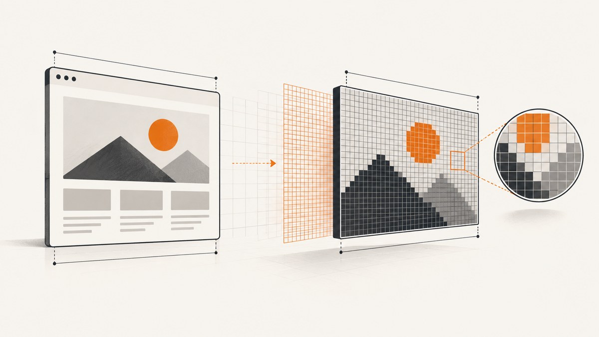
A screenshot that is wider than its HTML element usually has one of three explanations: the bitmap uses device pixels while the element is measured in CSS pixels, the capture includes a larger region than the element, or the page rendered at an unexpected viewport size. In Playwright, use scale: "css" for one output pixel per CSS pixel, capture the element itself when that is the desired boundary, and set the viewport before navigating. Then compare the element’s measured CSS width with the screenshot’s pixel width.
This guide uses Playwright for the concrete example because its screenshot API documents both CSS and device scaling. The diagnosis applies more broadly, but other screenshot tools may name or expose the equivalent settings differently.
1. Understand which width you are comparing
HTML layout is measured in CSS pixels. A PNG, JPEG, or WebP has a width in bitmap pixels. Those numbers only match when the screenshot scale maps each CSS pixel to one bitmap pixel. At a device pixel ratio (DPR) of 2, an element 600 CSS pixels wide may produce a 1200-pixel-wide bitmap with device scaling. That does not mean the element’s CSS width changed.
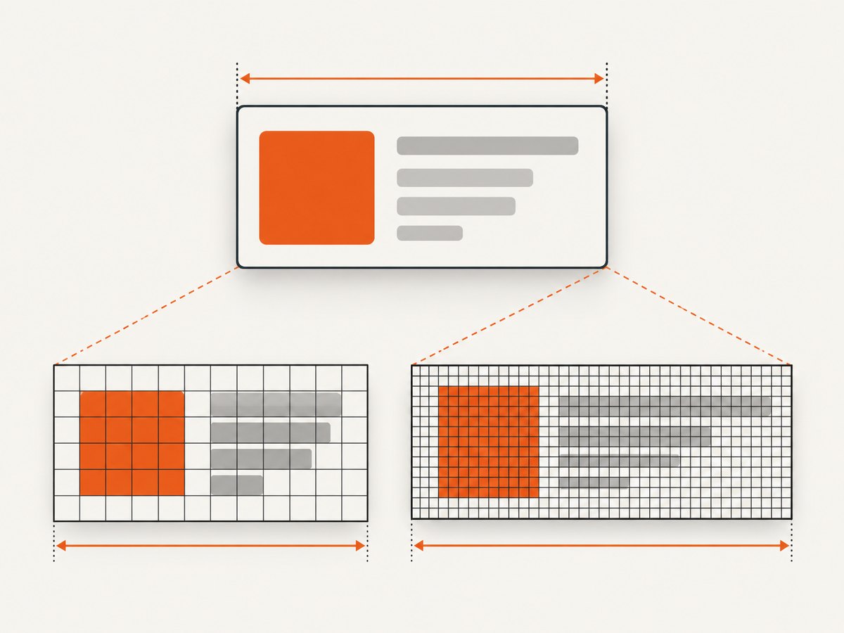
Playwright’s screenshot scale option supports "css" and "device". CSS scale produces one screenshot pixel per CSS pixel. Device scale uses device pixels, so a high-DPI capture may be twice as large or more. Choose CSS scale when the output dimensions need to match CSS measurements; choose device scale when you want a higher-resolution raster.
| What you measure | Unit | What can change it |
|---|---|---|
getBoundingClientRect().width |
CSS pixels | Layout, viewport, transforms |
| Screenshot bitmap width | Image pixels | Capture bounds and screenshot scale |
| Full-page screenshot width | Image pixels for the page capture | Page layout width and screenshot scale |
Do not compare an element’s CSS width directly to bitmap pixels until you know the screenshot scale. Also distinguish the element’s border box from its CSS width property: padding and borders can make those values differ under some box-sizing rules.
2. A runnable Playwright example
The following Node.js script creates a fixed viewport before navigation, measures the target element in CSS pixels, and saves an element screenshot at CSS scale. It prints the expected output width as a useful check. Install Playwright and its browser once with npm install playwright and npx playwright install chromium.
const { chromium } = require('playwright');

(async () => {
  const browser = await chromium.launch({ headless: true });
  const page = await browser.newPage({
    viewport: { width: 1440, height: 900 },
    deviceScaleFactor: 2,
  });

  await page.goto('https://example.com', { waitUntil: 'domcontentloaded' });
  const target = page.locator('main');
  await target.waitFor({ state: 'visible' });

  const box = await target.boundingBox();
  if (!box) throw new Error('Target is not visible or has no bounding box');
  console.log(`Element width: ${box.width} CSS px`);

  await target.screenshot({ path: 'element.png', scale: 'css' });
  console.log(`Expected bitmap width at CSS scale: ${Math.ceil(box.width)} px`);

  await browser.close();
})().catch((error) => {
  console.error(error);
  process.exitCode = 1;
});
Replace https://example.com and main with your target page and selector. The scale option belongs on the screenshot call. If you instead call page.screenshot(), you capture the page viewport or full page, not just the locator’s bounds.
3. Pick the correct capture boundary
Playwright offers several capture shapes. A width mismatch can be a correct result for the selected shape, even when scale is as intended.
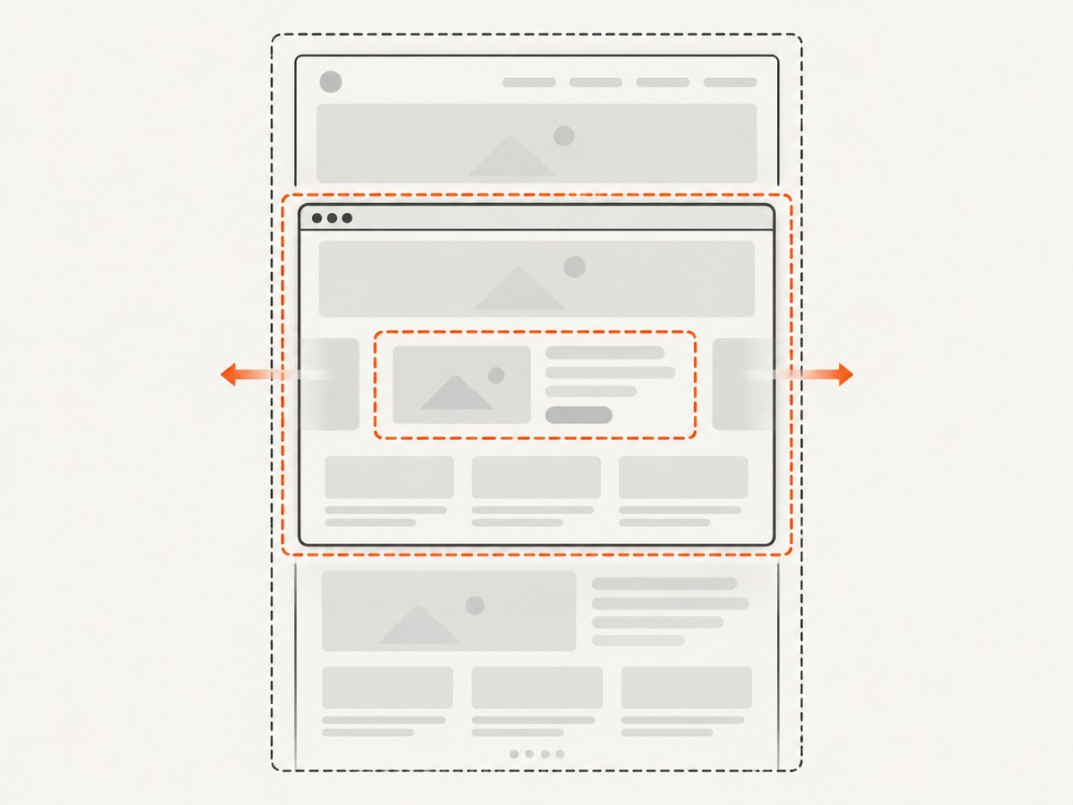
- Element:
locator.screenshot()captures the selected element’s bounds. Use this when the output should follow one component. - Viewport:
page.screenshot()captures the visible page viewport by default. Its width follows the viewport, not the element. - Full page:
page.screenshot({ fullPage: true })captures the full scrollable page. It is not an element capture, and page-level width or overflow can make the image wider than a particular element. - Clip:
page.screenshot({ clip: { x, y, width, height } })captures a rectangle in page coordinates. Use the measured rectangle when you need a defined region, and ensure the clip lies within the page.
For example, this intentionally captures the whole page at CSS scale:
await page.screenshot({ path: 'page.png', fullPage: true, scale: 'css' });For a selector-sized image, use the locator screenshot instead:
await page.locator('.product-card').screenshot({
  path: 'product-card.png',
  scale: 'css',
});
Keep the unit and region consistent when comparing results: element CSS bounding box against element screenshot pixels, or viewport CSS width against viewport screenshot pixels.
4. Set the viewport before navigation
Responsive pages can change their layout based on viewport size. A different width can change breakpoints, column count, wrapping, and the target element’s own rendered dimensions. Playwright recommends setting viewport size before navigating because many websites do not expect a phone to change size after page load.
Set it while creating the page or context, as in the runnable example. If you change it later, do so before loading the target page:
const context = await browser.newContext({
  viewport: { width: 1280, height: 800 },
  deviceScaleFactor: 1,
});
const page = await context.newPage();
await page.goto('https://example.com');
viewport controls the page’s CSS layout area. deviceScaleFactor controls the relationship between CSS pixels and device pixels. These are distinct settings: a DPR of 2 does not mean the CSS viewport is twice as wide.
5. Diagnose the remaining mismatch
- Record both measurements. Read the element bounding box in the browser and inspect the saved image’s pixel dimensions. Write down the configured viewport, device scale factor, and screenshot
scale. - Confirm the capture API. Check whether the code calls a locator screenshot, a viewport screenshot, a full-page screenshot, or a clip. Verify the capture has the intended bounds.
- Normalize the scale. Set
scale: "css"for a CSS-pixel comparison. If using device scale, account for DPR when comparing bitmap dimensions. - Inspect layout after load. Wait for the target to be visible and, if needed, for its content to settle. Record
getBoundingClientRect()after the page has reached the state you want to capture. - Check CSS geometry. Inspect computed width, padding, borders, transforms, and overflowing descendants. A transform can affect the visual bounding rectangle; overflowing children can extend beyond the element’s declared width. Measure before deciding which is responsible.
const geometry = await page.locator('.target').evaluate((el) => {
  const rect = el.getBoundingClientRect();
  const style = getComputedStyle(el);
  return {
    rectWidth: rect.width,
    cssWidth: style.width,
    boxSizing: style.boxSizing,
    paddingLeft: style.paddingLeft,
    paddingRight: style.paddingRight,
    borderLeft: style.borderLeftWidth,
    borderRight: style.borderRightWidth,
    transform: style.transform,
    scrollWidth: el.scrollWidth,
    clientWidth: el.clientWidth,
  };
});
console.log(geometry);
rectWidth is the rendered rectangle width in CSS pixels. scrollWidth can help identify content extending beyond the visible content area. These measurements are clues; compare them with the capture mode before changing page CSS.
6. Relevant screenshot options and tradeoffs
| Option | Use it when | Watch for |
|---|---|---|
scale: "css" |
You need one raster pixel per CSS pixel. | Output may be less sharp than a high-DPI image intended for display. |
scale: "device" |
You want device-pixel resolution. | High DPR increases image dimensions and memory use. |
fullPage: true |
You need the full scrollable document. | It captures the page bounds, not only an element. |
clip |
You need a specific page rectangle. | Coordinates and dimensions must reflect the page’s CSS layout and fit the capture area. |
viewport |
You need repeatable responsive layout. | Set it before navigation for predictable page behavior. |
For very tall full-page captures, image height and memory can become substantial even if the width is correct. If only one component matters, an element screenshot avoids capturing irrelevant page area. If output files need to remain manageable, select an appropriate scale and image format for the downstream use.
7. Reliability, performance, and cost
A deterministic capture starts with deterministic inputs: browser version, viewport, device scale factor, page state, selector, and screenshot options. Pages with animations, lazy-loaded content, or late-loading fonts can produce different geometry between runs. Wait for a meaningful application condition or target selector rather than using an arbitrary long delay whenever possible. For visual comparisons, keep the same browser and viewport configuration across runs.
Higher device scale produces more pixels, which can increase encoding time, transfer size, and memory usage. Full-page captures also increase height and therefore total pixels. CSS scale is usually the appropriate choice for matching CSS layout measurements; device scale is useful when the image will be displayed at a higher pixel density. Keep captures limited to the required region when processing time or artifact size matters.
With a self-hosted browser, account for browser installation, runtime, and compute resources in your own environment. With a screenshot API, compare the provider’s billing rules and response signals before building a workflow around it. ScreenshotNeo states that only clean shots are billed: bot checks/CAPTCHAs, blank pages, timeouts, failed loads, and cache hits cost nothing, and responses include X-Page-Verdict and X-Billed headers. Its plans are Free for 1,000 shots monthly, Starter $5 for 3,000, Growth $15 for 15,000, Pro $39 for 60,000, Scale $99 for 250,000, and Business $249 for 1,000,000; yearly billing gives two months free. Every feature is available on every plan.
8. Or skip the browser setup
For a hosted capture, ScreenshotNeo takes a URL and returns an image or PDF. Its parameter names used by other screenshot APIs also work, which can make switching easier. See the ScreenshotNeo API documentation for the available parameters and response details.
curl -G "https://api.screenshotneo.com/v1/shot" \
  -d access_key=YOUR_API_KEY \
  --data-urlencode url=https://stripe.com \
  -o shot.webp
import requests
r = requests.get(
"https://api.screenshotneo.com/v1/shot",
params={"access_key": "YOUR_API_KEY", "url": "https://stripe.com"},
timeout=90,
)
r.raise_for_status()
open("shot.webp", "wb").write(r.content)const q = new URLSearchParams({
access_key: 'YOUR_API_KEY',
url: 'https://stripe.com',
});
const res = await fetch(`https://api.screenshotneo.com/v1/shot?${q}`);
if (!res.ok) throw new Error(`Screenshot request failed: ${res.status}`);
const image = Buffer.from(await res.arrayBuffer());
await import('node:fs/promises').then(fs => fs.writeFile('shot.webp', image));ScreenshotNeo accepts cookie and consent banners as a visitor and removes more than 60 known consent platforms, newsletter popups, and chat widgets before capture; each of these steps can be turned off. Bot checks, blank pages, and failed loads are never billed. An MCP server gives AI agents tools to take screenshots, get page information, and capture PDFs. The Free plan includes 1,000 screenshots a month with no card, and paid plans start at $5 for 3,000.
Sign up for ScreenshotNeo’s free plan to get 1,000 screenshots a month without a card.
9. Troubleshooting common failures
| Symptom | Likely cause | Fix |
|---|---|---|
| Output is about twice the CSS width | Device-pixel scale on a DPR 2 context. | Use scale: "css" or compare against device pixels deliberately. |
| Output matches viewport width, not component width | Page screenshot was used instead of locator screenshot. | Call locator.screenshot() or set an explicit clip. |
| Full-page image is unexpectedly broad | Full-page capture includes page layout bounds or horizontal overflow. | Inspect page scroll width and use element capture if that is the intended artifact. |
| Element width changes between runs | Viewport, responsive breakpoint, late content, or fonts differ. | Fix viewport before navigation and wait for stable content. |
| Screenshot fails because target has no box | Selector did not match, element is hidden, or it has no rendered bounds. | Check selector count and visibility; inspect the locator before capture. |
| Clip does not capture the intended region | Clip coordinates or dimensions were computed in a different coordinate system or before layout settled. | Measure after load, use page coordinates, and keep the rectangle within the page. |
| Image looks blurry after making it narrower | Image was resampled or displayed beyond its intrinsic dimensions. | Choose an appropriate output scale and avoid enlarging a low-resolution bitmap. |
10. Frequently asked questions
Does CSS width always equal the screenshot width?
No. The CSS width property, rendered border box, selected capture region, and output bitmap width describe different things. Compare bounding-box CSS pixels to bitmap pixels only after accounting for screenshot scale.
Should I always use CSS scale?
No. Use it when matching CSS-pixel dimensions matters. Use device scale when you want a higher-resolution output for high-DPI display or processing.
Can responsive layout cause a wider screenshot?
It can change the element’s rendered width when the viewport changes. Set the viewport before navigation, then measure the element in that layout.
Is horizontal overflow proof that the screenshot API is wrong?
No. Overflow is one possible layout factor. First verify the scale and capture bounds, then inspect the page and element dimensions to identify the actual source.
References
- Playwright Page screenshot API for full-page, clip, and screenshot behavior.
- Playwright Page API for viewport sizing guidance.
- Playwright screenshot API parameters for the CSS versus device scale options.
- ScreenshotNeo website.


