How to Fix Font Sizes Rendering Too Small in wkhtmltoimage
Fix tiny text in wkhtmltoimage by matching viewport CSS, tuning FlowType, and using width, zoom, and minimum-font-size correctly.
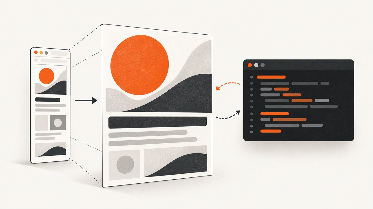
When text looks normal in a browser but becomes tiny in a wkhtmltoimage PNG, the renderer is usually doing what the page asked at a different viewport width. Start by rendering at the same width as the command, inspect the page’s computed font sizes at that width, and then adjust the responsive CSS or JavaScript that reduces the type. In the documented 300-pixel example, FlowType calculated a smaller font for the narrow viewport; changing its fontRatio or using a wider render width corrected the result.
wkhtmltoimage also exposes --width, --zoom, and --minimum-font-size. They solve different problems: width changes the layout seen by responsive code, zoom scales the rendered page, and minimum font size imposes a lower bound. Treat them as diagnostic controls, not interchangeable font-size switches.
1. Reproduce the exact render conditions
Before changing CSS, make the browser and wkhtmltoimage see the same page width. A command such as this gives the page a narrow screen width:
wkhtmltoimage --width 300 --height 100 https://example.com/page.html shot.pngOpen the same URL in a browser window that is approximately 300 CSS pixels wide. Use developer tools to inspect the affected element and record:
- the computed
font-sizeandline-height; - media queries that match at that width;
- JavaScript that reads
window.innerWidthor changes typography after load; - the loaded font family and whether a fallback font is being used;
- wrapping, clipping, and the element’s final dimensions.
If the browser is already small at that width, the image is faithfully reproducing the responsive design. If the browser remains readable but the image does not, continue with renderer settings and timing checks.
2. Check responsive CSS and JavaScript first
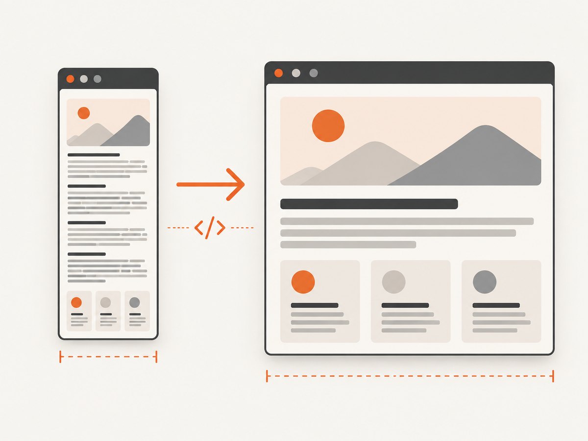
--width is a screen-width input, not a command that sets CSS font size. A narrow width can activate rules such as:
@media (max-width: 480px) {
  .headline { font-size: 18px; }
}
Fluid typography can also reduce text continuously:
.headline {
  font-size: clamp(18px, 4vw, 56px);
}
JavaScript libraries create another common cause. The directly matching community case used FlowType, which computes type from viewport dimensions and a target line length. At a 300-pixel viewport, its calculation produced very small text. The accepted fix changed FlowType’s fontRatio; in that example, a value of 15 made the text larger than the default value of 30. That value is specific to the page’s design and should not be copied blindly.
$('.headline').flowtype({
  fontRatio: 15
});
When the image is intended for a desktop-style layout, rendering at a representative width is often safer than overriding every mobile rule:
wkhtmltoimage --width 1200 --height 800 page.html desktop.pngCompare one variable at a time. Keep the source page, output format, height, and binary version constant while changing only the width or page typography.
3. Understand width, smart width, zoom, and minimum size
| Option | What it changes | When to use it | Risk |
|---|---|---|---|
--width |
Requested screen width used by layout and responsive code | You need a specific composition or breakpoint | Changing it can alter wrapping, media queries, and element positions |
--disable-smart-width |
Makes the requested width strict instead of allowing smart-width behavior | You need predictable width control | A strict narrow width may increase wrapping or clipping |
--zoom |
Scales rendered page content | The layout is correct but every rendered detail needs proportional scaling | It scales images and spacing too, and can change the effective output composition |
--minimum-font-size |
Sets a lower bound for font size | You must prevent unreadable fallback or body text | Large minimums can cause overflow and unexpected wrapping |
The corresponding library settings include screenWidth, smartWidth, load.zoomFactor, and web.minimumFontSize. See the official command-line reference and libwkhtmltox settings reference for the exact names supported by your build.
Use zoom when the layout is right
Try a modest zoom only after confirming that the page’s breakpoints and wrapping are correct:
wkhtmltoimage --width 1000 --zoom 1.25 page.html zoomed.pngZoom is proportional. A value of 1.25 enlarges text, borders, images, and spacing together. It does not fix a media query that intentionally selected an 11-pixel font at a narrow width.
Use a minimum font size as a floor
wkhtmltoimage --width 800 --minimum-font-size 12 page.html readable.pngThis prevents fonts below the chosen floor, but it may make a carefully designed compact layout overflow. Inspect headings, buttons, table cells, and labels after applying it. If only one component is wrong, a page-level CSS fix is usually more controlled.
4. A repeatable diagnostic workflow
- Record the environment. Save the exact
wkhtmltoimageversion and build, operating system, command, input URL or file, output dimensions, installed fonts, and relevant flags. - Match the width. Inspect the page at the command’s width and note computed typography.
- Disable page-level sizing temporarily. Turn off FlowType or similar scripts and add a temporary fixed font size. If the output becomes correct, repair the responsive rule or library configuration.
- Test a wider width. If the composition is acceptable at 800 or 1200 pixels, use that width rather than forcing a mobile layout into a tiny image.
- Test zoom separately. Keep width constant and try a small zoom change. Confirm whether the whole page scales as intended.
- Apply a minimum only when needed. Check for overflow and changed line breaks.
- Compare versions and machines. Re-run the same command with the same fonts and options. Historical cross-platform reports show that rendering can differ, but those reports do not establish a universal operating-system DPI cause for every wkhtmltoimage build.
5. Complete command examples
Local HTML with a controlled viewport
wkhtmltoimage \
  --width 1024 \
  --height 768 \
  --disable-smart-width \
  --javascript-delay 500 \
  page.html page.png
The delay gives client-side typography time to settle. Use it only when the page actually needs JavaScript after load; unnecessary delays reduce throughput.
Readable narrow capture
wkhtmltoimage \
  --width 360 \
  --minimum-font-size 12 \
  --zoom 1.1 \
  mobile.html mobile.png
Review this output for horizontal overflow. A minimum size and zoom can both enlarge content, so combining them may require a wider canvas or a shorter page.
CSS override for a capture-only route
<style>
  /* Applied only when the capture route is requested */
  html.capture .headline { font-size: 32px; line-height: 1.15; }
  html.capture body { min-width: 900px; }
</style>
A dedicated capture stylesheet avoids changing the production responsive experience. Add the capture class from the page template or a query-controlled server-side variant.
6. Common errors and fixes
| Symptom | Likely cause | Fix |
|---|---|---|
| Everything is tiny at 300 px | Responsive CSS or FlowType sees a narrow viewport | Inspect computed styles at 300 px; adjust the page’s font rule, FlowType fontRatio, or render width |
| Text is larger but layout is broken | Zoom or minimum size enlarged content without more space | Increase width, reduce the scaling value, or target only the affected selector |
--width seems ignored |
Smart-width behavior or a wrapper is changing the effective width | Try --disable-smart-width and verify the actual viewport in page JavaScript |
| Only web fonts look wrong | Font files failed to load before capture or are unavailable on the host | Check network access, font URLs, CORS, and a sufficient JavaScript delay; compare the computed font family |
| Text differs between Linux and Windows | Different binaries, font files, rendering libraries, or platform behavior | Pin the binary and fonts, capture environment details, and compare one option at a time |
| Content is clipped after a font fix | Fixed height or overflow hides the enlarged lines | Remove the fixed height, increase it, or allow the page to grow |
| A PDF workaround has no effect | Intelligent shrinking is a PDF setting and is documented as having no effect for wkhtmltoimage | Do not rely on --disable-smart-shrinking; fix width, CSS, zoom, or minimum size instead |
| Output is blank or incomplete | Resource failures, redirects, authentication, or capture before client rendering | Use a reachable URL, allow required resources, add a targeted delay, and inspect console or network logs where available |
7. Performance and reliability considerations
Rendering more pixels costs time and memory. A 1,200-pixel-wide full page generally requires more raster work than a 300-pixel thumbnail, and long pages multiply that cost. Set the smallest width that preserves the intended layout, then avoid unnecessary zoom and delay values.
For repeatable builds:
- pin the wkhtmltoimage version and operating-system image;
- install the same font files on every worker;
- keep a fixed capture URL or fixture page for regression checks;
- record width, height, zoom, minimum size, delay, and smart-width flags with each artifact;
- retry transient network failures, but do not hide deterministic CSS failures behind retries;
- compare output dimensions and a few known text regions after upgrades.
Use a wider viewport when the image represents a desktop page. Use a narrow viewport only when you specifically need the mobile composition. That decision prevents many apparent font bugs before renderer tuning begins.
8. Or skip the browser setup
If you need a clean screenshot rather than a locally managed wkhtmltoimage pipeline, ScreenshotNeo provides a single API request. Its capture options include custom viewports, device presets, retina scale, full-page capture, element selectors, dark mode, custom CSS and JavaScript, waits, resource blocking, headers, cookies, user agents, timezone, geolocation, resizing, caching, PDFs, asynchronous jobs, bulk capture, and signed links. See the ScreenshotNeo API documentation for the available parameters.
curl -G 'https://api.screenshotneo.com/v1/shot' \
  -d access_key=YOUR_API_KEY \
  --data-urlencode url=https://stripe.com \
  -o shot.webp
import requests
r = requests.get(
'https://api.screenshotneo.com/v1/shot',
params={'access_key': 'YOUR_API_KEY', 'url': 'https://stripe.com'},
timeout=90,
)
r.raise_for_status()
open('shot.webp', 'wb').write(r.content)const q = new URLSearchParams({
access_key: 'YOUR_API_KEY',
url: 'https://stripe.com'
});
const res = await fetch(`https://api.screenshotneo.com/v1/shot?${q}`);
if (!res.ok) throw new Error(`HTTP ${res.status}`);
const bytes = Buffer.from(await res.arrayBuffer());
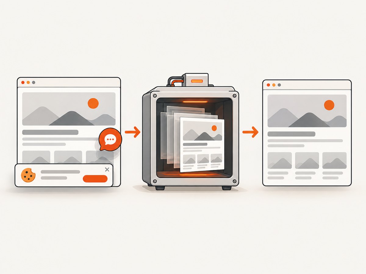
await fs.promises.writeFile('shot.webp', bytes);Cookie and consent banners, newsletter popups, and chat widgets are removed before the shot. Bot checks, blank pages, failed loads, timeouts, and cache hits are not billed; response headers identify the page verdict and whether the request was billed. ScreenshotNeo also includes an MCP server so Claude, Cursor, and other MCP clients can use take_screenshot, get_page_info, and capture_pdf. The Free plan includes 1,000 screenshots per month with no card; paid plans start at $5 for 3,000 shots. Create a free ScreenshotNeo account.
9. FAQ
Does increasing image dimensions automatically increase CSS font size?
No. Changing width can activate different responsive rules, while changing output dimensions alone does not rewrite the page’s computed CSS.
Should I always use --minimum-font-size?
No. Use it when you need a guaranteed lower bound. Diagnose responsive CSS or JavaScript first so you do not create overflow.
Is --disable-smart-shrinking the fix?
The official settings reference says intelligent shrinking has no effect for wkhtmltoimage. Use width, smart-width, zoom, or page-level typography controls instead.
Why does the same URL render differently on two hosts?
Compare binary version, operating system, installed fonts, network access, JavaScript timing, and every command-line option. Historical reports show platform differences, but the specific cause must be established for your environment.
When should I replace wkhtmltoimage?
Consider a managed screenshot API when you need consistent browser setup, consent and popup removal, asynchronous jobs, bulk capture, or agent access without maintaining renderer hosts.


