How to Fix CSS Dimensions Scaling Down in wkhtmltopdf
Diagnose why CSS dimensions shrink in wkhtmltopdf by checking smart shrinking, page geometry, print styles, viewport, zoom, DPI, and the build environment.
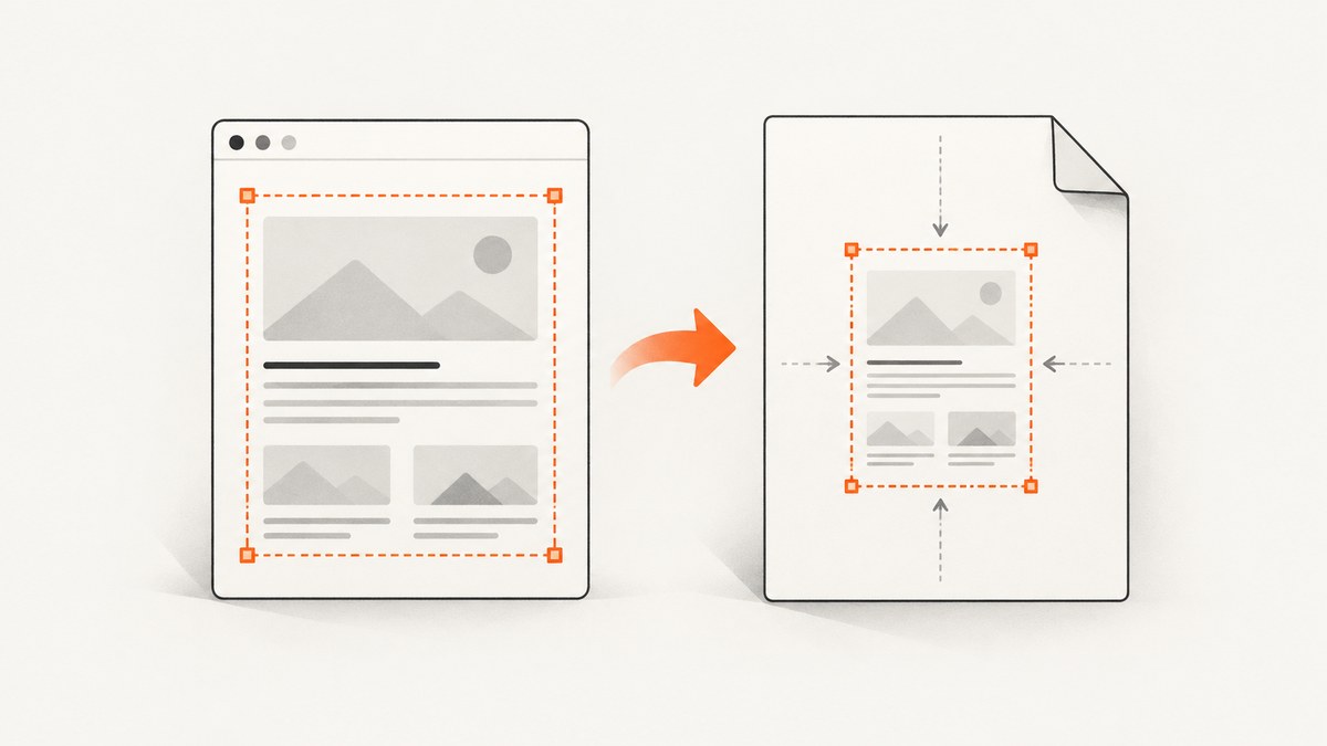
If CSS dimensions look smaller in a wkhtmltopdf PDF than they do in the browser, start by checking smart shrinking, which is enabled by default. Then verify paper size and margins, screen-versus-print CSS, viewport width, zoom, DPI, and the exact wkhtmltopdf build and operating system. These controls affect different parts of the output, so there is no universal zoom or DPI multiplier that restores a 1:1 relationship in every setup.
Use --disable-smart-shrinking as a comparison, not an automatic final fix: some installations then render too wide and clip content. Measure a small reproducible fixture and change one variable at a time.
1. Record the renderer and reproduce the scale problem
Before adjusting production CSS or deployment settings, record the binary, operating system, wrapper or library version, command line, and whether the binary is a patched-Qt build. wkhtmltopdf’s support guidance asks for version, OS/version, and a duplicating HTML/CSS/JS test case. Those details matter because historical reports describe differences across environments.
wkhtmltopdf --version
uname -a
On Windows, use the operating system’s version information or systeminfo in place of uname -a. If a Node, Python, PHP, or other wrapper invokes wkhtmltopdf, record its version and the actual arguments it passes too. A wrapper may set page, margin, zoom, or media options without those settings appearing in the application’s own configuration.
Make a minimal fixture with a fixed-size container and a few known widths, heights, and font sizes. For example, save this as fixture.html:
<!doctype html>
<html>
<head>
  <meta charset="utf-8">
  <style>
    html, body { margin: 0; padding: 0; }
    .box { width: 100mm; height: 50mm; border: 1px solid black; }
    .label { font: 12pt sans-serif; }
    @media print { .box { border-color: black; } }
  </style>
</head>
<body>
  <div class="box"><span class="label">100 mm by 50 mm; 12 pt</span></div>
</body>
</html>
This is a diagnostic starting point, not a complete print layout. Measure the resulting PDF in a PDF viewer or inspect its page and object dimensions with your normal PDF tools. Compare the box and page dimensions separately. A correctly sized page can still contain a scaled box, and a correct box can still sit on a page with unexpected margins.
2. Check paper size, orientation, and margins
CSS dimensions and PDF page geometry are separate. wkhtmltopdf exposes page size, custom page width and height, orientation, and the top, right, bottom, and left margins. Margins reduce the available content area. A page-size mismatch can cause content to wrap, overflow, or appear smaller when a renderer fits it into the printable area.
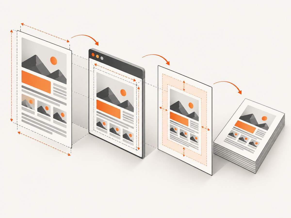
For an A4 comparison using the fixture, run:
wkhtmltopdf --page-size A4 --margin-top 10mm --margin-right 10mm --margin-bottom 10mm --margin-left 10mm fixture.html fixture-a4.pdfUse the same paper size, orientation, and four margins in the production command and any wrapper configuration. If the design needs custom dimensions, set the intended width and height explicitly using the documented page-width/page-height options rather than assuming the browser viewport defines the PDF sheet.
Inspect all four margins, not only the left and right. A change in usable width can trigger line wrapping, which changes the apparent size and position of content even when individual CSS lengths have not changed. Keep a record of the PDF page dimensions and the fixture measurements for each run.
3. Compare smart shrinking carefully
The CLI documentation says intelligent shrinking is enabled by default. The manual describes it as a WebKit strategy that makes the pixel-to-DPI ratio non-constant; the library documentation describes it as fitting more content on a page. That means rendered CSS dimensions may not correspond to a single fixed scale relative to the PDF page.
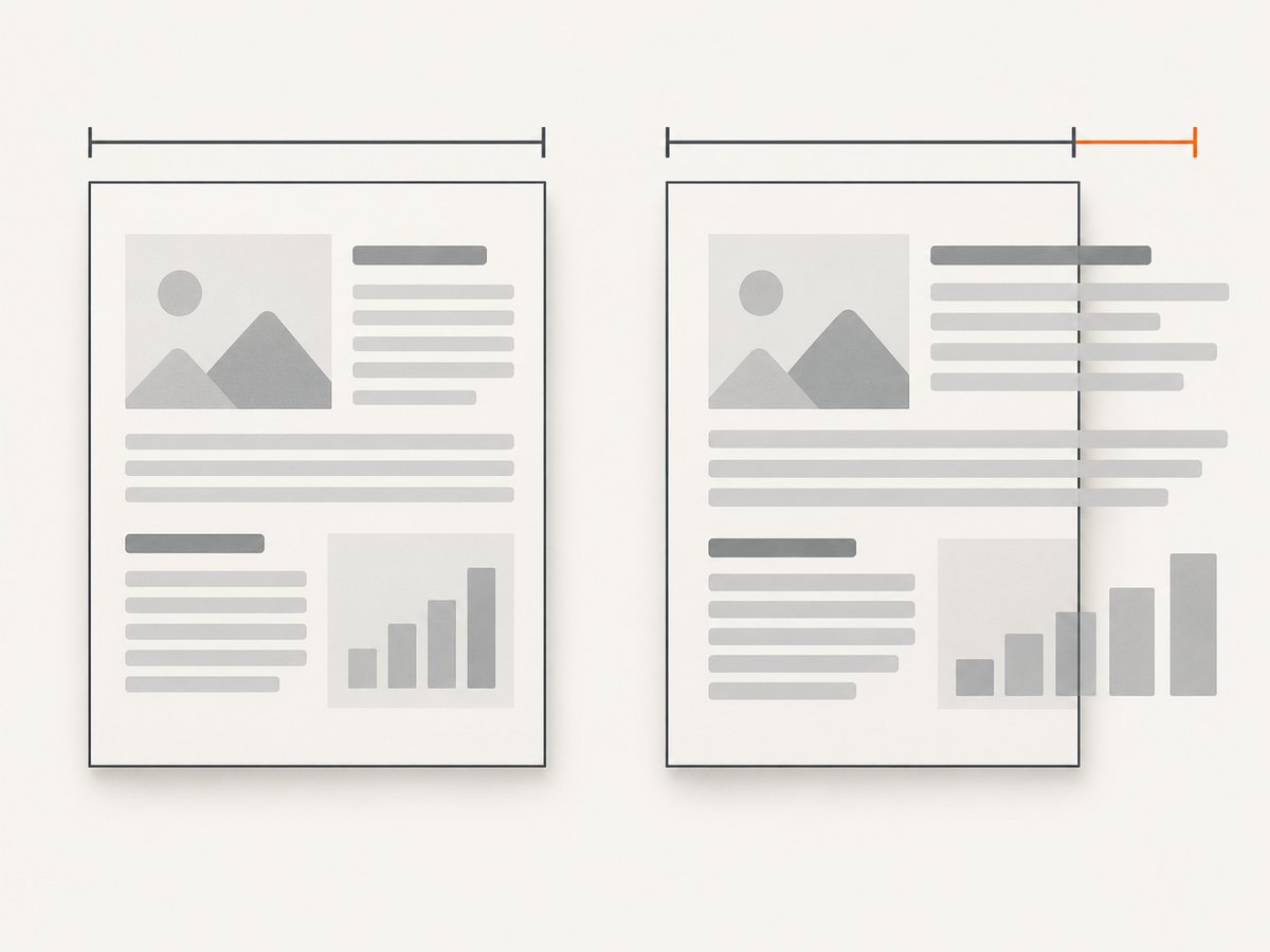
Compare the default behavior with a run that disables smart shrinking:
wkhtmltopdf --page-size A4 --print-media-type fixture.html fixture-default.pdf
wkhtmltopdf --page-size A4 --disable-smart-shrinking --print-media-type fixture.html fixture-no-shrink.pdf
Measure both PDFs. Check the known box width and height, text size, page bounds, and whether content clips on the right or bottom. Do not keep the flag solely because one dimension got closer. A historical report using wkhtmltopdf 0.12.4 on Windows Server 2012 R2 says disabling it made content too wide and clipped at the right. Another report describes the flag helping in one Node.js Lambda environment; that is an environment-specific report, not a general guarantee.
4. Inspect print CSS and the selected media type
The CLI defaults to screen media and offers --print-media-type. Therefore, the PDF may use different rules from those you see when printing through a browser or inspecting a page with print preview. Check for @media print, print-specific font sizes, widths, transforms, and rules that hide or resize elements.
Choose the intended output mode, then compare it explicitly:
wkhtmltopdf --page-size A4 fixture.html fixture-screen.pdf
wkhtmltopdf --page-size A4 --print-media-type fixture.html fixture-print.pdf
Review the CSS rules that apply in each mode. If print CSS sets a narrower wrapper, uses different units, or changes font metrics, the result can look like global shrinking even when the renderer’s scale is unchanged. Do not switch media mode as a blind fix; match it to the stylesheet and intended document design.
5. Check viewport width before tuning zoom
Responsive breakpoints depend on the render viewport, not simply the PDF paper dimensions. wkhtmltopdf documents --viewport-size for cases involving custom scrollbars and CSS overflow. A narrow viewport can select a mobile layout, change widths, wrap text, or cause a page to overflow in a way that resembles scaling.
Set a viewport that reflects the layout you intend to render, then compare. For instance, where the design expects a 1280-pixel-wide desktop layout:
wkhtmltopdf --page-size A4 --viewport-size 1280x900 fixture.html fixture-viewport.pdfAdapt the viewport to your actual CSS breakpoints and content. Test pages with overflow, fixed-width elements, custom scrollbars, or responsive navigation separately from the minimal fixture. The viewport option does not change the PDF paper size; it controls the browser window dimensions used to lay out the page.
6. Calibrate zoom and DPI last
The CLI documents --zoom with a default of 1 and DPI with a default of 96. It also notes that the DPI option has no effect on X11-based systems. These options are distinct from page geometry and smart shrinking, so changing them before the other checks can hide the underlying issue or cause a second mismatch.
Once the page size, margins, media mode, viewport, and smart-shrinking behavior are understood, change one scale setting at a time. Keep the measured fixture and exact command alongside each result. Treat any adjusted zoom or DPI as specific to the binary and deployment environment, and repeat the measurement on the production host before adopting it.
7. Run a controlled diagnostic sequence
- Record wkhtmltopdf version, OS/version, wrapper/library version, patched-Qt status if known, and the exact command.
- Generate a minimal HTML fixture with known CSS dimensions and measure its output.
- Confirm PDF page size, orientation, and each margin.
- Compare default smart shrinking with
--disable-smart-shrinking; check for overflow as well as scale. - Set and record the viewport if responsive rules or overflow matter.
- Compare screen and print media only after deciding which stylesheet mode is intended.
- Adjust zoom or DPI only after the earlier variables are stable.
- Repeat with the same binary, fixture, and options on the deployment environment.
Keep each run’s command, environment, PDF, and measurements together. If behavior still differs, the fixture gives maintainers a compact case they can reproduce instead of a full application whose many styles and resources may obscure the cause.
8. Common symptoms, causes, and fixes
| Symptom | Likely cause to investigate | Next step |
|---|---|---|
| Everything looks smaller than expected | Default smart shrinking, page geometry, or a print stylesheet alters layout. | Measure the fixture, then compare shrinking and media mode independently. |
| Disabling smart shrinking makes the right edge clip | The content no longer fits the available page width at the new scale. | Restore the baseline and check page size, margins, viewport, and actual content width before deciding whether the flag belongs in production. |
| Text wraps differently from the browser | Different viewport, media rules, margins, or font availability can change line layout. | Record viewport and media mode, inspect print CSS, and reproduce on the deployment host. |
| A4 output dimensions differ between hosts | Binary, patched-Qt build, operating system, or environment differences. | Capture version and OS details and run the same minimal fixture on both hosts. |
| Zoom or DPI changes have no predictable effect | Other scale or geometry controls remain different; DPI may not affect X11-based systems. | Return to a measured baseline and adjust one documented option at a time. |
| Local output is correct but deployed output is not | The deployment may use a different executable, wrapper options, fonts, OS, or viewport. | Log the resolved binary version and full arguments in the deployment environment, then compare the same fixture. |
9. Environment differences and long-term reliability
A historical issue for wkhtmltopdf 0.12.1 with patched Qt reported different A4 dimensions on Windows and Linux. That report shows why environment comparison belongs in diagnosis; it does not prove that all Windows and Linux builds differ. Another report concerns 0.12.4 on Windows Server 2012 R2, and a separate comment says disabling shrinking helped one 0.12.6 Lambda setup. Treat issue reports as examples of symptoms, not controlled compatibility guarantees.
The wkhtmltopdf repository is archived and read-only as of January 2, 2023. For a system that needs stable output over time, pin and record the executable and deployment image, preserve representative HTML fixtures, and include PDF dimension checks in the release process. If evaluating another renderer, compare maintenance/support status, fidelity to the site’s CSS and print styles, repeatability across deployment images, page and viewport controls, and migration effort. The reviewed sources do not establish which alternative will suit a particular application.
Or skip the browser setup
If your goal is a screenshot of a web page rather than a wkhtmltopdf PDF, ScreenshotNeo returns a PNG, JPEG, WebP, or PDF from one GET request. It has controls for viewport, device presets, full-page capture, PDF paper size and margins, and image resizing. See the API documentation for parameters.
curl -G "https://api.screenshotneo.com/v1/shot" -d access_key=YOUR_API_KEY --data-urlencode url=https://stripe.com -o shot.webpimport requests
r = requests.get(
"https://api.screenshotneo.com/v1/shot",
params={"access_key": "YOUR_API_KEY", "url": "https://stripe.com"},
timeout=90,
)
open("shot.webp", "wb").write(r.content)const q = new URLSearchParams({ access_key: 'YOUR_API_KEY', url: 'https://stripe.com' });
const res = await fetch(`https://api.screenshotneo.com/v1/shot?${q}`);
if (!res.ok) throw new Error(`Screenshot request failed: ${res.status}`);
const fs = await import('node:fs/promises');
await fs.writeFile('shot.webp', Buffer.from(await res.arrayBuffer()));Cookie banners, newsletter popups, and chat widgets are removed before the shot. Bot checks, blank pages, and failed loads are never billed, and response headers report the page verdict and billing status. An MCP server lets AI agents use screenshot tools, including Claude, Cursor, and other MCP clients. The free plan includes 1,000 screenshots per month with no card; paid plans start at $5 for 3,000 shots. Sign up for 1,000 free screenshots a month, no card required.
Performance, reliability, and cost considerations
For wkhtmltopdf, repeated experiments are cheaper and easier to interpret when they use a small local fixture rather than repeatedly rendering a large production page. Once the settings are understood, validate representative long pages, image-heavy pages, and responsive layouts on the actual deployment build. The research sources do not provide benchmark figures or a universal performance estimate, so measure with your own document and host.
For a PDF pipeline, reliability depends on making the binary and its environment repeatable. Record the version and options; test output page dimensions and clipping; and compare output after changes to the operating system, wrapper, or renderer. The project’s archived status is relevant to ongoing maintenance planning, but by itself does not identify a replacement or predict a particular defect.
For ScreenshotNeo, the listed plans are Free: 1,000 shots/month; Starter: $5 for 3,000; Growth: $15 for 15,000; Pro: $39 for 60,000; Scale: $99 for 250,000; and Business: $249 for 1,000,000. Yearly billing gives two months free, and every feature is on every plan. Choose based on expected volume and the output and workflow controls you need.
Frequently asked questions
Should I always use --disable-smart-shrinking?
No. It is a useful diagnostic comparison. Measure the output and check for clipping before deciding whether it belongs in your configuration.
Does --zoom 1 guarantee CSS pixels map 1:1 to PDF units?
No. Zoom is only one control among smart shrinking, DPI, page geometry, margins, viewport, and media styles. The sources do not support a universal 1:1 multiplier across builds.
Why does the same command produce a different result on another host?
The binary, patched-Qt build, OS, wrapper arguments, and rendering environment can differ. Compare version and OS details and run the same fixture on both systems.
Is wkhtmltopdf still maintained?
The repository is archived and read-only as of January 2, 2023. Check the project’s status and your own maintenance requirements when planning a long-lived pipeline.
Can ScreenshotNeo fix an existing wkhtmltopdf layout?
It is a website screenshot API and MCP server, not a wkhtmltopdf patch. It can capture a page or produce a PDF through its API; validate its output against your document requirements before migrating a PDF workflow.


