How to Fix wkhtmltopdf –print-media-type Ignoring Screen Styles
Learn why wkhtmltopdf uses print CSS, how to restore screen styles, and how to diagnose missing rules, assets, and version-specific behavior.
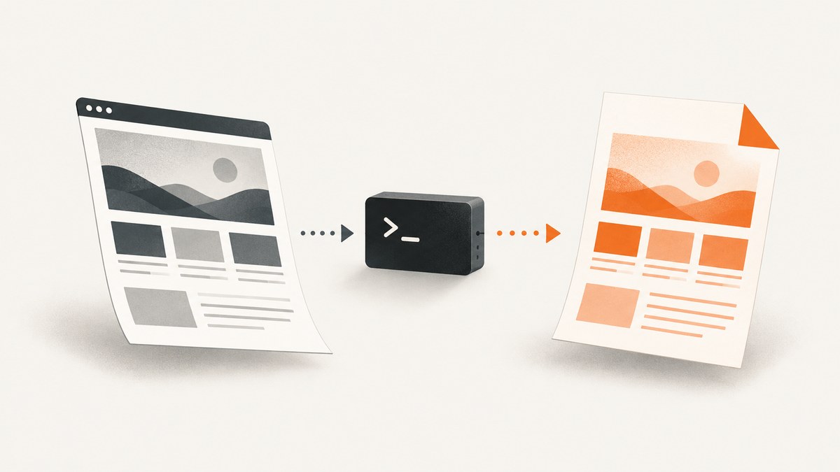
Short answer: wkhtmltopdf --print-media-type deliberately selects the print media type. CSS inside @media screen, and stylesheets linked with media="screen", are therefore not the styles you should expect in that run. If the PDF should resemble the browser view, remove the flag or pass --no-print-media-type, which is the documented default. If the PDF should use print CSS, keep the flag and debug stylesheet loading, selectors, assets, and the exact wkhtmltopdf build.
The option is documented as “Use print media-type instead of screen.” Read the official command documentation before changing other rendering settings.
1. Confirm the media mode first
Run the same input twice, changing only the media option:
wkhtmltopdf --print-media-type input.html print.pdf
wkhtmltopdf --no-print-media-type input.html screen.pdf
# Equivalent screen-mode command because screen is the default:
wkhtmltopdf input.html screen-default.pdf
Use --no-print-media-type when your target is the screen layout. Use --print-media-type when you have deliberately authored print rules for paper output. The library API exposes the same choice as the load.printMediaType setting in its page settings documentation: libwkhtmltox page settings.
| Command | Selected CSS media | Typical purpose |
|---|---|---|
wkhtmltopdf --print-media-type |
Print-specific page layout | |
wkhtmltopdf --no-print-media-type |
screen | Match the browser view |
wkhtmltopdf |
screen | Default screen rendering |
2. Understand which rules are eligible
Media selection affects more than an @media block. Check all of these forms:
/* Applies to both media types unless overridden */
.card { color: #222; }

@media screen {
  .card { display: grid; }
}

@media print {
  .card { display: block; color: #000; }
}

/* Linked files can be restricted by media attribute */
<link rel="stylesheet" href="screen.css" media="screen">
<link rel="stylesheet" href="print.css" media="print">
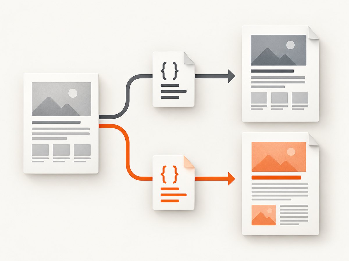
With print media selected, print rules are eligible and screen-only rules are not. Unqualified rules are generally eligible for both media types, but a missing stylesheet, selector mismatch, cascade order, or renderer limitation can still make them appear to be ignored. Do not infer the cause from one visual symptom.
3. Build a minimal reproduction
Remove your application framework, bundler output, JavaScript, fonts, and unrelated assets. Create a small file that makes the media difference obvious:
<!doctype html>
<html>
<head>
  <meta charset="utf-8">
  <style>
    body { font-family: Arial, sans-serif; margin: 24px; }
    .screen-only { background: #dff4ff; padding: 20px; }
    .print-only { display: none; }
    @media print {
      .screen-only { background: white; border: 2px solid #222; }
      .print-only { display: block; }
    }
    @media screen {
      .screen-only { border-radius: 16px; }
    }
  </style>
</head>
<body>
  <div class="screen-only">Media test</div>
  <div class="print-only">Print rule active</div>
</body>
</html>
Generate both PDFs and compare them. If the minimal file behaves correctly, the original problem is likely in your application CSS, asset URLs, load timing, or cascade. If the minimal file fails on one build but not another, record the exact binary and operating system before changing your production code.
4. Check stylesheet loading and the cascade
- Verify every URL. Use absolute URLs or a correct
--allowpath for local files. A browser session may resolve relative paths differently from the converter. - Inspect the media attribute. A file linked with
media="screen"is not intended for a print-media run. Remove the restriction only if the file truly applies to both modes. - Check selector matching. Confirm that the generated HTML contains the class, ID, or element targeted by the rule. Server-side templates often produce a different structure for PDF requests.
- Check ordering and specificity. A later rule or inline style can override an apparently correct declaration. Use browser developer tools to calculate the winning rule, then reproduce the relevant declarations in the minimal file.
- Check generated CSS. If a build pipeline emits nested rules, unsupported syntax, or a stylesheet that loads only after JavaScript runs, the converter may never see the expected declarations.
Issue #2336 contains a 2015 report where print-enclosed rules appeared while rules without an explicit media type did not. The issue does not establish a universal fix; the reporter was asked for a version and did not follow up. Treat it as a symptom report, then reproduce the case with your own build: issue #2336.
5. Separate CSS problems from missing assets
A page can have the correct media mode and still look wrong because images, fonts, or background resources did not load. Test assets independently:
- Open each image, font, and stylesheet URL from the machine running wkhtmltopdf.
- Check authentication, firewall rules, DNS, redirects, and certificate compatibility.
- Use absolute URLs and confirm case-sensitive filenames on Linux.
- For local resources, provide the required access permission and avoid assuming the current working directory is the HTML file’s directory.
- Temporarily replace a remote image with a small data URI or inline SVG to determine whether CSS or networking is at fault.
Issue #4674 reports a missing background image referenced only inside @media print on wkhtmltopdf 0.12.5 on CentOS. The report describes an experiment where referencing the same image from an invisible default-rule element made it appear. That is a user report, not a guaranteed workaround. First verify URL resolution and loading in your own renderer: issue #4674.
6. Record the exact version and operating system
Before blaming CSS, capture the executable version and environment:
wkhtmltopdf --version
uname -a                 # Linux and macOS
systeminfo              # Windows (run in Command Prompt)
Package names can hide materially different builds. Issue #2327 describes different observations between a 0.12 build and a 0.13.0-alpha build on Windows 7. It does not prove that every 0.13 or 0.12 build behaves the same. Compare exact binaries on the same reproduction and operating system: issue #2327.
When reporting a problem, include the version, operating system and version, complete command, a minimal HTML file, linked assets, and the expected-versus-actual result. The project support guidance requests this information: wkhtmltopdf support.
7. Useful rendering options to test
Change one variable at a time. Keep the input, CSS, assets, output settings, and binary constant while testing:
| Option | What it helps diagnose |
|---|---|
--print-media-type |
Whether print rules are selected |
--no-print-media-type |
Whether screen rules produce the expected layout |
--enable-local-file-access |
Whether local CSS and images are blocked by access policy |
--allow /path/to/assets |
Whether a specific local directory is permitted |
--javascript-delay 1000 |
Whether late DOM or style changes need time to finish |
--debug-javascript |
Whether JavaScript errors explain missing content |
--custom-header Name Value |
Whether protected stylesheets require a request header |
--cookie name value |
Whether a session cookie is required for assets |
These options cannot turn a print-media run into a screen-media run. They only help isolate loading, access, and timing issues after the media choice is correct.
8. Common errors and fixes
“My @media screen rules are ignored.”
Cause: print media is selected. Fix: remove the flag or pass --no-print-media-type. If you need both layouts, put shared declarations outside media blocks and maintain explicit print overrides.
“Unqualified rules disappear too.”
Cause: usually a stylesheet or asset load failure, selector mismatch, cascade override, or a version-specific renderer behavior. Fix: reproduce with inline CSS, then add external files and assets one at a time.
“Only background images are missing.”
Cause: URL resolution, permissions, network access, or renderer handling of background resources. Fix: test the URL directly, use an absolute path, enable permitted local access, and try an inline image solely as a diagnostic.
“The browser and PDF use different fonts.”
Cause: the converter cannot reach the font, does not have the same installed fonts, or finishes before a web font loads. Fix: verify the font request from the conversion host, provide a fallback, and test a controlled delay.
“The page looks correct locally but fails in CI.”
Cause: different wkhtmltopdf build, OS packages, working directory, network policy, or missing local-file permission. Fix: print the version in CI, pin the binary, use absolute paths, and archive the minimal reproduction with the job logs.
“A newer build changed the result.”
Cause: renderer differences are possible. Fix: compare exact versions against the same input and document the observed behavior. The upstream repository was archived and made read-only on January 2, 2023, so an old issue status should not be treated as a promise of a future fix: repository archive notice.
9. A repeatable debugging checklist
- Copy the exact command and remove unrelated flags.
- Run with and without
--print-media-type. - Inspect
@media screen,@media print, and link media attributes. - Reduce the page to inline HTML and CSS.
- Add external stylesheets back one at a time.
- Test images, fonts, and backgrounds independently.
- Confirm local-file permissions and request authentication.
- Wait for JavaScript-generated content only when the page truly needs it.
- Record the binary version and operating system.
- Keep the smallest failing reproduction for deployment and bug reports.
10. Performance, reliability, and cost considerations
Every additional stylesheet, remote font, JavaScript dependency, and delayed request increases conversion time and creates another failure point. For predictable jobs, self-host critical assets, reduce third-party requests, set a bounded delay, and reuse a pinned renderer image. Run a small sample after changing the binary or CSS pipeline rather than discovering a media regression in a large batch.
For high-volume PDF generation, measure the complete job: page load, asset wait, rendering, file transfer, and retries. Retry only transient failures; repeated retries do not repair a deterministic media mismatch. Cache stable input where appropriate, but invalidate it when CSS, fonts, or templates change.
Or skip the browser setup
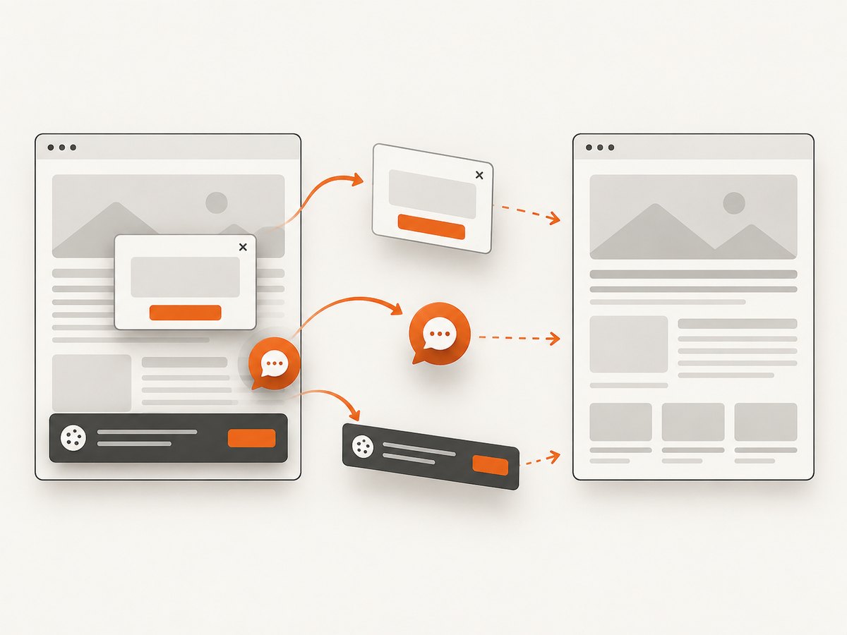
If your goal is a clean PDF or image of a URL rather than maintaining a wkhtmltopdf environment, ScreenshotNeo provides a hosted screenshot API. Cookie and consent banners are accepted and removed before capture, along with more than 60 known consent platforms, newsletter popups, and chat widgets. Bot checks, blank pages, timeouts, failed loads, and cache hits are not billed, and each response identifies the result with X-Page-Verdict and X-Billed headers. An MCP server provides take_screenshot, get_page_info, and capture_pdf tools for Claude, Cursor, and other MCP clients.
See the ScreenshotNeo API documentation for all options. A basic request is:
curl -G "https://api.screenshotneo.com/v1/shot" \
  -d access_key=YOUR_API_KEY \
  --data-urlencode url=https://example.com \
  -o page.webp
import requests
r = requests.get(
"https://api.screenshotneo.com/v1/shot",
params={"access_key": "YOUR_API_KEY", "url": "https://example.com"},
timeout=90,
)
r.raise_for_status()
open("page.webp", "wb").write(r.content)const q = new URLSearchParams({
access_key: 'YOUR_API_KEY',
url: 'https://example.com'
});
const res = await fetch(`https://api.screenshotneo.com/v1/shot?${q}`);
if (!res.ok) throw new Error(`HTTP ${res.status}`);
const buffer = Buffer.from(await res.arrayBuffer());
require('fs').writeFileSync('page.webp', buffer);ScreenshotNeo supports PNG, JPEG, WebP, and PDF output, plus full-page capture with lazy images loaded, CSS-selector element capture, dark mode, device presets or custom viewports, retina scale, custom CSS and JavaScript, clicks, waits, blocked resources, headers, cookies, user agents, authorization, timezone, geolocation, transparent backgrounds, resizing, chosen cache TTLs, signed links, asynchronous jobs with signed webhooks, bulk capture for up to 100 URLs per call, usage reporting, and an OpenAPI specification. Parameter names used by other screenshot APIs also work, which can simplify migration.
The Free plan includes 1,000 screenshots each month with no card. Paid plans start at $5 for 3,000 screenshots; yearly billing gives two months free, and every feature is available on every plan. Create a free ScreenshotNeo account.
FAQ
Does --print-media-type disable all screen CSS?
It selects print media, so screen-only rules are not the expected rules. Shared, unqualified rules can still apply if the stylesheet loads and no later rule overrides them.
Is --no-print-media-type required for screen output?
No. Screen media is the default, but the explicit flag makes scripts and code reviews clearer.
Should I copy a reported GitHub workaround?
Only after reproducing the underlying asset or loading failure. Historical issue experiments are evidence for diagnosis, not universal fixes.
What should I include in a bug report?
Include the exact wkhtmltopdf version, operating system, command, minimal HTML/CSS, asset URLs, and PDFs produced with both media options.
Can ScreenshotNeo reproduce my exact wkhtmltopdf output?
It is a hosted browser capture and PDF service with its own rendering behavior. Use the API when you want a maintained URL-to-image or URL-to-PDF workflow and compare the resulting output against your requirements.


