How to Fix Wkhtml2pdf Rendering Size Issues
Fix PDFs that look too small, too large, or different across machines by checking paper size, margins, DPI, zoom, smart shrinking, and viewport settings.
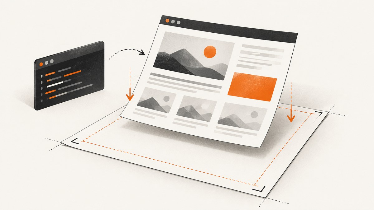
If a wkhtmltopdf PDF looks too small, too large, or different on another machine, first make the physical page size and margins explicit. Then change one scale control at a time: --dpi, --zoom, and smart shrinking. Set --viewport-size only when you need to control the browser window used for responsive layout; it does not set the PDF paper size.
The defaults are A4 paper, 96 DPI, zoom 1, and smart shrinking enabled. Those defaults are a starting point, not a guarantee that two operating systems or binary builds will produce identical output. The practical fix is to reproduce the issue with a fixed input and environment, then compare measured output after changing one setting at a time. [wkhtmltopdf usage reference]
1. Capture a reproducible baseline
Before adjusting flags, write down the exact command, binary version, operating system, input fixture, and expected physical dimensions. Save the generated PDF too. Without that baseline, it is easy to “fix” one machine by changing several variables and leave the actual cause unknown.
wkhtmltopdf --version
wkhtmltopdf --extended-help
Use a small local HTML file that contains the same relevant CSS and content as the failing document. Remove unrelated scripts, remote fonts, and content where possible. Include a known-width box and a known font size so you can measure whether the problem affects all content or only specific elements. Keep the original input and output unchanged for comparison.
Record these details for each run:
- Full
wkhtmltopdfcommand and version output. - Operating system and version, and whether the build says it uses patched Qt.
- Input HTML, CSS, scripts, fonts, and assets that affect layout.
- Page size, orientation, all four margins, viewport dimensions, DPI, zoom, and smart shrinking state.
- Expected and actual page dimensions, content measurements, and page count.
2. Set paper geometry and margins explicitly
wkhtmltopdf renders A4 by default. Choose the actual output paper with --page-size—for example, A4, Letter, or Legal—or specify custom dimensions using --page-width and --page-height. The usage documentation lists both the standard-size option and custom width and height controls. [Page size and margin options]
Margins reduce the area available to the HTML. If you are diagnosing why content does not fill the sheet, inspect all four margins before increasing zoom. For example, a page can have the correct physical dimensions but appear to have undersized content because its usable width is narrower than expected. Choose margins deliberately for the final document; setting all of them to zero is useful as a diagnostic but may not be suitable for printing.
wkhtmltopdf \
  --page-size Letter \
  --orientation Portrait \
  --margin-top 10mm \
  --margin-right 10mm \
  --margin-bottom 10mm \
  --margin-left 10mm \
  input.html output.pdf
For a custom sheet, use dimensions supported by the installed build and units accepted by the option parser. For example:
wkhtmltopdf \
  --page-width 100mm \
  --page-height 150mm \
  --margin-top 5mm --margin-right 5mm \
  --margin-bottom 5mm --margin-left 5mm \
  label.html label.pdf
Use either a standard paper size or explicit custom dimensions as your geometry source. If you set conflicting options, simplify the command so the intended sheet size is unambiguous.
3. Diagnose DPI, zoom, and smart shrinking
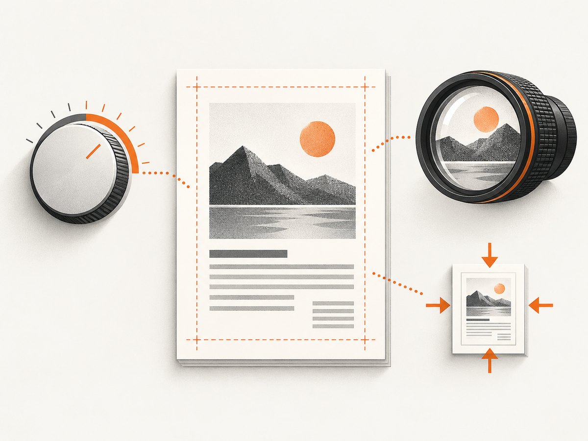
These controls are related, but they are not interchangeable:
| Control | What to check | Diagnostic approach |
|---|---|---|
--dpi |
Raster and pixel-to-print scale behavior; documented default is 96. | Set an explicit value and compare against the baseline. |
--zoom |
Overall content zoom; documented default is 1. | Try a modest factor change while holding other settings fixed. |
| Smart shrinking | WebKit may scale wide content to fit; enabled by default. | Compare enabled and --disable-smart-shrinking output. |
Do not change DPI and zoom together in the first experiment. Run a small matrix: baseline; explicit DPI only; explicit zoom only; then, if relevant, smart shrinking disabled. Compare page count, a known CSS width, and the physical PDF page dimensions after each run. A uniform size change points toward scale. A change in page count or line wrapping can indicate a layout fit or overflow effect instead.
# Baseline with explicit paper geometry and margins
wkhtmltopdf --page-size A4 \
  --margin-top 10mm --margin-right 10mm \
  --margin-bottom 10mm --margin-left 10mm \
  input.html baseline.pdf

# Test explicit DPI by itself
wkhtmltopdf --page-size A4 --dpi 96 \
  --margin-top 10mm --margin-right 10mm \
  --margin-bottom 10mm --margin-left 10mm \
  input.html dpi-96.pdf

# Test zoom by itself
wkhtmltopdf --page-size A4 --zoom 1.1 \
  --margin-top 10mm --margin-right 10mm \
  --margin-bottom 10mm --margin-left 10mm \
  input.html zoom-1-1.pdf

# Compare the default shrinking behavior with it disabled
wkhtmltopdf --page-size A4 --disable-smart-shrinking \
  --margin-top 10mm --margin-right 10mm \
  --margin-bottom 10mm --margin-left 10mm \
  input.html no-shrinking.pdf
A report in the project issue tracker found that --dpi 300 improved one particular case. That is a case-specific observation, not a universal recommended value. Very different DPI values have also been reported as workarounds in other version and platform combinations. Start from the documented default and use the value your measured output supports, rather than copying a number from an unrelated issue. [Issue discussion of DPI and font size differences]
Smart shrinking is not simply a global “make content larger” switch. The documentation describes it as WebKit’s intelligent shrinking strategy, which affects the pixel/DPI ratio. Disabling it can help diagnose content that is being scaled to fit, but may instead cause overflow, clipping, or additional pages. Treat both states as candidates and choose based on the actual layout. [Smart shrinking option]
4. Set the layout viewport when responsive CSS is involved
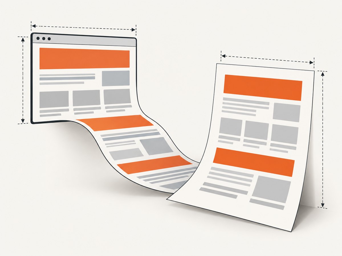
--viewport-size WIDTHxHEIGHT controls the emulated browser window dimensions used for layout. This matters when CSS media queries, overflow, or custom scrollbars change the rendered page based on window size. It does not choose Letter, A4, or any other physical PDF page size. Set page geometry separately. [Viewport option]
wkhtmltopdf \
  --page-size A4 \
  --viewport-size 1280x900 \
  --margin-top 10mm --margin-right 10mm \
  --margin-bottom 10mm --margin-left 10mm \
  responsive.html responsive.pdf
Use the viewport that matches the layout you want to capture, not the physical paper dimensions. If a responsive page switches to a mobile breakpoint, increasing PDF zoom will not reliably restore the desktop layout; explicitly set a suitable viewport and inspect the CSS breakpoint behavior.
5. Check operating system and build differences
Identical HTML and nominal command flags can produce different apparent scale across environments. In a project issue discussion, a wkhtmltopdf maintainer explained that the tool still uses the platform graphics library when running headlessly; Windows display DPI can affect text rendering, while the Linux environment discussed used a hardcoded assumption in that historical setup. Treat that discussion as evidence that environment details matter, not as a current universal description of every build. [Cross-platform scale discussion]
For diagnosis, hold the binary version/build, OS image, installed fonts, and display scaling conditions constant. If production runs on Windows, test on the same Windows environment and inspect its display scaling/DPI. If production runs in a Linux container, capture its exact package/build and font environment rather than assuming a desktop run is equivalent.
6. Use a controlled command as your starting point
This template makes the major geometry and scale settings visible. Replace the example paths and adjust one test variable at a time:
wkhtmltopdf \
  --page-size A4 \
  --orientation Portrait \
  --margin-top 10mm --margin-right 10mm \
  --margin-bottom 10mm --margin-left 10mm \
  --dpi 96 \
  --zoom 1 \
  --viewport-size 1280x900 \
  input.html output.pdf
Once the baseline is stable, add only the options your page needs. Remove --viewport-size if the page does not depend on a particular window size. Test --disable-smart-shrinking as a separate run rather than quietly combining it with DPI and zoom changes.
7. Troubleshooting common symptoms
| Symptom | Likely area | What to try |
|---|---|---|
| Everything is uniformly too small | DPI, zoom, platform scaling, or build difference. | Make paper/margins explicit, then test DPI and zoom separately on the target OS. |
| Content is smaller only on wide pages | Smart shrinking or available printable width. | Check margins and compare default shrinking with --disable-smart-shrinking. |
| Wrong physical sheet dimensions | Default A4 or an unintended page-size setting. | Set --page-size or explicit width and height. |
| Mobile layout appears in the PDF | Responsive CSS is using a narrow viewport. | Set a deliberate --viewport-size; keep paper size separate. |
| Text differs between Windows and Linux | OS graphics/DPI behavior, installed fonts, or binary build. | Reproduce with the target OS and same version/build; record display scaling. |
| Disabling shrinking creates extra pages | Content no longer fits the available width. | Check CSS width and margins; decide whether fit-to-page or preserved dimensions are desired. |
| CSS width looks right but printed measurement does not | Pixel-to-physical mapping and scaling controls. | Measure a known element and change one of DPI or zoom per run. |
| Results vary between runs | Dynamic content, asynchronous scripts, external assets, or environment changes. | Use a fixed fixture and stable assets; capture the command, version, OS, and output for each run. |
When escalating a persistent problem, follow the project’s reporting guidance: include the wkhtmltopdf version, operating system/version, a detailed description, and an HTML/CSS/JavaScript test case that reproduces it. [wkhtmltopdf issue reporting guidance]
8. Performance, reliability, and cost considerations
Scale flags mainly affect rendering geometry, so avoid adding speculative changes to a production command. A short controlled matrix takes less time to interpret than repeated trial-and-error runs with several flags changing at once. Keep a known fixture and expected measurements in deployment diagnostics so changes to the binary or OS image can be spotted.
Reliability depends on reproducing the rendering environment as well as the input. Pin the executable version and OS image where practical, provide the same fonts, and keep responsive viewport and paper settings explicit. If the page relies on JavaScript or remote resources, distinguish load timing and content changes from scale changes. Compare page count and physical dimensions in addition to visual appearance.
For cost, wkhtmltopdf is a local command-line workflow, so the cited size controls do not prescribe a per-capture service price. Account for your own compute, maintenance, deployment, and debugging time. If you need a managed website screenshot or PDF endpoint instead of maintaining a browser-rendering setup, ScreenshotNeo provides a one-request API with configurable output options.
Or skip the browser setup
ScreenshotNeo is a website screenshot API and MCP server for developers. One GET request can return a PNG, JPEG, WebP, or PDF. Its capture flow accepts cookie/consent banners like a visitor and removes 60+ known consent platforms, newsletter popups, and chat widgets before the shot; each step can be turned off. Bot checks/CAPTCHAs, blank pages, timeouts, failed loads, and cache hits cost nothing, and response headers report the page verdict and billing status. An MCP server gives AI agents tools for screenshots, page information, and PDF capture.
Here is the cURL request; replace the URL and API key with your values. See the ScreenshotNeo API documentation for request options.
curl -G "https://api.screenshotneo.com/v1/shot" \
  -d access_key=YOUR_API_KEY \
  --data-urlencode url=https://stripe.com \
  -o shot.webp
The same endpoint can be called from Python:
import requests

r = requests.get(
    "https://api.screenshotneo.com/v1/shot",
    params={"access_key": "YOUR_API_KEY", "url": "https://stripe.com"},
    timeout=90,
)
open("shot.webp", "wb").write(r.content)
Or Node.js:
const q = new URLSearchParams({
  access_key: 'YOUR_API_KEY',
  url: 'https://stripe.com'
});
const res = await fetch(`https://api.screenshotneo.com/v1/shot?${q}`);
const bytes = new Uint8Array(await res.arrayBuffer());
await import('node:fs/promises').then(fs => fs.writeFile('shot.webp', bytes));
Cookie banners, popups, and chat widgets are removed before the shot. Bot checks, blank pages, and failed loads are never billed. An MCP server lets AI agents take screenshots. The free plan includes 1,000 screenshots a month with no card; paid plans start at $5 for 3,000. Every feature is on every plan. Learn about ScreenshotNeo or sign up free for 1,000 screenshots a month, with no card.
FAQ
Does a higher DPI always make the PDF larger?
No single DPI value is a universal correction. The result depends on the version and environment, so measure a known element while holding other options constant.
Should I disable smart shrinking for every document?
No. It can change whether content fits, but disabling it may cause overflow or more pages. Compare both behaviors against the intended layout.
Is viewport size the same as PDF page size?
No. Viewport size controls the emulated layout window. Set the physical sheet with page size or page width and height.
Why did the same command change after deployment?
The binary, operating system, graphics/DPI behavior, fonts, or input assets may differ. Capture those details alongside the command to identify the changed variable.


