Free HTML and CSS to Image Converter
Convert HTML and CSS into PNG, JPG, or WebP with free browser tools, code, APIs, troubleshooting, and a practical ScreenshotNeo workflow.
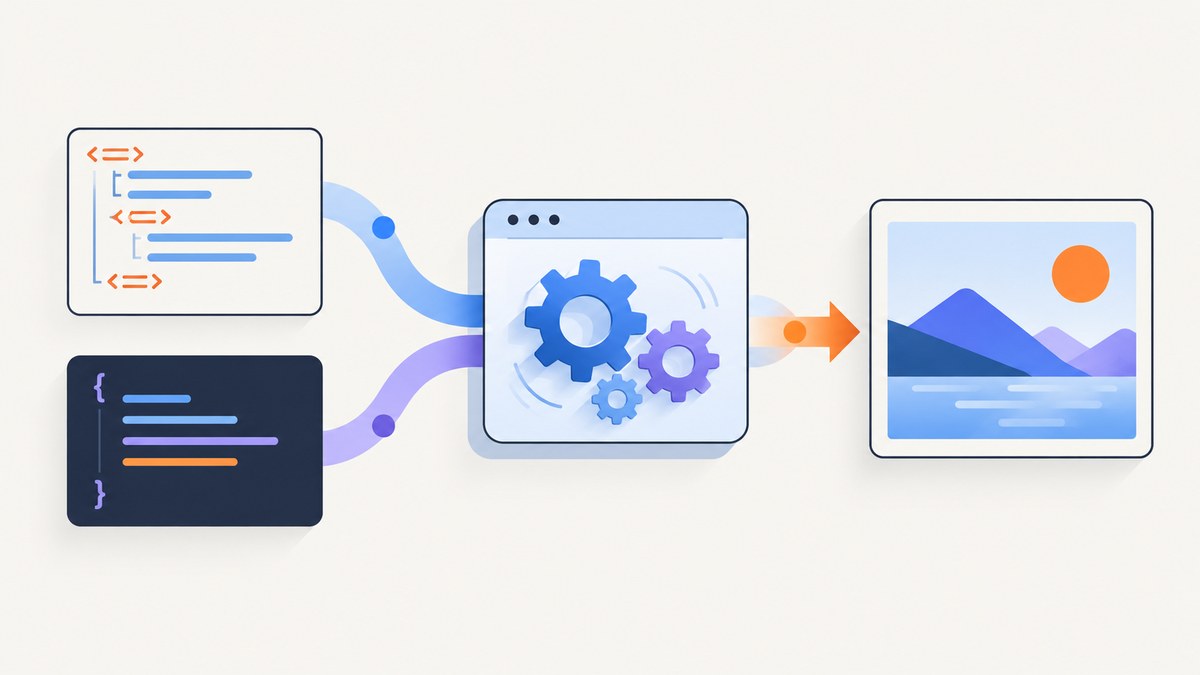
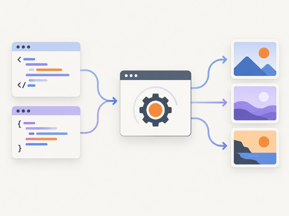
Short answer: an HTML/CSS-to-image converter renders your markup in a browser-like engine and exports a PNG, JPG, or WebP. For a one-off snippet, use a browser-based converter. For repeatable renders, use Playwright or an API. For public webpage screenshots, choose a URL-capable screenshot service and verify its free quota and output formats.
1. Choose the right kind of converter
| Job | Best fit | What to verify |
|---|---|---|
| Render a small HTML/CSS snippet once | Browser converter or a local HTML file | PNG/JPG/WebP output, custom fonts, viewport size |
| Generate social cards repeatedly | Reusable template plus an API or Playwright script | Stable dimensions, fonts, deterministic data, rate limits |
| Screenshot a public URL | URL screenshot API | JavaScript execution, full-page capture, cookie banners, failures and billing |
| Archive a document | PDF-capable renderer | Paper size, margins, page ranges and print CSS |
A converter is not automatically a webpage screenshot service. Some accept raw HTML and CSS; others accept a public URL, a named template, or both. Check the provider documentation for the exact input and output contract.
2. The basic HTML and CSS example
Save this as card.html. It uses no external dependencies, so it is a reliable starting point for local rendering.
<!doctype html>
<html lang="en">
<head>
  <meta charset="utf-8">
  <meta name="viewport" content="width=device-width, initial-scale=1">
  <style>
    * { box-sizing: border-box; }
    body {
      margin: 0;
      width: 1200px;
      height: 630px;
      display: grid;
      place-items: center;
      font-family: Arial, sans-serif;
      color: #fff;
      background: linear-gradient(135deg, #111827, #4f46e5);
    }
    .card {
      width: 1020px;
      padding: 72px;
      border: 1px solid rgba(255,255,255,.25);
      border-radius: 28px;
      background: rgba(255,255,255,.12);
    }
    h1 { margin: 0 0 20px; font-size: 64px; line-height: 1.05; }
    p { margin: 0; font-size: 28px; color: #dbeafe; }
  </style>
</head>
<body>
  <main class="card">
    <h1>HTML + CSS to image</h1>
    <p>A deterministic card rendered by a browser engine.</p>
  </main>
</body>
</html>
Keep the canvas dimensions explicit when the image will be used in a feed, email, thumbnail, or Open Graph card. If content can grow, use a measured layout or a full-page capture instead of clipping it to a fixed height.
3. Render locally with Playwright (Node.js)
Playwright gives you a real browser engine, JavaScript execution, network control and screenshot options. Install it once:
npm init -y
npm install playwright
npx playwright install chromium
Create render.mjs beside card.html:
import { chromium } from 'playwright';

const browser = await chromium.launch();
const page = await browser.newPage({
  viewport: { width: 1200, height: 630 },
  deviceScaleFactor: 1
});
await page.goto(`file://${process.cwd()}/card.html`);
await page.screenshot({ path: 'card.png', type: 'png' });
await browser.close();
Run node render.mjs. For a public page, replace the file:// URL with https://example.com and wait for the page state you need:
await page.goto('https://example.com', { waitUntil: 'networkidle' });
await page.screenshot({ path: 'page.webp', type: 'webp', fullPage: true });
Use fullPage for the entire document, or target one element when only a component is needed:
await page.locator('.card').screenshot({ path: 'component.png' });4. Render locally with Python
Install the Python package and Chromium:
python -m pip install playwright
python -m playwright install chromium
Save this as render.py:
from pathlib import Path
from playwright.sync_api import sync_playwright

with sync_playwright() as p:
    browser = p.chromium.launch()
    page = browser.new_page(viewport={"width": 1200, "height": 630}, device_scale_factor=1)
    page.goto(Path("card.html").resolve().as_uri())
    page.screenshot(path="card.png", type="png")
    browser.close()
For dynamic content, wait for a selector rather than guessing a delay:
page.goto("https://example.com", wait_until="networkidle")
page.locator(".hero").wait_for(state="visible")
page.screenshot(path="hero.png", full_page=False)
5. Use an online HTML/CSS-to-image API
An API is useful when a server, build job or content system needs repeatable renders. The HTML/CSS to Image documentation describes HTML or URL input (one is required), optional CSS, authentication, PNG/JPG/WebP/PDF output, viewport dimensions, device scale, full-page capture, selector cropping and render delay. Its documentation says url overrides html; protect the API key as a secret. Provider controls and parameter names can change, so use the current API reference when implementing.
html2img advertises HTML, public URL and named-template workflows, with PNG or PDF output. Its official site currently advertises “50 free renders” at signup without a card; treat that as that provider’s offer and verify the live terms before relying on it.
Free quotas are provider-specific. Record the number of renders, whether a card is required, retention, output restrictions and whether advanced controls are paid. Do not assume that a free browser converter includes an API or that a screenshot API accepts raw HTML.
6. Options that determine image quality
Viewport and device scale
Set the CSS viewport to the design size. Device scale (also called device pixel ratio or retina scale) increases output pixels without changing CSS layout. A 1200×630 viewport at scale 2 produces a 2400×1260 bitmap.
Full page versus fixed canvas
Full-page mode captures the document’s scroll height. Fixed canvases are better for cards and thumbnails. Long pages can be expensive and may expose lazy-loading or sticky-header behavior.
Element cropping
Capture a CSS selector when you need a chart, article header or card. Make sure the element has a stable size and wait until its fonts and images are loaded.
Fonts and assets
Web fonts can arrive after the first paint. Wait for document.fonts.ready in Playwright, or self-host fonts for deterministic builds. External images may be blocked by CORS, authentication or hotlink protection.
JavaScript and timing
Use a selector wait for a known state, network idle for mostly static pages, and a short delay only when an animation or third-party widget cannot expose a readiness signal. Disable animations in your capture CSS when pixel stability matters.
Color and transparency
Use PNG for sharp text and transparency, JPG for photographic pages, and WebP when your consumers support it and file size matters. A transparent background requires that the renderer and the page both preserve alpha; a page with an opaque body background cannot become transparent by format conversion alone.
7. A repeatable rendering checklist
- Define the output dimensions and format.
- Make fonts, images and data available to the renderer.
- Set the viewport and device scale explicitly.
- Wait for a selector, fonts, images or network idle.
- Disable animations and blinking cursors.
- Capture the full page or the required selector.
- Validate dimensions, file type and non-empty content.
- Store failures with the URL, renderer version and error message.
8. Edge cases
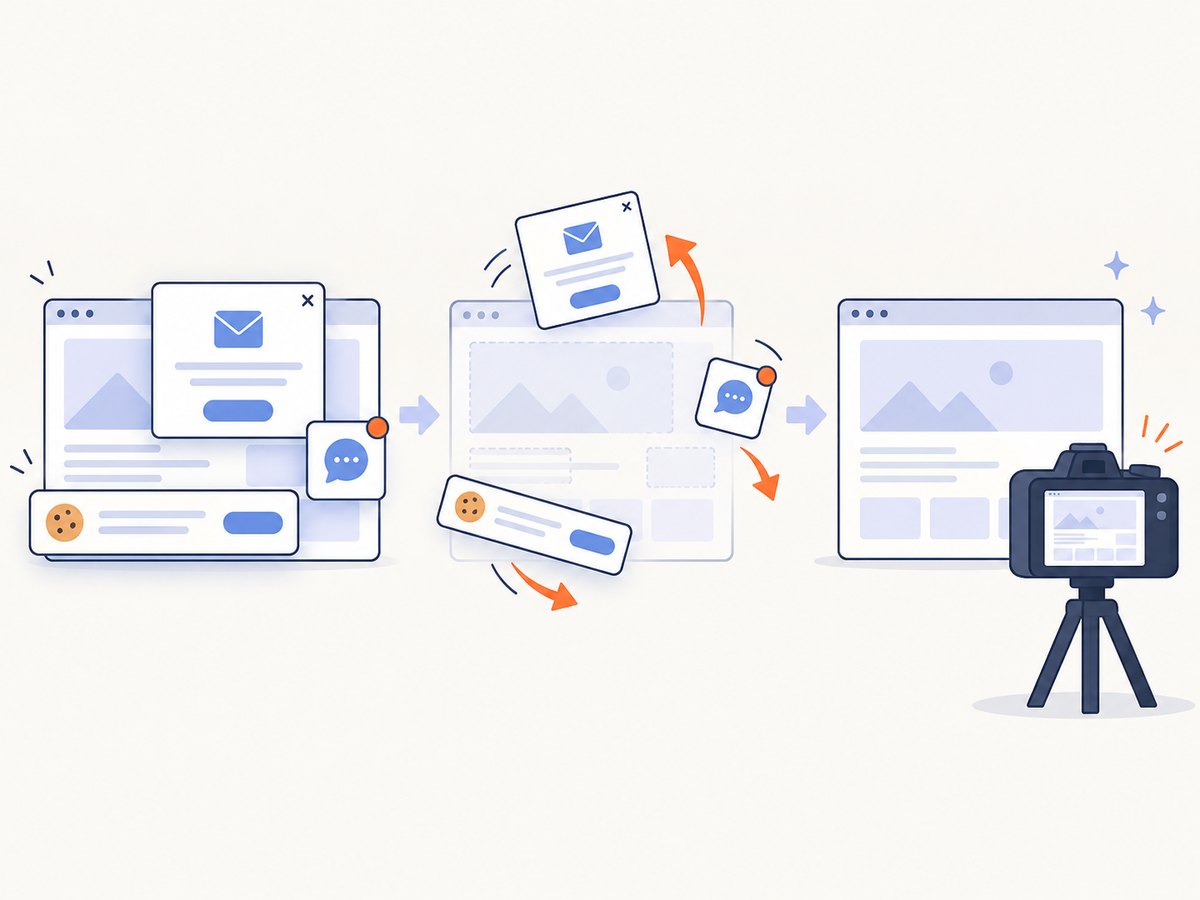
- Cookie banners and popups: dismiss them before capture or hide their selectors. A banner can cover the content you intended to render.
- Lazy-loaded images: scroll through the page or use a renderer that explicitly loads lazy images before full-page capture.
- Infinite scroll: set a maximum height or item count; otherwise the capture may never finish.
- Authentication: use an authenticated browser context, headers or cookies. Never put credentials in a public image URL.
- Animations: pause them with injected CSS and wait for the final state.
- Responsive breakpoints: test each target viewport; a layout that works at 1440px may stack at 768px.
- Cross-origin frames: an iframe may require its own permissions or may not be capturable from the parent page.
- Very large pages: split them into sections or PDF pages to avoid memory pressure.
9. Troubleshooting
| Symptom | Likely cause | Fix |
|---|---|---|
| Blank or white image | Capture ran before content rendered, or navigation failed | Check the response, wait for a selector, and save page HTML for debugging. |
| Missing web fonts | Font request was still pending or blocked | Wait for document.fonts.ready, self-host the font, and inspect network errors. |
| Images missing | Lazy loading, CORS, authentication or hotlink rules | Scroll to trigger loading, provide credentials, or use same-origin assets. |
| Wrong dimensions | CSS pixels were confused with output pixels | Set viewport and device scale separately, then verify the bitmap dimensions. |
| Text is clipped | Fixed height, overflow or late layout shift | Use full-page capture, wait for layout completion, or increase the canvas height. |
| Timeout | Third-party request, infinite loading or an unreachable URL | Block unnecessary resources, set a bounded timeout, and retry only transient failures. |
| API key exposed | Secret embedded in browser JavaScript or a public URL | Keep the key on your server or in an environment variable and proxy requests. |
10. Performance, reliability and cost
Browser startup is often the largest fixed cost in a self-hosted workflow. Reuse a browser process, create isolated pages or contexts per job, and limit concurrency to the memory available. Cache identical inputs using a hash of the HTML, CSS, data and renderer settings. Block ads, analytics and unrelated resource types when they are not part of the image.
For reliable output, pin your browser version, set explicit timeouts, retry only network or server errors with exponential backoff, and keep the original input beside the output. Treat a bot check, empty page or failed load as a failed capture rather than a valid image.
Self-hosting has infrastructure and maintenance cost. Hosted APIs trade that setup for usage charges and provider limits. Compare the total workflow: render quota, output storage, retries, browser maintenance and engineering time. Free offers change; check the provider’s current pricing and terms before publishing a production integration.
11. Or skip the browser setup
ScreenshotNeo is a website screenshot API and MCP server. It can render HTML/CSS to an image, capture a public URL, capture one CSS-selected element, run full-page shots with lazy images loaded, and return PNG, JPEG, WebP or PDF. Its capture controls include viewport and device presets, retina scale, dark mode, custom CSS and JavaScript, selector waits, delays, network-idle waits, request blocking, headers, cookies, user agents, authorization, timezone, geolocation, transparent backgrounds, resizing, caching, signed links, async webhooks and bulk capture.
Use the ScreenshotNeo API documentation for the current options. The simplest URL capture is:
curl -G "https://api.screenshotneo.com/v1/shot" -d access_key=YOUR_API_KEY --data-urlencode url=https://stripe.com -o shot.webpimport requests
r = requests.get("https://api.screenshotneo.com/v1/shot", params={"access_key": "YOUR_API_KEY", "url": "https://stripe.com"}, timeout=90)
open("shot.webp", "wb").write(r.content)const q = new URLSearchParams({ access_key: 'YOUR_API_KEY', url: 'https://stripe.com' });
const res = await fetch(`https://api.screenshotneo.com/v1/shot?${q}`);Before the capture, ScreenshotNeo accepts the cookie or consent banner like a visitor and removes more than 60 known consent platforms, newsletter popups and chat widgets; each step can be turned off. Bot checks or CAPTCHAs, blank pages, timeouts, failed loads and cache hits cost nothing, and each response identifies the result with X-Page-Verdict and X-Billed headers. Its MCP server includes take_screenshot, get_page_info and capture_pdf for Claude, Cursor and other MCP clients.
The free plan includes 1,000 shots per month with no card. Paid plans start at $5 for 3,000 shots; every feature is available on every plan. Create a free ScreenshotNeo account.
12. Frequently asked questions
Can I convert HTML and CSS without hosting the page?
Yes. Use a local browser renderer or an API that accepts raw HTML and CSS. A URL-only screenshot endpoint requires the page to be publicly reachable.
Which format should I choose?
Use PNG for text, diagrams and transparency; JPG for photos; WebP for smaller files when supported. Use PDF when the deliverable is a document rather than a bitmap.
Is a screenshot the same as HTML-to-image rendering?
Both use a browser-like renderer, but a screenshot usually starts from a URL while HTML-to-image starts from supplied markup and styles. Their controls and security requirements differ.
How do I make renders deterministic?
Pin browser versions, self-host fonts and assets, freeze data, disable animations, set viewport and scale explicitly, and wait for a known ready condition.
Are free quotas permanent?
No. Quotas, card requirements and feature limits are provider-specific and can change. Verify the provider’s current pricing page before committing to a workflow.


