How to Choose a Full-Page Website Background Image Size
Choose background dimensions by viewport, aspect ratio, focal point and cropping needs—not by one universal pixel size.
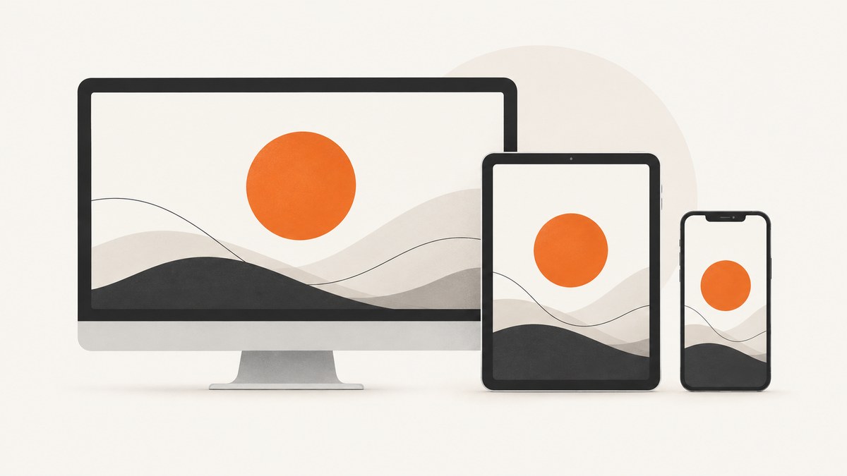
There is no universal pixel size for a full-page website background. Choose the source image for the page area it must cover, the viewport range you support, the subject’s focal point and whether cropping is acceptable. Use background-size: cover when the image must fill the area edge to edge; use contain when the complete source must remain visible.
1. Start with the area, not a monitor resolution
CSS paints a background against an element’s background positioning area. The browser scales the bitmap according to that area and the image’s intrinsic aspect ratio. A 16:9 source behaves differently in a short desktop hero, a tall phone viewport and a full document with an unusual height. That is why advice such as “always use 1920×1080” cannot answer every layout.
Define the real target first:
- Which element receives the background: the body, a hero, or a section?
- What viewport widths and heights must look good?
- Must the entire image be visible?
- Where is the subject that must remain visible?
- Can you ship different crops or files to mobile?
For a full-viewport backdrop, the effective area is approximately the viewport, but browser chrome, dynamic mobile viewport units and your content layout can change the visible region. For a hero, size the composition around the hero’s actual aspect ratios instead of the whole monitor.
2. Choose between cover and contain
| Decision | cover |
contain |
|---|---|---|
| Fills the area edge to edge | Yes | Not always |
| Entire source remains visible | Not guaranteed | Yes, unless another rule clips it |
| Cropping | Possible when aspect ratios differ | Avoided |
| Uncovered space | Avoided | Possible; the background color may show |
| Typical use | Decorative full-bleed backdrop | Logos, diagrams and images where every detail matters |
MDN describes cover as scaling the image as small as possible while keeping both dimensions at least as large as the container. The result fills the box, but the excess dimension is cropped. See MDN’s background-size reference.
3. Understand the crop mathematically
Let the source dimensions be Ws × Hs and the area be Wa × Ha.
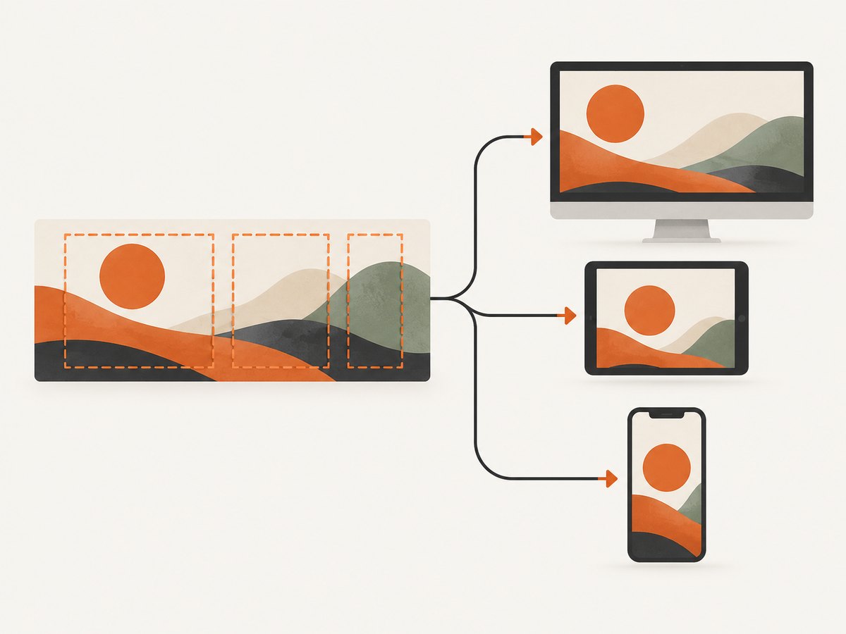
- Cover scale:
max(Wa / Ws, Ha / Hs). The scaled image covers both dimensions; one dimension may extend beyond the area and be cropped. - Contain scale:
min(Wa / Ws, Ha / Hs). The whole image fits; leftover space remains in the area.
Example: a 2400×1350 (16:9) source inside a 390×844 phone area is much wider than the area. cover scales by the height and crops the left and right sides. A centered subject may disappear unless you adjust background-position or provide a mobile crop.
4. Position the focal point deliberately
background-position controls which part survives cropping. Use a percentage, keyword or length rather than accepting a default center when the subject is off-center.
.hero {
  min-height: 70vh;
  background-image: url("/images/hero-desktop.webp");
  background-size: cover;
  background-position: 65% center;
  background-repeat: no-repeat;
  background-color: #17202b;
}

@media (max-width: 640px) {
  .hero {
    background-image: url("/images/hero-mobile.webp");
    background-position: center top;
  }
}
Leave “safe” composition space around faces, products and text overlays. Test the crop at representative wide, narrow, short and tall viewports rather than judging only from a desktop window.
5. Pick source dimensions without wasting bytes
Export enough pixels for the largest rendered use and display density you support, then avoid delivering that largest file to every device. The dossier’s sources support matching assets to viewport, resolution and layout; they do not establish one universal source dimension or file-weight target.
- Create separate desktop and mobile crops when the composition changes, not merely when the width changes.
- Use CSS media queries to select meaningful variants.
- Compress and encode in formats your browser support policy allows, while checking visible quality.
- Do not stretch imagery by assigning unrelated width and height values when preserving the ratio matters.
Responsive background guidance from web.dev shows why a smaller mobile asset can avoid unnecessary transfer; the demo’s percentage is specific to that demo, not a general rule.
6. Decide whether the image should be CSS or HTML
Use a CSS background when the image is decorative, layered behind content or intentionally cropped. If it is the main meaningful image in the initial view, consider an <img> or <picture> element with responsive sources. The browser preload scanner does not discover CSS background images as early as markup images, which can affect loading priority for an image that becomes the largest contentful paint candidate. See web.dev’s LCP guidance and MDN responsive images.
<picture>
  <source media="(max-width: 640px)" srcset="/images/hero-mobile.webp">
  <img
    src="/images/hero-desktop.webp"
    alt=""
    width="2400"
    height="1350"
    fetchpriority="high"
  >
</picture>
Keep meaningful imagery accessible with useful alternative text. A purely decorative background should not duplicate nearby content.
7. A complete responsive CSS example
:root {
  --hero-color: #101820;
}

.page {
  min-height: 100svh;
  color: white;
  background-color: var(--hero-color);
  background-image: url("/images/site-bg-wide.webp");
  background-repeat: no-repeat;
  background-size: cover;
  background-position: 50% 35%;
}

@media (max-width: 900px) {
  .page {
    background-image: url("/images/site-bg-medium.webp");
    background-position: 55% center;
  }
}

@media (max-width: 600px) {
  .page {
    background-image: url("/images/site-bg-tall.webp");
    background-position: center top;
  }
}

@media (prefers-reduced-motion: reduce) {
  .page { background-attachment: scroll; }
}
100svh gives a stable small viewport height on browsers that support dynamic mobile viewport units. If your layout needs a different minimum height, set that on the element and test it on real target devices.
8. Verify the result systematically
- List representative viewport shapes: wide desktop, laptop, tablet portrait, narrow phone and tall phone.
- Capture each at the same scroll position and compare the focal point, crop and contrast behind text.
- Check both
coverandcontainwhere the decision is uncertain. - Inspect at normal and high pixel density; look for blur caused by an undersized source.
- Measure transfer size and loading timing for the initial view.
- Check keyboard focus, text contrast and whether the image competes with content.
9. Or skip the browser setup
If you need rendered screenshots of these layouts for QA, documentation or visual regression, ScreenshotNeo returns a PNG, JPEG, WebP or PDF from one GET request. Its capture options include full-page shots with lazy images loaded, custom viewports and device presets, retina scale, dark mode, custom CSS and JavaScript, waits, blocked resources and caching.
One call:
curl -G "https://api.screenshotneo.com/v1/shot" \
  -d access_key=YOUR_API_KEY \
  --data-urlencode url=https://example.com \
  -o shot.webp
import requests
r = requests.get(
"https://api.screenshotneo.com/v1/shot",
params={"access_key": "YOUR_API_KEY", "url": "https://example.com"},
timeout=90,
)
r.raise_for_status()
open("shot.webp", "wb").write(r.content)const q = new URLSearchParams({
access_key: 'YOUR_API_KEY',
url: 'https://example.com'
});
const res = await fetch(`https://api.screenshotneo.com/v1/shot?${q}`);
if (!res.ok) throw new Error(`HTTP ${res.status}`);
const data = Buffer.from(await res.arrayBuffer());
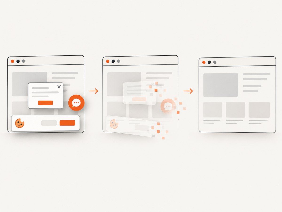
require('fs').writeFileSync('shot.webp', data);See the ScreenshotNeo API documentation for parameters and response headers. Cookie and consent banners, newsletter popups and chat widgets are removed before capture. Bot checks, blank pages and failed loads are not billed, and the response identifies the page verdict and billing status. An MCP server lets AI agents use take_screenshot, get_page_info and capture_pdf. The Free plan includes 1,000 screenshots per month with no card; paid plans start at $5 for 3,000.
Create a free ScreenshotNeo account and start with the included 1,000 screenshots.
10. Troubleshooting
The subject is cut off
Cause: cover crops the dimension that exceeds the area. Fix: change background-position, leave more safe space in the source, reduce the focal subject, or provide an art-directed mobile crop.
There are blank bands around the image
Cause: contain preserves the whole source and leaves uncovered space. Fix: use cover if edge-to-edge coverage matters, or set a deliberate background color and keep contain when the whole image is required.
The mobile image looks stretched
Cause: independent width and height sizing or an unsuitable source ratio. Fix: preserve the intrinsic ratio and use a mobile-specific crop or background-size: cover.
The background loads late
Cause: CSS backgrounds are discovered later than markup images. Fix: use <picture> or <img> for meaningful above-the-fold imagery, and avoid an oversized file.
Text is hard to read
Cause: the focal area and text occupy the same contrast range. Fix: move the background position, choose a better crop, add a controlled overlay, or change the text placement.
Different browsers show different visible height
Cause: mobile browser UI changes the dynamic viewport. Fix: test stable viewport units such as svh, set an intentional minimum height and verify on target devices.
11. Performance, reliability and cost notes
- Deliver responsive files so a small viewport does not download a needlessly large desktop source.
- Keep the initial background visually useful without requiring a huge bitmap; compression and appropriate dimensions matter more than a magic pixel number.
- Preload or use responsive HTML markup when the image is the primary LCP candidate; keep decorative backgrounds in CSS.
- Use a stable fallback color so content remains legible while the image loads or if it fails.
- For automated screenshots, wait for the layout and lazy images to settle, and use caching when repeated captures are identical. ScreenshotNeo supports selector waits, delays, network idle, resource blocking and a caller-chosen cache TTL.
12. FAQ
Is 1920×1080 the correct full-page background size?
It can be a useful source for some wide layouts, but it is not universal. The area ratio, viewport range and intended crop determine the appropriate source.
Should I always use cover?
No. Use it for edge-to-edge decorative coverage when cropping is acceptable. Use contain when every part of the source must remain visible.
When do I need separate mobile artwork?
Use it when the desktop composition crops badly on narrow or tall screens, or when a smaller file can serve the mobile layout without losing the focal point.
Can a CSS background be the main page image?
Yes, but meaningful above-the-fold imagery may load earlier and more responsively as an <img> or <picture> element.
How can I review every viewport crop automatically?
Capture representative viewport sizes with a browser tool or ScreenshotNeo, compare the focal point and text contrast, and keep the source or position that passes those checks.


