Full-Width Image Sizes for Websites
Choose responsive image dimensions from your real layout slot, density and crop rules—not a universal pixel size.
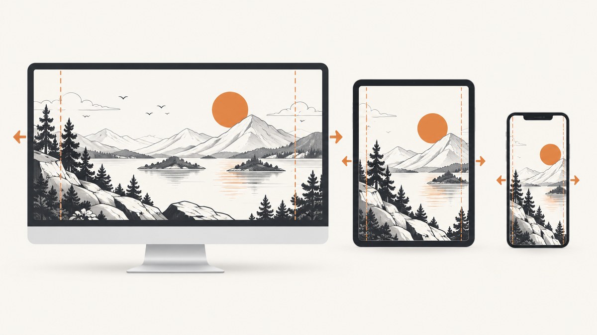
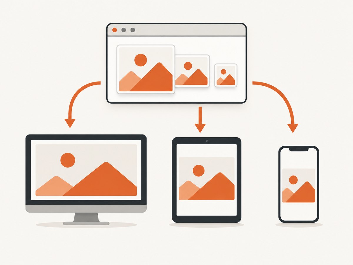
There is no universal pixel dimension for a full-width website image. Choose source dimensions from the largest rendered slot, the device pixel density you need to support, the image’s aspect ratio and whether the design crops it. Provide responsive source variants so the browser can download an appropriate candidate for each layout.
If the whole composition must remain visible, make the image fluid inside its container and preserve its ratio. If the design uses a fixed hero frame, define the frame’s aspect ratio and choose an intentional crop or containment rule.
1. Start with the rendered slot
Measure the image’s actual CSS width at each supported layout. A “full-width” image might span the viewport, a centered content column, or a grid column. The source file should be large enough for the widest important slot at the highest display density you support, while smaller variants prevent mobile devices from downloading unnecessary pixels.
| Layout question | What to record |
|---|---|
| How wide does it render? | CSS width in pixels at each breakpoint, including container padding. |
| What density must it support? | Usually 1x and 2x candidates; add higher density only when the design and performance budget justify it. |
| Does the frame have a fixed shape? | The intended aspect ratio, such as 16:9 or a custom hero ratio. |
| Will edges be cropped? | The crop rule and focal position, especially around people, products and text overlays. |
| Does mobile need a different composition? | If yes, plan an art-directed mobile source instead of forcing one crop to work everywhere. |
A 1600 × 500 hero is sometimes recommended in tourism guidance, but that is a layout-specific example rather than a web standard. Do not use it as a universal requirement.
2. Build responsive sources with srcset and sizes
srcset lists available source widths. sizes tells the browser how wide the image will render, so it can choose a suitable candidate before downloading. The breakpoints below are examples; replace them with your measured layout.
<img
  src="/images/hero-1280.jpg"
  srcset="
    /images/hero-640.jpg 640w,
    /images/hero-960.jpg 960w,
    /images/hero-1280.jpg 1280w,
    /images/hero-1600.jpg 1600w,
    /images/hero-2200.jpg 2200w"
  sizes="
    (min-width: 1400px) 1200px,
    (min-width: 900px) 90vw,
    100vw"
  width="2200"
  height="1100"
  alt="People collaborating around a desk"
>
The width descriptors describe the intrinsic pixel width of each file. The sizes value describes the rendered CSS width, not the file width. If the image occupies half the viewport between two breakpoints, say so in sizes rather than always declaring 100vw.
For a grid image that is one-third wide on large screens, one-half wide on medium screens and full width on small screens, the pattern could be:
<img
  src="/images/card-960.jpg"
  srcset="
    /images/card-480.jpg 480w,
    /images/card-720.jpg 720w,
    /images/card-960.jpg 960w,
    /images/card-1440.jpg 1440w"
  sizes="
    (min-width: 1200px) 33.333vw,
    (min-width: 700px) 50vw,
    100vw"
  width="1440"
  height="900"
  alt=""
>
Browsers account for device pixel ratio and current layout when selecting a candidate. Supplying several practical widths is usually better than shipping one oversized master file to every device. See web.dev’s responsive image guidance and MDN’s responsive images guide.
3. Preserve the ratio or define the crop
When the complete image should remain visible, let its height follow its intrinsic ratio:
.full-width-image {
  display: block;
  inline-size: 100%;
  max-inline-size: 100%;
  block-size: auto;
}
As web.dev explains, setting block-size: auto preserves the image’s aspect ratio as it resizes. Do not set unrelated width and height values that stretch the pixels.
For a fixed hero frame, reserve the shape explicitly and crop deliberately:
.hero {
  aspect-ratio: 16 / 7;
  overflow: hidden;
}

.hero img {
  display: block;
  inline-size: 100%;
  block-size: 100%;
  object-fit: cover;
  object-position: 50% 40%;
}
object-fit: cover fills the frame and crops overflow. Move the focal point with object-position. Use object-fit: contain when every edge must remain visible and empty space is acceptable.
4. Use art direction when mobile composition changes
A portrait mobile crop may hide the subject or collide with a headline even when a desktop crop looks correct. Use picture when mobile needs a different source, not merely a different resolution:

<picture>
  <source
    media="(max-width: 699px)"
    srcset="/images/hero-mobile-720.jpg 720w, /images/hero-mobile-1080.jpg 1080w"
    sizes="100vw"
  >
  <img
    src="/images/hero-wide-1280.jpg"
    srcset="/images/hero-wide-1280.jpg 1280w, /images/hero-wide-1920.jpg 1920w"
    sizes="100vw"
    width="1920"
    height="840"
    alt="A chef preparing food in a bright kitchen"
  >
</picture>
Check the focal subject, text-safe areas and edge content at every supported viewport shape. A separate art-directed image is often clearer than relying on one cover crop across radically different frames.
5. Reserve space and load at the right time
Include intrinsic width and height attributes. The browser can reserve the correct ratio before the file arrives, reducing layout movement. If CSS imposes another frame, reserve that frame with aspect-ratio.
<img
  src="/images/hero-1280.jpg"
  width="1280"
  height="560"
  alt="A mountain trail at sunrise"
>
Use lazy loading for images below the fold:
<img src="/images/gallery-960.jpg" width="960" height="640" loading="lazy" alt="...">Do not lazy-load an above-the-fold hero by default. For a critical hero, fetchpriority="high" can communicate its importance:
<img
  src="/images/hero-1280.jpg"
  width="1280"
  height="560"
  fetchpriority="high"
  alt="..."
>
These loading hints do not change the dimensions the asset needs; they change when the browser fetches it. Validate them against your current browser support and performance data.
6. A practical sizing workflow
- List the supported viewport ranges and measure the image’s CSS width in each one.
- Choose the intended aspect ratio for each composition.
- Multiply the largest rendered width by the target density to estimate the largest useful source width.
- Generate several width variants around your real slots, such as 640, 960, 1280, 1600 and 2200 pixels, adjusting to your layout.
- Write
srcsetwith width descriptors andsizesthat matches the CSS layout. - Add intrinsic dimensions or an explicit aspect-ratio box.
- Decide whether each image is cover, contain or uncropped, then set the focal position.
- Inspect every breakpoint for subject visibility, overlay safety and unexpected cropping.
- Measure download size and rendering performance using representative images, formats and devices.
7. Validate the result by capturing real viewports
To check a responsive image, render the page at the viewport sizes your design supports and inspect the resulting files. A browser automation script can capture screenshots after the layout settles:
// Playwright example
import { chromium } from 'playwright';

const browser = await chromium.launch();
const page = await browser.newPage({ viewport: { width: 1440, height: 900 }, deviceScaleFactor: 1 });
await page.goto('https://example.com/page', { waitUntil: 'networkidle' });
await page.screenshot({ path: 'desktop.webp', fullPage: true });
await browser.close();
Repeat with a narrow viewport and a higher device scale factor. Check that the selected source is appropriate, the hero does not crop important content and the reserved space prevents movement.
8. Or skip the browser setup
ScreenshotNeo captures a URL with one request, so you can review the rendered result at your chosen viewport without maintaining browser automation. See the ScreenshotNeo API documentation for all options.
cURL
curl -G "https://api.screenshotneo.com/v1/shot" -d access_key=YOUR_API_KEY --data-urlencode url=https://stripe.com -o shot.webpPython
import requests
r = requests.get("https://api.screenshotneo.com/v1/shot", params={"access_key": "YOUR_API_KEY", "url": "https://stripe.com"}, timeout=90)
open("shot.webp", "wb").write(r.content)
Node.js
const q = new URLSearchParams({ access_key: 'YOUR_API_KEY', url: 'https://stripe.com' });
const res = await fetch(`https://api.screenshotneo.com/v1/shot?${q}`);
Cookie banners, newsletter popups and chat widgets are removed before the shot. Bot checks, blank pages and failed loads are never billed. The response identifies the result with X-Page-Verdict and X-Billed headers. An MCP server provides take_screenshot, get_page_info and capture_pdf tools for AI agents. The Free plan includes 1,000 screenshots a month with no card; paid plans start at $5 for 3,000 shots. Start with a free ScreenshotNeo account.
9. Troubleshooting
| Symptom | Likely cause | Fix |
|---|---|---|
| Image looks blurry on a large or high-density display | The largest candidate is narrower than the rendered slot times the target density. | Add a wider source variant and ensure sizes reports the real rendered width. |
| Mobile downloads the desktop-sized file | sizes says 100vw when the image is actually narrower, or the media conditions do not match CSS. |
Mirror the layout’s slot widths in sizes and inspect the selected resource in DevTools. |
| Hero subject is cut off | object-fit: cover crops the frame from its center. |
Adjust object-position, change the aspect ratio, or provide an art-directed mobile source. |
| Layout jumps when the image loads | No intrinsic dimensions or reserved aspect-ratio box. | Add width/height attributes or set aspect-ratio on the frame. |
| Image is stretched | CSS sets independent width and height values without preserving the ratio. | Use block-size: auto for uncropped images or a deliberate object-fit rule for a fixed frame. |
| Text overlay becomes unreadable | The crop moves the subject or removes the intended quiet area. | Test all viewport shapes and choose a different focal point or art-directed asset. |
| Hero loads late | The image is lazy-loaded or competing with other high-priority requests. | Remove lazy loading from the above-the-fold hero, consider fetchpriority="high", and reduce the selected source size. |
10. Performance, reliability and cost considerations
- Dimensions: Serve pixels close to the rendered slot. A universal oversized source increases transfer and decode work.
- Variants: Full-width heroes often need more width variants than small thumbnails because their rendered slot spans a wider range.
- Formats and compression: File weight depends on image content, format, compression and dimensions; there is no universal byte target.
- Layout stability: Reserve the ratio before loading so late responses do not move surrounding content.
- Cropping: Recheck focal points after every design change or breakpoint adjustment.
- Capture reliability: When validating rendered pages with ScreenshotNeo, failed loads, blank pages, bot checks and cache hits cost nothing, and the response states the verdict and billing result.
FAQ
Is 1920 pixels always the right full-width image size?
No. It may be suitable for one layout, but the correct maximum depends on the largest rendered slot and target density.
Should I use one image file for desktop and mobile?
Use one responsive source set when the composition works at every shape. Use art direction with picture when mobile needs a materially different crop or subject placement.
Does full width mean 100vw?
No. Full width means the width of the relevant layout slot. A centered container or grid column can be full width within its own slot while being narrower than the viewport.
Do width and height attributes force that display size?
They provide intrinsic dimensions and a ratio. CSS can still make the image fluid while the browser uses the ratio to reserve space.
When should I use object-fit: contain?
Use it when showing the complete composition matters more than filling the frame. Expect empty space when the source and frame ratios differ.


