How to Generate Website Content Images From HTML and CSS
Render HTML and CSS in a real browser, wait for assets, then capture the viewport, an element, or the full page as PNG, JPEG, or WebP.
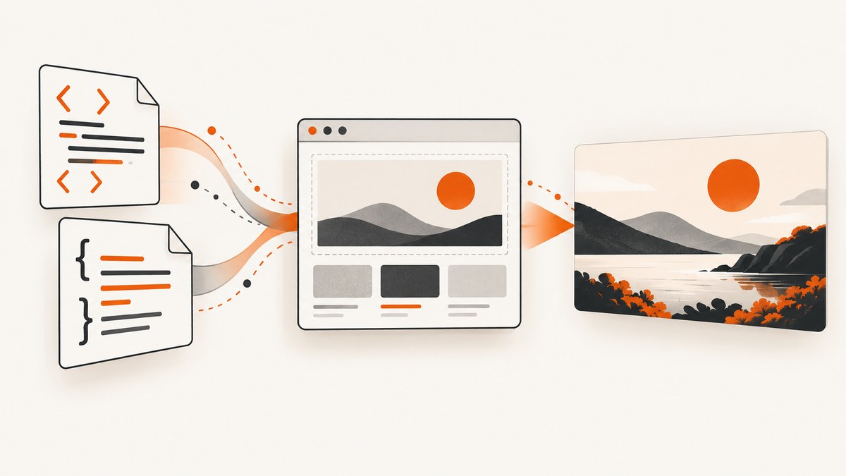
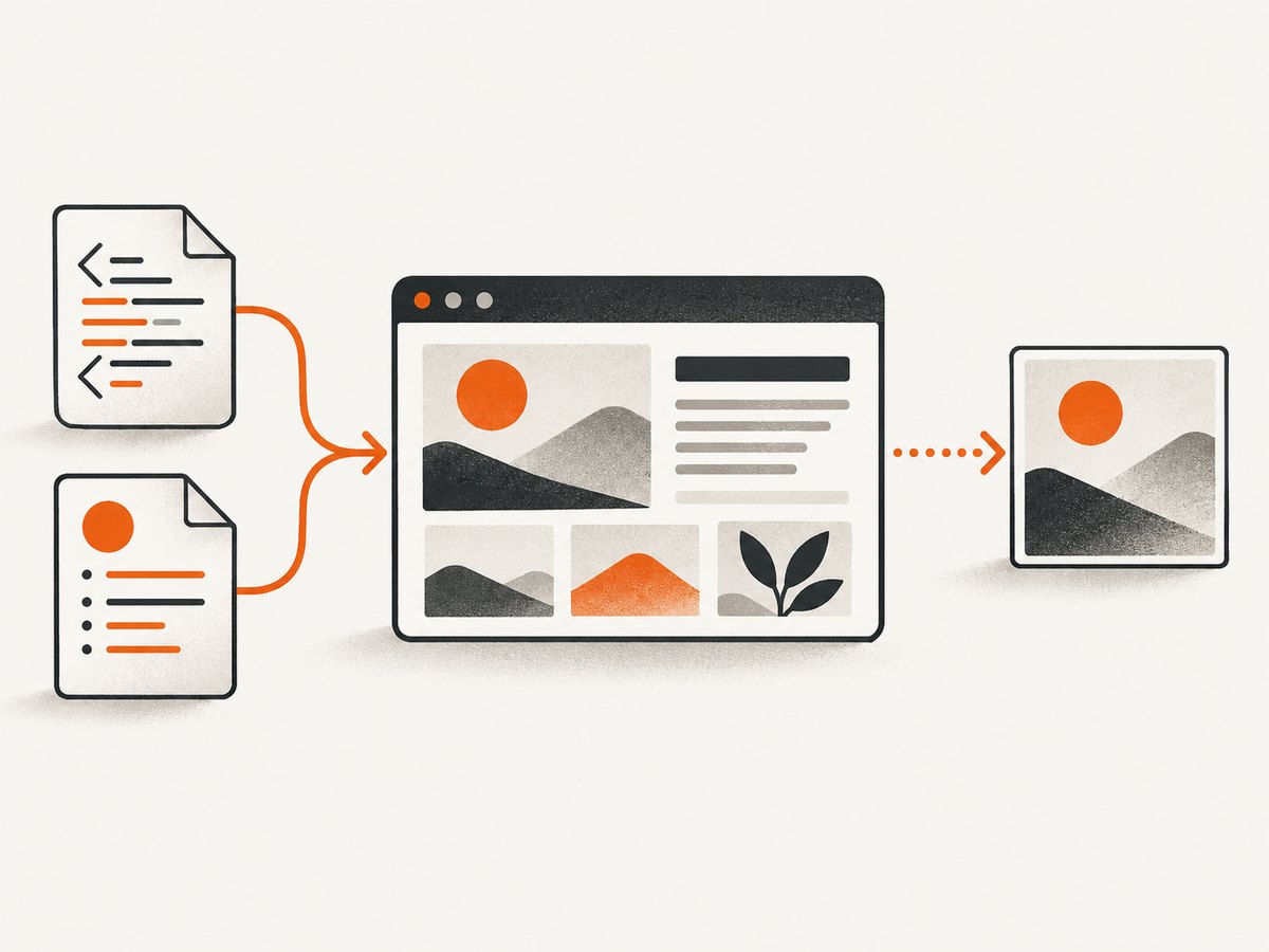
To generate a website content image from HTML and CSS, render the markup in a real browser and capture the rendered page or a selected element. Browser automation tools such as Playwright and Puppeteer can load a URL or HTML string, wait for the content your design needs, and save a screenshot as PNG, JPEG, or WebP. The reliable workflow is: prepare assets, render, wait for readiness, choose a capture scope, set pixel scale and format, then save or return the image bytes.
This method captures what a browser actually paints. CSS layout, web fonts, images, pseudo-elements, responsive rules, and JavaScript-driven content are evaluated before the pixels are produced.
1. Decide what the image must contain
Choose the capture boundary before writing code. The correct scope depends on where the image will be used.
| Goal | Capture scope | Typical use |
|---|---|---|
| Visible browser view | Viewport | Social preview, hero artwork, dashboard snapshot |
| One component | Selected element | Card, chart, product tile, article illustration |
| Entire document | Full page | Long article, report, documentation page |
Playwright documents viewport, element, and full-page screenshots. Its full-page mode cannot be combined with an element target, so use one or the other for each capture. Puppeteer documents page screenshots and element screenshots as well. Playwright screenshot documentation and the Page screenshot API describe the available modes.
2. Build a self-contained HTML and CSS document
For repeatable output, keep the HTML, CSS, fonts, and images available to the browser. Relative URLs resolve differently for a file loaded from disk than for a page served over HTTP, so a small local server is often easier when your design references assets.
<!doctype html>
<html lang="en">
<head>
  <meta charset="utf-8">
  <meta name="viewport" content="width=device-width, initial-scale=1">
  <style>
    * { box-sizing: border-box; }
    body {
      margin: 0;
      background: #eef2ff;
      color: #172033;
      font-family: Inter, system-ui, sans-serif;
    }
    .canvas {
      width: 1200px;
      margin: 0 auto;
      padding: 72px;
      background: white;
    }
    .card {
      padding: 40px;
      border-radius: 24px;
      background: linear-gradient(135deg, #312e81, #6366f1);
      color: white;
    }
    .card h1 { margin: 0 0 12px; font-size: 56px; }
    .card p { margin: 0; font-size: 22px; line-height: 1.45; }
  </style>
</head>
<body>
  <main class="canvas">
    <section class="card" id="content-card">
      <h1>Rendered content</h1>
      <p>This component can become a PNG, JPEG, or WebP image.</p>
    </section>
  </main>
</body>
</html>
Use explicit dimensions for designs that must match a fixed export size. A responsive design can still be captured, but you should set the browser viewport deliberately so media queries select the intended layout.
3. Generate an image with Playwright
Install Playwright and its browser once in the project, then run a script. The example below uses page.setContent() to render an HTML string, waits for fonts, and captures one element as a WebP file.
npm install -D playwright
npx playwright install chromium
// capture.mjs
import { chromium } from 'playwright';
import { readFile } from 'node:fs/promises';
const html = await readFile('./design.html', 'utf8');
const browser = await chromium.launch();
const page = await browser.newPage({
viewport: { width: 1200, height: 800 },
deviceScaleFactor: 1
});
try {
await page.setContent(html, { waitUntil: 'load' });
await page.evaluate(() => document.fonts.ready);
await page.locator('#content-card').screenshot({
path: 'content-card.webp',
type: 'webp',
quality: 90
});
} finally {
await browser.close();
}To capture the viewport instead, call page.screenshot({ path: 'viewport.png', fullPage: false }). For the complete scrollable page, use fullPage: true. Playwright supports PNG, JPEG, and WebP; JPEG and WebP accept a quality setting in APIs that expose it. Returning bytes instead of writing a file is also supported:
const bytes = await page.screenshot({ type: 'png' });
// Send bytes to object storage, an HTTP response, or an image pipeline.
4. Generate an image with Puppeteer
Puppeteer follows the same browser-rendering model. Its guide shows navigation followed by a screenshot and demonstrates waiting for network activity. Treat network idle as one possible readiness signal, not a universal guarantee: pages can continue changing after the network becomes quiet.
npm install puppeteer// puppeteer-capture.mjs
import puppeteer from 'puppeteer';
const browser = await puppeteer.launch();
const page = await browser.newPage();
await page.setViewport({ width: 1200, height: 800, deviceScaleFactor: 1 });
try {
await page.setContent(`
<style>body{margin:0;font:32px system-ui} .box{padding:48px;background:#fef3c7}</style>
<div class="box" id="box">HTML and CSS rendered in Chromium</div>
`, { waitUntil: 'networkidle0' });
await page.evaluate(() => document.fonts.ready);
const element = await page.$('#box');
await element.screenshot({ path: 'puppeteer-element.png' });
} finally {
await browser.close();
}For a page capture, use await page.screenshot({ path: 'page.png', fullPage: true }). For an element, obtain a handle with a CSS selector and call its screenshot method.
5. Make readiness deterministic
Most incorrect screenshots are timing errors. A page can have the right HTML while images, fonts, charts, or client-rendered text are still missing. Wait for the specific condition that defines “ready” for your design.
- Fonts: await
document.fonts.ready; for a particular family, checkdocument.fonts.check(). - Images: wait until every image reports
completeand has a nonzero natural width. - Application state: wait for a selector that only appears after rendering, such as
[data-render-complete]. - Animations: disable transitions in capture CSS or wait for the animation to finish.
- Network: use a navigation wait condition when external assets must load, then add page-specific checks.
await page.addStyleTag({ content: `
  *, *::before, *::after {
    animation: none !important;
    transition: none !important;
    caret-color: transparent !important;
  }
` });
await page.waitForFunction(() =>
  [...document.images].every(img => img.complete && img.naturalWidth > 0)
);
await page.locator('#content-card').screenshot({ path: 'stable.png' });
If your page loads data after navigation, expose a stable marker from the application or wait for a meaningful selector instead of adding an arbitrary long delay.
6. Choose format, quality, and pixel scale
PNG is lossless and suits text, diagrams, and transparency. JPEG is useful for photographic content but does not preserve transparency. WebP can reduce file size while supporting modern web delivery. The cited Playwright documentation establishes support for PNG, JPEG, and WebP; it does not establish a universal best format.
Pixel scale controls output dimensions. A CSS-pixel scale keeps the image close to the CSS viewport dimensions. A device-pixel scale such as 2 produces a high-DPI image with roughly twice the width and height, and therefore about four times as many pixels. That can improve sharpness while increasing memory use and file size.
const page = await browser.newPage({
  viewport: { width: 1200, height: 630 },
  deviceScaleFactor: 2
});
await page.screenshot({
  path: 'social-card.jpg',
  type: 'jpeg',
  quality: 88
});
Set the viewport and scale together. A 1200 by 630 CSS viewport at scale 2 produces approximately 2400 by 1260 device pixels.
7. Full-page, element, and responsive edge cases
Long pages
Full-page capture stitches the document’s scrollable area into one image. Very tall pages consume more memory and can exceed downstream image limits. Split long documents into sections when the destination has a maximum height.
Element bounds
An element screenshot uses the element’s bounding box. Overflow outside that box is not automatically included. Add padding in CSS or capture a containing element when shadows and decorative edges matter.
Cross-origin assets
Images and fonts from another origin must be publicly reachable by the browser and served with headers that allow the request. A failed font request can change line wrapping, which changes the final dimensions.
Responsive layout
Set the exact viewport width, height, and device scale for each variant. Do not infer a mobile result from a desktop screenshot; responsive breakpoints may change content order, typography, and visibility.
Transparent backgrounds
Use a transparent page background only when the output format and consumer support alpha. Otherwise set an explicit background color so the result is consistent across viewers.
8. Troubleshooting checklist
| Symptom | Likely cause | Fix |
|---|---|---|
| Blank or partly blank image | Capture ran before rendering finished | Wait for a selector, fonts, images, or application-ready marker. |
| Wrong font or line breaks | Font request failed or was still loading | Verify the font URL, await document.fonts.ready, and check browser logs. |
| Missing images | Broken relative URL, blocked request, or lazy loading | Serve assets from a reachable origin and scroll or trigger lazy content before capture. |
| Element not found | Selector runs before client rendering or does not match | Use waitForSelector, confirm the selector in browser devtools, and verify the frame. |
| Unexpected animation frame | CSS or JavaScript animation is active | Inject capture CSS to disable motion or wait for a deterministic state. |
| Full page is clipped | Fixed container height or overflow hides content | Capture the document or remove restrictive overflow for the export route. |
| Large, slow files | High device scale or very tall page | Use CSS scale, WebP or JPEG where appropriate, and split oversized documents. |
| Timeout | Third-party request or script never completes | Set a bounded timeout, block nonessential resources, and wait for the content you actually need. |
9. Performance, reliability, and cost planning
- Reuse a browser: launching Chromium is expensive compared with opening another page. Keep one browser process for a batch and close pages after each job.
- Control resources: block analytics, advertisements, video, and other requests that do not affect the image. This can reduce waiting and make output more repeatable.
- Cache stable inputs: cache by URL, HTML hash, CSS version, viewport, scale, and format. Invalidate when any visual dependency changes.
- Bound every wait: use navigation and selector timeouts so one broken asset cannot hold a worker forever.
- Record metadata: store the browser version, viewport, device scale, format, and source revision with each image so a visual diff is reproducible.
- Retry carefully: retry transient navigation failures, but do not blindly retry deterministic selector or authentication errors.
Playwright and Puppeteer documentation explains their APIs, but the cited sources do not provide a head-to-head speed, fidelity, or operating-cost benchmark. Choose the library that fits your runtime and required capture controls.
10. Or skip the browser setup
ScreenshotNeo provides a website screenshot API and MCP server. One GET request returns a PNG, JPEG, WebP, or PDF. It can render a public page or HTML/CSS workflow without you maintaining Chromium workers.
curl -G "https://api.screenshotneo.com/v1/shot" -d access_key=YOUR_API_KEY --data-urlencode url=https://stripe.com -o shot.webpimport requests
r = requests.get("https://api.screenshotneo.com/v1/shot", params={"access_key": "YOUR_API_KEY", "url": "https://stripe.com"}, timeout=90)
open("shot.webp", "wb").write(r.content)const q = new URLSearchParams({ access_key: 'YOUR_API_KEY', url: 'https://stripe.com' });
const res = await fetch(`https://api.screenshotneo.com/v1/shot?${q}`);See the ScreenshotNeo documentation for request options. Its 63 options include full-page capture with lazy images loaded, CSS selector element capture, dark mode, 12 device presets or a custom viewport, retina scale, PDF paper sizes and page ranges, HTML/CSS to image, custom CSS and JavaScript, clicks, selector or delay waits, network-idle waits, request and resource blocking, custom headers, cookies, user agents and Authorization, timezone and geolocation, transparent backgrounds, resizing, TTL caching, signed image links, asynchronous jobs with signed webhooks, bulk capture for 100 URLs per call, a usage API, and an OpenAPI specification. Parameter names used by other screenshot APIs also work, which can simplify migration.
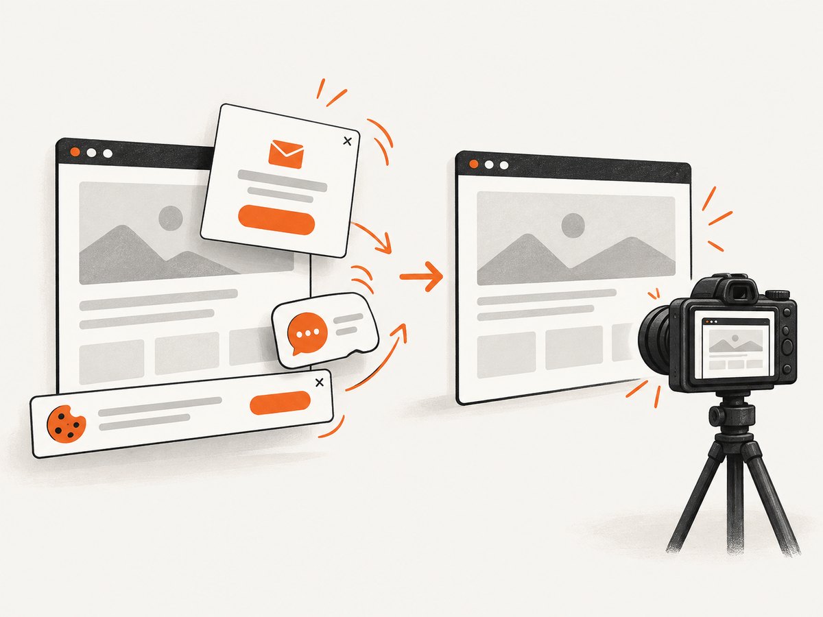
Before each capture, ScreenshotNeo accepts cookie and consent banners and removes more than 60 known consent platforms, newsletter popups, and chat widgets; each step can be turned off. Bot checks and CAPTCHAs, blank pages, timeouts, failed loads, and cache hits cost nothing, and the response identifies the result with X-Page-Verdict and X-Billed headers. Its MCP server exposes take_screenshot, get_page_info, and capture_pdf to Claude, Cursor, and other MCP clients.
The Free plan includes 1,000 screenshots each month with no card. Paid plans start at $5 for 3,000 shots; yearly billing gives two months free, and every feature is available on every plan. Create a free ScreenshotNeo account and start with the 1,000 monthly screenshots.
11. FAQ
Can I generate an image without opening a visible browser window?
Yes. Playwright and Puppeteer launch headless browser instances by default in common server workflows. The browser still renders the page before producing pixels.
Should I capture an element or the whole page?
Capture an element when the image represents one component. Use full-page mode for a document, and viewport mode when the visible fold is the product.
Why does the same HTML produce different images?
Fonts, viewport dimensions, device scale, browser versions, animation timing, and external assets can all change pixels. Pin those inputs and wait for a deterministic ready state.
Which format should I use for a social card?
Pick the format accepted by the destination. PNG preserves crisp text and transparency; JPEG and WebP can reduce file size when their quality controls meet your needs.
Can an AI agent request screenshots?
Yes. ScreenshotNeo includes an MCP server with screenshot, page-information, and PDF tools for MCP-compatible clients.


