How to Generate a Website Hero Image
Create a hero image that supports your message, survives responsive crops, loads quickly, and stays accessible.
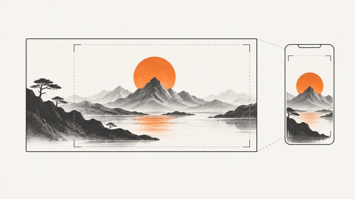
Generate a website hero image by designing for the page section first. Define the page purpose, focal subject, text placement, crop-safe composition, responsive variants, accessibility requirements, and delivery sizes before creating the artwork. Keep the headline and CTA as live HTML text, then review the finished image inside the real component at desktop, tablet, and mobile widths.
1. Define the hero brief before creating anything
Write a short brief that answers:
- Audience: Who should understand this page immediately?
- Purpose: What action or idea should the hero support?
- Subject: What person, product, place, or abstract idea is pictured?
- Mood and palette: Which colors and visual qualities fit the brand?
- Text position: Where will the live headline, supporting copy, and CTA appear?
- Crop behavior: Which parts must remain visible when the image is cropped?
- Variants: Does the component need separate desktop, tablet, and mobile artwork?
Ask for uncluttered negative space on the text side and keep the focal subject away from likely crop edges. Do not ask artwork to render the headline, body copy, or button. The National Science Foundation states that “Text in an image, except for pure decoration, creates accessibility issues.” Live text can reflow, remain selectable, be translated, and work with assistive technology.
2. Choose dimensions from the component specification
There is no universal hero-image size. The correct dimensions depend on the component’s aspect ratio, fixed height, crop rules, and supported breakpoints.
| Documented example | Dimensions | How to use it |
|---|---|---|
| NSF preferred full-width hero | 1920 × 1080 (16:9) | A useful starting point for a wide full-width component. NSF also lists 1366 × 768 at the same ratio. |
| NCI widescreen hero | 2800 × 854 at 2× | Use only when implementing that NCI component specification. |
| NCI desktop hero | 2048 × 854 at 2× | Component-specific desktop upload size. |
| NCI tablet-large hero | 1760 × 854 at 2× | Component-specific tablet upload size. |
| NCI tablet and large mobile | 16:9, minimum 1280 × 720 at 2× | Use the documented 16:9 treatment for those breakpoints. |
| NCI mobile | 1:1, minimum 640 × 640 at 2× | Use a square crop or a separate mobile asset. |
| Shopify editorial recommendation | 1600 × 500 desktop; 800 × 1200 mobile | An ecommerce recommendation, not a web standard. |
Before exporting, inspect the actual theme or design-system specification. Compare aspect ratio, fixed height, crop behavior, support for art-directed mobile images, text location, visual resolution, and resulting file weight.
3. Compose for responsive cropping
A wide image can look correct in an editor and fail inside a real hero component. NSF warns that hero components can crop images unpredictably at different sizes. Keep the subject and its meaning visible after center-cropping or resizing.
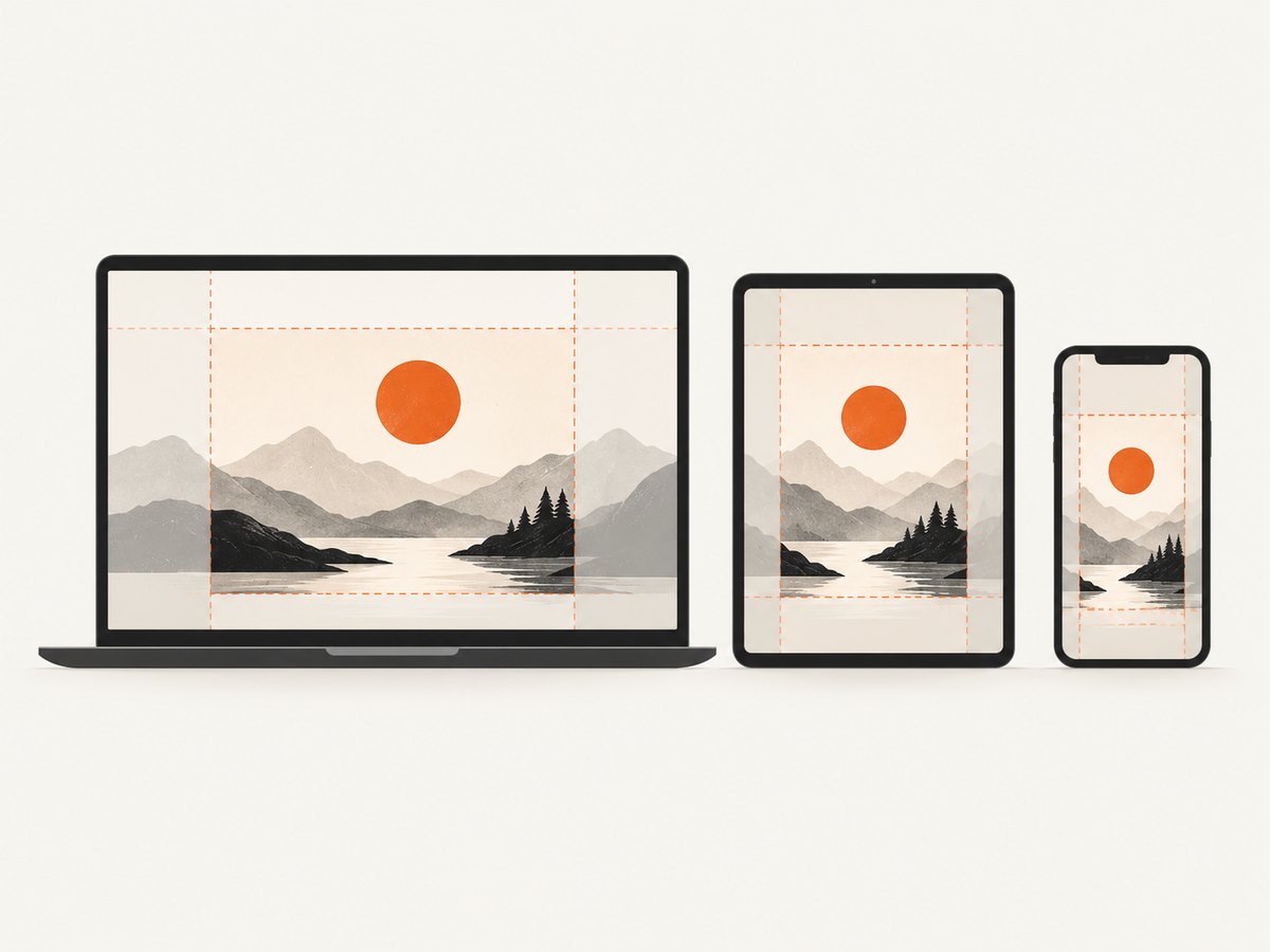
- Place the focal subject inside the area shared by the desktop and mobile crops.
- Leave quiet visual space where the live headline and CTA will sit.
- Keep faces, products, and important edges away from likely crop boundaries.
- Preview the image at the actual CSS sizes used by the page.
- If the full composition must be visible, use a component that displays it fully instead of relying on an aggressive background crop.
- Create a distinct mobile crop when one composition cannot preserve the subject and text space at every breakpoint.
NCI’s guidance also connects hero layout to page purpose: use one primary CTA when there is a clear next step, and use a CTA strip only for a small related group of actions. Its label limits belong to that component and should not be treated as universal rules.
4. Generate, photograph, or assemble the artwork
Choose the source that fits the page:
- Original photography: Useful for products, people, locations, and events. Shoot wider than the final crop so responsive layouts have room.
- Licensed stock: Check the license, permitted use, attribution requirements, and whether recognizable people or trademarks need additional clearance.
- Graphic composition: Combine shapes, illustrations, screenshots, and photography in an online design tool. Shopify names Canva, Visme, and Adobe tools as examples.
- Generated artwork: Prompt for the subject, composition, palette, aspect ratio, focal position, and negative space. Review every output for inaccurate products, people, logos, text, and brand details before publication.
Keep the prompt tied to the page’s real subject. Do not rely on generated lettering for the headline or CTA. The artwork should provide atmosphere and visual focus while the page supplies the meaning in live text.
Example image-generation brief
Wide editorial hero illustration for a developer documentation page.
Subject: a browser window showing a clean product dashboard on a desk.
Composition: subject on the right third, generous quiet negative space on the left
for live HTML headline and CTA, no important detail near the edges.
Style: restrained blue and graphite palette, soft daylight, crisp geometric forms.
Output: 16:9 landscape, no words, no letters, no logos, no buttons, no UI copy.
5. Build responsive image variants
Generate or transform candidates at widths close to the image’s actual rendered widths. Use srcset and sizes when the same composition works at different resolutions. Use <picture> when mobile needs a genuinely different crop.
One composition with responsive resolutions
<img
  src="/images/hero-1280.webp"
  srcset="
    /images/hero-640.webp 640w,
    /images/hero-960.webp 960w,
    /images/hero-1280.webp 1280w,
    /images/hero-1920.webp 1920w"
  sizes="(max-width: 640px) 100vw, (max-width: 1200px) 100vw, 1920px"
  width="1920"
  height="1080"
  alt="A developer reviewing a website screenshot workflow"
>
The src, srcset, and sizes attributes work together so the browser can select an appropriate candidate. Three to five sizes are common, but the right set depends on your rendered widths and delivery system.
Art-directed mobile crop
<picture>
  <source
    media="(max-width: 700px)"
    srcset="/images/hero-mobile-square.webp"
  >
  <source
    media="(max-width: 1200px)"
    srcset="/images/hero-tablet.webp"
  >
  <img
    src="/images/hero-desktop.webp"
    width="1920"
    height="1080"
    alt="A developer reviewing a website screenshot workflow"
  >
</picture>
Use an empty alt attribute, alt="", when the image is purely decorative and the adjacent live text communicates the section. For an informative image, describe its role in context rather than stuffing keywords.
6. Implement the hero section
<section class="hero" aria-labelledby="hero-title">
  <div class="hero__content">
    <h1 id="hero-title">Generate better website screenshots</h1>
    <p>Capture pages with a clean, predictable image workflow.</p>
    <a class="button" href="/docs">Read the guide</a>
  </div>
  <picture class="hero__media">
    <source media="(max-width: 700px)" srcset="/images/hero-mobile.webp">
    <img
      src="/images/hero-desktop.webp"
      width="1920"
      height="1080"
      alt="A browser page being prepared for a clean screenshot"
    >
  </picture>
</section>
.hero {
position: relative;
display: grid;
min-height: 32rem;
align-items: center;
overflow: hidden;
background: #172033;
}
.hero__media,
.hero__media img {
position: absolute;
inset: 0;
width: 100%;
height: 100%;
}
.hero__media img { object-fit: cover; }
.hero__content {
position: relative;
z-index: 1;
max-width: 34rem;
margin-inline: clamp(1rem, 8vw, 8rem);
color: white;
}
.button:focus-visible {
outline: 3px solid #fff;
outline-offset: 3px;
}
@media (max-width: 700px) {
.hero { min-height: 38rem; align-items: end; }
.hero__content { margin: 1.25rem; padding-bottom: 1.5rem; }
}Set intrinsic width and height, or an equivalent aspect ratio, so the browser can reserve space while the image loads. This reduces layout shift but does not by itself make the image download faster.
7. Optimize delivery and performance
- Export only the dimensions the component can render. Do not send a 1920-pixel desktop file to a small phone when a smaller candidate is available.
- Choose PNG, JPEG, WebP, or another supported format based on the artwork, browser support, compression, and delivery setup.
- Compress until the visual result is acceptable at the real display size.
- Reserve layout space with dimensions or
aspect-ratio. - Use a responsive image CDN or transformation service when it reliably creates the required variants.
- Preload the hero only when it is the page’s actual above-the-fold priority; avoid preloading every image.
- Lazy-load below-the-fold images, but do not defer the primary hero without a reason.
Shopify documents format negotiation through its own CDN, but that behavior should not be assumed for another host. Web.dev’s responsive-image guidance explains the browser selection process and why appropriately sized candidates matter.
8. Accessibility review
- Keep the headline and CTA in live HTML.
- Write contextual alt text for informative images.
- Use
alt=""for decorative images. - Check text contrast against the final image, including the darkest and lightest crop areas.
- Ensure every CTA is reachable and usable from the keyboard.
- Do not communicate essential meaning through color or image detail alone.
- Review the actual mobile crop; a contrast-safe desktop crop can become unreadable on a phone.
Google recommends descriptive alt text and warns against keyword stuffing. Its developer guidance recommends empty alt text for purely decorative imagery. Shopify’s checklist also points to WCAG contrast and keyboard review. WebAIM’s February 2026 million-home-page report detected low-contrast text on 83.9% of sampled home pages and missing alternative text on 53.1%; those figures describe automated detections on home pages, not hero images specifically, and automated tools have limits.
9. Review at real breakpoints
- Open the page at desktop, tablet, and mobile widths.
- Confirm that the focal subject remains understandable after every crop.
- Check that the headline does not cover important detail.
- Test CTA contrast, focus state, and keyboard operation.
- Confirm that layout space is reserved before the image loads.
- Use browser network tools to verify that the selected candidate is appropriate for the viewport.
- Inspect slow connections and zoomed text sizes.
- Ask someone unfamiliar with the page what the hero communicates before reading the body.
Or skip the browser setup
If you need screenshots of an existing page for hero references, content QA, or automated workflows, ScreenshotNeo returns a PNG, JPEG, WebP, or PDF from one GET request. Read the ScreenshotNeo API documentation for the complete parameter list.
curl -G "https://api.screenshotneo.com/v1/shot" -d access_key=YOUR_API_KEY --data-urlencode url=https://stripe.com -o shot.webpimport requests
r = requests.get("https://api.screenshotneo.com/v1/shot", params={"access_key": "YOUR_API_KEY", "url": "https://stripe.com"}, timeout=90)
open("shot.webp", "wb").write(r.content)const q = new URLSearchParams({ access_key: 'YOUR_API_KEY', url: 'https://stripe.com' });
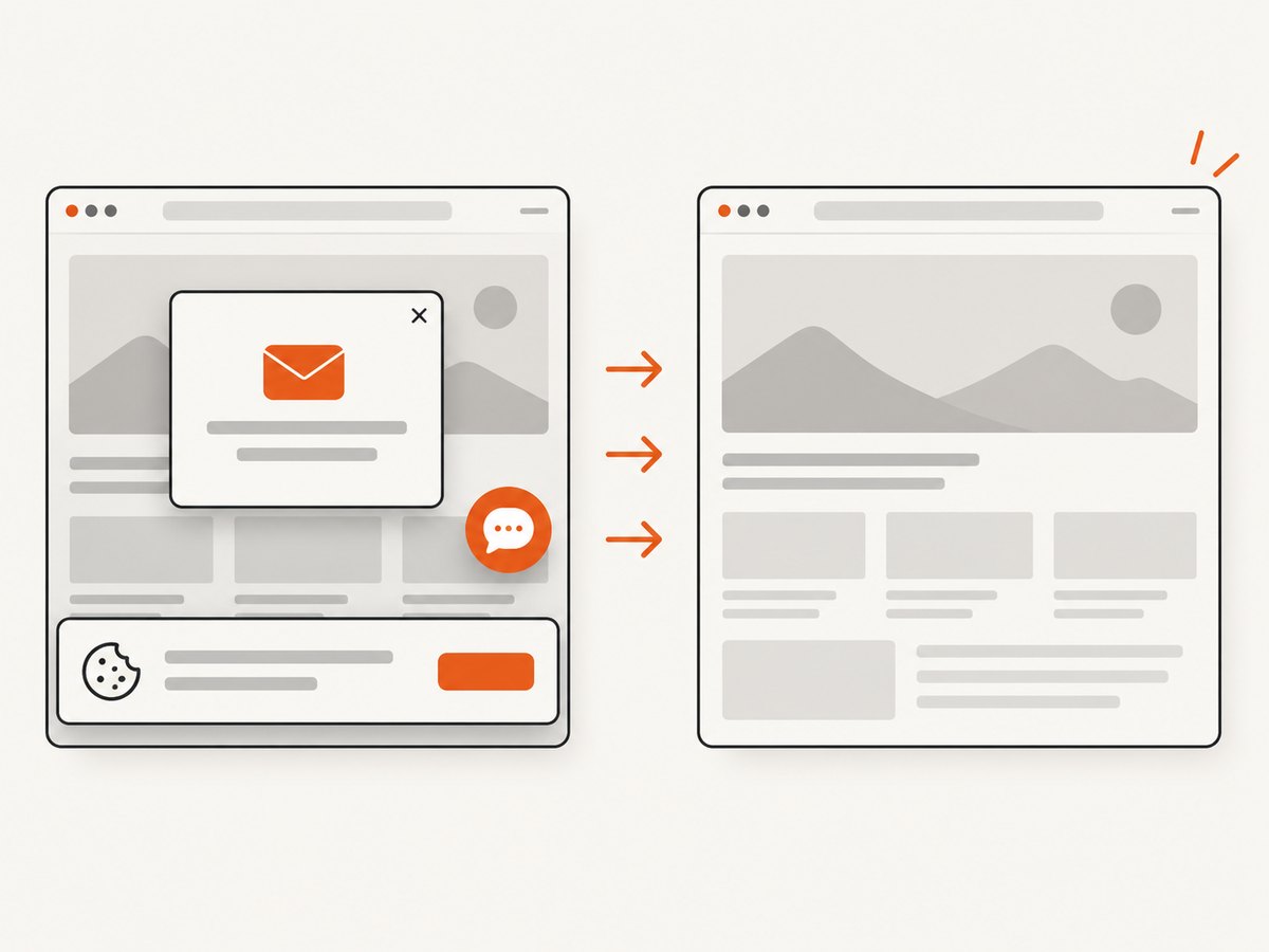
const res = await fetch(`https://api.screenshotneo.com/v1/shot?${q}`);ScreenshotNeo removes cookie and consent banners, newsletter popups, and chat widgets before capture. Bot checks, blank pages, failed loads, timeouts, and cache hits are not billed, and response headers identify the page verdict and billing status. Its MCP server lets Claude, Cursor, and other MCP clients use take_screenshot, get_page_info, and capture_pdf. You can also set full-page capture, a CSS element selector, dark mode, device or viewport, retina scale, custom CSS and JavaScript, click actions, waits, blocked requests, headers, cookies, user agent, timezone, geolocation, transparent backgrounds, resizing, caching TTL, signed links, asynchronous webhooks, bulk capture for up to 100 URLs, and usage reporting. One thousand screenshots per month are free with no card; paid plans start at $5 for 3,000 shots. Create a free ScreenshotNeo account.
Troubleshooting
The subject is cut off on mobile
Cause: The desktop composition is being cropped into a narrower or taller container.
Fix: Move the subject toward the shared safe area, change the component’s object position, or provide a mobile-specific <picture> source.
The headline is hard to read
Cause: The image has high-detail or high-contrast pixels behind the text.
Fix: Reserve quieter negative space, add a tested overlay, move the text, or use a different crop. Check contrast on the actual rendered image.
The hero causes layout shift
Cause: The browser does not know the image’s dimensions before it loads.
Fix: Add intrinsic width and height or set an explicit aspect ratio on the media container.
The page feels slow on phones
Cause: A desktop-sized image is being downloaded for a small viewport, or the file is insufficiently compressed.
Fix: Add srcset and sizes, create smaller variants, compress the selected format, and inspect the network panel on a throttled connection.
The artwork contains broken words or fake UI
Cause: Generated-image systems often render lettering and interface details inaccurately.
Fix: Regenerate with an explicit no-text instruction, remove inaccurate details during editing, and place all required copy and controls in HTML.
The image has no useful alt text
Cause: The alt attribute was omitted, used as a keyword list, or treated as a caption.
Fix: Describe the image’s meaning in context, or use alt="" when it is decorative and nearby text already conveys the information.
A screenshot includes consent banners or popups
Cause: A normal browser capture records the page before its visitor-facing overlays are dismissed.
Fix: Dismiss the overlays in your browser automation, hide the relevant selectors, or use ScreenshotNeo, which accepts consent banners and removes more than 60 known consent platforms plus newsletter popups and chat widgets before capture.
Performance, reliability, and cost notes
- Designing one wide image and forcing it into every breakpoint can reduce image count but often produces poor crops. Separate art direction is worth the extra asset when meaning or readability depends on it.
- Responsive variants reduce transfer size, while intrinsic dimensions reduce layout movement. They solve different problems.
- Compression settings should be judged at the displayed size, not at 400% zoom in an editor.
- Cache immutable image variants with long-lived cache headers and use content-hashed filenames when your deployment supports them.
- For automated screenshots, retries should distinguish navigation failures, bot checks, blank pages, and valid captures. ScreenshotNeo exposes page verdict and billing headers, and failed loads, blank pages, bot checks, timeouts, and cache hits are not billed.
- ScreenshotNeo caching lets you choose a TTL; asynchronous jobs and signed webhooks are useful when a capture should not block a request. Bulk capture supports up to 100 URLs per call.
FAQ
What is the best size for a website hero image?
Use the dimensions required by your component. NSF lists 1920 × 1080 as a preferred full-width example, while NCI specifies several breakpoint-specific sizes, including a square mobile asset.
Should hero text be inside the image?
No. Keep essential wording as live HTML so it remains accessible, selectable, responsive, and localizable.
Do I need a separate mobile hero image?
Only when the desktop composition cannot preserve the subject, meaning, or text contrast after mobile cropping. Use art direction when a responsive resolution of the same image is not enough.
Is a hero image always decorative?
No. If it conveys information that the surrounding text does not, provide contextual alt text. If it only supplies atmosphere and the live text carries the meaning, use an empty alt attribute.
Can I generate a hero image with text already included?
You can, but essential text inside an image creates accessibility and responsive-cropping problems. Generate the artwork without words and place the copy in HTML.
How can I capture a clean reference screenshot?
Use a browser automation workflow that handles consent and overlays, or use ScreenshotNeo’s screenshot API and MCP tools to capture a page after those distractions are removed.
Primary references
- National Science Foundation, hero-image author guidance.
- NCI Design System, hero component guidance.
- web.dev responsive images guide.
- Google image SEO and alt-text guidance.
- WebAIM Million report.
- Shopify hero-image guidance.


