How to Get Screen Coordinates with getBoundingClientRect() When CSS Zoom Is Applied
getBoundingClientRect() already includes CSS zoom. Learn which coordinate space it returns, how to convert to document coordinates, and what changes on mobile.

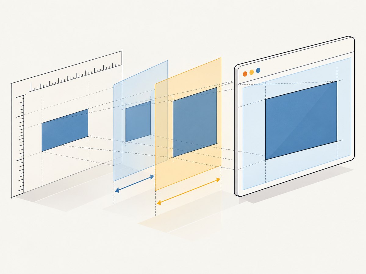
Element.getBoundingClientRect() already accounts for CSS zoom. Its left, top, right, bottom, width, and height describe the element’s rendered rectangle in viewport-relative CSS pixels. Do not multiply those values by the CSS zoom again.
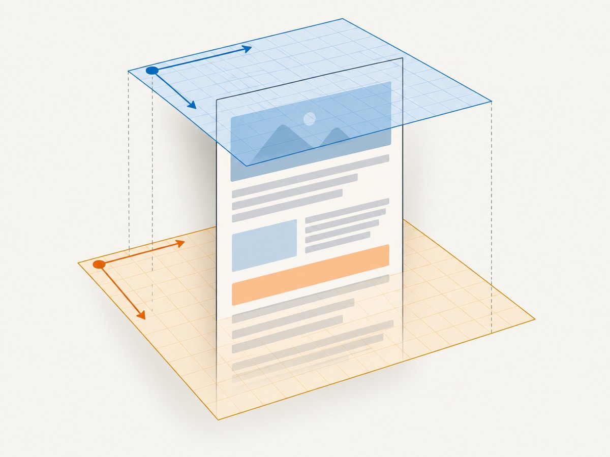
For document-relative coordinates, add the page scroll offset. These are still CSS pixels, not physical display pixels. The phrase “screen coordinates” can mean several different origins and units, so identify the coordinate space your code needs before converting.
const element = document.querySelector(".target");
if (!element) throw new Error("Target element not found");

const rect = element.getBoundingClientRect();
const viewport = {
  left: rect.left,
  top: rect.top,
  width: rect.width,
  height: rect.height,
};
const documentPosition = {
  left: rect.left + window.scrollX,
  top: rect.top + window.scrollY,
};

console.log({ viewport, documentPosition });
The CSSOM View draft says rectangle APIs return scaled lengths, and MDN documents that getBoundingClientRect() includes CSS zoom effects. CSS Viewport Module Level 1 draft · MDN: getBoundingClientRect() · MDN: currentCSSZoom.
1. What coordinates does getBoundingClientRect() return?
The returned DOMRect is relative to the viewport’s top-left corner. Its dimensions include the element’s padding and border. The values are CSS pixels: browser layout and rendering units, not guaranteed physical pixels on a monitor.
| Value | Meaning | Origin or unit |
|---|---|---|
rect.left, rect.top |
Rendered upper-left position | Viewport origin, CSS pixels |
rect.right, rect.bottom |
Rendered lower-right edges | Viewport origin, CSS pixels |
rect.width, rect.height |
Rendered border-box size | CSS pixels |
window.scrollX, window.scrollY |
Page scroll displacement | CSS pixels from document origin |
Scrolling changes the viewport-relative position of a fixed document element. To express that point relative to the document origin, add scroll offsets to its viewport coordinates. This changes the origin, not the unit.
2. How CSS zoom affects the rectangle
CSS zoom magnifies or reduces an element and can affect layout. A value of 1 or 100% is normal scale; 1.25 means 125% and 80% means 80%. If a zoomed element renders 200 CSS pixels wide at the relevant scale, the rectangle reports its rendered geometry. Do not apply the same scale a second time.
.panel {
  zoom: 1.25;
  width: 240px;
}
transform: scale() is related but not interchangeable. A transform changes visual rendering without recalculating surrounding layout in the same way CSS zoom does. If an application uses transforms, inspect the resulting rectangle directly rather than assuming layout dimensions and visual dimensions match. MDN: CSS zoom.
Zoom can come from ancestors as well as the target. The effective zoom is the accumulated zoom through the ancestor chain. The newer Element.currentCSSZoom property reports that effective value where supported; for example, ancestor zooms of 2 and 3 combine to 6. It is useful for understanding measurements from APIs that do not incorporate zoom. It is not a multiplier for a DOMRect. MDN marks this property newly available since March 2026, so check support if older browsers are in scope.
3. Choose the coordinate system first
Viewport coordinates
Use rect.left and rect.top directly when positioning an overlay with position: fixed in the same viewport coordinate space:
const rect = target.getBoundingClientRect();
const overlay = document.querySelector(".overlay");
if (!overlay) throw new Error("Overlay not found");

overlay.style.position = "fixed";
overlay.style.left = `${rect.left}px`;
overlay.style.top = `${rect.bottom}px`;
Document coordinates
Use document coordinates when storing a location relative to the page or comparing it to a document-origin measurement. Keep the positioning scheme consistent with that origin.
function getDocumentRect(element) {
  const rect = element.getBoundingClientRect();
  return {
    left: rect.left + window.scrollX,
    top: rect.top + window.scrollY,
    right: rect.right + window.scrollX,
    bottom: rect.bottom + window.scrollY,
    width: rect.width,
    height: rect.height,
  };
}
For ordinary document flow, an absolutely positioned element in a positioned ancestor uses that ancestor’s coordinate system, not automatically the document origin. Convert relative to the actual containing block when placing it there.
Visual viewport on mobile
On mobile, the visual viewport—the area currently visible to the user—can move or shrink independently from the layout viewport. Pinch zoom, the on-screen keyboard, and browser UI changes can affect it. If an interaction must track what is visibly on screen, inspect window.visualViewport and its offsetLeft, offsetTop, width, height, and scale as relevant. These describe visual viewport state; they are not a CSS zoom multiplier to apply indiscriminately to the DOMRect. MDN: VisualViewport.
const rect = target.getBoundingClientRect();
const vv = window.visualViewport;

console.log({
  elementViewport: { left: rect.left, top: rect.top },
  visualViewport: vv && {
    offsetLeft: vv.offsetLeft,
    offsetTop: vv.offsetTop,
    width: vv.width,
    height: vv.height,
    scale: vv.scale,
  },
});
Physical screen coordinates
A DOMRect is not an operating-system screen rectangle. Mapping it to physical display pixels can depend on browser window placement, page zoom, device pixel ratio, and visual viewport state. There is no universal conversion formula established by the sources for every browser and platform. If a native API, remote desktop, or image-processing system needs display pixels, specify that system’s coordinate convention and verify the mapping in the target environment.
4. Avoid mixing measurement APIs
A common source of apparent inconsistency is combining values that use different zoom behavior. getBoundingClientRect() reflects CSS zoom. Client and offset properties such as clientWidth, clientHeight, offsetWidth, and offsetHeight, along with scrolling APIs, do not include zoom in the same way.
| Measurement | CSS zoom behavior | Use |
|---|---|---|
getBoundingClientRect() |
Includes scaled geometry | Rendered viewport rectangle |
clientWidth, clientHeight |
Not scaled the same way | Client box measurements |
offsetWidth, offsetHeight |
Not scaled the same way | Layout box measurements |
scrollX, scrollY |
Not a DOMRect zoom conversion | Shift viewport origin to document origin |
Compare like with like. If the task is to place something at the rendered edge, use the rectangle. If the task is to reason about layout dimensions, use the appropriate layout API and account for the documented difference instead of treating the numbers as interchangeable.
5. Practical implementation checklist
- Define the origin. Decide whether you need viewport, document, visual viewport, or platform screen coordinates.
- Read the DOMRect. Use
getBoundingClientRect()for rendered geometry. - Do not reapply CSS zoom. The rectangle already contains it.
- Convert the origin only if needed. Add
scrollX/scrollYfor document-relative positions. - Keep units consistent. DOM measurements are CSS pixels; native display APIs may use another unit.
- Account for mobile state. Inspect the visual viewport if the visible region can move or resize.
- Recompute after layout changes. Scrolling, resizing, content loading, and zoom changes can make a stored rectangle stale.
6. Runnable example: track an element after scroll and resize
This small page places a fixed marker at the lower edge of a zoomed target. It recalculates on scroll and resize so the viewport-relative rectangle stays current.
<!doctype html>
<meta name="viewport" content="width=device-width, initial-scale=1">