How to Create High-Definition Website Screenshots
Learn how viewport size, DPR, scaling and full-page capture affect screenshot sharpness, with Chrome, Playwright and ScreenshotNeo workflows.
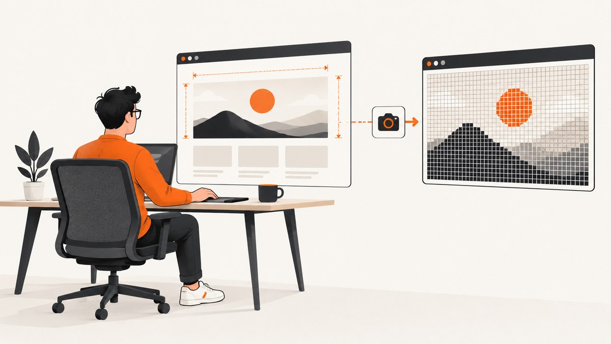
To create a high-definition website screenshot, set the correct CSS viewport first, then choose an output scale or device pixel ratio (DPR) that provides the pixels you need. A larger DPR increases output resolution for the same layout; it does not make the page use a wider desktop layout. Use Chrome DevTools for an occasional capture, Playwright for repeatable automation, or a screenshot API when you need a managed browser workflow.
This guide explains viewport and full-page screenshots, CSS pixels versus device pixels, browser settings, runnable Playwright code, cURL, Python and Node.js API examples, configuration choices, troubleshooting, performance, reliability and cost considerations.
1. Understand what makes a screenshot high definition
A webpage has a layout size and an output pixel density. The CSS viewport controls how the page lays out: breakpoints, columns, navigation, typography and responsive images all respond to its width and height. DPR describes the relationship between physical pixels and logical CSS pixels. Chrome defines DPR as “the ratio between physical pixels on the hardware screen and logical (CSS) pixels).” Chrome DevTools documentation explains the same relationship in Device Mode.
For example, a 1440 CSS-pixel-wide viewport captured at a scale of 1 produces about 1440 output pixels across. The same viewport at a device scale factor of 2 produces about 2880 output pixels across. The page still follows the 1440-pixel layout; only the rasterized image is denser. A high scale can improve text and vector sharpness while increasing memory use, processing time and file size.
| Setting | What it controls | Typical use |
|---|---|---|
| Viewport width and height | Responsive layout and visible area | Match a desktop, tablet or mobile breakpoint |
| DPR/device scale factor | Output pixels per CSS pixel | Retina-density images and print-quality assets |
| Viewport screenshot | Only the visible browser area | Hero sections, above-the-fold QA, social cards |
| Full-page screenshot | The complete scrollable document | Long pages, archives and visual regression records |
| Element screenshot | One DOM element’s bounding box | Cards, charts, logos or components |
Do not use a higher scale to compensate for the wrong viewport. A mobile layout captured at 2x remains a mobile layout, and a desktop page captured at 1x can still be perfectly sharp for its intended output.
2. Choose viewport, full-page or element capture
Start by deciding what the image must communicate:
- Viewport capture: captures the screen state at a defined width and height. Use it for responsive design checks, landing-page previews and above-the-fold marketing images.
- Full-page capture: includes content below the fold. Use it for documentation, long-form pages and visual comparisons. Very tall pages can create large files and may expose sticky-header behavior or lazy-loading quirks.
- Element capture: isolates a component with a CSS selector. Use it when surrounding navigation or whitespace would reduce usefulness.
Chrome DevTools provides Capture screenshot for the current viewport and Capture full size screenshot for the entire page. Open Device Mode when you need a particular responsive viewport or DPR, then verify the resulting image dimensions. The official Device Mode guide documents these controls.
3. Create a high-definition screenshot in Chrome DevTools
- Open the target URL in Chrome.
- Open DevTools and toggle Device Mode.
- Choose a device preset or enter an explicit viewport width and height.
- Set the DPR/device scale setting appropriate to the output. Keep the viewport fixed when comparing screenshots.
- Open the DevTools screenshot menu and choose Capture screenshot for the visible area or Capture full size screenshot for the complete document.
- Open the saved file and check its pixel dimensions, text edges, image loading and any fixed or sticky elements.
For a one-off image, this is usually the fastest route. It is less suitable for a batch because a person must repeat the settings and navigation steps. A full-page image can also be awkward to inspect when the document is extremely tall.
4. Automate high-definition captures with Playwright
Playwright gives you explicit control over viewport, device scale factor and screenshot target. Its screenshot API supports a page, an element or the full scrollable page. The scale option selects CSS-pixel output or device-pixel output. See the Page screenshot API and emulation guide.
Install Playwright
npm init -y
npm install playwright
npx playwright install chromium
Viewport screenshot at device density
const { chromium } = require('playwright');

(async () => {
  const browser = await chromium.launch();
  const context = await browser.newContext({
    viewport: { width: 1440, height: 900 },
    deviceScaleFactor: 2,
  });
  const page = await context.newPage();
  await page.goto('https://example.com', { waitUntil: 'networkidle' });
  await page.screenshot({ path: 'viewport-hd.png', scale: 'device' });
  await browser.close();
})();
The viewport remains 1440 by 900 CSS pixels, while the output is approximately twice as dense in each dimension. Use scale: 'css' when you want one output pixel per CSS pixel regardless of the context’s device scale.
Full-page screenshot
const { chromium } = require('playwright');

(async () => {
  const browser = await chromium.launch();
  const context = await browser.newContext({
    viewport: { width: 1366, height: 768 },
    deviceScaleFactor: 2,
  });
  const page = await context.newPage();
  await page.goto('https://example.com', { waitUntil: 'networkidle' });
  await page.screenshot({
    path: 'full-page-hd.png',
    fullPage: true,
    scale: 'device',
  });
  await browser.close();
})();
Capture one element
const card = page.locator('.pricing-card').first();
await card.screenshot({ path: 'pricing-card.png', scale: 'device' });
Make repeated captures reproducible
Set the context viewport and device scale factor in code rather than relying on the machine’s monitor. Record the URL, viewport, scale, browser version, color scheme and capture time beside each artifact. Choose fullPage: true for a complete document and omit it for the visible viewport. Device emulation controls improve repeatability, but they do not prove that the result is identical to rendering on every physical device.
5. Handle loading, lazy content and dynamic pages
Sharp pixels are useless if the page is captured before its content appears. Navigate with an appropriate wait condition, then wait for a meaningful selector when possible.
await page.goto('https://example.com/catalog', { waitUntil: 'domcontentloaded' });
await page.locator('.product-grid').waitFor({ state: 'visible' });
await page.waitForTimeout(500);
await page.screenshot({ path: 'catalog.png', fullPage: true, scale: 'device' });
networkidle can be unreliable on pages with analytics, streaming or long polling. A selector wait plus a short, documented delay is often more deterministic. For lazy images, scroll the page or use the page’s own loading behavior before capture. Disable animations in a test stylesheet when visual comparisons require stable frames.
6. Output formats, dimensions and practical limits
- PNG: lossless and well suited to text, UI and transparency. It can become large for photographic pages.
- JPEG: smaller for photos, but introduces compression artifacts around text and sharp edges.
- WebP: often provides a useful size-quality compromise and supports transparency in modern tooling.
Multiply CSS width and height by the chosen scale to estimate output dimensions. A 1200 × 800 CSS viewport at 2x is approximately 2400 × 1600 pixels. Full-page height can be many times the viewport height, so check downstream limits in image viewers, CMSs and social platforms. If an image is too large, reduce scale, capture an element, resize after capture or split a long document into sections.
7. Or skip the browser setup
ScreenshotNeo provides a website screenshot API and MCP server. One GET request returns PNG, JPEG, WebP or PDF. Its controls include full-page capture with lazy images loaded, CSS-selector element capture, dark mode, 12 device presets or any viewport, retina scale, custom CSS and JavaScript, selector waits, delays, network-idle waits, click actions, hidden selectors, blocked ads and trackers, custom headers, cookies, user agents and Authorization, timezone and geolocation, transparent backgrounds, resizing, caching with a chosen TTL, signed links, asynchronous jobs with signed webhooks, bulk capture of up to 100 URLs per call, usage reporting and an OpenAPI specification. Common parameter names used by other screenshot APIs also work.
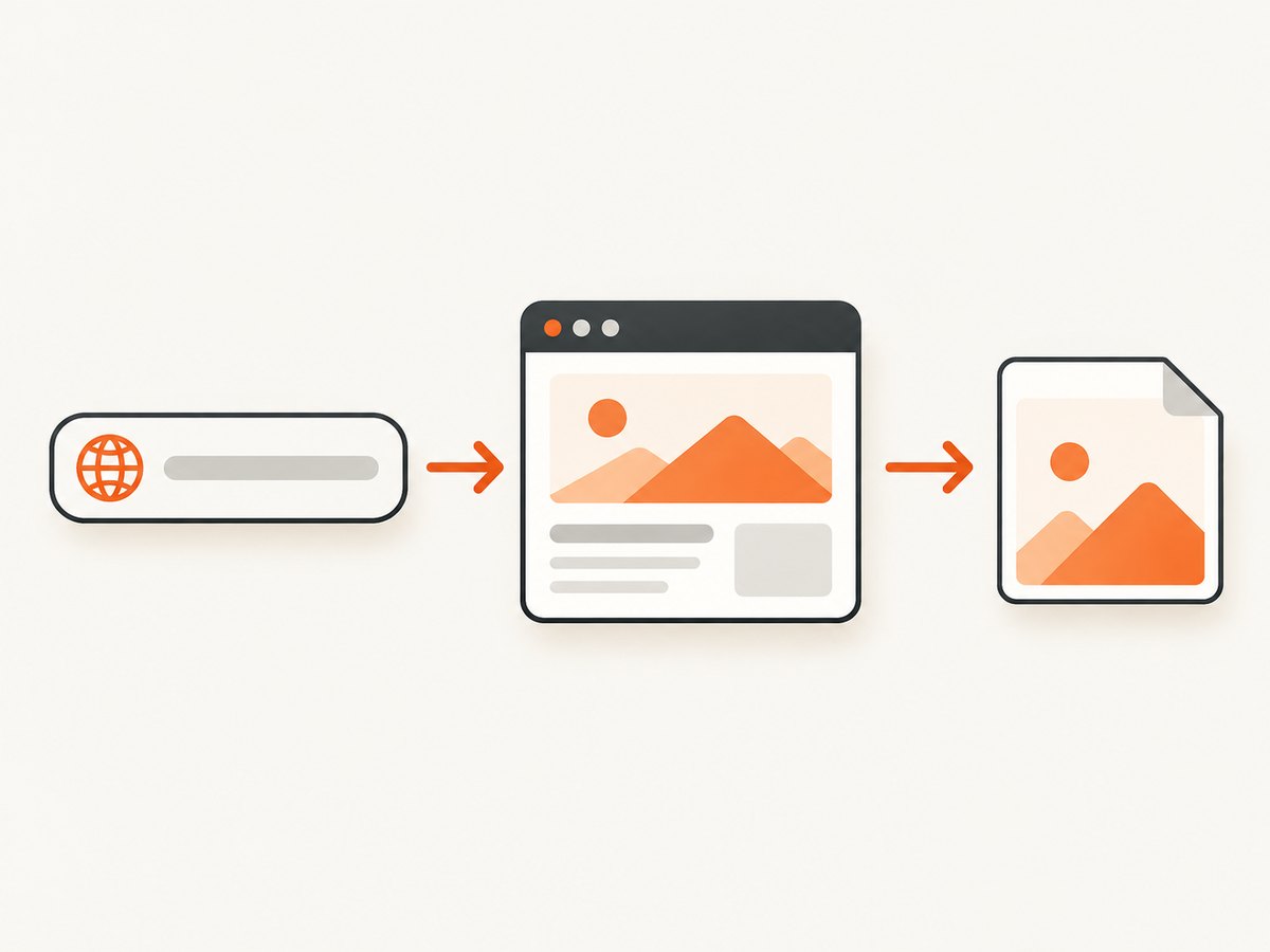
See the ScreenshotNeo documentation for the complete parameter reference. These minimal calls capture https://stripe.com:
cURL
curl -G "https://api.screenshotneo.com/v1/shot" -d access_key=YOUR_API_KEY --data-urlencode url=https://stripe.com -o shot.webpPython
import requests
r = requests.get("https://api.screenshotneo.com/v1/shot", params={"access_key": "YOUR_API_KEY", "url": "https://stripe.com"}, timeout=90)
open("shot.webp", "wb").write(r.content)
Node.js
const q = new URLSearchParams({ access_key: 'YOUR_API_KEY', url: 'https://stripe.com' });
const res = await fetch(`https://api.screenshotneo.com/v1/shot?${q}`);
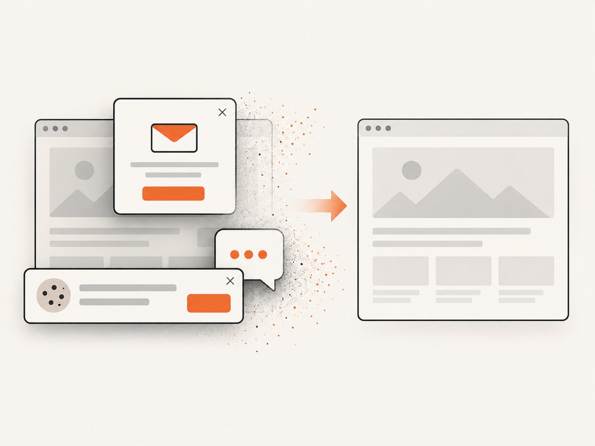
ScreenshotNeo accepts consent banners as a visitor and removes more than 60 known consent platforms, newsletter popups and chat widgets before capture. Each step can be disabled. Only clean shots are billed: bot checks or CAPTCHAs, blank pages, timeouts, failed loads and cache hits cost nothing. Response headers identify the result with X-Page-Verdict and X-Billed. An MCP server exposes take_screenshot, get_page_info and capture_pdf to Claude, Cursor and other MCP clients.
Free usage includes 1,000 screenshots per month without a card. Paid plans start at $5 for 3,000 shots; yearly billing provides two months free. This is useful when a repeatable capture service matters more than maintaining browser binaries, waiting logic and cleanup code.
8. Troubleshooting checklist
| Symptom | Likely cause | Fix |
|---|---|---|
| Image is sharp but layout is wrong | Viewport breakpoint is incorrect | Set the intended CSS width and height before changing DPR. |
| Text looks soft | Output scale is 1 or the source is rasterized | Use device scale or a higher ScreenshotNeo retina scale; verify source assets. |
| Full-page image stops early | Lazy content has not loaded | Wait for a content selector, scroll to trigger loading, then capture. |
| Blank or partially rendered page | Capture began before app hydration or a bot check appeared | Wait for a stable selector; inspect navigation and page verdict headers when using ScreenshotNeo. |
| Sticky header repeats down a full-page image | Fixed-position element is captured during stitching | Hide the selector temporarily or use custom CSS; inspect the result at section boundaries. |
| Playwright times out on network idle | Persistent analytics or streaming requests | Use domcontentloaded plus explicit selector and delay waits. |
| File is too large | High scale combined with a tall page | Use CSS scale, reduce viewport width, resize, or capture sections. |
| ScreenshotNeo response is not an image | Invalid key, URL or a non-clean page verdict | Check HTTP status and X-Page-Verdict/X-Billed; correct credentials and target access. |
9. Performance, reliability and cost
Higher DPR increases pixels roughly quadratically: doubling width and height creates about four times as many pixels. It can increase browser memory, encoding time and transfer size. Use the smallest scale that satisfies the destination. Full-page captures are more expensive to process than viewport or element captures because they include more content.
For batches, reuse a browser context in Playwright, keep viewport settings constant and avoid unnecessary font or animation changes. ScreenshotNeo offers caching with a TTL you choose and bulk capture for up to 100 URLs per call. Async jobs and signed webhooks help when captures take longer than a synchronous request. Cache hits are not billed, and failed loads, timeouts, blank pages and bot checks are not billed as clean shots.
For reliable comparisons, pin the viewport, scale, browser version, color scheme, timezone and geolocation. Keep authentication headers and cookies separate from public URLs, and avoid embedding API keys in client-side code. Signed links are available when a public <img> destination needs controlled access.
10. Recommended decision process
- Define the destination pixel dimensions and whether the image is viewport, full-page or element based.
- Choose the CSS viewport that produces the intended responsive layout.
- Choose CSS scale for compact output or device scale for denser pixels.
- Wait for stable content and account for lazy images, consent dialogs and fixed elements.
- Capture and inspect dimensions, text edges, loading state and file size.
- Automate with Playwright for local repeatability or use ScreenshotNeo when you need an API, MCP tools, cleanup and billing visibility.
11. FAQ
Does a higher DPR make a website wider?
No. DPR increases output pixels for the same CSS layout. Set viewport width to change responsive layout.
Should I always use full-page screenshots?
No. Use full-page for document-level records; use viewport or element capture when the visible state or one component is the subject.
Is 2x always better than 1x?
Only when the destination benefits from extra pixels. A 2x image is larger and can take longer to encode and transfer.
Can a screenshot prove a physical device looks identical?
No. Browser emulation controls viewport and device scale, but they do not guarantee identical rendering on every physical device.
When should I use an API instead of Playwright?
Use an API when you want a request-based workflow, managed browser infrastructure, batch or asynchronous jobs, consent cleanup, billing status and MCP access.
Start with the free ScreenshotNeo plan: sign up for 1,000 screenshots a month with no card.


