How to Take High-Resolution Screenshots with cy.screenshot() in Cypress
Configure Chrome’s window size and device scale factor, set the Cypress viewport, and verify the pixels your screenshot actually contains.
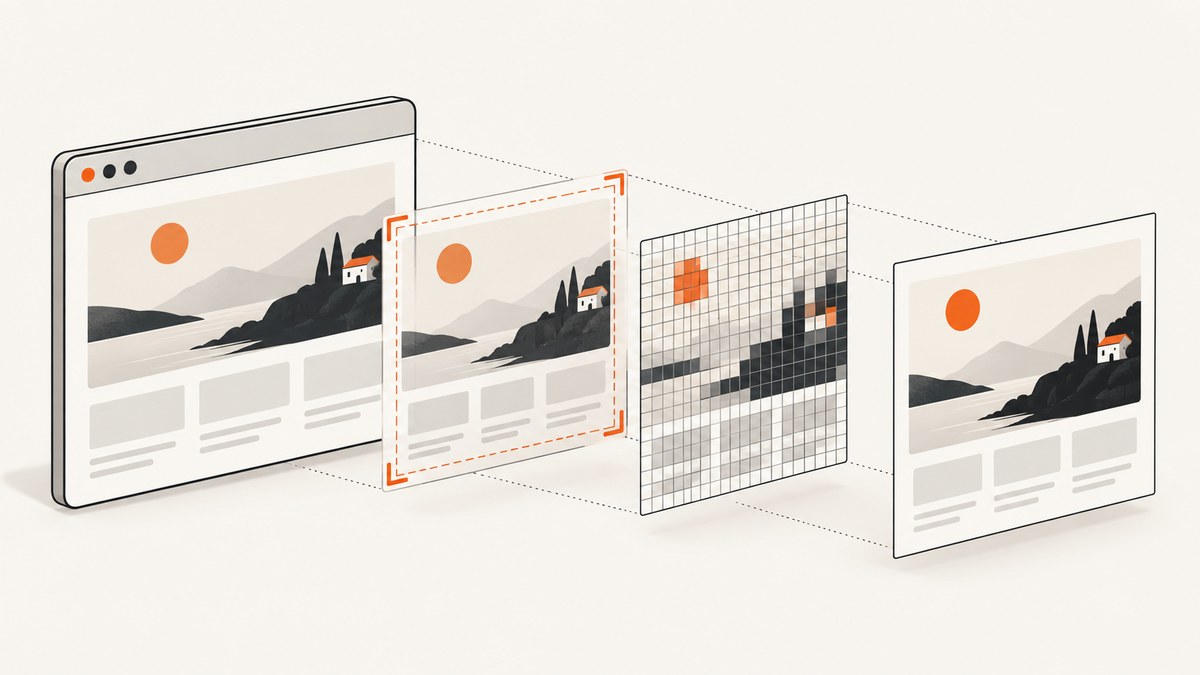
Direct answer: cy.viewport() controls the application layout in CSS pixels; it does not simulate a retina display. For higher-density screenshots in headless Chrome, set the browser window size and Chrome device scale factor in Cypress’s before:browser:launch hook, then choose the capture mode with cy.screenshot(). Verify the saved file or screenshot metadata instead of assuming the requested settings produced a particular pixel size.
Cypress documents that cy.viewport() does not simulate devicePixelRatio. The browser launch API documents the --window-size and --force-device-scale-factor arguments for headless Chrome. See the viewport API and browser launch API.
1. Configure high-resolution output
Add a browser launch hook to cypress.config.js (or cypress.config.ts) and set the application viewport in the test:
const { defineConfig } = require('cypress')

module.exports = defineConfig({
  e2e: {
    setupNodeEvents(on, config) {
      on('before:browser:launch', (browser, launchOptions) => {
        if (browser.name === 'chrome' && browser.isHeadless) {
          launchOptions.args.push('--window-size=1400,1200')
          launchOptions.args.push('--force-device-scale-factor=2')
        }
        return launchOptions
      })
    },
  },
})
describe('high-resolution screenshots', () => {
it('captures a retina-density viewport', () => {
cy.visit('https://example.com')
cy.viewport(1280, 800)
cy.screenshot('high-resolution-page', { capture: 'viewport' })
})
})The launch arguments affect the headless browser screen and device scale factor. The cy.viewport(1280, 800) call affects the page’s CSS layout. The final image dimensions depend on the browser, Cypress version, run mode, and capture type, so inspect the artifact after the run.
TypeScript configuration
import { defineConfig } from 'cypress'

export default defineConfig({
  e2e: {
    setupNodeEvents(on, config) {
      on('before:browser:launch', (browser, launchOptions) => {
        if (browser.name === 'chrome' && browser.isHeadless) {
          launchOptions.args.push('--window-size=1400,1200')
          launchOptions.args.push('--force-device-scale-factor=2')
        }
        return launchOptions
      })
    },
  },
})
2. Understand viewport, screen, scale, and pixels
| Setting | What it changes | What it does not guarantee |
|---|---|---|
cy.viewport(width, height) |
The application’s CSS viewport and responsive breakpoints. | A higher device pixel ratio or larger output bitmap. |
--window-size=w,h |
The headless Chrome window dimensions. | A specific screenshot size for every capture mode. |
--force-device-scale-factor=2 |
Chrome’s device scale factor for rendering. | That every Cypress run or browser produces identical pixels. |
scale screenshot option |
Whether Cypress scales the application to fit the browser viewport. | Retina rendering or a resolution multiplier. Cypress defaults it to false for viewport captures and coerces it to true for runner captures. |
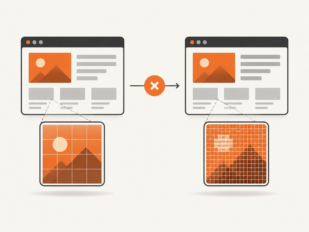
A 1280 × 800 CSS viewport at a scale factor of 2 may produce a bitmap around 2560 × 1600, but treat that as a result to verify, not a promise. Browser mode, operating system, Cypress version, and capture type can change the artifact.
3. Choose the right capture area
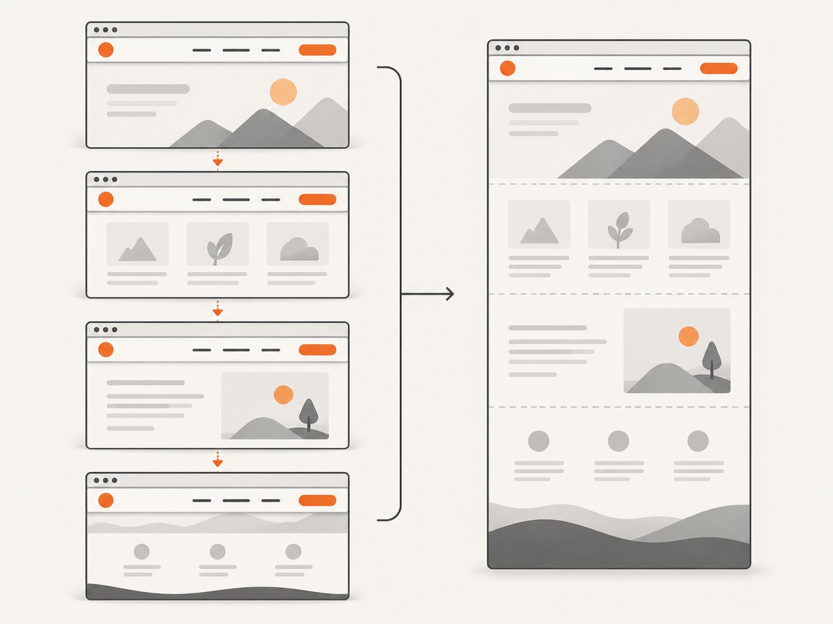
cy.screenshot() captures the application under test by default. Use capture to select the area:
// Visible application viewport
cy.screenshot('viewport', { capture: 'viewport' })

// Entire application, stitched from successive scroll positions
cy.screenshot('full-page', { capture: 'fullPage' })

// Browser viewport including the Cypress Command Log
cy.screenshot('runner', { capture: 'runner' })
Full-page mode scrolls from top to bottom and stitches captures. Fixed or sticky headers, lazy content, and scroll-triggered effects can need visual review after stitching. Runner captures include Cypress chrome and are usually unsuitable for product screenshots.
Element and clipped screenshots
// Element capture with padding in CSS pixels
cy.get('.report-card').screenshot('report-card', { padding: 12 })

// Pixel-coordinate crop from the current capture area
cy.screenshot('cropped', {
  capture: 'viewport',
  clip: { x: 20, y: 20, width: 400, height: 300 },
})
Element padding and clip change the capture region; neither increases device density. Use a scale-factor launch argument when the goal is more physical pixels.
4. Make the page stable before capture
High resolution does not fix a page that is still changing. Visit the page, set the viewport, wait for application state, and capture only after the important content is present:
cy.visit('/dashboard')
cy.viewport(1440, 900)
cy.get('[data-cy="dashboard"]', { timeout: 30000 }).should('be.visible')
cy.get('[data-cy="loading"]', { timeout: 30000 }).should('not.exist')
cy.screenshot('dashboard', {
  capture: 'viewport',
  overwrite: true,
})
Cypress disables timers and CSS animations during screenshots by default, but network responses, application state, fonts, and lazy-loaded content can still change around capture. For full-page images, ensure content has loaded before taking the shot; otherwise the stitched result may contain placeholders.
5. Verify the actual artifact
Cypress screenshot callbacks and the after:screenshot Node event can expose metadata such as dimensions, scaled, and pixelRatio. Log those details to catch configuration mistakes:
const { defineConfig } = require('cypress')

module.exports = defineConfig({
  e2e: {
    setupNodeEvents(on, config) {
      on('after:screenshot', (details) => {
        console.log(JSON.stringify({
          path: details.path,
          dimensions: details.dimensions,
          scaled: details.scaled,
          pixelRatio: details.pixelRatio,
        }))
      })
    },
  },
})
You can also inspect the output image with an image tool or metadata utility and record width, height, color mode, and file size in CI. The after:screenshot API describes the available details.
6. Keep visual regression screenshots reproducible
- Use the same browser family and version in local development and CI.
- Pin the viewport dimensions and device scale factor.
- Use the same operating system, installed fonts, and display scaling where possible.
- Wait for network data, fonts, images, and application transitions before capture.
- Choose one capture mode and keep it consistent between baseline and comparison runs.
- Review full-page images for sticky elements and scroll-position artifacts.
Cypress recommends generating and comparing screenshots in the same environment with a fixed viewport. Its visual testing guidance also notes that operating systems, browser versions, display scaling, and installed fonts can produce rendering differences; see Cypress visual testing guidance.
7. Troubleshooting
| Symptom | Likely cause | Fix |
|---|---|---|
Changing cy.viewport() does not create a sharper image. |
The command changes CSS layout, not devicePixelRatio. |
Set --force-device-scale-factor in before:browser:launch, then verify metadata or file dimensions. |
| Output dimensions are smaller than expected. | The browser was not launched with the intended window size or scale factor, or the capture mode scales content. | Confirm the hook runs for the selected browser and headless mode; inspect dimensions, scaled, and pixelRatio. |
| The launch hook has no effect. | The run uses Firefox, Electron, headed Chrome, or a different config file. | Check browser.name, browser.isHeadless, the selected project config, and the command used in CI. Apply browser-specific arguments only where supported. |
| Full-page screenshots contain duplicated headers. | Sticky or fixed elements are present while Cypress stitches scroll positions. | Review the stitched output; hide or temporarily unfix the element for the test, or capture a viewport/element instead. |
| Lazy images or charts are missing. | Content loads only after scrolling or after asynchronous requests complete. | Wait for a visible loaded state, trigger the required scroll, and assert image or chart readiness before capture. |
| Visual diffs appear on every CI run. | Fonts, browser versions, operating systems, or display scaling differ. | Use a consistent container or runner image, install identical fonts, pin browser versions, and keep viewport and scale fixed. |
| The screenshot includes Cypress controls. | capture: 'runner' was selected. |
Use capture: 'viewport' or capture: 'fullPage' for application-only output. |
| Capture is intermittently blank or incomplete. | The page is still navigating, blocked, or rendering after the assertion. | Wait for a stable selector and network-driven state, increase command timeouts where justified, and inspect browser logs and the saved artifact. |
8. Performance, reliability, and cost
Performance
Increasing the device scale factor increases the number of pixels Cypress must render, encode, write, and sometimes upload to CI. Full-page stitching also requires multiple scroll-and-capture operations. Use the smallest viewport, scale factor, and capture area that satisfy the review or regression requirement. Capture one element when a whole-page image is unnecessary.
Reliability
Deterministic screenshots depend on deterministic inputs. Freeze test data where possible, wait for meaningful readiness signals, keep fonts available, and use the same browser environment. Record screenshot metadata in CI so a failed comparison shows whether the dimensions or pixel ratio changed.
Cost
Cypress screenshots are artifacts generated by your test runs. The main costs are CI compute, storage, and transfer. Higher-density and full-page captures consume more of each. Retain only the baselines and failure artifacts your workflow needs, and avoid capturing every intermediate state.
9. Or skip the browser setup
ScreenshotNeo provides a website screenshot API when you need a rendered image without maintaining Cypress browser configuration. One GET request returns PNG, JPEG, WebP, or PDF. The API supports full-page capture with lazy images loaded, element selectors, any viewport, 12 device presets, retina scale, custom CSS and JavaScript, waits, headers, cookies, user agents, geolocation, caching, signed links, asynchronous jobs, bulk capture, and more. Read the ScreenshotNeo API documentation for the option names.
curl -G "https://api.screenshotneo.com/v1/shot" -d access_key=YOUR_API_KEY --data-urlencode url=https://stripe.com -o shot.webpimport requests
r = requests.get(
"https://api.screenshotneo.com/v1/shot",
params={"access_key": "YOUR_API_KEY", "url": "https://stripe.com"},
timeout=90,
)
open("shot.webp", "wb").write(r.content)const q = new URLSearchParams({ access_key: 'YOUR_API_KEY', url: 'https://stripe.com' });
const res = await fetch(`https://api.screenshotneo.com/v1/shot?${q}`);- Cookie and consent banners, newsletter popups, and chat widgets are removed before the shot, with each cleanup step configurable.
- Bot checks, blank pages, timeouts, failed loads, and cache hits are not billed; response headers report the page verdict and whether it was billed.
- An MCP server lets Claude, Cursor, and other MCP clients call
take_screenshot,get_page_info, andcapture_pdf. - The free plan includes 1,000 screenshots per month with no card. Paid plans start at $5 for 3,000 shots, and every feature is on every plan.
Sign up for 1,000 free ScreenshotNeo screenshots a month.
10. FAQ
Does cy.viewport() increase screenshot resolution?
No. It changes CSS viewport dimensions. Configure the browser’s device scale factor separately.
What scale factor should I use?
Use the lowest factor that meets your review or output requirement. A factor of 2 is a common starting point, but verify the resulting dimensions in your own browser and CI environment.
Should I use fullPage for visual regression?
Only when the entire document is the subject of the comparison. Full-page stitching can expose sticky-element and lazy-loading differences; a fixed viewport or element capture is often easier to keep stable.
Why are screenshots different between my laptop and CI?
Browser versions, operating systems, fonts, display scaling, timing, and data can all affect rendering. Keep those inputs consistent and use fixed readiness checks.
Can I capture a single component at high resolution?
Yes. Use cy.get(selector).screenshot() for an element, and configure the browser scale factor if you need more physical pixels.


