How to Highlight the Focused Control in a Website Screenshot
Show keyboard focus clearly in website screenshots with browser steps, :focus-visible CSS, Playwright overlays, troubleshooting, and ScreenshotNeo.
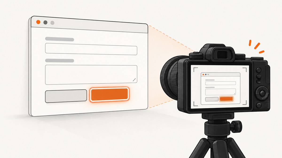
To highlight the focused control, move keyboard focus to it with Tab or Shift+Tab, confirm that the page’s visible focus indicator remains on the control, and capture the screenshot before focus moves. If the site’s indicator is difficult to see, add a temporary :focus-visible style, then repeat the keyboard action.
This distinction matters: a browser or automation overlay can point at an element, but only the page’s own focus state proves that the control is keyboard-focused. WCAG 2.2 Success Criterion 2.4.7 requires a mode in which keyboard focus is visible for keyboard-operable interfaces. See W3C’s Focus Visible guidance.
1. Focus the control with the keyboard
- Open the page at the viewport size you want to document.
- Click an empty area only if needed to establish the page context. Do not click the target control when you specifically need to show keyboard focus; pointer and keyboard input can produce different focus-indicator behavior.
- Press Tab to move forward through links, buttons, inputs and other focusable controls. Press Shift+Tab to move backward.
- Stop when the intended control receives focus. Check that the ring, border, underline or other indicator is still visible.
- Capture while focus remains on that control. Include enough surrounding content to identify the page region.
Browsers can provide a native indicator. The exact appearance varies by browser, operating system and component styles, so inspect the actual target page rather than relying on a sample image.
2. Add a visible :focus-visible style when necessary
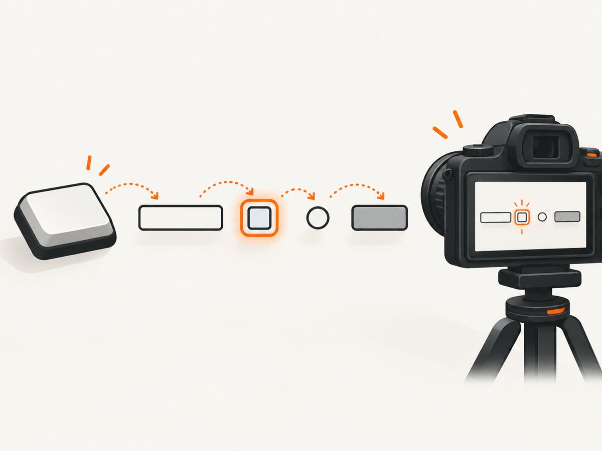
:focus-visible lets authors style focus when the browser determines that a visible indicator is appropriate, especially during keyboard navigation. W3C’s working example uses :focus-visible { outline: 5px solid red; }; treat that as an example, not a universal color requirement. Choose a color and thickness that contrast with both the control and nearby page colors.
<style>
/* Temporary documentation style; adapt colors to your design system. */
:where(button, a, input, select, textarea, [tabindex]:not([tabindex="-1"])):focus-visible {
  outline: 5px solid #d00;
  outline-offset: 3px;
}
</style>
Do not remove the default outline unless you replace it with an equally visible treatment. W3C identifies invisible or removed focus indication as a failure technique. Read the C45 technique for :focus-visible and G195 on author-supplied indicators.
3. Capture manually in the browser
- Reload the page after adding temporary CSS, if required.
- Use Tab or Shift+Tab to focus the target.
- Check that no animation, tooltip or sticky header hides the indicator.
- Use the browser’s screenshot command or operating-system capture while the control remains focused.
- Review the saved image at its final display size. A thin ring can disappear after resizing or compression.
4. Locate the active element with Chrome DevTools
When a page has many controls, Chrome DevTools can help you find the active element. Chrome documents a Live Expression that tracks the focused element; hovering over the result highlights that element in the viewport. This is an inspection aid, not automatically part of the screenshot. See Track element focus in Chrome DevTools.
To keep the screenshot clean, use DevTools to identify the control, then close or move DevTools before capturing. If you intentionally include a red box or other marker, label it in the surrounding documentation as an annotation rather than the website’s native focus style.
5. Capture a repeatable screenshot with Playwright
Automation is useful when the same focused state must be captured for several pages or in CI. This example injects a temporary focus style, focuses a button with the keyboard, waits for the browser to paint the state, and saves a screenshot.
import { chromium } from 'playwright';

const browser = await chromium.launch();
const page = await browser.newPage({ viewport: { width: 1440, height: 900 } });

await page.goto('https://example.com/form', { waitUntil: 'networkidle' });
await page.addStyleTag({
  content: `
    :where(button, a, input, select, textarea, [tabindex]:not([tabindex="-1"])):focus-visible {
      outline: 5px solid #d00;
      outline-offset: 3px;
    }
  `
});

// Replace this selector with the control you want to document.
await page.locator('button[type="submit"]').focus();
await page.waitForTimeout(100);
await page.screenshot({ path: 'focused-control.png', fullPage: false });

await browser.close();
Install and run it with:
npm install playwright
npx playwright install chromium
node capture-focused-control.mjs
Use keyboard traversal instead of programmatic focus
If your documentation needs to demonstrate the real keyboard path, start from a known element and press Tab the required number of times:
await page.locator('body').click({ position: { x: 2, y: 2 } });
await page.keyboard.press('Tab');
await page.keyboard.press('Tab');
await page.screenshot({ path: 'keyboard-focused-control.png' });
Prefer a semantic locator and an assertion when possible. Programmatic focus() establishes the state, while keyboard traversal also checks that the page’s tab order reaches the intended control.
Add a documentation overlay only when you need an annotation
Playwright’s debugging tools document persistent browser highlights and screenshot annotation workflows. An overlay is useful for teaching or review, but it is separate from the page’s accessible focus indicator. Keep the native or authored focus style visible, and disclose any added outline in the caption. See Playwright debugging tools.
6. Focused controls in common layouts
| Situation | What to check |
|---|---|
| Modal dialog | Focus should be inside the dialog, and the indicator must not be clipped by the dialog boundary. |
| Custom button or link | Use a semantic element where possible. If a custom element is focusable, verify its keyboard behavior and visible style. |
| Form validation | Capture after validation has finished. Ensure an error message or icon does not cover the focus ring. |
| Sticky header or fixed toolbar | Scroll the control fully into view before capture; fixed layers can obscure the indicator. |
| Shadow DOM | Use the component’s public locator or a test id and confirm the focus style is rendered inside the shadow tree. |
| Virtualized lists | Focus the item after it is mounted, then wait for the list to settle before taking the screenshot. |
| High zoom or responsive layout | Set the same viewport and device scale factor used by readers of the documentation. |
7. Verify the screenshot before publishing
- The intended element, not its parent or a hidden duplicate, owns
document.activeElement. - The focus indicator is visible against every adjacent background.
- The indicator is not clipped by
overflow: hidden, a mask, a border radius or a screenshot crop. - The image still shows enough context to identify the control.
- Any tooling overlay is clearly described as an annotation.
- The capture does not imply WCAG conformance from color alone; visibility, contrast, geometry and browser behavior all matter. W3C’s techniques are examples rather than the only conforming implementations. See Understanding Focus Appearance.
8. Troubleshooting
| Problem | Cause | Fix |
|---|---|---|
| No ring appears after pressing Tab | The site removed the outline, the control is not keyboard-focusable, or the browser’s heuristic chose not to show it. | Inspect document.activeElement, restore or add a :focus-visible style, and verify the element’s tabindex and semantics. |
| Focus moves to the wrong element | Unexpected tab order, a hidden control, or a modal focus trap. | Inspect the DOM order and tabindex values. Use a semantic locator and test traversal from a known starting point. |
| The ring is cut off | An ancestor clips overflow or the screenshot crop is too tight. | Increase outline-offset carefully, adjust overflow for the documentation build, or expand the capture area. |
| Playwright captures before the ring is painted | The screenshot happens immediately after focus changes. | Wait for a stable locator state and one short render turn, or use a web-first assertion before capture. |
| Clicking changes the indicator | Pointer focus and keyboard focus can use different browser heuristics. | Use Tab or keyboard.press() when documenting keyboard focus. |
| Overlay is mistaken for native focus | A DevTools or automation annotation was added without explanation. | Keep the page’s focus style visible and label the added marker as an annotation. |
| Focus disappears after navigation | Navigation replaced the document or moved focus to a new context. | Wait for navigation, then focus the target again before capturing. |
9. Performance, reliability and cost
A manual capture is fastest for one image. Playwright adds browser startup and page-load time, so reuse a browser process for a batch and wait on specific selectors instead of arbitrary long delays. Network-dependent pages can change layout after load; wait for the target control and any required fonts or data, then capture at a fixed viewport.
For repeatability, pin the browser version in CI, set an explicit viewport and device scale factor, disable animations where appropriate, and save the HTML/CSS used for temporary focus styling. Keep screenshots at the output dimensions readers will see; excessive retina scaling increases file size without making a thin focus ring easier to interpret.
Or skip the browser setup
ScreenshotNeo provides a website screenshot API and MCP server. Its one-call capture handles the browser work while preserving the page state you configure. Full documentation is at screenshotneo.com/docs/.
curl -G "https://api.screenshotneo.com/v1/shot" -d access_key=YOUR_API_KEY --data-urlencode url=https://stripe.com -o shot.webpimport requests
r = requests.get("https://api.screenshotneo.com/v1/shot", params={"access_key": "YOUR_API_KEY", "url": "https://stripe.com"}, timeout=90)
open("shot.webp", "wb").write(r.content)const q = new URLSearchParams({ access_key: 'YOUR_API_KEY', url: 'https://stripe.com' });
const res = await fetch(`https://api.screenshotneo.com/v1/shot?${q}`);Configure the capture for the focused-control workflow with a custom CSS rule, a click or scripted interaction where appropriate, a wait for a selector or network idle, and a fixed viewport or device preset. ScreenshotNeo can also capture one element by CSS selector, use custom JavaScript, set a delay, hide selectors, choose a retina scale and return PNG, JPEG, WebP or PDF.
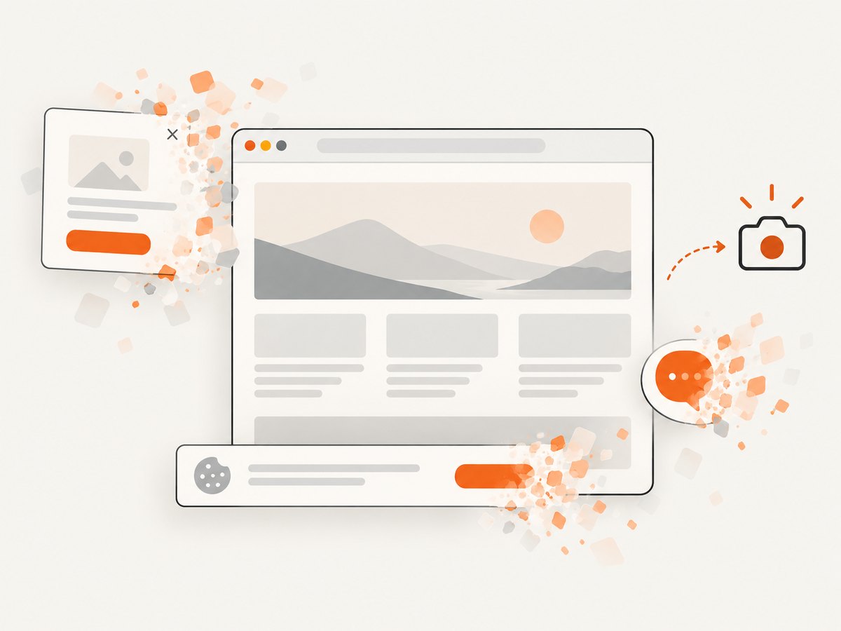
- Cookie and consent banners, newsletter popups and chat widgets are removed before the shot.
- Bot checks or CAPTCHAs, blank pages, timeouts, failed loads and cache hits are not billed; response headers identify the page verdict and whether it was billed.
- An MCP server lets Claude, Cursor and other MCP clients use
take_screenshot,get_page_infoandcapture_pdf. - The Free plan includes 1,000 screenshots a month with no card. Paid plans start at $5 for 3,000 screenshots; every feature is available on every plan.
Create a free ScreenshotNeo account and start with 1,000 screenshots per month at no charge.
FAQ
Should I click the control before taking the screenshot?
No, if the goal is to show keyboard focus. Use Tab or Shift+Tab so the capture represents keyboard navigation.
Does a red outline automatically make a page accessible?
No. It must remain visible, contrast with its surroundings and work across the relevant components and browsers. The success criteria and context still apply.
Can I use a DevTools highlight as the focus indicator?
You can use it as an explanatory annotation. It does not prove that the website itself exposes a visible keyboard-focus state.
How do I capture only the focused control?
Use an element screenshot in your automation tool or ScreenshotNeo’s CSS-selector capture, while retaining enough surrounding context for the focus state to be understandable.


