How Responsive Design Works in UI and UX
Responsive design adapts a page to the space available in the browser. Learn how viewports, CSS media queries, flexible layouts and accessibility checks work together.
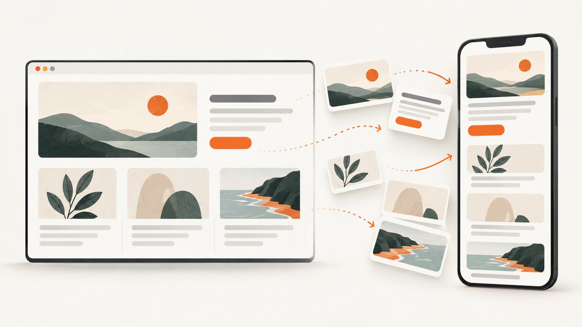
Responsive design adapts a web page’s presentation to the space available for rendering. A flexible layout can grow, shrink, wrap, or rearrange as the viewport changes, while the page’s underlying content remains the same. CSS media queries let developers apply styles conditionally—for example, switching a multi-column layout to one column when the available width becomes too narrow.
The viewport is the browser area available for the page, not the physical width of the device. A responsive page should be judged by whether its content and controls remain usable at the widths people actually have, including when they enlarge text or zoom. Responsive techniques can support accessibility, but they do not guarantee it: information and functionality still need to remain available and applicable accessibility criteria must be met.
1. What is responsive design?
Responsive design is an approach to building interfaces that respond to the available rendering space. Instead of assuming that every phone, tablet, or computer has one fixed screen size and needs a separate page, the layout adjusts to the viewport in which it appears.
A responsive page might show a navigation bar beside the main content when there is room, then move the navigation above the content when space is limited. Images can fit within their containers, and cards can wrap onto additional rows. These are presentation changes: the goal is to make the same information and functionality work in the space available.
Responsive design is not one specific framework, breakpoint list, or visual style. It is a way to make layout decisions based on the space available and the needs of the content. W3C describes media queries as a way to tailor presentation to output devices without changing the content itself. W3C Media Queries Level 3
2. What is a viewport?
The viewport is the area available for a page’s layout in a browser or other rendering context. Its width can be different from the physical width of the device: browser chrome, split-screen windows, zoom, and other circumstances affect the space the page has to use.
For continuous media, CSS’s width media feature describes viewport width. When a layout needs to adapt to available space, query the viewport with features such as width, height, or aspect-ratio. Device-dimension features such as device-width describe physical device dimensions, which do not tell you how much space the page currently has for its layout. W3C Media Queries Level 4
This distinction changes how you choose a layout threshold. A user might view a desktop site in a narrow browser window, or use a large device with the browser at high zoom. A layout based only on device categories can miss both situations. Let the content and available layout space guide when the presentation should change.
3. How does responsive design work?
Responsive behavior usually combines fluid sizing, flexible layout systems, images that fit their containers, and media queries for changes in arrangement or presentation. The browser evaluates the available viewport and applies the matching CSS rules.
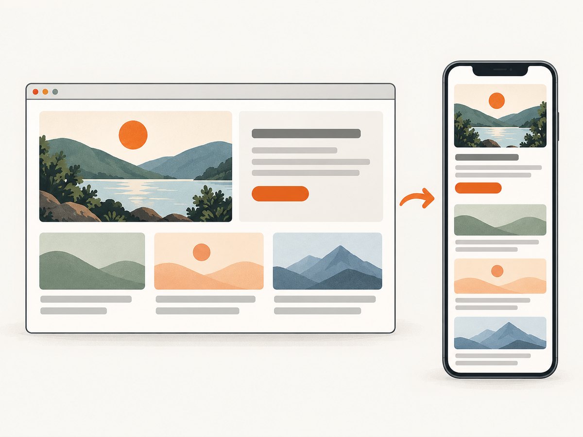
Here is a complete, runnable example. Save it as responsive.html and open it in a browser. Drag the browser window narrower or wider to see the layout change.
<!doctype html>
<html lang="en">
<head>
  <meta charset="utf-8">
  <meta name="viewport" content="width=device-width, initial-scale=1">
  <title>Responsive layout example</title>
  <style>
    * { box-sizing: border-box; }
    body {
      margin: 0;
      font: 1rem/1.5 system-ui, sans-serif;
      color: #172033;
    }
    .page {
      width: min(100% - 2rem, 72rem);
      margin-inline: auto;
    }
    header, footer { padding-block: 1rem; }
    .layout {
      display: grid;
      grid-template-columns: minmax(0, 2fr) minmax(14rem, 1fr);
      gap: 1.5rem;
      align-items: start;
    }
    .cards {
      display: grid;
      grid-template-columns: repeat(auto-fit, minmax(min(100%, 15rem), 1fr));
      gap: 1rem;
    }
    .card, aside {
      padding: 1rem;
      border: 1px solid #ccd3df;
      border-radius: .5rem;
    }
    img { display: block; max-width: 100%; height: auto; }
    @media (max-width: 45rem) {
      .layout { grid-template-columns: 1fr; }
    }
  </style>
</head>
<body>
  <div class="page">
    <header><h1>Field notes</h1></header>
    <div class="layout">
      <main>
        <h2>Recent stories</h2>
        <section class="cards" aria-label="Recent stories">
          <article class="card"><h3>Flexible layouts</h3><p>Content gets room to wrap as space changes.</p></article>
          <article class="card"><h3>Useful breakpoints</h3><p>Change the arrangement when it becomes cramped.</p></article>
          <article class="card"><h3>Fitting images</h3><p>Images stay within their available space.</p></article>
        </section>
      </main>
      <aside><h2>About these notes</h2><p>A sidebar that moves below the stories on narrow screens.</p></aside>
    </div>
    <footer>End of notes</footer>
  </div>
</body>
</html>
The viewport meta element tells mobile browsers to use the device’s layout viewport rather than a wider default layout scaled down to fit. The page container uses a maximum width while retaining room at the sides. The grid defines a main region and sidebar when there is sufficient space, and a media query changes that arrangement at a chosen width. The cards use a flexible grid so their column count can adjust to fit.
The example’s 45rem threshold is illustrative, not a standard breakpoint. The right threshold depends on when your content becomes cramped. Try intermediate widths as well as common device sizes; a layout can fit both ends of a range but fail between them.
4. What should change as the viewport changes?
Start with the content rather than a list of device labels. Ask what currently becomes hard to read, reach, or understand when the available width decreases. Then choose the smallest presentation change that restores usable space.
- Let regions resize. Use flexible or percentage-based sizing where it suits the content, with sensible limits when regions should not grow indefinitely.
- Allow items to wrap. Navigation links, cards, and controls may need to flow onto another line or form a different arrangement.
- Rearrange regions when needed. A sidebar can move below the main content when the two-column layout no longer has enough room.
- Keep images inside their containers. A wide image should not force the rest of a narrow page to scroll sideways.
- Retain access to content and actions. A smaller screen may call for a different arrangement, but the information and functionality should still be available.
WAI describes using CSS max-width and responsive height behavior to keep images within available space. Its technique is an implementation example; WCAG conformance is determined by the normative requirements, not by using a particular CSS recipe. WAI Technique C37
5. How does responsive design help accessibility?
A layout that adapts can make content easier to use when people have limited screen space or enlarge text. But responsiveness by itself is not proof that a page is accessible. Check the actual result: whether information and functionality remain available, and whether the applicable accessibility criteria are met.
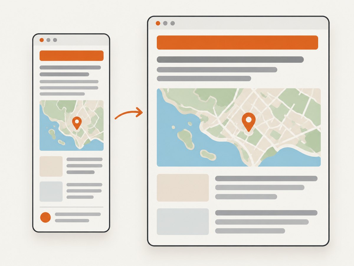
Reflow at 320 CSS pixels
WCAG 2.2 Success Criterion 1.4.10 addresses reflow. Vertically scrolling content should work at a width equivalent to 320 CSS pixels without loss of information or functionality and without requiring scrolling in two dimensions. The criterion allows exceptions for parts whose use or meaning requires two-dimensional layout, such as some data tables or maps. WCAG 2.2, SC 1.4.10
This is a specific reflow check, not a rule that every horizontal scrollbar is automatically a failure. Where two-dimensional layout is inherently necessary, evaluate the exception in context. WAI also explains that relocating or adjusting content is not loss when users can still access it. Understanding Reflow
Text resizing to 200 percent
Text resize is a separate check. WCAG 2.2 Success Criterion 1.4.4 requires text to be resizable up to 200 percent without loss of content or functionality. Enlarging text can expose problems that a narrow viewport alone does not: headings may overlap, buttons may clip labels, or fixed-height regions may hide content. WCAG 2.2, SC 1.4.4
Check both conditions rather than treating one as a substitute for the other: reflow at the equivalent of 320 CSS pixels, and text resized to 200 percent. Also inspect images and controls at those settings. A page may look acceptable at its default zoom yet become difficult to use after text is enlarged.
6. How to review a responsive page
- Begin with the actual content. Identify long headings, wide tables, images, navigation, forms, and other regions likely to need space.
- Resize the browser gradually. Look for the point where content becomes cramped, overlaps, clips, or forces unnecessary horizontal scrolling. Add a layout change where it helps.
- Check narrow widths. Include the 320 CSS pixel equivalent reflow condition for applicable vertically scrolling content, and confirm information and functionality remain available.
- Enlarge text to 200 percent. Inspect for clipped labels, lost content, overlapping controls, and actions that become unavailable.
- Inspect two-dimensional content deliberately. For tables, maps, or other content that needs two dimensions, consider the WCAG exception and make sure its use or meaning genuinely requires that arrangement.
- Review the rendered page, not only the CSS. A media query can run as intended while the resulting layout still hides an action or makes text difficult to read.
A screenshot can help compare the same page at different viewport widths. It records a visual result for inspection; it does not establish that content is available to assistive technology or prove conformance. Combine visual review with appropriate accessibility checks.
7. Or skip the browser setup
To inspect a responsive page at a chosen viewport, you can capture it through the ScreenshotNeo website screenshot API. The API returns an image or PDF from one GET request. See the ScreenshotNeo API documentation for parameters and options.
cURL
curl -G "https://api.screenshotneo.com/v1/shot" \
  -d access_key=YOUR_API_KEY \
  --data-urlencode url=https://stripe.com \
  -o shot.webp
Python
import requests

r = requests.get(
    "https://api.screenshotneo.com/v1/shot",
    params={"access_key": "YOUR_API_KEY", "url": "https://stripe.com"},
    timeout=90,
)
open("shot.webp", "wb").write(r.content)
Node.js
const q = new URLSearchParams({
  access_key: 'YOUR_API_KEY',
  url: 'https://stripe.com'
});
const res = await fetch(`https://api.screenshotneo.com/v1/shot?${q}`);
if (!res.ok) throw new Error(`Screenshot request failed: ${res.status}`);
const image = Buffer.from(await res.arrayBuffer());
await import('node:fs/promises').then(fs => fs.writeFile('shot.webp', image));
These examples use the supplied target URL. For responsive review, configure the requested viewport using the relevant API parameters in the docs. ScreenshotNeo removes known cookie and consent banners, newsletter popups, and chat widgets before capture; each of those steps can be turned off. Bot checks and CAPTCHAs, blank pages, timeouts, failed loads, and cache hits cost nothing, and response headers report the page verdict and billing status.
ScreenshotNeo also offers an MCP server for AI agents using Claude, Cursor, or another MCP client, with tools for screenshots, page information, and PDF capture. The free plan includes 1,000 shots per month with no card; paid plans start at $5 for 3,000. Sign up for free: 1,000 screenshots a month, no card required.
8. Performance, reliability, and cost considerations
Responsive design is primarily a layout approach, so the CSS choices shown here do not imply a particular performance benchmark. Avoid making assumptions about performance from a breakpoint count alone: review the page and its assets in the conditions that matter to your project. Images should fit the available space, but responsive layout does not automatically mean that every image is appropriately sized or delivered efficiently.
For screenshot-based review, capture only the viewport states you need to compare, and use repeatable viewport settings so visual differences are easier to interpret. A screenshot is a point-in-time rendering: page content, loading state, and overlays can affect what appears. It cannot substitute for testing interaction or verifying accessibility requirements.
ScreenshotNeo pricing is Free at 1,000 shots per month, Starter at $5 for 3,000, Growth at $15 for 15,000, Pro at $39 for 60,000, Scale at $99 for 250,000, and Business at $249 for 1,000,000. Yearly billing gives two months free, and every feature is on every plan. Those prices describe the product plans; they do not determine whether screenshot capture is the right review method for a particular page.
9. Troubleshooting responsive layouts
| Symptom | Likely cause | What to check |
|---|---|---|
| The desktop layout appears tiny on a phone | The viewport meta element may be missing. | Include <meta name="viewport" content="width=device-width, initial-scale=1"> in the document head. |
| The page scrolls sideways at a narrow width | A region, image, or unbreakable piece of content may exceed the viewport. | Find the element wider than its container; allow appropriate wrapping and keep images within available space. Check whether a two-dimensional exception applies to any necessary content. |
| A layout only works at a few familiar device sizes | Breakpoints may have been chosen by device category instead of content needs. | Resize gradually and add or adjust a layout change where the existing arrangement becomes cramped. |
| Text overlaps or controls clip after enlargement | The layout may rely on fixed dimensions or fail to make room for larger text. | Test at 200 percent text resize and confirm content and functionality remain available. |
| Images push the page wider | An image may render wider than its container. | Use responsive sizing such as max-width: 100%; height: auto; where appropriate. |
| A screenshot looks fine but the page is still hard to use | A still image cannot verify interaction or accessibility on its own. | Check the live page at narrow widths and enlarged text, and assess information and functionality against applicable criteria. |
10. Frequently asked questions
Is responsive design the same as mobile-first design?
No. Responsive design describes adapting presentation to available space. A mobile-first workflow is one possible way to build an interface; it is not a requirement of responsive design.
Do I need a breakpoint for every device?
No. Choose layout changes based on when the content needs them. Device categories do not describe the exact viewport available in every situation.
Does a responsive page automatically meet accessibility requirements?
No. Responsive behavior can help content fit different spaces, but you still need to check that information and functionality remain available and assess the applicable criteria.
Does every table have to fit without horizontal scrolling?
Not necessarily. WCAG’s reflow criterion includes an exception for parts whose use or meaning requires a two-dimensional layout. Evaluate whether that exception applies to the content.


