How to Create HTML Ellipsis Without a Fixed Width
Create responsive one-line ellipsis text without hard-coded widths using flex, grid, and intrinsic sizing fixes.
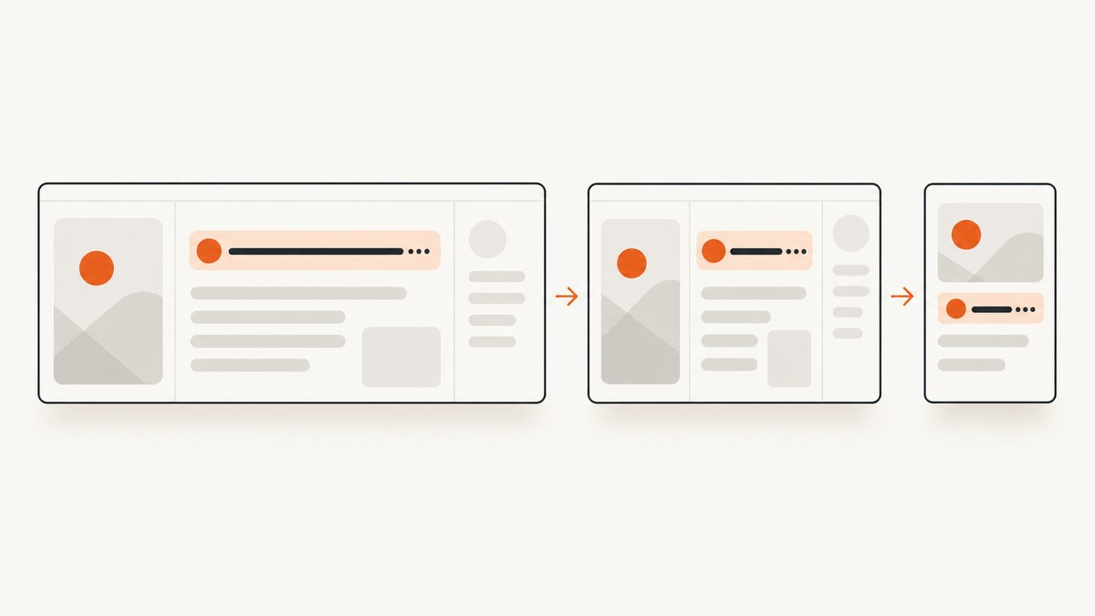
Yes, you can create an HTML ellipsis without assigning a fixed pixel width to the text. The text still needs a real boundary supplied by its layout context, such as the remaining space in a flex row, a responsive grid track, or a parent column. Then apply the one-line truncation rules:
.truncate {
  min-inline-size: 0;
  overflow: hidden;
  white-space: nowrap;
  text-overflow: ellipsis;
}
text-overflow only changes how already-hidden inline overflow is displayed; it does not create overflow or choose a width by itself. See the MDN text-overflow reference.
1. The basic pattern for a constrained block
If a block already receives a width from its parent, no fixed width is needed on the text element:
<article class="card">
  <h2 class="title">A very long article title that may not fit in the card</h2>
</article>
.card {
max-inline-size: 100%;
}
.title {
overflow: hidden;
white-space: nowrap;
text-overflow: ellipsis;
}This works when the card itself is constrained by a viewport, column, parent width, or another layout rule. If every ancestor can expand indefinitely, the title never overflows and there is nothing to replace with an ellipsis.
2. Flexbox: truncate the item that should take remaining space
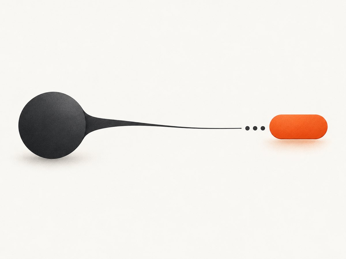
Flexbox is the most common case: an icon, button, or metadata sits beside a label, and the label should consume whatever space remains.
<div class="row">
  <span class="title">A long filename or page title that should shorten</span>
  <button class="icon" type="button" aria-label="More options">…</button>
</div>
.row {
display: flex;
align-items: center;
gap: 0.5rem;
inline-size: 100%;
}
.title {
flex: 1 1 auto;
min-inline-size: 0;
overflow: hidden;
white-space: nowrap;
text-overflow: ellipsis;
}
.icon {
flex: none;
}min-inline-size: 0 is the key declaration. A flex item has an automatic minimum based on its content, so a long unbreakable string can prevent the item from shrinking. The physical equivalent is min-width: 0.
Nested flex layouts
In a nested layout, put the zero minimum on every intermediate flex item that must shrink. The inner span can have the correct truncation properties and still fail if its parent refuses to become narrower.
.shell,
.header-group,
.title {
  min-inline-size: 0;
}

.title {
  overflow: hidden;
  white-space: nowrap;
  text-overflow: ellipsis;
}
Inspect each element’s computed inline size in browser developer tools. The first element whose size remains wider than the available space is usually the blocker.
3. Grid: use a zero-minimum flexible track
Grid tracks also account for intrinsic content size. Define the flexible track with minmax(0, 1fr) when it must shrink below the text’s min-content size.
<div class="grid-row">
  <span class="title">A long title inside a responsive grid track</span>
  <span class="status">Ready</span>
</div>
.grid-row {
display: grid;
grid-template-columns: minmax(0, 1fr) auto;
gap: 0.5rem;
inline-size: 100%;
}
.title {
min-inline-size: 0;
overflow: hidden;
white-space: nowrap;
text-overflow: ellipsis;
}The first track follows the available space, while the second track keeps its intrinsic size. Without minmax(0, 1fr), the first track can preserve a content-based minimum and push the grid wider than intended.
4. Responsive columns and container constraints
A fluid parent can provide the boundary without any width on the text itself:
.layout {
  display: grid;
  grid-template-columns: minmax(0, 2fr) minmax(12rem, 1fr);
  max-inline-size: 70rem;
  margin-inline: auto;
  padding-inline: 1rem;
}

.heading {
  min-inline-size: 0;
  overflow: hidden;
  white-space: nowrap;
  text-overflow: ellipsis;
}
Use the least complicated constraint that matches the design. A parent column, flex allocation, or grid track can all be fluid and responsive.
5. Why text-overflow: ellipsis sometimes does nothing
Check these conditions in order:
- The text box has
overflow: hidden(or another non-visible overflow value). - The line cannot wrap:
white-space: nowrap. - The text box is narrower than its rendered content.
- A flex item can shrink: add
min-inline-size: 0ormin-width: 0. - A grid track can shrink: use
minmax(0, 1fr)where appropriate. - Padding, borders, gaps, and neighboring non-shrinking items leave enough space for overflow to occur.
Intrinsic sizing uses the content’s minimum requirements. A long unbroken URL, hash, or filename can therefore determine a larger minimum than the visual design expects. The MDN intrinsic size glossary and the CSS Flexbox specification draft describe these sizing rules.
6. One line versus multiple lines
The recipe above is for one line. text-overflow handles overflow in the inline direction; it does not put an ellipsis at the bottom of a multi-line block.
/* One line only */
.single-line {
  overflow: hidden;
  white-space: nowrap;
  text-overflow: ellipsis;
}
For multiple lines, use a line-clamping technique that matches your browser-support requirements and test it in your target browsers. The CSS Overflow Level 4 draft discusses block overflow ellipsis behavior, but it is a living draft rather than a guarantee of identical behavior everywhere: CSS Overflow Level 4.
7. Direction, writing modes, and editable controls
With one text-overflow value, the ellipsis appears at the end of the line’s inline progression: normally the right side in left-to-right text and the left side in right-to-left text. The property also accepts separate values for the two ends when that is required.
Static text and editable controls are different cases. Text inputs, textareas, and contenteditable elements may clip instead of rendering an ellipsis, especially while focused, and browser behavior varies. Verify the actual control rather than assuming the static-text recipe applies.
Keep the complete value available in the document. If truncation hides information users need, provide an appropriate disclosure such as an accessible label, details view, or other interaction selected for the control and audience.
8. A complete responsive example
<!doctype html>
<html lang="en">
<head>
  <meta charset="utf-8">
  <meta name="viewport" content="width=device-width, initial-scale=1">
  <style>
    * { box-sizing: border-box; }
    body { margin: 0; font: 16px/1.4 system-ui, sans-serif; }
    .list { max-inline-size: 42rem; margin: 2rem auto; padding: 0 1rem; }
    .item {
      display: grid;
      grid-template-columns: minmax(0, 1fr) auto;
      align-items: center;
      gap: .75rem;
      padding: .75rem 0;
      border-bottom: 1px solid #ddd;
    }
    .name {
      min-inline-size: 0;
      overflow: hidden;
      white-space: nowrap;
      text-overflow: ellipsis;
    }
    .meta { white-space: nowrap; }
  </style>
</head>
<body>
  <main class="list">
    <div class="item">
      <span class="name" title="quarterly-report-with-a-very-long-file-name.pdf">quarterly-report-with-a-very-long-file-name.pdf</span>
      <span class="meta">PDF</span>
    </div>
  </main>
</body>
</html>
9. Troubleshooting checklist
| Symptom | Likely cause | Fix |
|---|---|---|
| No ellipsis, text expands the layout | No real constraint or an intrinsic minimum blocks shrinking | Constrain the parent; add min-inline-size: 0 to the shrinking flex/grid item. |
| Flex row overflows horizontally | The text item keeps its automatic minimum size | Use flex: 1 1 auto and min-width: 0 (or the logical property). |
| Grid column pushes other columns away | The flexible track has a content-based minimum | Change 1fr to minmax(0, 1fr). |
| Text wraps instead of truncating | white-space is not set to nowrap |
Add the one-line rule, or choose a multiline clamp deliberately. |
| Ellipsis appears on the wrong side | Inline direction is right-to-left or a different writing mode | Check direction/writing-mode and choose one or two overflow values accordingly. |
| Input does not show an ellipsis | Editable-control behavior differs by browser and focus state | Test the control directly and provide another way to reveal the full value. |
10. Performance, reliability, and maintainability
- CSS truncation is cheap: it avoids measuring text in JavaScript and updates naturally as the layout changes.
- Prefer logical properties such as
min-inline-sizewhen the component supports different writing directions; usemin-widthfor projects that require the physical property. - Do not add fixed widths merely to force an ellipsis. A fixed width can break responsive layouts and localization.
- Test long unbroken strings, translated labels, narrow viewports, zoomed text, right-to-left content, and nested flex/grid structures.
- Keep the full string available for copying, assistive technology, or a details interaction when shortening would hide important meaning.
11. Verify the rendered result with screenshots
When a truncation bug depends on a particular viewport, font, direction, or responsive breakpoint, capture the page at those exact conditions and compare the result. ScreenshotNeo can capture full pages or a selected element, set any viewport and retina scale, apply custom CSS or JavaScript, wait for a selector or network idle, and return PNG, JPEG, WebP, or PDF.

Or skip the browser setup
Use ScreenshotNeo’s one-call API when you need a rendered screenshot without maintaining a browser. Cookie banners, newsletter popups, and chat widgets are removed before the shot; bot checks, blank pages, failed loads, timeouts, and cache hits are not billed. An MCP server lets AI agents take screenshots, and the response identifies the page verdict and billing status.
See the ScreenshotNeo API documentation for all options.
curl -G "https://api.screenshotneo.com/v1/shot" -d access_key=YOUR_API_KEY --data-urlencode url=https://stripe.com -o shot.webpimport requests
r = requests.get(
"https://api.screenshotneo.com/v1/shot",
params={"access_key": "YOUR_API_KEY", "url": "https://stripe.com"},
timeout=90,
)
open("shot.webp", "wb").write(r.content)const q = new URLSearchParams({ access_key: 'YOUR_API_KEY', url: 'https://stripe.com' });
const res = await fetch(`https://api.screenshotneo.com/v1/shot?${q}`);Plans include 1,000 screenshots per month free with no card; paid plans start at $5 for 3,000 screenshots, and every feature is available on every plan. Create a free ScreenshotNeo account.
12. FAQ
Can I use ellipsis with width: auto?
Yes, if a parent layout still supplies a smaller available inline size. The text itself does not need a fixed width.
Is max-width: 100% enough in flexbox?
Not always. Flex item’s automatic minimum can still prevent shrinking, so add min-inline-size: 0 to the item that must yield space.
Why does a long URL defeat my grid?
Its intrinsic minimum can enlarge the track. Use minmax(0, 1fr) for the flexible track and allow the text item to shrink.
Does ellipsis work on two lines?
The standard one-line recipe does not create a bottom ellipsis for multiple lines. Choose and test a multiline clamping method for your browser targets.
Should I truncate the accessible name?
Keep the complete value available to users and assistive technology, and add a disclosure mechanism when the shortened display would hide meaningful information.


