HTML Image Tooltip: title, alt, Captions, and Accessible Custom Tooltips
Learn how to add an HTML image tooltip, keep alt text accessible, build captions, and create keyboard-friendly custom tooltips.

For a basic browser tooltip, add a short title attribute to the <img> element:
<img src="park-map.png" alt="Map of the park" title="Trail map">Browsers commonly show the title text after a pointer pauses over the image, but the browser controls how and whether it appears. Keep alt for the image’s text alternative. A title tooltip is optional advisory text and must not contain information people need to understand the page.
1. Add a basic image tooltip
Use a concise title that adds context without repeating the alternative text:
<!doctype html>
<html lang="en">
<meta charset="utf-8">
<title>Image tooltip</title>
<img
  src="park-map.png"
  alt="Map of the park"
  title="Trail map"
  width="640"
  height="360"
>
</html>
The title value is advisory. The HTML Standard defines its meaning, while the browser decides the presentation. A tooltip may appear only after a hover delay, may be exposed through another browser UI, or may not be shown at all.
2. Write correct alt and title text
| Attribute or element | Purpose | Use it for |
|---|---|---|
alt |
Text alternative for the image | Conveying the image’s meaning when it cannot be seen |
title |
Optional advisory information | Short supplemental context that is not essential |
figcaption |
Visible caption associated with a figure | Captions, credits, dates, and explanations readers should see |
| Custom tooltip | Designed hover or focus interaction | Additional interface help when it works with keyboard and other input methods |
Good examples
<!-- Informative image: describe its meaning in alt. -->
<img src="sales-chart.png" alt="Sales increased from January to March" title="Quarterly sales trend">

<!-- Decorative image: use an empty alt value. -->
<img src="divider.svg" alt="" title="Section divider">

<!-- A logo that is also a home link. -->
<a href="/">
  <img src="logo.svg" alt="Acme home" title="Go to the Acme home page">
</a>
Do not copy the same phrase into both attributes. Some screen-reader combinations can announce duplicated text. The MDN <img> reference explains how alternative text is exposed and why it remains separate from advisory information.
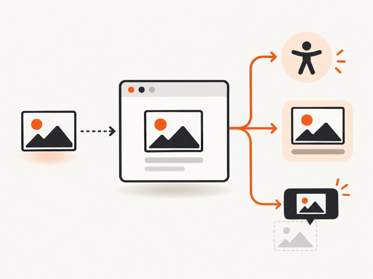
3. Use a visible caption when readers need the information
If the text is a caption, credit, date, or explanation, make it visible with <figure> and <figcaption>:
<figure>
  <img src="park-map.png" alt="Map of the park">
  <figcaption>Trail map, updated April 2026.</figcaption>
</figure>
A caption remains available to people using keyboards, touchscreens, screen readers, and magnification. It also avoids forcing readers to discover content through a hover gesture.
4. Build a custom tooltip for hover and focus
Use a custom tooltip only when a designed interaction is useful. The trigger must be reachable without a mouse, and the text should appear on keyboard focus as well as pointer hover.
<button class="image-help" type="button" aria-describedby="image-help-text">
  <img src="park-map.png" alt="Map of the park">
  <span id="image-help-text" role="tooltip">Trail map</span>
</button>
.image-help {
position: relative;
border: 0;
padding: 0;
background: transparent;
}
.image-help [role="tooltip"] {
position: absolute;
left: 50%;
bottom: calc(100% + 0.5rem);
transform: translateX(-50%);
width: max-content;
max-width: 18rem;
padding: 0.4rem 0.6rem;
color: #fff;
background: #222;
border-radius: 0.25rem;
opacity: 0;
pointer-events: none;
visibility: hidden;
}
.image-help:hover [role="tooltip"],
.image-help:focus-visible [role="tooltip"] {
opacity: 1;
visibility: visible;
}
.image-help:focus-visible {
outline: 3px solid #1463ff;
outline-offset: 3px;
}This pattern supplies a focusable trigger and uses aria-describedby to associate the explanation. Keep the tooltip short. For long content, use a dialog, disclosure, or visible help text instead. Check the W3C guidance for content on hover or focus: additional content should be dismissible when appropriate, hoverable so it does not vanish while the pointer moves over it, and persistent long enough to read.
5. Choose the right pattern
- Need an image alternative? Write meaningful
alttext. - Need a short optional hint? Add a concise
title, while accepting that user agents control its delivery. - Need a caption or credit? Use
<figure>and<figcaption>. - Need an interactive explanation? Build a custom tooltip that works on focus and hover, then assess its dismissal, persistence, and contrast.
6. Common mistakes and fixes
| Problem | Cause | Fix |
|---|---|---|
| The tooltip never appears | The browser or input method does not expose title as a hover popup. |
Use visible text or an accessible custom interaction; do not depend on the popup. |
| Screen readers announce the same words twice | alt and title contain duplicate text. |
Keep the image meaning in alt and make title supplemental, or remove it. |
| Important instructions are hidden | Information is available only through hover. | Put essential content in the page or a visible caption. |
| Keyboard users cannot open the tooltip | The trigger is a non-focusable image or hover-only CSS. | Use a button or link and show the tooltip on :focus-visible. |
| Touch users cannot discover it | Touch has no reliable hover state. | Use visible text, a tap-controlled disclosure, or a dialog. |
| The tooltip is clipped | An ancestor has overflow: hidden or the tooltip is near a viewport edge. |
Allow overflow, reposition with JavaScript, or use an overlay attached to the document. |
| Decorative images are announced | Decorative images have descriptive or missing alternative text. | Use alt="" and avoid adding essential meaning only to title. |
7. Test checklist
- Disable images and confirm the
alttext still communicates the purpose. - Navigate with Tab and verify every custom tooltip trigger receives visible focus.
- Use a screen reader to check that text is not duplicated.
- Test a touchscreen or mobile browser where hover is unavailable.
- Zoom to 200% or more and check that tooltip content is readable and not clipped.
- Check high contrast, forced colors, and reduced motion settings.
- Confirm essential information is visible without waiting for a pointer hover.
8. Capture tooltip states for documentation or tests
When you need a screenshot of an image tooltip, first make the state visible with a focus or hover action in your browser automation. A screenshot service can then capture the resulting page or a selected element. For repeatable documentation images, control the viewport, device scale, wait condition, and any custom CSS that reveals the tooltip.
9. Or skip the browser setup
ScreenshotNeo provides a website screenshot API and MCP server. It can capture a page after your interaction or CSS state is ready, while removing cookie banners, newsletter popups, and chat widgets before the shot. Bot checks, blank pages, failed loads, timeouts, and cache hits are not billed, and the response identifies the result with X-Page-Verdict and X-Billed headers. Its MCP server lets Claude, Cursor, and other MCP clients use take_screenshot, get_page_info, and capture_pdf.
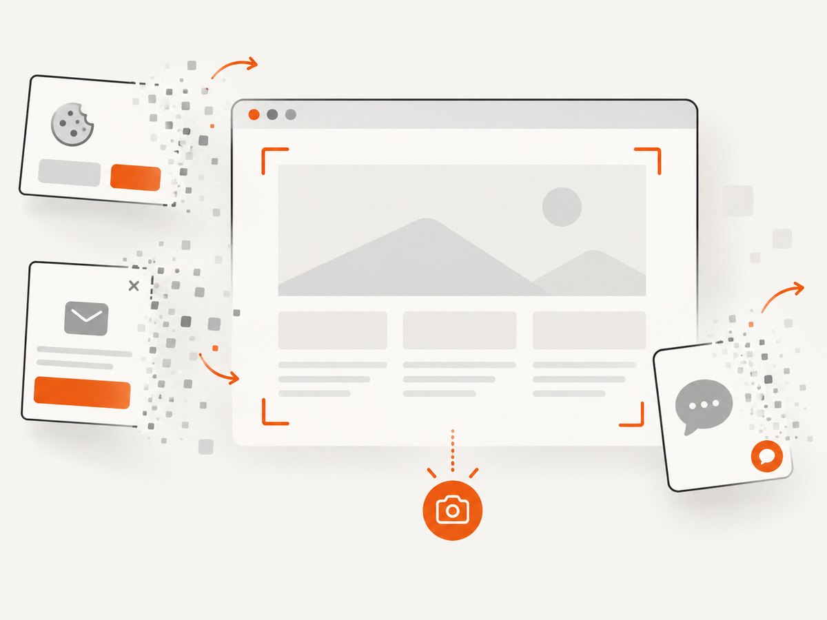
See the ScreenshotNeo API documentation for all capture options. A basic request is:
curl -G "https://api.screenshotneo.com/v1/shot" -d access_key=YOUR_API_KEY --data-urlencode url=https://stripe.com -o shot.webpimport requests
r = requests.get("https://api.screenshotneo.com/v1/shot", params={"access_key": "YOUR_API_KEY", "url": "https://stripe.com"}, timeout=90)
open("shot.webp", "wb").write(r.content)const q = new URLSearchParams({ access_key: 'YOUR_API_KEY', url: 'https://stripe.com' });
const res = await fetch(`https://api.screenshotneo.com/v1/shot?${q}`);Use custom JavaScript or a click action when the tooltip is revealed only after interaction; use a selector to capture one image and its tooltip, or full-page capture for a complete example. One thousand shots per month are free with no card, and paid plans start at $5 for 3,000 shots. Create a free ScreenshotNeo account.
10. Performance, reliability, and cost notes
- A native
titleattribute has negligible page cost and no JavaScript dependency. - Custom tooltips add CSS and possibly positioning logic; keep the DOM small and avoid layout work on every pointer movement.
- Visible captions are the most reliable option because they do not depend on a hover event, browser behavior, or assistive-technology support.
- For automated captures, wait for the tooltip’s selector or for the state-changing script to finish before taking the shot.
- ScreenshotNeo supports caching with a TTL you choose, async jobs with signed webhooks, bulk capture of up to 100 URLs per call, and custom headers, cookies, user agents, timezone, and geolocation when a page requires them.
FAQ
Does title create a real tooltip?
It provides advisory text that browsers commonly render as a tooltip. The user agent controls the exact behavior.
Should every image have a title?
No. Add one only when short supplemental context helps. Every meaningful image still needs appropriate alt text.
Can I use a tooltip instead of a caption?
Use a visible figcaption when the caption matters to readers. A hover-only tooltip is not a dependable replacement.
Can a parent title be inherited?
The HTML Standard permits a missing title to inherit relevance from the nearest titled ancestor; an empty title can suppress inherited relevance. Do not rely on inheritance for important information.
What is the simplest accessible solution?
Put the image meaning in alt, put required explanations in visible text, and reserve title for optional hints.


