HTML Images vs CSS Background Images: Which Should You Use?
Use HTML images for meaningful content and CSS backgrounds for decoration. Compare accessibility, responsive behavior, loading, layout stability, and code examples.
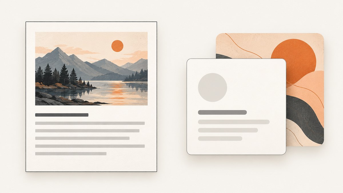
Use <img> or <picture> when an image communicates information or belongs to the page’s content. Use CSS background-image when the image is purely decorative or part of a component’s visual treatment. HTML images can have alternative text and use native responsive source selection. CSS backgrounds can be positioned and sized as part of an element’s design, but they have no image alt-text attribute. If an image is meaningful, do not make it available only as a background.
Neither method makes a page fast automatically. Set an image’s dimensions or aspect ratio to reserve space, avoid lazy-loading a likely above-the-fold or largest-contentful-paint (LCP) image, and defer appropriate noncritical images below the fold. See the primary guidance from MDN on <img>, MDN on responsive images, and web.dev on lazy loading.
1. The decision: content or decoration?
Ask what a visitor would lose if the image did not load or could not be seen. If the answer includes information, context, or meaning, represent it in HTML. Examples include a product photo, a chart, a diagram, an editorial photograph, or a thumbnail that identifies an article. Provide an alternative text appropriate to its purpose in context.

If removing the image changes only the visual styling—such as a texture, abstract gradient, flourish, or decorative crop—CSS is usually appropriate. A screen reader does not get an equivalent description from a CSS background, which is fine when there is nothing meaningful to convey.
| Image use | Prefer | Reason |
|---|---|---|
| Product image, diagram, editorial photo | <img> or <picture> |
Content can have purpose-specific alt text and responsive sources. |
| Texture, flourish, visual treatment | CSS background-image |
Presentation can be positioned and sized with its component. |
| Same image meaning, different crop by viewport | <picture> |
Art direction can select a source based on media conditions. |
| Same image meaning, multiple file sizes | srcset and sizes |
The browser can choose a candidate suited to display conditions. |
| HTML image that adds no meaning in this context | <img alt=""> |
An empty alternative lets assistive technology skip it. |
2. Use HTML for meaningful images
A basic image should have a useful alt value and intrinsic dimensions. Alt text should communicate the image’s purpose in context, not mechanically narrate every visible detail. For example, if a nearby caption already explains a diagram, the best alternative may be concise; if the image conveys a key result not stated elsewhere, make that information available to nonvisual users too.
<img
  src="trail-800.jpg"
  width="1600"
  height="1067"
  alt="A hiker crossing a rocky trail above the tree line"
  style="max-width: 100%; height: auto;"
>
The width and height attributes provide the browser an aspect-ratio hint before the image arrives. CSS can then scale it responsively without changing that ratio. Use dimensions that correspond to the source image, not the rendered CSS width.
Use srcset and sizes for size candidates
When the same composition is available at multiple widths, srcset lists candidates and sizes describes the rendered slot. The browser uses that information alongside its display conditions to select a resource. Keep the fallback src and candidates valid, and ensure the size description reflects your layout.
<img
  src="trail-800.jpg"
  srcset="trail-400.jpg 400w, trail-800.jpg 800w, trail-1600.jpg 1600w"
  sizes="(max-width: 600px) 100vw, 800px"
  width="1600"
  height="1067"
  alt="A hiker crossing a rocky trail above the tree line"
  style="max-width: 100%; height: auto;"
>
Here, sizes says the rendered slot fills the viewport up to 600 CSS pixels wide and is otherwise 800 CSS pixels. If the real layout uses a narrower article column, describe that instead. An inaccurate slot description may lead to an unnecessarily large or small candidate.
Use <picture> for art direction or format choice
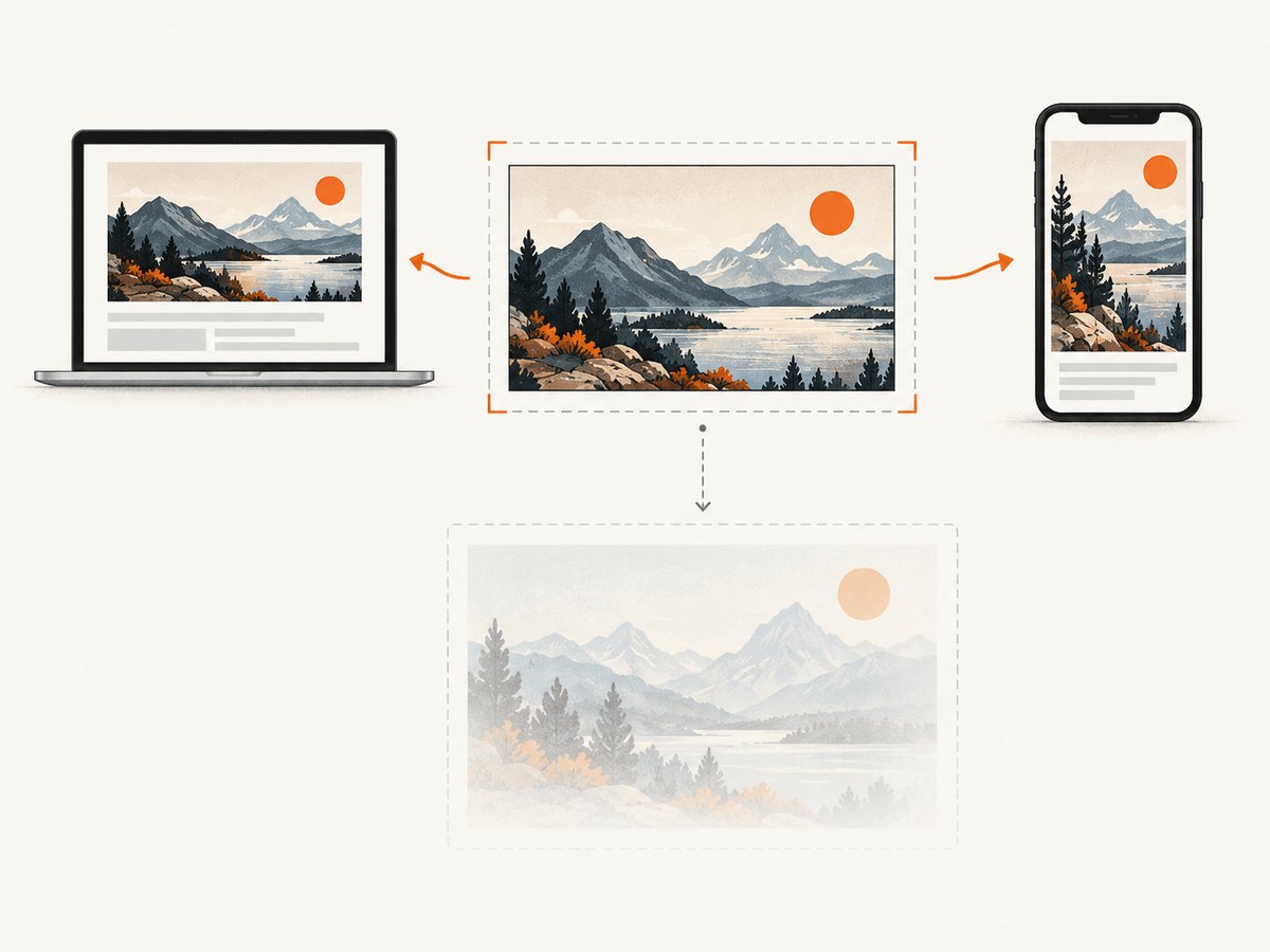
<picture> is useful when the image should change based on a media condition—for example, a wide landscape crop on desktop and a tighter portrait crop on a small screen—or when offering a supported format with a fallback. Keep a meaningful fallback <img>; that is where the alternative text and intrinsic dimensions go.
<picture>
  <source
    media="(max-width: 600px)"
    srcset="trail-portrait.webp"
    type="image/webp"
  >
  <source srcset="trail-landscape.webp" type="image/webp">
  <img
    src="trail-landscape.jpg"
    width="1600"
    height="1067"
    alt="A hiker crossing a rocky trail above the tree line"
    style="max-width: 100%; height: auto;"
  >
</picture>
Use the same alt description when the sources show the same essential content. If a crop changes what matters, ensure the alternative remains accurate for the selected image. Responsive-image details are documented in MDN’s responsive images guide.
3. Use CSS backgrounds for decoration
Apply the background to the component that owns the visual treatment. background-size: cover fills the box and may crop the image; background-position controls which part remains visible. These properties are useful for decorative composition, but do not put essential text, product identity, or instructions only in the background.
<div class="card">
  <h2>Featured</h2>
  <p>The card’s meaningful content remains available as text.</p>
</div>
.card {
background-image: url("paper-texture.webp");
background-size: cover;
background-position: center;
background-color: #f4f0e8;
}A background color is a useful fallback if the image is unavailable. If the design needs multiple decorative layers, CSS can express that directly:
.hero {
  background-image:
    linear-gradient(rgb(0 0 0 / 35%), rgb(0 0 0 / 35%)),
    url("hero-texture.webp");
  background-size: cover;
  background-position: center;
}
If the photograph in that hero communicates something about the article or product, expose it through an HTML image with alt text. A CSS overlay does not change the fact that the background itself has no semantic alternative.
4. Accessibility: write alternatives for people, not files
For a meaningful <img>, write alternative text that conveys the relevant information or action. A linked image might need to describe the link destination or function rather than list visual details. Avoid using a filename, repeating nearby text without purpose, or leaving the alternative empty when the image supplies information.
For a decorative HTML image, use alt="". This explicitly marks it as having no additional content for assistive technology. CSS backgrounds are generally suitable for decoration because they are not exposed as image content. If an image matters, pair it with visible text or an HTML image that supplies an appropriate alternative.
Do not add an accessible name by stuffing descriptive text into an unrelated CSS pseudo-element or background. Put meaningful content in the document structure where users and tools can find it.
5. Loading, responsive behavior, and layout stability
Reserve layout space
Images without known dimensions can cause content to move when their intrinsic size becomes available. Set width and height on HTML images, or otherwise establish an aspect ratio in CSS, so the browser can reserve space. For a responsive image, a common pattern is intrinsic dimensions plus max-width: 100%; height: auto.
.article-image {
  display: block;
  max-width: 100%;
  height: auto;
}
Choose loading behavior by importance
Use loading="lazy" for appropriate noncritical images below the fold. Do not lazy-load an image likely to appear in the initial viewport, such as the page’s hero or LCP image; lazy loading can defer its discovery until layout. fetchpriority="high" may help communicate priority for a genuinely important image, but use it sparingly because competing high-priority resources can undermine prioritization.
<!-- Likely above the fold: eager by default; consider high priority only if justified. -->
<img src="article-hero.jpg" width="1600" height="900" alt="..." fetchpriority="high">

<!-- Noncritical image farther down the page. -->
<img src="related-story.jpg" width="800" height="533" alt="..." loading="lazy">
CSS backgrounds do not have the <img loading> attribute. Their discovery depends on stylesheets and rendering, so evaluate when a critical background becomes available rather than assuming it behaves exactly like an early HTML image. Consult web.dev’s image performance guidance and its lazy-loading guide when tuning a real page.
6. Common mistakes and fixes
| Symptom | Likely cause | Fix |
|---|---|---|
| A meaningful image is missing to screen-reader users | It was added only as a CSS background. | Use an HTML <img> with an appropriate alternative, or provide the information in accessible text. |
| A decorative image is announced with an unhelpful name | It has a redundant or filename-like alt value. | Use alt="" if the HTML image adds no meaning in context. |
| The page jumps when an image loads | Space was not reserved before the file arrived. | Provide correct intrinsic dimensions or establish the image aspect ratio. |
| The hero appears late | A likely initial-viewport image was lazy-loaded or discovered late as a background. | Keep the important HTML image eager; inspect discovery and priority before tuning. |
| Mobile downloads an oversized image | sizes does not describe the rendered slot, or candidates are missing. |
Correct the slot description and provide suitable srcset candidates. |
| A background crop hides the subject | cover fills the box by cropping, with an unsuitable position. |
Adjust background-position or choose a better asset/crop. Use art direction with <picture> if the content needs a different image on smaller screens. |
One <picture> source fails unexpectedly |
Source order, media condition, type, or URL is wrong. | Check conditions and paths, and keep a valid fallback <img>. |
7. Performance and reliability checklist
- Decide whether each image is content or decoration before choosing markup.
- For content, use HTML with purpose-appropriate alt text; use an empty value for decorative HTML images.
- Supply intrinsic dimensions or an aspect ratio to reserve layout space.
- Use
srcset/sizesfor size candidates and<picture>when media-dependent crop or format selection is needed. - Keep likely above-the-fold and LCP images eager; lazy-load suitable noncritical images lower on the page.
- Use high fetch priority only for a genuinely important resource.
- Choose background sizing and position with cropping in mind, and provide a sensible color fallback.
- Verify that important information remains present if an image cannot load.
For automated visual checks, a screenshot can reveal broken crops, missing backgrounds, or unexpected empty image regions after changes to markup and CSS. [ScreenshotNeo](https://screenshotneo.com) is a website screenshot API and MCP server. A screenshot can help inspect the rendered result, but it does not replace accessibility review, alt-text checks, or performance measurement.
8. Or skip the browser setup
If you need a rendered screenshot to review how your image choices look across pages, ScreenshotNeo returns an image or PDF from one GET request. Its clean-shot flow accepts cookie/consent banners like a visitor and removes 60+ known consent platforms, newsletter popups, and chat widgets; each step can be turned off. Bot checks/CAPTCHAs, blank pages, timeouts, failed loads, and cache hits cost nothing, and the response identifies the page verdict and billing status in headers. Its MCP server provides take_screenshot, get_page_info, and capture_pdf tools for AI agents and MCP clients.
See the ScreenshotNeo documentation for request options. This cURL example saves a WebP screenshot of a page:
curl -G "https://api.screenshotneo.com/v1/shot" \
  -d access_key=YOUR_API_KEY \
  --data-urlencode url=https://stripe.com \
  -o shot.webp
ScreenshotNeo includes 1,000 shots per month free with no card; paid plans start at $5 for 3,000 shots. Every feature is available on every plan. Sign up for free and get 1,000 screenshots a month with no card.
9. FAQ
When should I use CSS background images?
Use them for imagery that contributes only to appearance, such as textures and decorative treatments. Keep meaningful information in HTML content.
Can a background image have alt text?
No. CSS backgrounds do not have an image alt-text attribute. Use an HTML image with appropriate alternative text when the image communicates content.
Is <picture> always better than CSS?
No. It solves responsive source selection for content images. CSS remains a good fit for decoration that belongs to a component’s presentation.
Should I lazy-load every image?
No. Lazy loading is suitable for noncritical images below the fold. Keep a likely hero or LCP image eager so it is not delayed.
Can I use both approaches on one element?
You can combine an HTML image and CSS backgrounds in a design, but give each a clear role. Keep content accessible in HTML and use CSS for decoration.
10. Practical conclusion
Choose based on meaning first: HTML for content, CSS for decoration. Then make the HTML image responsive when needed, give it appropriate alternative text, reserve its dimensions, and align its loading priority with when readers need it. Use CSS backgrounds when crop, position, layering, and component styling are the main concerns.


