How to Render html2canvas at a Different Viewport Size
Set html2canvas render dimensions correctly, separate viewport from canvas size, and fix clipping, media-query, CORS, and scaling problems.
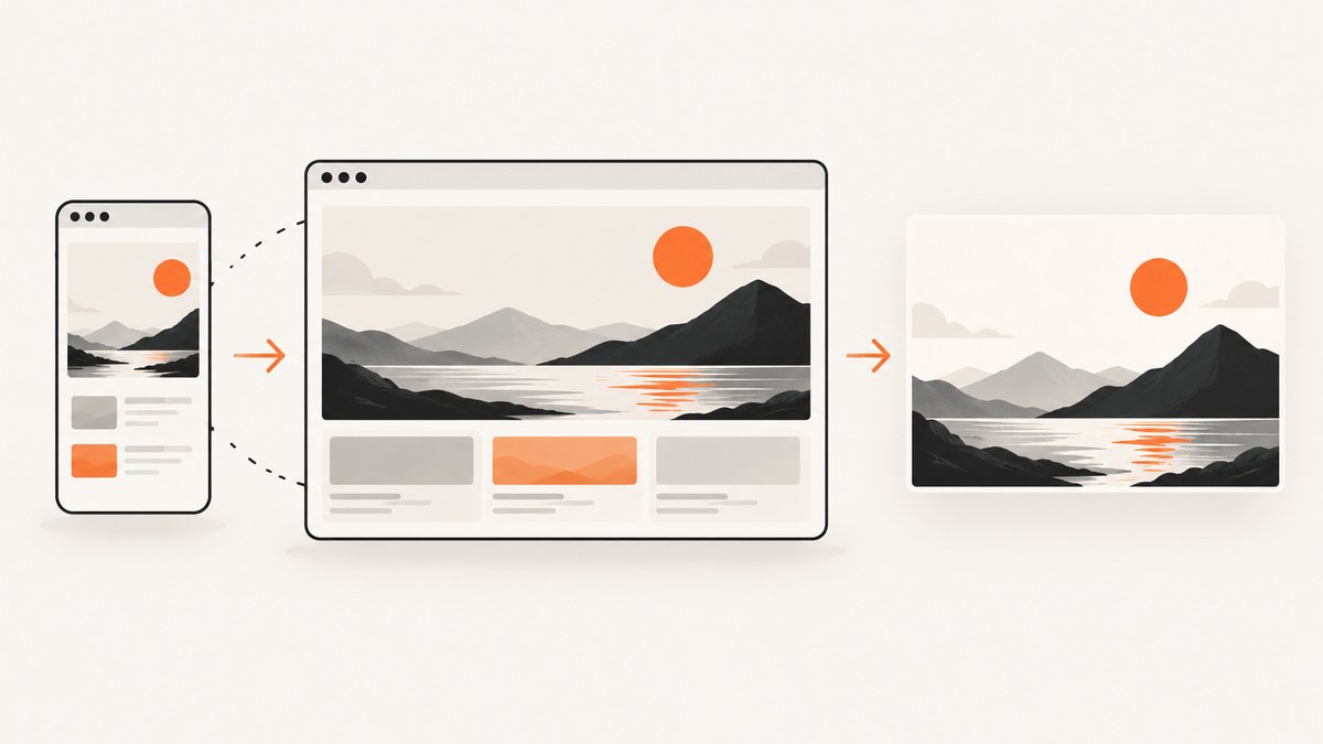
Use windowWidth and windowHeight in the html2canvas options object. These values control the window dimensions html2canvas uses while it renders an element, so they can change responsive media-query styles. They do not define the final bitmap dimensions. Use width and height for the canvas, x and y for cropping, and scale for output density.
const canvas = await html2canvas(element, {
  windowWidth: 1200,
  windowHeight: 900
});
This guide explains the difference between those settings, shows complete browser code, covers full-page and responsive captures, and gives fixes for clipping, blank canvases, cross-origin images, and browser limits.
1. What “viewport size” means in html2canvas
A request for a different viewport can mean three separate things:
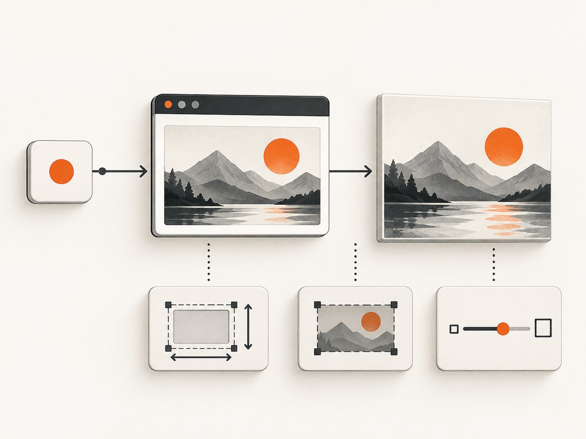
| Goal | Options | What changes |
|---|---|---|
| Render a responsive layout at a breakpoint | windowWidth, windowHeight |
The virtual window used while the DOM is cloned and rendered; media queries may select different rules. |
| Make the resulting image larger or sharper | scale |
Raster density and output resolution, without selecting a different responsive layout. |
| Choose the bitmap region and dimensions | x, y, width, height |
The crop origin and canvas size. |
The official configuration reference lists the current window’s inner dimensions as the defaults for windowWidth and windowHeight. Set them explicitly when you need a reproducible desktop, tablet, or mobile rendering. See the html2canvas configuration reference.
2. Complete browser example
The following page lets a user select a viewport, applies the dimensions to html2canvas, and downloads the result. Include the library from your own asset pipeline or the official distribution used by your project.
<!doctype html>
<html lang='en'>
<head>
  <meta charset='utf-8'>
  <meta name='viewport' content='width=device-width, initial-scale=1'>
  <title>html2canvas viewport demo</title>
  <script src='https://html2canvas.hertzen.com/dist/html2canvas.min.js'></script>
  <style>
    #preview {
      width: 100%;
      max-width: 1000px;
      margin: 1rem auto;
      padding: 2rem;
      background: white;
      color: #17202a;
      box-sizing: border-box;
    }

    @media (max-width: 700px) {
      #preview { padding: 1rem; }
      #preview .wide-only { display: none; }
    }

    body { margin: 0; background: #e9edf2; font-family: system-ui, sans-serif; }
    .toolbar { padding: 1rem; text-align: center; }
  </style>
</head>
<body>
  <div class='toolbar'>
    <label>Viewport width
      <input id='viewportWidth' type='number' value='1200' min='1'>
    </label>
    <label>Viewport height
      <input id='viewportHeight' type='number' value='900' min='1'>
    </label>
    <button id='capture'>Capture</button>
  </div>

  <main id='preview'>
    <h1>Responsive content</h1>
    <p>The selected render window can activate different media queries.</p>
    <p class='wide-only'>This paragraph is hidden below 700px.</p>
  </main>

  <script>
    document.querySelector('#capture').addEventListener('click', async () => {
      const element = document.querySelector('#preview');
      const windowWidth = Number(document.querySelector('#viewportWidth').value);
      const windowHeight = Number(document.querySelector('#viewportHeight').value);

      if (!Number.isFinite(windowWidth) || !Number.isFinite(windowHeight) ||
          windowWidth < 1 || windowHeight < 1) {
        throw new Error('Viewport dimensions must be positive numbers');
      }

      const canvas = await html2canvas(element, {
        windowWidth,
        windowHeight,
        scale: window.devicePixelRatio,
        backgroundColor: '#ffffff'
      });

      const link = document.createElement('a');
      link.download = `capture-${windowWidth}x${windowHeight}.png`;
      link.href = canvas.toDataURL('image/png');
      link.click();
    });
  </script>
</body>
</html>
In this example, changing the width from 1200 to 600 can activate the media query. The scale value makes the bitmap denser on a high-DPI display; it does not turn a mobile layout into a desktop layout.
3. Full-element and full-page captures
When an element is taller or wider than the visible page, use its scroll dimensions for the render window. The html2canvas FAQ recommends this pattern when content is clipped or the canvas is empty:
const canvas = await html2canvas(element, {
  windowWidth: element.scrollWidth,
  windowHeight: element.scrollHeight
});
You can also set the canvas dimensions explicitly:
const canvas = await html2canvas(element, {
  windowWidth: 1440,
  windowHeight: 1200,
  width: element.scrollWidth,
  height: element.scrollHeight,
  x: 0,
  y: 0,
  scale: 1
});
Use the first pattern when responsive rules should be evaluated against the complete element dimensions. Use explicit width and height when you need a predictable crop or output box. Very large pages can exceed a browser’s canvas limits; those limits vary by browser, operating system, and hardware, so do not rely on one universal maximum.
Capture only one region
For a crop inside an element, set x and y to the crop origin and width and height to the crop size. These values describe the canvas region, while windowWidth and windowHeight still describe the render window.
const canvas = await html2canvas(document.querySelector('#invoice'), {
  windowWidth: 1280,
  windowHeight: 900,
  x: 40,
  y: 80,
  width: 720,
  height: 480,
  scale: 2
});
4. Responsive breakpoints, scaling, and device presets
To test a breakpoint, choose dimensions that match the CSS media query. For example, if a stylesheet changes at 768px, render once at 767 and once at 768 to verify the transition. Set both window dimensions so scripts that inspect height behave consistently.
const sizes = [
  { name: 'mobile', width: 390, height: 844 },
  { name: 'tablet', width: 768, height: 1024 },
  { name: 'desktop', width: 1440, height: 900 }
];

for (const size of sizes) {
  const canvas = await html2canvas(element, {
    windowWidth: size.width,
    windowHeight: size.height,
    scale: 1
  });
  canvas.toBlob(blob => {
    // Store blob with size.name in your application.
  }, 'image/png');
}
Choose scale: 1 for predictable pixel dimensions. Choose a larger scale when you need a sharper image and can accept more memory and encoding work. A larger scale does not change CSS layout or media-query selection.
5. Images, fonts, and cross-origin content
html2canvas reconstructs an image from the DOM and CSS available to the page; it does not take a native browser screenshot. Only CSS properties implemented by the library can be rendered correctly, and the project documents that full CSS support is not possible. Complex filters, browser chrome, plugins, and some effects may therefore differ from what you see on screen.
For images hosted on another origin, try useCORS: true:
const canvas = await html2canvas(element, {
  windowWidth: 1200,
  windowHeight: 900,
  useCORS: true
});
This works only when the image server permits cross-origin access with the appropriate headers. If it does not, proxy the asset through a server you control or omit it. Wait for fonts and lazy images before starting the capture; otherwise the canvas can contain fallback fonts or blank image areas.
await document.fonts.ready;

for (const image of document.images) {
  if (!image.complete) {
    await new Promise(resolve => {
      image.addEventListener('load', resolve, { once: true });
      image.addEventListener('error', resolve, { once: true });
    });
  }
}

const canvas = await html2canvas(element, {
  windowWidth: 1200,
  windowHeight: 900,
  useCORS: true
});
6. Troubleshooting checklist
The layout does not change at the requested width
Cause: the code changed width or scale but left windowWidth at its default, or the breakpoint is outside the selected dimensions.
Fix: pass numeric windowWidth and windowHeight, then inspect the breakpoint conditions. Remember that these values affect the cloned render window, not necessarily the CSS width of the target element itself.
The output is clipped
Cause: the element’s scroll area is larger than the render window or explicit canvas dimensions.
Fix: use element.scrollWidth and element.scrollHeight, or set width and height to the region you intend to export. Check overflow containers as well as the document body.
The canvas is blank or empty
Cause: an oversized canvas, cross-origin images without permission, resources that have not loaded, or unsupported CSS.
Fix: capture a smaller region, lower scale, wait for images and fonts, enable useCORS when the origin supports it, and inspect the browser console. The FAQ specifically warns that canvas limits vary across browsers, platforms, and hardware.
Images are missing or taint the canvas
Cause: the image server does not send a permissive cross-origin header.
Fix: configure the image server, use a same-origin proxy, or remove the image before capture. useCORS: true is not a bypass for server policy.
Fonts or lazy-loaded sections differ
Cause: capture started before the browser finished loading them.
Fix: await document.fonts.ready, wait for image completion, trigger the page’s lazy-loading mechanism, and verify that the target element has reached its final scroll dimensions.
CSS effects do not match the browser
Cause: html2canvas implements CSS properties individually and does not capture the compositor output of the browser.
Fix: simplify unsupported effects for export, provide a print-specific style, or use a real browser screenshot service when pixel fidelity is required.
7. Performance and reliability
- Keep the capture area small: render a component instead of the entire document when you only need a card, chart, or invoice.
- Control scale: doubling both dimensions can multiply pixel work and memory substantially. Use the smallest scale that meets your delivery requirement.
- Capture after layout settles: wait for fonts, images, animations, and data-driven components. Disable transitions during export to avoid inconsistent frames.
- Split very long pages: capture sections separately and assemble them if a single canvas approaches browser limits.
- Reuse stable settings: record viewport, scale, and crop values with each output so a later comparison is reproducible.
- Handle failures: wrap the promise in
try/catch, report the URL or component being captured, and avoid retrying a deterministic CORS or unsupported-CSS problem.
For server-side screenshot generation, the html2canvas documentation points to browser automation tools such as Puppeteer or Playwright because html2canvas depends on browser APIs and runs client-side.
8. Or skip the browser setup
ScreenshotNeo provides a website screenshot API when you need a URL captured at a chosen viewport without wiring a browser into your application. The API accepts viewport, device, full-page, selector, scale, custom CSS and JavaScript, wait conditions, headers, cookies, user agents, timezone, geolocation, blocking rules, caching, resizing, PDF, async jobs, bulk capture, and signed links. See the ScreenshotNeo API documentation for the complete option list.

cURL
curl -G 'https://api.screenshotneo.com/v1/shot' -d access_key=YOUR_API_KEY --data-urlencode url=https://stripe.com -o shot.webpPython
import requests
r = requests.get('https://api.screenshotneo.com/v1/shot', params={'access_key': 'YOUR_API_KEY', 'url': 'https://stripe.com'}, timeout=90)
open('shot.webp', 'wb').write(r.content)
Node.js
const q = new URLSearchParams({ access_key: 'YOUR_API_KEY', url: 'https://stripe.com' });
const res = await fetch(`https://api.screenshotneo.com/v1/shot?${q}`);
Cookie banners, newsletter popups, and chat widgets are removed before the shot. Bot checks, blank pages, timeouts, failed loads, and cache hits cost nothing, and response headers identify the page verdict and whether it was billed. ScreenshotNeo also provides an MCP server so Claude, Cursor, and other MCP clients can take screenshots with take_screenshot, inspect pages with get_page_info, and create PDFs with capture_pdf.
The Free plan includes 1,000 screenshots each month with no card. Paid plans start at $5 for 3,000 screenshots; every feature is available on every plan. Create a free ScreenshotNeo account.
9. A practical decision checklist
- Need a different responsive layout? Set
windowWidthandwindowHeight. - Need a larger bitmap of the same layout? Adjust
scale. - Need a crop? Set
x,y,width, andheight. - Need the whole element? Start with its
scrollWidthandscrollHeight. - Seeing missing images? Resolve CORS and wait for resources.
- Seeing unsupported effects or browser-limit failures? Use a real browser capture service or split the page.
10. FAQ
Does windowWidth resize my element?
It sets the window dimensions used during rendering and can change media-query results. It is separate from the element’s CSS width and from the canvas dimensions.
Should I use scale or windowWidth for a retina image?
Use scale for raster density. Use windowWidth when you need a different responsive layout.
Can html2canvas capture a page exactly as Chrome displays it?
No guarantee exists. It reconstructs the image from DOM and supported CSS rather than taking a native screenshot, so some properties and effects will differ.
Why does the FAQ recommend scroll dimensions?
They give the renderer enough window space for content that would otherwise be clipped. They still do not bypass browser canvas limits.
Is html2canvas suitable for server-side jobs?
It is client-side and depends on browser APIs. For server-side work, its documentation points to Puppeteer or Playwright, or you can call a screenshot API such as ScreenshotNeo.


