How to Capture an HTML Page at a Fixed Width With html2canvas
Set a predictable html2canvas width by coordinating element CSS, windowWidth, canvas width, scale, and full-page dimensions.
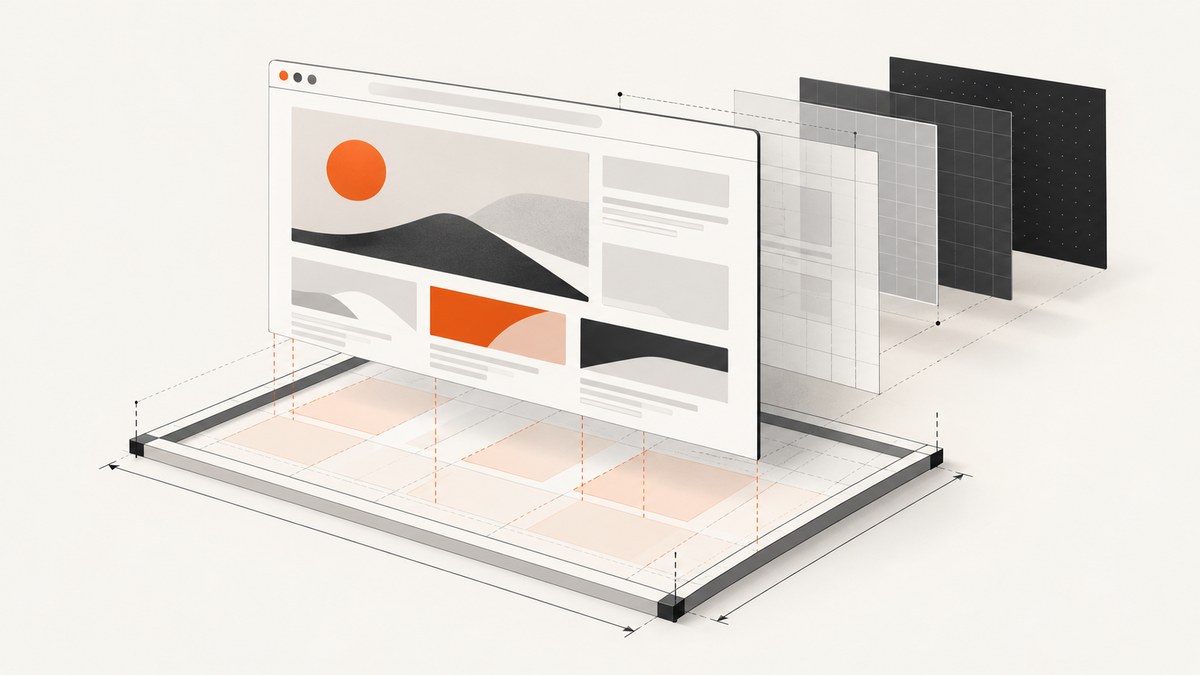
Direct answer: Set the captured element’s CSS width to the target layout width, set windowWidth to that width when responsive media queries must behave as though the viewport has that size, set the canvas width to the desired output width, and choose an explicit scale for predictable pixels.
const element = document.querySelector('#capture');
const targetWidth = 800;

const previousWidth = element.style.width;
element.style.width = `${targetWidth}px`;

try {
  const canvas = await html2canvas(element, {
    windowWidth: targetWidth,
    width: targetWidth,
    scale: 1
  });

  document.querySelector('#result').replaceChildren(canvas);
} finally {
  element.style.width = previousWidth;
}
This distinction matters because html2canvas reconstructs a canvas from DOM information and supported CSS rather than copying the browser’s native pixels. Its windowWidth option controls the virtual rendering window and can change media-query results; width controls the canvas output width. Setting only one of them often produces a screenshot that looks like the wrong breakpoint or has unexpected pixel dimensions. See the official configuration reference and the project’s limitations documentation.
1. Decide which width you actually need
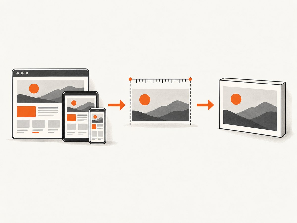
“Fixed width” can mean three different things. Choose the one that matches your output requirement before changing options:
| Goal | What to set | Typical use |
|---|---|---|
| Fixed component layout | The element’s CSS width |
A card, invoice, report, or design preview that must always be 800 CSS pixels wide. |
| Fixed responsive viewport | windowWidth, usually together with the element width |
Testing the desktop or tablet breakpoint of a responsive page. |
| Fixed output pixels | width plus an explicit scale |
Generating an image with a known raster width for storage or another API. |
The element’s own CSS controls layout. windowWidth controls the virtual window used while html2canvas renders and can affect @media rules. width controls the canvas width and defaults to the element width. scale defaults to window.devicePixelRatio, so leaving it implicit can produce different pixel sizes on different screens.
2. Minimal runnable browser example
Load html2canvas, add a target element, and capture it after its content has reached the state you want. The example below fixes both layout and output width at 800 CSS pixels and uses scale 1, so the resulting canvas is normally 800 pixels wide.
<!doctype html>
<html lang="en">
<head>
  <meta charset="utf-8">
  <title>Fixed-width html2canvas capture</title>
  <script src="https://cdn.jsdelivr.net/npm/html2canvas@1.4.1/dist/html2canvas.min.js"></script>
  <style>
    #capture {
      width: 800px;
      box-sizing: border-box;
      padding: 32px;
      background: white;
      color: #111;
    }
    #capture img { max-width: 100%; height: auto; }
  </style>
</head>
<body>
  <main id="capture">
    <h1>An 800px report</h1>
    <p>This element is laid out and exported at a known width.</p>
  </main>
  <button id="download">Download PNG</button>

  <script>
    const target = document.querySelector('#capture');
    const targetWidth = 800;

    document.querySelector('#download').addEventListener('click', async () => {
      const oldWidth = target.style.width;
      target.style.width = `${targetWidth}px`;

      try {
        const canvas = await html2canvas(target, {
          windowWidth: targetWidth,
          width: targetWidth,
          scale: 1,
          backgroundColor: '#ffffff'
        });

        canvas.toBlob((blob) => {
          if (!blob) throw new Error('Canvas could not be encoded');
          const link = document.createElement('a');
          link.download = 'report-800px.png';
          link.href = URL.createObjectURL(blob);
          link.click();
          URL.revokeObjectURL(link.href);
        }, 'image/png');
      } finally {
        target.style.width = oldWidth;
      }
    });
  </script>
</body>
</html>
Restore temporary inline styles in a finally block. That prevents a capture-only width from changing the live page after the export completes. If your stylesheet already gives the element a fixed width, you can omit the temporary assignment.
3. Choose CSS width, windowWidth, and canvas width together
Fixed component inside a fluid page
For a component that must remain 800 CSS pixels wide even when the surrounding page is fluid, set the component width and use width: 800. You may leave windowWidth at its normal value if the component does not depend on viewport media queries.
const canvas = await html2canvas(document.querySelector('.invoice'), {
  width: 800,
  scale: 1
});
Capture a responsive breakpoint
When the page should render as it would at a particular viewport, set windowWidth to that breakpoint. Also ensure the captured element can occupy that width; changing the virtual window alone does not force the element’s CSS width.
const page = document.querySelector('#page');
const breakpoint = 1024;
const oldWidth = page.style.width;
page.style.width = `${breakpoint}px`;

try {
  const canvas = await html2canvas(page, {
    windowWidth: breakpoint,
    width: breakpoint,
    scale: 1
  });
} finally {
  page.style.width = oldWidth;
}
Retina output
Use scale: 2 when you want twice as many raster pixels per CSS pixel. An 800 CSS-pixel target will generally produce a canvas about 1,600 pixels wide. This increases memory use and can hit browser canvas limits sooner.
const canvas = await html2canvas(element, {
  windowWidth: 800,
  width: 800,
  scale: 2
});
console.log(canvas.width, canvas.height);4. Capture a full page or a long fixed-width element
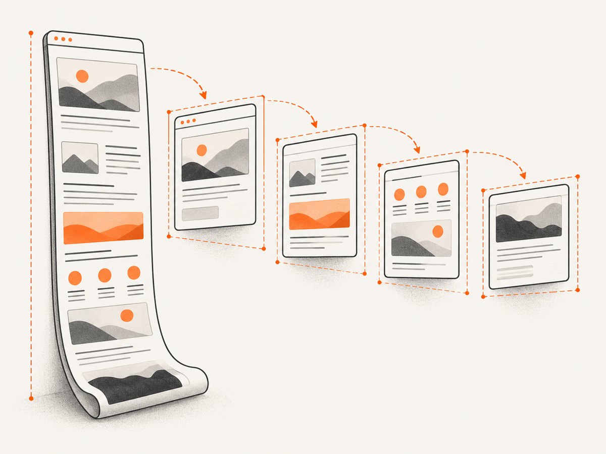
A viewport-sized window can clip content below the fold. For a long element, measure its scroll dimensions and provide matching virtual window dimensions. The html2canvas FAQ recommends this approach for content larger than the current viewport.
const element = document.querySelector('#capture');
const targetWidth = 800;
const oldWidth = element.style.width;
element.style.width = `${targetWidth}px`;

try {
  const canvas = await html2canvas(element, {
    windowWidth: targetWidth,
    windowHeight: element.scrollHeight,
    width: targetWidth,
    height: element.scrollHeight,
    scale: 1,
    x: 0,
    y: 0
  });

  console.log({ cssWidth: targetWidth, pixels: [canvas.width, canvas.height] });
} finally {
  element.style.width = oldWidth;
}
Do not blindly replace the target width with element.scrollWidth. That value can be wider than the layout you intended. Use the requested width for a fixed-width design, and use scroll dimensions for the height or width only when you specifically want the entire overflow area.
Very tall canvases have browser-dependent limits. The project FAQ gives approximate evergreen guidance of about 32,767 pixels per dimension, with total-area limits that vary by browser; iOS devices can have lower limits depending on available RAM. Treat those figures as practical warnings rather than guarantees. Split extremely long documents into sections if a single canvas is blank or truncated.
5. Options that affect fixed-width output
| Option | Effect | When to use |
|---|---|---|
windowWidth |
Virtual window width used during rendering; can change media queries. | Reproducing a desktop, tablet, or mobile breakpoint. |
windowHeight |
Virtual window height. | Long captures that need more layout space. |
width |
Canvas output width. | Exact output width or a crop. |
height |
Canvas output height. | Exact output height or a crop. |
x, y |
Crop origin in the rendered element. | Exporting a region rather than the whole element. |
scale |
Raster density; defaults to device pixel ratio. | Use 1 for predictable CSS-pixel dimensions, 2 for higher-density output. |
backgroundColor |
Background color; set to null for transparency where supported. |
Preventing a transparent page from becoming black or choosing a known background. |
useCORS |
Attempts to load images through CORS. | Remote images whose server sends an appropriate CORS header. |
proxy |
Routes resource loading through a proxy. | When you control a permitted proxy for resources that cannot be loaded directly. |
allowTaint |
Allows cross-origin content to taint the canvas, which can prevent export. | Only when you understand the resulting export restrictions; it does not bypass browser policy. |
ignoreElements |
Skips matching elements. | Removing carets, animations, ads, or controls before capture. |
onclone |
Lets you modify the cloned document before rendering. | Applying capture-only styles without changing the live page. |
For capture-only styling, onclone is often cleaner than mutating the live DOM:
const canvas = await html2canvas(element, {
  windowWidth: 800,
  width: 800,
  scale: 1,
  onclone: (clonedDocument) => {
    const cloned = clonedDocument.querySelector('#capture');
    cloned.style.width = '800px';
    cloned.style.fontFamily = 'Arial, sans-serif';
  }
});
6. Export PNG, JPEG, or a blob efficiently
The examples commonly use canvas.toDataURL() to create a download. Data URLs are convenient but hold the entire encoded image in a JavaScript string. For larger captures, toBlob() avoids that base64 string and lets you choose an image type and quality.
canvas.toBlob((blob) => {
  if (!blob) return;
  const link = document.createElement('a');
  link.download = 'capture.webp';
  link.href = URL.createObjectURL(blob);
  link.click();
  URL.revokeObjectURL(link.href);
}, 'image/webp', 0.9);
JPEG does not preserve transparency. PNG is usually appropriate for text and sharp UI edges. WebP can reduce file size where your consuming browser or service supports it. Always inspect canvas.width and canvas.height after rendering rather than assuming CSS dimensions survived transforms, borders, and scaling exactly.
7. Cross-origin images, fonts, and iframes
Browser security rules still apply. If an image is hosted on another origin, html2canvas can read it only when the server permits the request with suitable CORS headers, or when a permitted proxy fetches it. useCORS: true requests a CORS load; it is not a bypass for server policy.
const canvas = await html2canvas(element, {
  width: 800,
  windowWidth: 800,
  scale: 1,
  useCORS: true
});
Cross-origin iframe documents cannot be rendered because the parent page cannot inspect their DOM. Same-origin iframe content is supported recursively according to the project documentation. If you own the embedded application, serve it from the same origin or provide a server-side capture path.
8. Troubleshooting checklist
| Symptom | Likely cause | Fix |
|---|---|---|
| Responsive layout uses the wrong breakpoint | Only canvas width was set. | Set windowWidth to the desired viewport and give the target element a matching CSS width. |
| Output is the wrong number of pixels | Implicit device-pixel scale or transforms. | Set scale explicitly, then inspect canvas.width and canvas.height. |
| Images are missing | Remote server lacks CORS headers or the image is not loaded yet. | Wait for images, use CORS-enabled assets with useCORS, or use a permitted proxy. |
| Iframe is empty | The iframe is cross-origin. | Use same-origin content or capture the iframe separately where you have access. |
| Bottom of page is clipped | Virtual window or output height is too small. | Use the element’s scroll height for windowHeight and height. |
| Canvas is blank or throws a size error | Canvas dimension or total-area limit was exceeded. | Reduce scale, capture smaller sections, or split a long page. |
| Styles differ from the browser | html2canvas does not support every CSS property and reconstructs the scene from DOM data. | Simplify unsupported effects, add capture-only CSS, and compare the result at the intended width. |
| Download contains a black background | Transparency was replaced during encoding or by a viewer. | Set an explicit backgroundColor, or use PNG when transparency is required. |
Before debugging width, wait for fonts and images. A capture started before web fonts finish can change line wrapping and therefore the element’s height. For deterministic output, disable animations, remove blinking carets, and capture after the page reaches an idle state.
9. Performance, reliability, and cost considerations
- Memory: Raster memory grows with width × height × scale². A 2× scale can use roughly four times the pixel storage of scale 1 for the same CSS area.
- Work: Large DOM trees, shadows, gradients, filters, and long pages take more time to clone and paint. Capture the smallest element that satisfies the requirement.
- Repeatability: Use explicit width, viewport, scale, background, fonts, and content state. Avoid capturing while layout is changing.
- Browser limits: Maximum canvas dimensions and area differ by browser and device. Build a fallback that splits long documents.
- Client-side cost: html2canvas runs in the user’s browser, so CPU, memory, CORS access, and page state are your responsibility. A server capture service can centralize those concerns.
10. Or skip the browser setup
If you need a clean fixed-width image from a URL rather than a canvas reconstructed in the current browser, ScreenshotNeo provides a website screenshot API. Its API accepts one GET request and returns PNG, JPEG, WebP, or PDF. Use the documented parameters at ScreenshotNeo docs:
curl -G "https://api.screenshotneo.com/v1/shot" \
  -d access_key=YOUR_API_KEY \
  --data-urlencode url=https://stripe.com \
  -d width=800 \
  -o shot.webp
import requests
r = requests.get(
"https://api.screenshotneo.com/v1/shot",
params={
"access_key": "YOUR_API_KEY",
"url": "https://stripe.com",
"width": 800,
},
timeout=90,
)
r.raise_for_status()
open("shot.webp", "wb").write(r.content)const q = new URLSearchParams({
access_key: 'YOUR_API_KEY',
url: 'https://stripe.com',
width: '800'
});
const res = await fetch(`https://api.screenshotneo.com/v1/shot?${q}`);
if (!res.ok) throw new Error(`HTTP ${res.status}`);
const fs = await import('node:fs/promises');
await fs.writeFile('shot.webp', Buffer.from(await res.arrayBuffer()));ScreenshotNeo removes cookie and consent banners, newsletter popups, and chat widgets before capture; each cleanup step can be turned off. Bot checks and CAPTCHAs, blank pages, timeouts, failed loads, and cache hits cost nothing, and the response identifies the result with X-Page-Verdict and X-Billed headers. An MCP server exposes take_screenshot, get_page_info, and capture_pdf to Claude, Cursor, and other MCP clients.
You can set a viewport or device preset, retina scale, full-page capture, element selector, dark mode, custom CSS and JavaScript, waits, blocked requests, cookies, headers, user agent, timezone, geolocation, transparent background, resizing, caching TTL, signed links, asynchronous webhooks, and bulk capture. Plans include 1,000 shots per month free with no card; paid plans start at $5 for 3,000 shots. Create a free ScreenshotNeo account.
11. FAQ
Does setting width: 800 change the responsive breakpoint?
No. It sets the canvas width. Set windowWidth: 800 when media queries must evaluate against an 800-pixel virtual viewport.
Should I always set scale: 1?
Use scale 1 when CSS-pixel dimensions matter. Use a higher explicit scale when you need denser output and can afford the additional memory.
Can html2canvas capture a page exactly like a browser screenshot?
No. It reconstructs an image from DOM information and supported CSS. Unsupported or partially supported properties can produce visual differences.
Why does a cross-origin image make export fail?
The browser protects pixels from origins that do not grant access. Configure CORS on the image server or use a permitted proxy; useCORS cannot override that policy.
How do I capture only one element?
Pass that element to html2canvas, set its CSS width to the desired layout width, and use width and scale to control the output pixels.


