How to Increase the Screen Size in Playwright
Set larger Playwright viewports reliably with config, per-test overrides, device emulation, troubleshooting, and a no-browser ScreenshotNeo option.
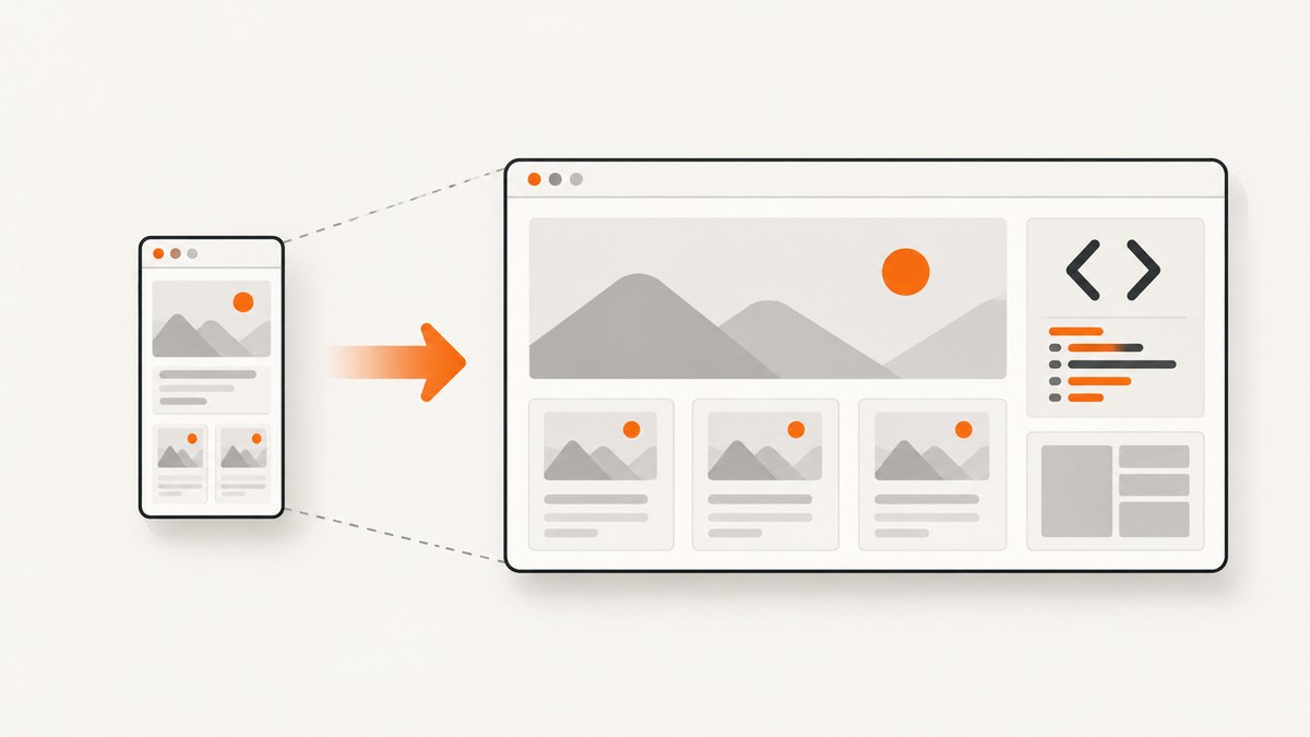
In Playwright, “screen size” usually means the page viewport: the width and height, in CSS pixels, available to the web page. Set it in Playwright Test with use.viewport, set it for a suite with test.use(), configure it on a browser context, or resize one page with page.setViewportSize().
The most deterministic project-wide setting is:
import { defineConfig } from '@playwright/test';

export default defineConfig({
  use: {
    viewport: { width: 1600, height: 1200 },
  },
});
For one page, use:
await page.setViewportSize({ width: 1600, height: 1200 });These dimensions affect responsive CSS, media queries, layout, screenshots and the coordinates available to mouse and touch actions. They do not directly resize the operating-system browser window. Playwright Test’s documented default viewport is 1280 × 720. See the official TestOptions and emulation documentation for the complete API.
What “screen size” means in Playwright
Several related settings are easy to confuse:
| Setting | What it changes | Use it for |
|---|---|---|
| Viewport | CSS width and height available to the page | Responsive layout tests, screenshots and visual checks |
| Screen size | Emulated physical screen dimensions exposed to the page | Tests that read screen APIs or emulate a device |
| Device scale factor | Emulated device pixel ratio | Retina or high-density rendering behavior |
| Outer browser window | Visible operating-system window | Rare headed-browser workflows; not a portable layout setting |
For ordinary responsive testing, change the viewport. A larger outer window is not a substitute because page layout is calculated from the viewport exposed to the document. A deviceScaleFactor changes pixel density, not the CSS dimensions.
Set a larger viewport globally
Use use.viewport in playwright.config.ts when every test in a project should run at the same size.

import { defineConfig, devices } from '@playwright/test';

export default defineConfig({
  testDir: './tests',
  use: {
    baseURL: 'http://localhost:3000',
    viewport: { width: 1920, height: 1080 },
    screenshot: 'only-on-failure',
    trace: 'retain-on-failure',
  },
  projects: [
    {
      name: 'desktop-chrome',
      use: { ...devices['Desktop Chrome'] },
    },
  ],
});
The viewport is expressed in CSS pixels. Choose dimensions that represent the layout you want to exercise, such as 1366 × 768 for a common laptop layout or 1920 × 1080 for a wide desktop layout. Keep the value fixed in CI so a test does not change behavior with the machine running it.
Disable the viewport (and why that is usually a bad idea)
import { defineConfig } from '@playwright/test';

export default defineConfig({
  use: {
    viewport: null,
  },
});
viewport: null makes the viewport depend on the host window. The official documentation warns that this makes execution nondeterministic. A developer laptop, CI runner and container can then produce different line wrapping, breakpoints and screenshots. Use fixed dimensions for repeatable tests.
Change the viewport for one file or test block
test.use() overrides the project setting for a file, describe block or individual test.
import { test, expect } from '@playwright/test';

test.describe('wide dashboard', () => {
  test.use({ viewport: { width: 1600, height: 1000 } });

  test('shows the desktop navigation', async ({ page }) => {
    await page.goto('/dashboard');
    await expect(page.getByRole('navigation')).toBeVisible();
  });
});

test('uses a compact viewport', async ({ page }) => {
  test.use({ viewport: { width: 1024, height: 768 } });
  await page.goto('/reports');
});
This approach keeps a special layout requirement close to the tests that need it. Use the smallest scope that makes the requirement clear: project for a standard, file for a suite, and test for an isolated case.
Resize a page at runtime
With the Playwright library, create a context with a viewport:
import { chromium } from 'playwright';

const browser = await chromium.launch();
const context = await browser.newContext({
  viewport: { width: 1600, height: 1200 },
});
const page = await context.newPage();

await page.goto('https://example.com');
console.log(await page.evaluate(() => ({
  width: window.innerWidth,
  height: window.innerHeight,
})));

await browser.close();
To resize an existing page:
await page.setViewportSize({ width: 1600, height: 1200 });
await page.reload();
Set the size before navigation when possible. Many sites initialize responsive components during page load and do not expect phone or desktop dimensions to change halfway through a session. If you must test a resize event, make the resize itself the subject of the test and wait for the UI to settle before asserting.
Override a device preset’s viewport
Device descriptors configure more than width and height: user agent, touch support, screen characteristics and other device behavior. Spread the descriptor first, then put your viewport override after it.
import { chromium, devices } from 'playwright';

const browser = await chromium.launch();
const context = await browser.newContext({
  ...devices['iPhone 13'],
  viewport: { width: 430, height: 932 },
});
const page = await context.newPage();

await page.goto('https://example.com');
await browser.close();
The order matters: a later viewport property replaces the preset’s viewport. Keep the device’s mobile user agent and touch behavior when those are part of the scenario, but override dimensions when your test needs a specific breakpoint.
Use screen size, scale factor and mobile settings together
For a test that reads window.screen or depends on pixel density, configure the related options explicitly:
const context = await browser.newContext({
  viewport: { width: 1440, height: 900 },
  screen: { width: 1440, height: 900 },
  deviceScaleFactor: 2,
  isMobile: false,
  hasTouch: false,
});
The viewport controls the document’s layout area. screen describes the emulated screen. A scale factor of 2 can produce a high-density screenshot while keeping CSS layout at 1440 × 900. Do not increase the viewport merely to make an image contain more device pixels; use scale factor for that purpose.
Generate tests at a chosen size with codegen
When recording a test, pass --viewport-size:
npx playwright codegen --viewport-size="1600,1000" https://playwright.devThe generated test records interactions at that viewport. Treat the generated value as a starting point and move the durable setting into your configuration or test fixture once the test is committed. The option is documented in the official test generator guide.
Full-page screenshots versus a larger viewport
A larger viewport shows more content in one screenful, but it does not capture an entire long page. Use Playwright’s full-page screenshot option when you need the complete document:
import { test } from '@playwright/test';

test('capture the whole page', async ({ page }) => {
  await page.setViewportSize({ width: 1600, height: 1000 });
  await page.goto('https://example.com', { waitUntil: 'networkidle' });
  await page.screenshot({ path: 'page.png', fullPage: true });
});
Full-page capture can expose lazy-loading edge cases. Scroll the page or trigger the application’s lazy-loader before capture when images appear only after intersection. A very tall document also creates a large bitmap and may require more memory than a viewport screenshot.
Reliable viewport test patterns
Test breakpoints instead of arbitrary sizes
Choose widths around your application’s actual CSS breakpoints. A useful matrix might include 375, 768, 1024, 1280 and 1600 pixels, with a height that keeps the test fast. The goal is to prove behavior on both sides of each breakpoint, not to enumerate every possible monitor.
Keep dimensions in one source of truth
export const viewports = {
  mobile: { width: 390, height: 844 },
  tablet: { width: 768, height: 1024 },
  desktop: { width: 1440, height: 900 },
} as const;
Import these values into projects or fixtures so screenshots, visual-regression tests and end-to-end tests agree. Record the chosen dimensions in test output when diagnosing a failure.
Wait for layout stability
Viewport changes can trigger font loading, image layout shifts and responsive data requests. Wait for a stable locator rather than sleeping for an arbitrary period:
await page.setViewportSize({ width: 1600, height: 1000 });
await page.goto('/analytics');
await page.getByRole('heading', { name: 'Analytics' }).waitFor();
await page.locator('[data-chart="revenue"]').waitFor();
Common errors and fixes
| Symptom | Likely cause | Fix |
|---|---|---|
| The page still wraps at a narrow width | The code changed the outer window or used a device preset that overwrote the viewport | Set viewport directly and place it after a spread device descriptor. |
page.setViewportSize is unavailable |
You are using a non-Playwright page object or a different automation library | Confirm the import and fixture type; Playwright’s Page exposes this method. |
| Tests pass locally but fail in CI | viewport: null, different browser flags or host-dependent dimensions |
Use fixed width and height in configuration and avoid relying on the visible OS window. |
| Mobile styles do not appear | Only the viewport changed; the test still has a desktop user agent or lacks mobile emulation | Use a mobile device descriptor when user agent, touch or mobile behavior matters. |
| Screenshot is blurry or unexpectedly large | Device scale factor was changed or the output is a full-page bitmap | Keep CSS viewport dimensions separate from deviceScaleFactor; use the smallest capture area needed. |
| Elements move after the screenshot | Fonts, images or data were still loading | Wait for a meaningful locator, disable animations in test CSS, and ensure assets are ready. |
| Clicks miss after resizing | Coordinates were recorded at a different viewport or a fixed header changed position | Prefer locator actions and recalculate coordinates after the resize. |
| Custom browser arguments cause strange behavior | Arguments such as maximize flags can interfere with Playwright | Use viewport configuration for layout; add launch arguments only when a browser-specific requirement is unavoidable. |
Performance, reliability and cost considerations
- Runtime: A wider viewport does not inherently make JavaScript slower, but full-page screenshots, high device scale factors and very tall pages increase rendering and image-processing work.
- Parallelism: Large screenshots consume more memory per worker. Reduce worker count or capture dimensions when CI runners run out of memory.
- Determinism: Fixed viewport, browser version, fonts and device settings produce more stable visual results than host-dependent windows.
- Network: Wait for the application’s real readiness signal.
networkidlecan be inappropriate for pages with analytics or long polling; a stable selector is often more reliable. - Cost: Self-hosted Playwright costs the compute time and storage of your own runners. Keep artifacts such as full-page images and traces only for failures when storage matters.
Or skip the browser setup
If your goal is a clean screenshot at a chosen viewport rather than an interactive Playwright test, ScreenshotNeo provides a one-request website screenshot API. Its API accepts viewport and capture options, and the documentation lists the parameter names used by other screenshot APIs as well.
cURL:
curl -G "https://api.screenshotneo.com/v1/shot" \
  -d access_key=YOUR_API_KEY \
  --data-urlencode url=https://stripe.com \
  -o shot.webp
Python:
import requests

r = requests.get(
    "https://api.screenshotneo.com/v1/shot",
    params={
        "access_key": "YOUR_API_KEY",
        "url": "https://stripe.com",
        "viewport_width": 1600,
        "viewport_height": 1200,
    },
    timeout=90,
)
r.raise_for_status()
open("shot.webp", "wb").write(r.content)
Node.js:
const q = new URLSearchParams({
  access_key: 'YOUR_API_KEY',
  url: 'https://stripe.com',
  viewport_width: '1600',
  viewport_height: '1200',
});

const res = await fetch(`https://api.screenshotneo.com/v1/shot?${q}`);
if (!res.ok) throw new Error(`Screenshot failed: ${res.status}`);
const bytes = await res.arrayBuffer();
await Bun.write('shot.webp', bytes);
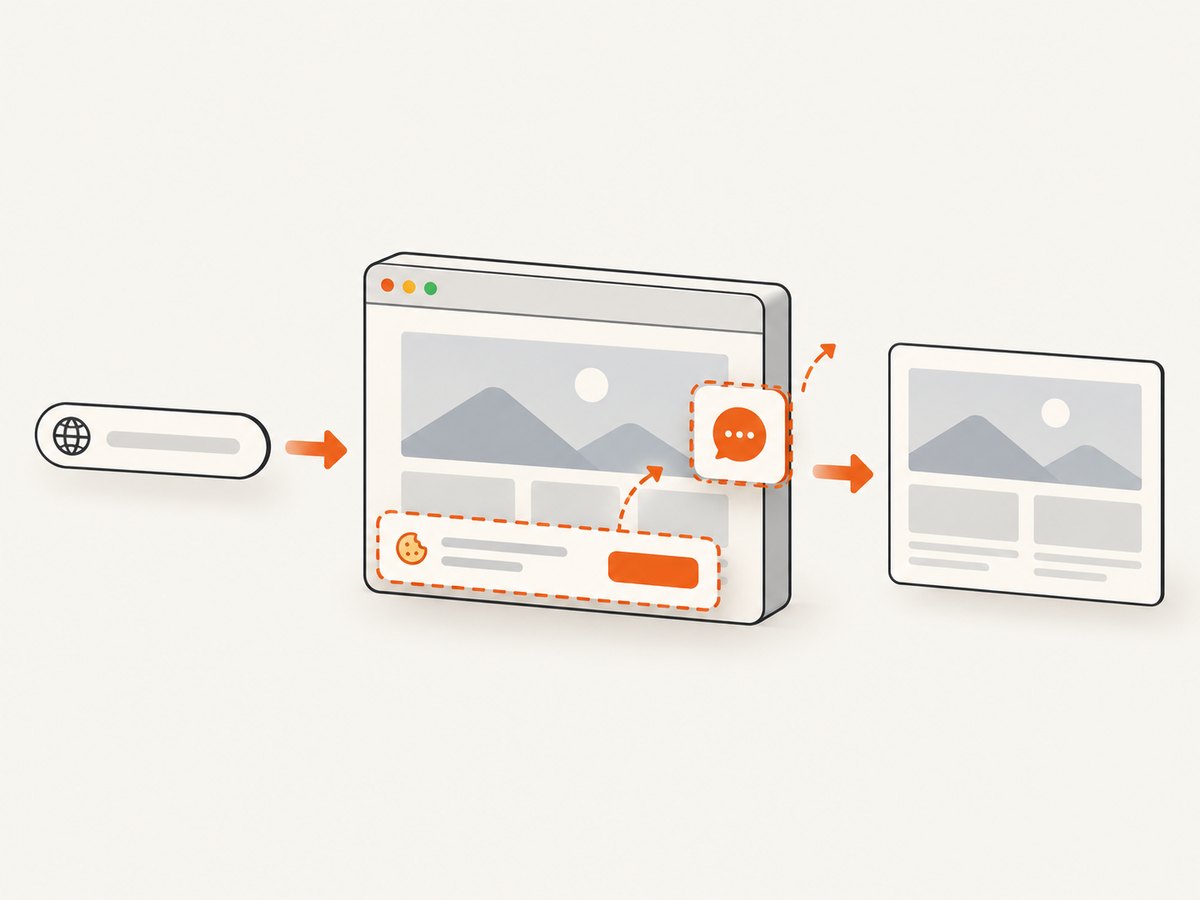
ScreenshotNeo removes cookie and consent banners, newsletter popups and chat widgets before capture. Bot checks, blank pages, timeouts, failed loads and cache hits are not billed, and response headers identify the page verdict and whether the request was billed. It also offers full-page and element capture, dark mode, retina scale, custom CSS and JavaScript, waits, request blocking, headers, cookies, user agents, geolocation, resizing, caching, signed links, asynchronous jobs, bulk capture and PDF output.
An MCP server provides take_screenshot, get_page_info and capture_pdf tools for Claude, Cursor and other MCP clients. The Free plan includes 1,000 screenshots per month without a card; paid plans start at $5 for 3,000 shots. Create a free ScreenshotNeo account.
FAQ
What is the largest viewport Playwright supports?
Playwright accepts positive width and height values. The practical limit is the memory and rendering capacity of the browser and runner, so choose dimensions that represent a real test scenario.
Does increasing the viewport make the browser window larger?
No. It changes the page’s emulated viewport. The visible outer window is a separate browser concern and is not a portable way to test responsive layouts.
Should I use page.setViewportSize() before or after page.goto()?
Set it before navigation when possible. This lets the application initialize at the intended breakpoint. Resize after navigation only when testing resize behavior itself.
Why is my screenshot still not full height?
A taller viewport shows more content but does not include the entire document. Use page.screenshot({ fullPage: true }) for a full-page image and prepare lazy-loaded content first.
Do I need a device descriptor for a wide desktop?
No. A plain viewport is sufficient for desktop layout checks. Use a descriptor when user agent, touch, mobile behavior or device screen characteristics are also part of the test.
Can I use a viewport of null in visual regression tests?
You can, but the result depends on the host window and is therefore less reproducible. Fixed dimensions are safer for visual comparisons.


