How to Increase Viewport Width in Percy Visual Testing
Set wider Percy viewports with snapshot.widths, keep responsive baselines stable, and troubleshoot configuration issues step by step.

To increase viewport width in Percy, add the widths you want to the snapshot.widths list in a version 2 .percy.yml file. For example:
version: 2
snapshot:
  widths: [375, 768, 1280]
  min-height: 1024
Run your test through Percy CLI so Percy reads the project configuration and captures each snapshot at every configured width. With Cypress, the documented pattern is:
npx percy exec -- cypress runThe values in the example are pixels. Replace them with widths that cover the breakpoints and layouts your application actually supports. Keep the list stable between runs so visual comparisons use the same viewport settings.
Configure wider viewports in .percy.yml
Percy reads viewport configuration from a project-level .percy.yml. Create that file at the configuration level used by your test project, or edit the existing file if one is already present. Use configuration version 2 and place the widths below the snapshot key.
version: 2
snapshot:
  widths: [375, 768, 1280, 1440]
  min-height: 1024
Each entry in snapshot.widths is an integer viewport width. The list can contain several responsive targets, so you can cover a phone-sized layout, a tablet-sized layout, and one or more desktop layouts in one test run. The Percy example uses 375, 768, and 1280 pixels; those values illustrate the format and are not a universal default or required set.
Choose widths from your responsive design
Start with the breakpoints that change structure, navigation, typography, grids, or spacing. A useful process is:
- List the breakpoints in your CSS, design system, or component documentation.
- Choose a viewport width at or near each breakpoint where the layout should be validated.
- Add a wide desktop width if your product has a separate max-width or multi-column layout.
- Use the same list for every run that should compare against the same baselines.
Do not add widths merely because they are common device numbers. A smaller, intentional set is easier to review. Add another width when a real layout rule is not represented by the current set.
What min-height does
The example also includes min-height: 1024. This sets the minimum capture height for the snapshot configuration. It does not increase the viewport width. Change min-height when the page needs more vertical space for a meaningful comparison, while keeping width decisions in snapshot.widths.
Run Percy with the new widths
After saving the YAML file, execute the test command through Percy CLI. For Cypress:
npx percy exec -- cypress runPercy CLI wraps the test command, captures the snapshots, and uploads them for review. Use the command that your project normally runs after the percy exec -- prefix. The important part is that the command is executed by Percy CLI rather than running the browser test directly.
Example project sequence
- Create or update
.percy.yml. - Commit the configuration with the test code so other runs use the same widths.
- Run the test through Percy CLI.
- Open the resulting Percy build and inspect each configured width.
- Approve a new baseline only when the visual change is intentional.
When a layout change is expected, review every width affected by the change. A component may look correct at 1280 pixels while overflowing or wrapping at 768 pixels.
Complete configuration example
This is a minimal version 2 configuration with three responsive widths and a minimum height:
version: 2
snapshot:
  widths: [375, 768, 1280]
  min-height: 1024
To add a wider desktop check, extend the list:
version: 2
snapshot:
  widths: [375, 768, 1280, 1536]
  min-height: 1024
Keep YAML indentation consistent. widths must be nested under snapshot, and the width values must be written as numbers rather than quoted strings.
How Percy compares multiple widths
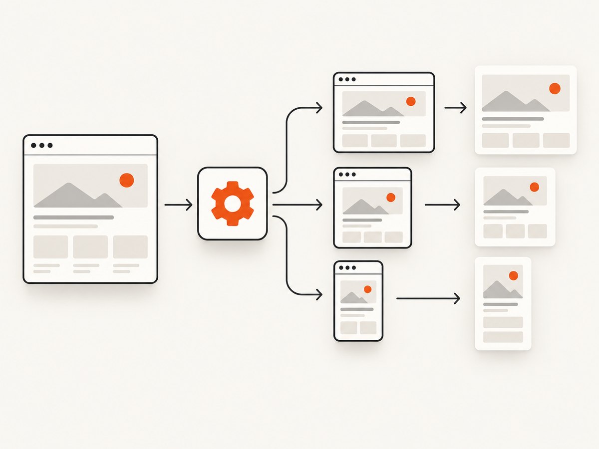
Each configured width creates a separate responsive rendering for the snapshot. Percy can then show visual differences for each width during review. This makes responsive regressions visible when a change affects only one layout range.
Stable configuration matters because changing the width list changes the set of screenshots being compared. Treat viewport widths as part of the visual test contract. When you intentionally add a width, expect a new baseline review for that viewport.
Testing breakpoint behavior
Suppose your navigation changes from a horizontal menu to a compact menu at a breakpoint. Include one width below that breakpoint and one above it. If a grid changes from two columns to four, include widths that render both states. The exact values depend on your application; the Percy guide does not prescribe a universal breakpoint matrix.
Troubleshooting viewport width changes
The new width does not appear
Cause: Percy is not reading the file, or the test was run without Percy CLI.
Fix: Confirm that .percy.yml is located at the project configuration level used by the run. Check that the command includes npx percy exec -- before the test command. Then inspect the generated Percy build for the expected set of widths.
YAML parsing fails
Cause: Incorrect indentation, a missing colon, or malformed list syntax.
Fix: Use spaces, not tabs. Make sure the structure matches this shape:
version: 2
snapshot:
  widths: [375, 768, 1280]
Keep widths aligned beneath snapshot. Remove quotes and stray punctuation around numeric values.
Only one viewport is captured
Cause: The test may be running directly instead of through Percy CLI, or the configuration may be outside the project being executed.
Fix: Run the complete command through Percy CLI and verify the working directory. If your repository contains multiple applications, place the configuration where the invoked Percy project can load it.
Visual differences appear unexpectedly after adding a width
Cause: The new viewport exposes a real responsive state that was not previously reviewed.
Fix: Inspect the page at that width. Check wrapping, hidden elements, navigation transitions, image sizing, and horizontal overflow. Approve the baseline only after confirming the rendering is intentional.
The width seems correct locally but differs in Percy
Cause: The local browser may be using a different test command or configuration than the Percy run.
Fix: Compare the command, project directory, and committed .percy.yml. Keep viewport settings and other rendering inputs stable between runs so the comparison isolates code changes.
Performance and reliability considerations
Every additional width expands the amount of visual output that reviewers must inspect. Start with widths that represent meaningful layout states, then add coverage where defects have a realistic chance of escaping. A fixed list also makes build comparisons easier to interpret because each run produces the same responsive targets.
Keep the configuration under version control. A reviewable change to .percy.yml makes it clear when a viewport was added or removed. If a build suddenly has a different set of screenshots, check configuration changes before investigating application code.
The cited Percy guidance demonstrates the configuration format and recommends stable viewport settings across runs. It does not state a maximum width, maximum number of entries, default widths, or plan-specific limits. Do not assume such limits without checking the current Percy documentation or account terms.
Automating the configuration check
You can make the width list part of your normal code review checklist:
- Is
version: 2present? - Are all widths nested under
snapshot.widths? - Are the values integers in pixels?
- Does the list cover every important responsive layout state?
- Does CI invoke the test through Percy CLI?
- Are intentional baseline changes reviewed at every width?
This checklist catches configuration drift before it becomes a confusing visual test result.
Or skip the browser setup
If your goal is to obtain screenshots at selected viewport widths rather than maintain a browser test harness, ScreenshotNeo provides a website screenshot API. It accepts one GET request and returns a PNG, JPEG, WebP, or PDF. Set the viewport with the API’s viewport options, and use full-page capture when you need the entire document.

See the ScreenshotNeo API documentation for the current parameter names and options. A basic request looks like this:
curl -G "https://api.screenshotneo.com/v1/shot" -d access_key=YOUR_API_KEY --data-urlencode url=https://stripe.com -o shot.webpPython:
import requests
r = requests.get("https://api.screenshotneo.com/v1/shot", params={"access_key": "YOUR_API_KEY", "url": "https://stripe.com"}, timeout=90)
open("shot.webp", "wb").write(r.content)
Node.js:
const q = new URLSearchParams({ access_key: 'YOUR_API_KEY', url: 'https://stripe.com' });
const res = await fetch(`https://api.screenshotneo.com/v1/shot?${q}`);
ScreenshotNeo removes cookie and consent banners, newsletter popups, and chat widgets before capture. Bot checks, blank pages, timeouts, failed loads, and cache hits are not billed, and each response identifies the result with X-Page-Verdict and X-Billed headers. Its MCP server provides take_screenshot, get_page_info, and capture_pdf tools for Claude, Cursor, and other MCP clients.
You can also use custom viewport sizes, 12 device presets, retina scale, full-page capture with lazy images loaded, CSS element capture, dark mode, custom CSS or JavaScript, click actions, waits, request blocking, headers, cookies, user agents, authorization, timezone, geolocation, transparent backgrounds, resizing, caching with a chosen TTL, signed links, asynchronous jobs, webhooks, bulk capture for up to 100 URLs per call, and the usage API. Every feature is available on every plan. The Free plan includes 1,000 shots per month without a card; paid plans start at $5 for 3,000 shots.
Create a free ScreenshotNeo account and get 1,000 screenshots a month with no card.
Cost and workflow notes
Percy is useful when viewport screenshots belong inside a visual regression workflow with baselines, builds, and approvals. A screenshot API is useful when an application, script, documentation pipeline, or AI agent needs an image on demand. Choose widths based on the job: Percy configurations describe repeatable test coverage, while an API request can generate a selected capture as part of another workflow.
For ScreenshotNeo, only clean shots are billed. Failed loads, bot checks, blank pages, timeouts, and cache hits cost nothing. This lets you handle unreliable target pages without treating every failed request as a paid screenshot.
FAQ
What is the direct Percy setting for viewport width?
Use snapshot.widths in a version 2 .percy.yml file.
Are Percy widths measured in pixels?
Yes. The configuration values represent viewport widths in pixels.
Does adding min-height make the viewport wider?
No. min-height controls minimum capture height. Width is controlled by snapshot.widths.
Is 1280 pixels the maximum Percy width?
The cited example includes 1280 pixels, but it does not establish a maximum width.
Do I need Percy CLI?
Run the test through Percy CLI so Percy can capture and upload snapshots using the project configuration.
Should every project use 375, 768, and 1280?
Those values are an example. Select widths that represent your own responsive layouts and breakpoints.


