How to Insert an Image in an HTML Document
Learn the HTML img tag, image paths, alt text, responsive images, dimensions, troubleshooting, and a ScreenshotNeo shortcut.
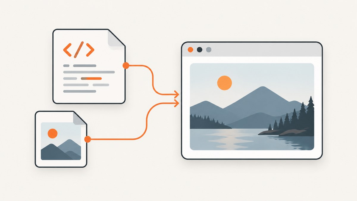
Use the void <img> element. A beginner-safe example is:
<img src="images/photo.jpg" alt="A description of the image">src identifies the image resource and alt provides a text replacement for its meaning. The HTML Standard recommends the img element when there is one image resource. See the WHATWG HTML Standard and MDN’s img reference.
1. Add a basic image
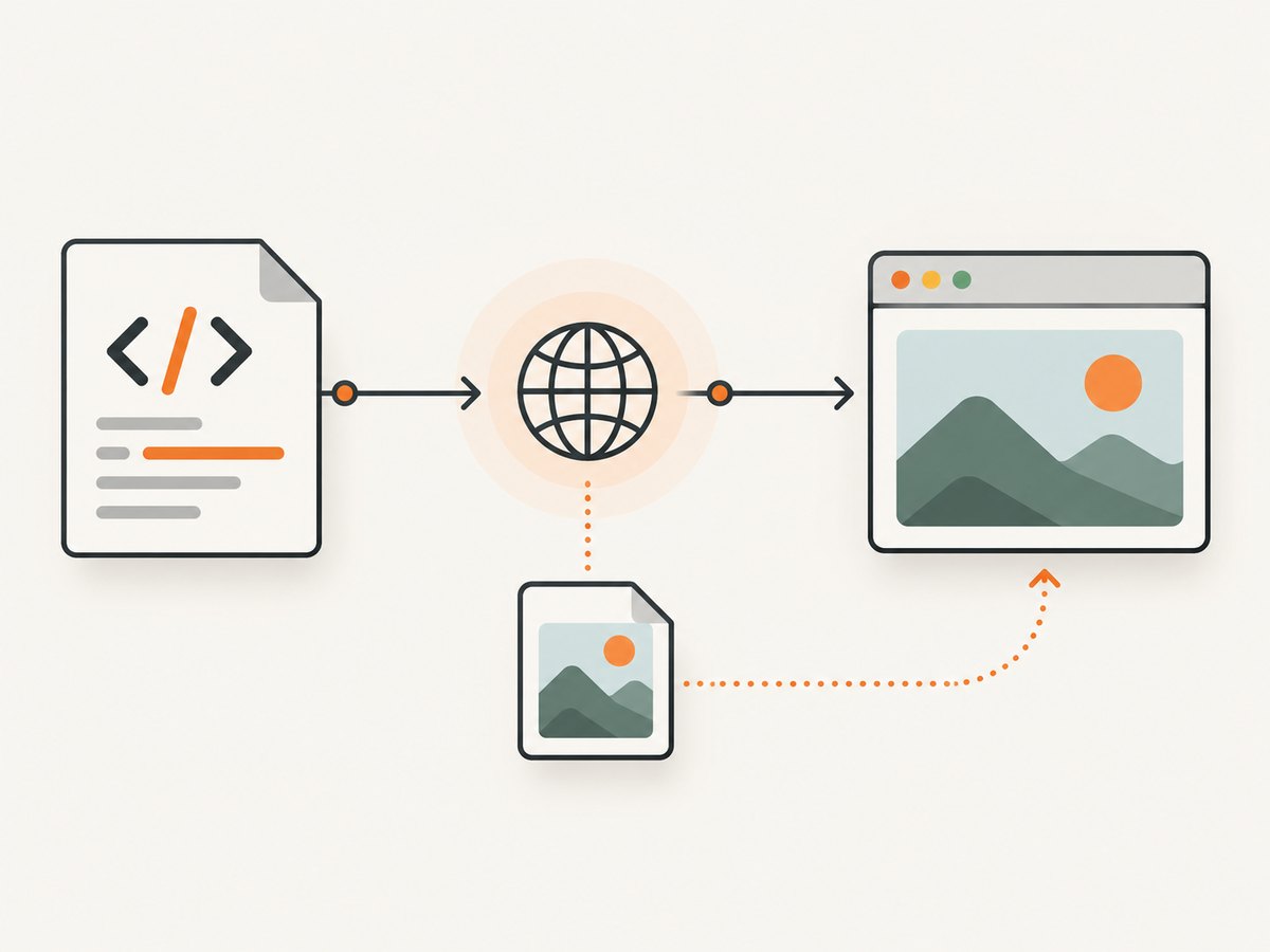
Create an HTML file and place an image file where the URL in src can reach it.
<!doctype html>
<html lang="en">
<head>
  <meta charset="utf-8">
  <meta name="viewport" content="width=device-width, initial-scale=1">
  <title>Image example</title>
</head>
<body>
  <h1>A mountain at sunrise</h1>
  <img src="images/mountain.jpg" alt="A mountain at sunrise">
</body>
</html>
The img element is void: it has no closing tag. Do not write </img>.
Choose the right src form
| Form | Example | Resolution base |
|---|---|---|
| Relative | images/photo.jpg |
The URL of the current HTML document |
| Root-relative | /images/photo.jpg |
The site’s root |
| Absolute | https://example.com/photo.jpg |
The specified host |
Paths are case-sensitive on many servers. A page at /docs/index.html resolves images/photo.jpg as /docs/images/photo.jpg, while /images/photo.jpg starts at the site root.
2. Write useful alternative text
Use alt as the useful replacement for the image’s meaning or function. It is also shown when the image cannot load and is read by screen readers.
<img src="penguin.jpg" alt="A penguin standing on a beach">- Describe the subject and relevant context, not the filename.
- Do not use generic text such as
alt="image". - For a decorative image with no information, use
alt="". - If the image is a link, describe the destination or action:
<a href="/gallery">
  <img src="gallery-thumb.jpg" alt="Open the photo gallery">
</a>
Do not repeat nearby text. If a caption already gives the complete meaning, an empty alt value may be appropriate when the image is supplementary.
3. Set dimensions and responsive layout
When intrinsic dimensions are known, include numeric width and height attributes. They let the browser reserve the correct aspect ratio before downloading the image, reducing layout shift.
<img
  src="photo.jpg"
  alt="A mountain at sunrise"
  width="1200"
  height="800">
HTML dimensions are integer pixel hints; do not include units such as px. Use CSS for fluid rendering:
img {
  max-width: 100%;
  height: auto;
}
Keep the HTML dimensions even when CSS scales the rendered image. They preserve the intrinsic ratio while the image adapts to its container.
Prevent overflow and control cropping
.content img {
  display: block;
  max-width: 100%;
  height: auto;
}

.avatar {
  width: 96px;
  height: 96px;
  object-fit: cover;
  border-radius: 50%;
}
Use object-fit: cover only when cropping is intentional. Use contain when the entire image must remain visible.
4. Serve responsive images
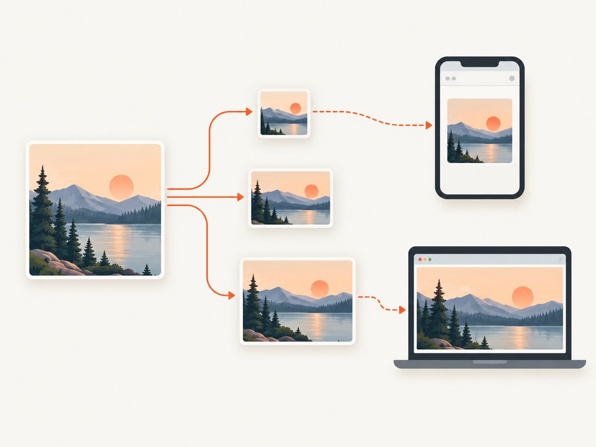
When the same image is available at multiple resolutions, use srcset with width descriptors and pair it with an accurate sizes rule.
<img
  src="photo-800.jpg"
  srcset="photo-400.jpg 400w, photo-800.jpg 800w, photo-1600.jpg 1600w"
  sizes="(max-width: 600px) 100vw, 800px"
  width="1600"
  height="1067"
  alt="A mountain at sunrise">
The browser uses the viewport, device pixel ratio, and sizes estimate to choose a candidate. The numbers must match each file’s actual intrinsic width. A wrong descriptor can make the browser download an unnecessarily large or blurry file.
Use picture for art direction or formats
<picture>
  <source media="(max-width: 600px)" srcset="portrait-crop.jpg">
  <source type="image/avif" srcset="photo.avif">
  <img src="photo.jpg" alt="A mountain at sunrise" width="1600" height="1067">
</picture>
picture can select a different crop or format. It must contain an img fallback with src and alt. The fallback is also where you put the final alternative text and intrinsic dimensions.
5. Add captions, links, and loading behavior
Captions
<figure>
  <img src="map.jpg" alt="Map of the hiking route" width="1200" height="700">
  <figcaption>The route follows the northern ridge.</figcaption>
</figure>
Linked images
<a href="/photos/sunrise-large.jpg">
  <img src="sunrise-thumb.jpg" alt="Open the full-size sunrise photograph" width="320" height="213">
</a>
Lazy loading
<img src="below-fold.jpg" alt="Forest trail" width="1200" height="800" loading="lazy" decoding="async">Use lazy loading for images below the initial viewport. Avoid lazy-loading the main above-the-fold image, because it can delay the largest visible content. Keep dimensions on every lazy image so its space is reserved.
6. Complete working example
<!doctype html>
<html lang="en">
<head>
  <meta charset="utf-8">
  <meta name="viewport" content="width=device-width, initial-scale=1">
  <title>Responsive image</title>
  <style>
    body { max-width:  fiftyrem; margin: 2rem auto; padding: 0 1rem; font: 1rem/1.5 system-ui, sans-serif; }
    img { display: block; max-width: 100%; height: auto; }
  </style>
</head>
<body>
  <main>
    <h1>Responsive image demo</h1>
    <figure>
      <picture>
        <source media="(max-width: 600px)" srcset="images/mountain-portrait.jpg">
        <source type="image/avif" srcset="images/mountain.avif">
        <img
          src="images/mountain-800.jpg"
          srcset="images/mountain-400.jpg 400w, images/mountain-800.jpg 800w, images/mountain-1600.jpg 1600w"
          sizes="(max-width: 600px) 100vw, 800px"
          width="1600"
          height="1067"
          alt="A mountain at sunrise"
          decoding="async">
      </picture>
      <figcaption>Sunrise over the ridge.</figcaption>
    </figure>
  </main>
</body>
</html>
Replace fiftyrem with 50rem in the CSS; the corrected declaration is max-width: 50rem.
7. Troubleshoot missing or incorrect images
| Symptom | Likely cause | Fix |
|---|---|---|
| Nothing appears | Missing src/srcset, a 404, or a blocked request |
Inspect the browser Network panel and open the resolved image URL directly. |
| Broken-image icon | Wrong relative base, filename case, URL encoding, permissions, or server availability | Check the exact path from the document URL and the server response status. |
| Image works locally but not after deployment | Case-sensitive production filesystem or missing copied asset | Match capitalization exactly and verify the deployed file exists. |
| Layout jumps while loading | No intrinsic dimensions or mismatched ratio | Add accurate width and height; keep height: auto. |
| Screen reader says an unhelpful phrase | Filename, “image,” or missing alt text | Write a concise meaningful alternative, or use alt="" for decoration. |
| Wrong responsive candidate | Incorrect srcset widths or inaccurate sizes |
Check each file’s intrinsic width and describe its rendered slot accurately. |
| Image is cropped unexpectedly | object-fit: cover or a fixed box |
Use contain, remove the crop, or choose a deliberate art-directed source. |
| Cross-origin error in script | JavaScript is reading pixels from another origin without permission | Configure the image host’s CORS policy or keep the image same-origin; ordinary img display does not require script access. |
Debug checklist
- View the page source and confirm the element contains
srcorsrcset. - Copy the browser’s resolved request URL and open it directly.
- Check status code, MIME type, redirects, and console errors.
- Verify filename case, URL encoding, and deployment output.
- Check computed CSS for
display: none, zero dimensions, clipping, or an unexpected object-fit rule. - For responsive markup, use the browser’s current source and compare it with the intended
sizesslot.
8. Performance, reliability, and cost
- Choose an appropriate intrinsic size and format; downloading a huge source for a small slot wastes bandwidth.
- Use
srcsetandsizeswhen the rendered width varies. - Reserve space with dimensions to reduce layout shift.
- Lazy-load below-fold images, but keep the primary visible image eager.
- Use a reliable origin or CDN, stable URLs, and long-lived caching for immutable filenames.
- Keep accessibility independent of image availability: meaningful alt text still communicates when loading fails.
- HTML itself has no image-hosting charge. Your costs come from storage, transfer, image processing, or a third-party host you choose.
9. Or skip the browser setup
If you need a clean screenshot of an existing page containing images, ScreenshotNeo returns a PNG, JPEG, WebP, or PDF from one GET request. Its capture process accepts consent banners and removes more than 60 known consent platforms, newsletter popups, and chat widgets before the shot; each step can be turned off.
See the ScreenshotNeo API documentation for the available options.
cURL
curl -G "https://api.screenshotneo.com/v1/shot" -d access_key=YOUR_API_KEY --data-urlencode url=https://stripe.com -o shot.webpPython
import requests

r = requests.get(
    "https://api.screenshotneo.com/v1/shot",
    params={"access_key": "YOUR_API_KEY", "url": "https://stripe.com"},
    timeout=90,
)
r.raise_for_status()
open("shot.webp", "wb").write(r.content)
Node.js
const q = new URLSearchParams({ access_key: 'YOUR_API_KEY', url: 'https://stripe.com' });
const res = await fetch(`https://api.screenshotneo.com/v1/shot?${q}`);
if (!res.ok) throw new Error(`HTTP ${res.status}`);
const bytes = new Uint8Array(await res.arrayBuffer());
await Bun.write('shot.webp', bytes);
Clean shots are the only shots billed. Bot checks or CAPTCHAs, blank pages, timeouts, failed loads, and cache hits cost nothing, and the response identifies the result with X-Page-Verdict and X-Billed headers. ScreenshotNeo also provides an MCP server with take_screenshot, get_page_info, and capture_pdf tools for Claude, Cursor, and other MCP clients.
Every plan includes every feature. The Free plan includes 1,000 shots per month with no card; paid plans start at $5 for 3,000 shots. Create a free ScreenshotNeo account.
10. FAQ
Does img need a closing tag?
No. It is a void element, so write <img ...>.
Can I use a local file path such as C:\\photo.jpg?
Use a web URL or a project-relative path served by your development server. Browser pages generally cannot request arbitrary files from a visitor’s computer.
Should decorative images have no alt attribute?
No. Keep the attribute and set it to an empty value: alt="".
What is the difference between srcset and picture?
srcset chooses among resolutions of the same image. picture can choose different crops or formats and still requires an img fallback.
Why does my image look blurry on a high-density display?
Provide larger candidates in srcset and describe the rendered slot correctly with sizes; the browser can then select an appropriate resource.


