How to Make an HTML Page Print-Friendly with CSS
Add print CSS that keeps content readable, removes screen-only UI, controls page breaks, and produces cleaner paper or PDF output.

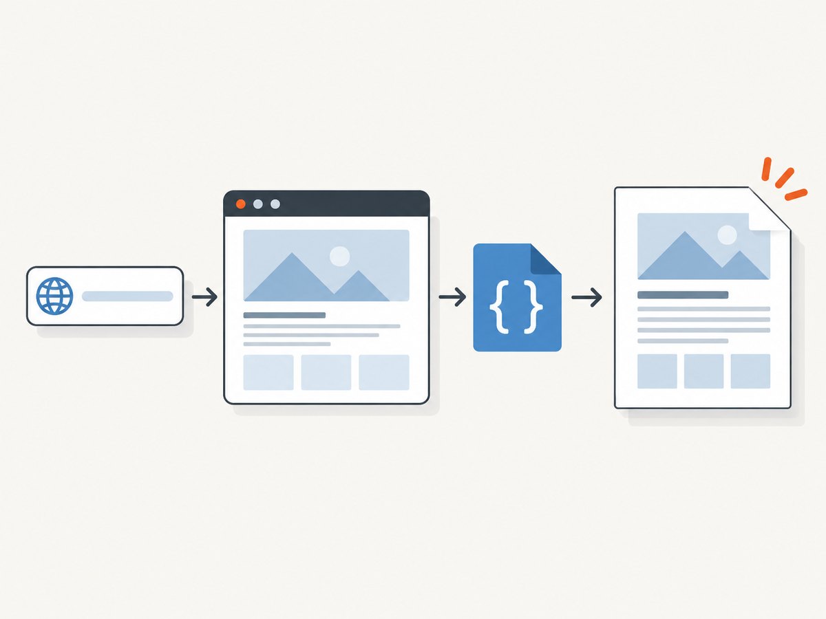
Use a print-specific CSS layer. Put it in a stylesheet linked with media="print" or inside an @media print block. Hide navigation and controls, let the main content use the page width, define useful page geometry with @page, and express pagination intent with break-before, break-after, and break-inside. Then inspect the browser’s print preview because browser support and the user’s print-dialog settings affect the final output.
1. Choose where your print rules live
A separate file keeps print decisions easy to find and prevents the screen stylesheet from becoming a mixture of unrelated concerns:
<link rel="stylesheet" href="print.css" media="print">For a small page, an existing stylesheet can contain the rules:
@media print {
  /* print-only rules */
}
Both forms are valid. Choose the separate file when print output is maintained independently or shared across many templates. Keep an @media print block in the main file when the page is small and the team benefits from seeing all styles together. Normal cascade and specificity still apply; a more specific screen rule can beat a print rule unless you adjust selectors deliberately. See MDN’s printing guide.
2. Start with a semantic HTML structure
Print CSS works best when the document already has a meaningful structure. Keep the title, metadata, main content, references, and useful links in the HTML. Mark screen-only controls explicitly so they can be removed without hiding information that readers need.
<!doctype html>
<html lang="en">
<head>
  <meta charset="utf-8">
  <meta name="viewport" content="width=device-width, initial-scale=1">
  <title>Quarterly report</title>
  <link rel="stylesheet" href="screen.css">
  <link rel="stylesheet" href="print.css" media="print">
</head>
<body>
  <header class="site-header print-hide">...</header>
  <nav class="site-nav print-hide" aria-label="Primary">...</nav>

  <main id="content">
    <article>
      <h1>Quarterly report</h1>
      <p class="report-meta">Updated 1 October 2026</p>
      <section>
        <h2>Summary</h2>
        <p>The report content remains available in print.</p>
      </section>
    </article>
  </main>

  <footer class="site-footer print-hide">...</footer>
</body>
</html>
3. Add a practical baseline print stylesheet
/* print.css */
@media print {
  *,
  *::before,
  *::after {
    box-shadow: none !important;
    text-shadow: none !important;
  }

  html,
  body {
    color: #000;
    background: #fff;
    font-family: Georgia, "Times New Roman", serif;
    font-size: 11pt;
    line-height: 1.45;
  }

  body {
    margin: 0;
  }

  .site-header,
  .site-nav,
  .site-footer,
  .toolbar,
  button,
  input,
  select,
  textarea,
  video,
  audio,
  .print-hide {
    display: none !important;
  }

  main,
  article,
  .content {
    display: block;
    width: auto;
    max-width: none;
    margin: 0;
    padding: 0;
  }

  h1,
  h2,
  h3 {
    color: #000;
    break-after: avoid;
  }

  p,
  li {
    orphans: 3;
    widows: 3;
  }

  figure,
  blockquote,
  pre,
  table,
  img {
    break-inside: avoid;
  }

  img {
    max-width: 100% !important;
    height: auto;
  }

  a {
    color: #000;
    text-decoration: underline;
  }

  a[href^="http"]::after {
    content: " (" attr(href) ")";
    overflow-wrap: anywhere;
  }

  pre,
  code {
    white-space: pre-wrap;
    overflow-wrap: anywhere;
  }
}

@page {
  margin: 1.5cm;
}
The baseline removes controls and decorative effects, releases screen-width constraints, keeps media inside the page, and exposes absolute URLs beside external links. Remove the URL rule for documents where printed links would add noise. Do not hide an interactive element when its label or value is essential to understanding the printed document.
4. Control paper size, orientation, and margins with @page
@page {
  size: A4 portrait;
  margin: 1.5cm 1.2cm 1.8cm;
}

@page landscape-report {
  size: A4 landscape;
  margin: 1cm;
}

@media print {
  .wide-table-page {
    page: landscape-report;
  }
}
@page describes page dimensions, orientation, and margins. Named pages can express a different geometry for a wide report section. Support for individual descriptors varies, so verify the target browsers and print destinations. Consult the MDN @page reference. Browser print dialogs can still apply their own paper, scale, header, footer, color, and background settings.
5. Express page-break intent
Use modern fragmentation properties to tell the browser where content should start, end, or remain together:
@media print {
  .chapter {
    break-before: page;
  }

  .appendix {
    break-before: page;
  }

  .keep-together {
    break-inside: avoid;
  }

  h2,
  h3 {
    break-after: avoid;
  }

  .signature {
    break-before: avoid;
  }
}
Legacy aliases such as page-break-before, page-break-after, and page-break-inside may still be needed for older engines, but use the break-* properties as the primary declarations. An element that is taller than a page cannot always stay intact; avoid expresses intent rather than an absolute guarantee. CSS paged media and fragmentation are covered in MDN’s paged-media guide.
6. Handle common content types
Links
Keep visible link text. For paper reports, append the destination only for external links:
@media print {
  a[href^="http"]::after {
    content: " (" attr(href) ")";
    font-size: 0.9em;
  }

  a[href^="#"]::after {
    content: "";
  }
}
Images and figures
@media print {
  figure {
    margin: 1em 0;
    break-inside: avoid;
  }

  img,
  svg {
    max-width: 100%;
    height: auto;
  }
}
A very large image may still force an awkward split or become unreadable. Supply a print-sized asset when the document needs precise image dimensions.
Tables
@media print {
  table {
    width: 100%;
    border-collapse: collapse;
    font-size: 9pt;
  }

  th,
  td {
    border: 0.5pt solid #666;
    padding: 0.35em;
    vertical-align: top;
  }

  thead {
    display: table-header-group;
  }

  tr {
    break-inside: avoid;
  }
}
Wide tables may need a landscape page or a deliberately smaller type size. Check whether the target browser repeats table headers across pages.
Code blocks
@media print {
  pre {
    white-space: pre-wrap;
    overflow-wrap: anywhere;
    border: 1px solid #999;
    padding: 0.6em;
    font-size: 8.5pt;
  }
}
Backgrounds and color
Use foreground and border colors that remain legible without color ink. Background printing is controlled partly by the print dialog, so do not rely on a background image or color to convey essential information.
7. Add a print button without printing the button
<button type="button" class="print-hide" id="print-page">Print</button>
<script>
  document.getElementById('print-page').addEventListener('click', () => {
    window.print();
  });
</script>
window.print() opens the browser’s print flow. The same CSS applies when the user chooses “Save to PDF.” A print button is optional; browser menus and keyboard shortcuts already provide the action.
8. Preview and verify the actual pages
- Open the page and choose Print or press the browser’s print shortcut.
- Check paper size, orientation, margins, scale, background graphics, and headers or footers in the dialog.
- Inspect the first and last page, every heading near a page edge, code blocks, tables, figures, long URLs, and links.
- Repeat in the browsers and paper formats that matter to your readers.
- Save a PDF and inspect it separately from the preview thumbnail.
Print CSS states the desired presentation; the browser’s support and user settings determine the final result. MDN documents print media and preview behavior in its @media reference.
9. A complete small example
<!doctype html>
<html lang="en">
<head>
  <meta charset="utf-8">
  <title>Print-friendly article</title>
  <style>
    body { font: 16px/1.5 system-ui, sans-serif; max-width: 48rem; margin: 2rem auto; }
    .toolbar { display: flex; gap: .5rem; }
    @media print {
      @page { size: A4 portrait; margin: 1.5cm; }
      body { max-width: none; margin: 0; color: #000; background: #fff; font: 11pt/1.45 Georgia, serif; }
      .toolbar { display: none !important; }
      h1, h2, h3 { break-after: avoid; }
      figure, blockquote, pre { break-inside: avoid; }
      img { max-width: 100%; height: auto; }
      a[href^="http"]::after { content: " (" attr(href) ")"; overflow-wrap: anywhere; }
    }
  </style>
</head>
<body>
  <div class="toolbar"><button onclick="window.print()">Print</button></div>
  <main>
    <h1>Print-friendly article</h1>
    <p>The article remains readable when printed or saved as a PDF.</p>
    <h2>Details</h2>
    <p>Use print preview to inspect page boundaries and browser settings.</p>
  </main>
</body>
</html>
10. Troubleshooting print CSS
| Symptom | Likely cause | Fix |
|---|---|---|
| Screen navigation appears on paper | The selector does not match, or a more specific rule wins. | Inspect the element in print emulation, use a matching class such as .print-hide, and adjust specificity. |
| Content is clipped at the right edge | A fixed width, minimum width, transform, or wide table remains active. | Override width and max-width, remove transforms, allow wrapping, or assign a landscape named page. |
| Headings are stranded at the bottom | No fragmentation rule keeps the heading with following content. | Apply break-after: avoid to headings and preview again. |
| A card or figure splits across pages | The browser is allowed to fragment it, or it cannot fit on one page. | Use break-inside: avoid for short blocks; shorten or redesign blocks taller than a page. |
| Colors or backgrounds are missing | The print dialog disables background graphics or color. | Make meaning available through text, borders, and contrast; tell users to enable backgrounds only when decorative color matters. |
| Margins do not match CSS | The printer or browser reserves non-printable areas or applies dialog settings. | Check the selected paper and margins in print preview; keep critical content away from page edges. |
| URLs make paragraphs too wide | Long unbroken strings cannot wrap. | Use overflow-wrap: anywhere on printed links or omit the URL suffix for that document. |
| The print stylesheet never loads | The link path is wrong, the response is blocked, or the media attribute is incorrect. |
Check the network panel and use exactly media="print"; temporarily remove the attribute to confirm the file loads. |
11. Performance, reliability, and cost
Print CSS is evaluated by the browser during layout. Keep selectors understandable, avoid unnecessary high-resolution background assets, and do not load print-only resources for screen users. The main reliability risk is variation between browser engines, paper sizes, printer margins, and user preferences, so maintain a small preview checklist for every important template.
CSS print rules do not require a screenshot service. If you need repeatable captures of many URLs, a PDF pipeline, or screenshots from pages you do not control, an API can remove browser setup and provide a stable request interface.
12. Or skip the browser setup
ScreenshotNeo provides a GET endpoint that returns a PNG, JPEG, WebP, or PDF. The same print-friendly CSS is rendered by the capture browser, and options cover full-page capture, PDF paper size, margins, orientation, page ranges, custom CSS and JavaScript, waiting for a selector or network idle, and blocking unwanted requests. Read the ScreenshotNeo API documentation for the complete option list.
curl -G "https://api.screenshotneo.com/v1/shot" -d access_key=YOUR_API_KEY --data-urlencode url=https://example.com/article -o shot.webpimport requests
r = requests.get(
"https://api.screenshotneo.com/v1/shot",
params={"access_key": "YOUR_API_KEY", "url": "https://example.com/article"},
timeout=90,
)
r.raise_for_status()
open("shot.webp", "wb").write(r.content)const q = new URLSearchParams({
access_key: 'YOUR_API_KEY',
url: 'https://example.com/article'
});
const res = await fetch(`https://api.screenshotneo.com/v1/shot?${q}`);
if (!res.ok) throw new Error(`Screenshot failed: ${res.status}`);
const data = await res.arrayBuffer();
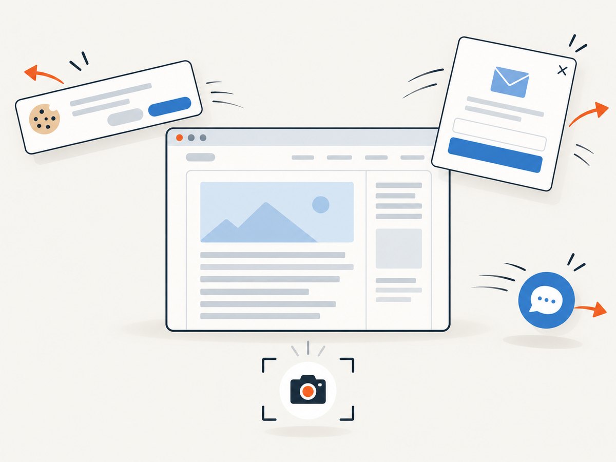
await Bun.write('shot.webp', data);Before capture, ScreenshotNeo accepts cookie or consent banners and removes more than 60 known consent platforms, newsletter popups, and chat widgets; each step can be turned off. Bot checks or CAPTCHAs, blank pages, timeouts, failed loads, and cache hits are not billed, and the response identifies the result with X-Page-Verdict and X-Billed headers. Its MCP server lets Claude, Cursor, and other MCP clients call take_screenshot, get_page_info, and capture_pdf. The free plan includes 1,000 screenshots per month with no card; paid plans start at $5 for 3,000. Create a free ScreenshotNeo account.
13. FAQ
Should print CSS replace my screen CSS?
No. Keep semantic HTML and add print overrides so the same content serves both contexts.
Can CSS force a user’s printer to use color?
No. The print dialog and printer settings can override color and background output.
Is @page required?
No. A page can print without it, but @page is useful when size, orientation, or margins need a deliberate value.
Why does break-inside: avoid sometimes fail?
Browsers may need to split content that is taller than a page, and support differs. Treat it as pagination intent and verify the preview.
Can I print only one element?
Yes. Hide unrelated regions in print rules or create a print-specific route containing only the intended semantic content.


