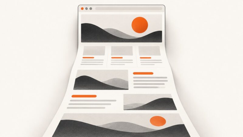
How to Make a Website Mobile Responsive
Make your website work across screen sizes with flexible layouts, responsive media, content-led breakpoints, and a practical reflow check.
To make a website mobile responsive, set the mobile viewport, build the layout with flexible sizing and normal document flow, keep images and other media within their containers, and add CSS breakpoints only when the content needs a different arrangement. Then inspect the page at narrow, intermediate, and wide widths. Responsive design is a set of layout techniques, not a separate technology or a collection of device-specific templates. See MDN’s responsive design guide.
1. Start with the content and the narrow layout
Write semantic HTML in the order people should read and use it. A single-column layout is often a useful narrow-screen starting point. Add columns, sidebars, and other regions when the available space supports them; avoid fixed desktop widths that force ordinary content to scroll horizontally.
Use normal document flow, CSS Grid, or Flexbox to let regions grow, shrink, and wrap. These layout tools can adapt naturally without a media query for every component. The W3C documents Grid and Flexbox as sufficient techniques for reflow when used appropriately; they are examples, not the only valid implementations.
2. Set the mobile viewport
Put this element in the document’s <head>:
<meta name="viewport" content="width=device-width">Without it, some mobile browsers may lay out a page against a wider virtual viewport, so narrow-screen CSS may not behave as expected. The viewport setting tells the browser to use the device width. This setting does not make a rigid layout responsive by itself; the CSS must still allow the content to fit.
3. Build a flexible layout
Here is a complete, runnable starting page. Save it as index.html and open it in a browser. It uses one column at narrow widths, introduces a sidebar when the content has room, and lets cards wrap without assigning a fixed width to each card.
<!doctype html>
<html lang="en">
<head>
  <meta charset="utf-8">
  <meta name="viewport" content="width=device-width">
  <title>Responsive page example</title>
  <style>
    * { box-sizing: border-box; }

    body {
      margin: 0;
      font: 1rem/1.5 system-ui, sans-serif;
      color: #182230;
    }

    .page {
      width: min(100% - 2rem, 72rem);
      margin-inline: auto;
    }

    header, main, aside, footer { padding-block: 1rem; }

    .layout { display: grid; gap: 1.5rem; }

    .cards {
      display: grid;
      grid-template-columns: repeat(auto-fit, minmax(min(100%, 16rem), 1fr));
      gap: 1rem;
    }

    .card {
      min-width: 0;
      padding: 1rem;
      border: 1px solid #c8d0da;
      border-radius: .5rem;
    }

    img, video, svg { max-width: 100%; height: auto; }

    @media (min-width: 48rem) {
      .layout { grid-template-columns: minmax(0, 2fr) minmax(14rem, 1fr); }
    }
  </style>
</head>
<body>
  <div class="page">
    <header><h1>Responsive page example</h1></header>
    <div class="layout">
      <main>
        <p>The main content stays first in the document and can use the available width.</p>
        <section class="cards" aria-label="Articles">
          <article class="card"><h2>First card</h2><p>Card content wraps as the available width changes.</p></article>
          <article class="card"><h2>Second card</h2><p>No device-specific card widths are required.</p></article>
          <article class="card"><h2>Third card</h2><p>The grid creates as many columns as fit.</p></article>
        </section>
      </main>
      <aside><h2>Related information</h2><p>This sidebar moves below the main content on narrow screens.</p></aside>
    </div>
    <footer>Page footer</footer>
  </div>
</body>
</html>
The 48rem breakpoint above is an example chosen for this sample layout, not a universal phone or tablet boundary. Adjust it after checking where this specific content becomes cramped. The minmax(0, ...) columns allow grid items to shrink; min-width: 0 also helps prevent long content from forcing a grid track wider than its container.
4. Add breakpoints when the content needs a change
Start narrow, then widen the page. Add a media query when a heading wraps awkwardly, a navigation arrangement stops working, columns become too narrow, or a second column would improve the layout. Choose the breakpoint based on the component and its content, rather than matching a list of device models. MDN explains media query fundamentals and notes that flexible Grid and Flexbox layouts can sometimes adapt without one.
Use relative units such as rem for breakpoints where practical. This makes the rule relate to text sizing and zoom more naturally than a device-specific pixel target. Keep the narrow and wide layouts in the same document flow so the reading order remains understandable.
5. Keep images and other media within the layout
A basic overflow guard is:
img, picture, video {
  max-width: 100%;
}

img, video {
  height: auto;
}
For images, supply alternate resolutions with srcset and sizes when appropriate. Use <picture> when a narrower viewport benefits from a different crop or source. A single large image scaled down can waste bandwidth; a wide crop may also lose its subject on a small screen. Choose image sizes and crops that suit the actual layout.
<img
  src="photo-800.jpg"
  srcset="photo-400.jpg 400w, photo-800.jpg 800w, photo-1200.jpg 1200w"
  sizes="(min-width: 48rem) 50vw, 100vw"
  alt="A descriptive alternative for the image">
The sizes value should describe the rendered image width in your page; the example is illustrative and should be adjusted to match the layout. For a different crop, use a <picture> source with a media condition and keep an <img> fallback.
6. Check reflow, zoom, and interactions
Resize the browser or use its responsive sizing tools at a narrow phone-like width, an intermediate width, and a wide desktop width. Check the whole page, not just the first screen. Look for clipped text, media outside its container, awkward line breaks, overlapping controls, and functions that disappear or become hard to reach.
WCAG 2.1 Success Criterion 1.4.10 Reflow is Level AA. For vertically scrolling content, it calls for presentation without loss of information or functionality and without two-dimensional scrolling at a width equivalent to 320 CSS pixels, except for content whose use or meaning inherently requires two-dimensional layout. The criterion explains that 320 CSS pixels corresponds to a 1280 CSS pixel starting viewport at 400% zoom. These are accessibility dimensions, not evidence that a particular site has been tested or conforms. Read the WCAG 2.1 specification and W3C’s explanation of Reflow.
Some content, such as a map, diagram, game, video, or data table, may need two-dimensional presentation. That exception applies to the content that requires it; surrounding page content should still reflow.
7. Troubleshoot common responsive layout failures
| Symptom | Likely cause | Fix |
|---|---|---|
| The page looks like a tiny desktop page on a phone. | The viewport meta element is missing or incorrect. | Add <meta name="viewport" content="width=device-width"> in the document head. |
| The whole page scrolls sideways. | A fixed-width region, long unbroken text, or oversized media exceeds the viewport. | Find the overflowing element; use flexible track sizing, allow appropriate wrapping, and constrain media with max-width: 100%. |
| A grid column refuses to shrink. | A grid item’s intrinsic minimum size is wider than its track. | Use a zero minimum such as minmax(0, 1fr) for the track and min-width: 0 on the item where needed. |
| The layout breaks between phone and desktop widths. | The chosen breakpoint does not match the content’s actual needs, or only the two endpoints were checked. | Resize gradually, identify where the component stops working, and place the breakpoint there. Add a fluid intermediate state if needed. |
| Text or controls overlap when zoomed. | Fixed heights or rigid widths prevent content from growing. | Prefer content-driven heights, flexible widths, and wrapping. Recheck at increased zoom and narrow equivalent widths. |
| An image fits but looks poorly framed on mobile. | The desktop crop does not suit the narrow composition. | Provide a mobile-appropriate crop with <picture>, or reconsider the image’s focal point and container behavior. |
| A table causes horizontal scrolling. | Its data genuinely needs row and column relationships, or the table styling prevents useful reflow. | Check whether a narrower presentation can preserve meaning. If the data needs two dimensions, contain that presentation so unrelated page content still reflows. |
8. Consider performance and maintenance
Flexible layout rules and content-led breakpoints avoid maintaining a separate template for every device size. Responsive image sources can avoid downloading an unnecessarily large image when a smaller resource is suitable. Check that the browser can select the intended source and that the selected resource still looks clear in its rendered size.
Responsive CSS alone does not guarantee fast loading or reliable behavior. Test with the assets, fonts, scripts, and content the page actually uses. Keep breakpoints understandable and tied to components that need a layout change; a long list of nearly identical device rules is harder to maintain. The supplied sources establish layout techniques and reflow criteria, not performance benchmarks or guarantees.
Or skip the browser setup
If you need screenshots to inspect a page at different sizes, ScreenshotNeo is a website screenshot API and MCP server. Its viewport and device options let you capture pages at different dimensions. One GET request returns a PNG, JPEG, WebP, or PDF. See the ScreenshotNeo documentation for the API options.
curl -G "https://api.screenshotneo.com/v1/shot" \
  -d access_key=YOUR_API_KEY \
  --data-urlencode url=https://example.com \
  -d width=390 \
  -d height=844 \
  -o mobile-shot.webp
import requests
r = requests.get(
"https://api.screenshotneo.com/v1/shot",
params={
"access_key": "YOUR_API_KEY",
"url": "https://example.com",
"width": 390,
"height": 844,
},
timeout=90,
)
r.raise_for_status()
with open("mobile-shot.webp", "wb") as f:
f.write(r.content)const q = new URLSearchParams({
access_key: 'YOUR_API_KEY',
url: 'https://example.com',
width: '390',
height: '844',
});
const res = await fetch(`https://api.screenshotneo.com/v1/shot?${q}`);
if (!res.ok) throw new Error(`Screenshot request failed: ${res.status}`);
const image = Buffer.from(await res.arrayBuffer());
await import('node:fs/promises').then(fs => fs.writeFile('mobile-shot.webp', image));Cookie banners, newsletter popups, and chat widgets are removed before the shot; each cleanup step can be turned off. Bot checks, blank pages, timeouts, and failed loads are never billed, and cache hits cost nothing; responses include X-Page-Verdict and X-Billed headers. An MCP server lets AI agents, including Claude and Cursor, take screenshots. The free plan includes 1,000 screenshots per month with no card; paid plans start at $5 for 3,000. Sign up for 1,000 free screenshots a month, no card required.
FAQ
Do I need a CSS framework to make a site responsive?
No. The HTML and CSS techniques here work without a framework. A framework is an implementation choice, not a requirement for responsive design.
Should every page use the same breakpoint?
Not necessarily. Shared breakpoints can help keep a site consistent, but each component still needs to work at widths where its own content fits.
Does responsive design mean hiding content on phones?
No. The goal is to present the information and functionality in a layout that fits the available space. Hiding content should be a deliberate product decision, not a substitute for reflow.
Can I check responsiveness from screenshots alone?
Screenshots help you inspect visual layout at chosen dimensions, but they do not replace checking keyboard access, interactions, zoom, or behavior between those dimensions.