How to Map Image Coordinates in HTML
Learn how HTML image maps, pointer events, responsive images, and canvas convert clicks into reliable image coordinates.
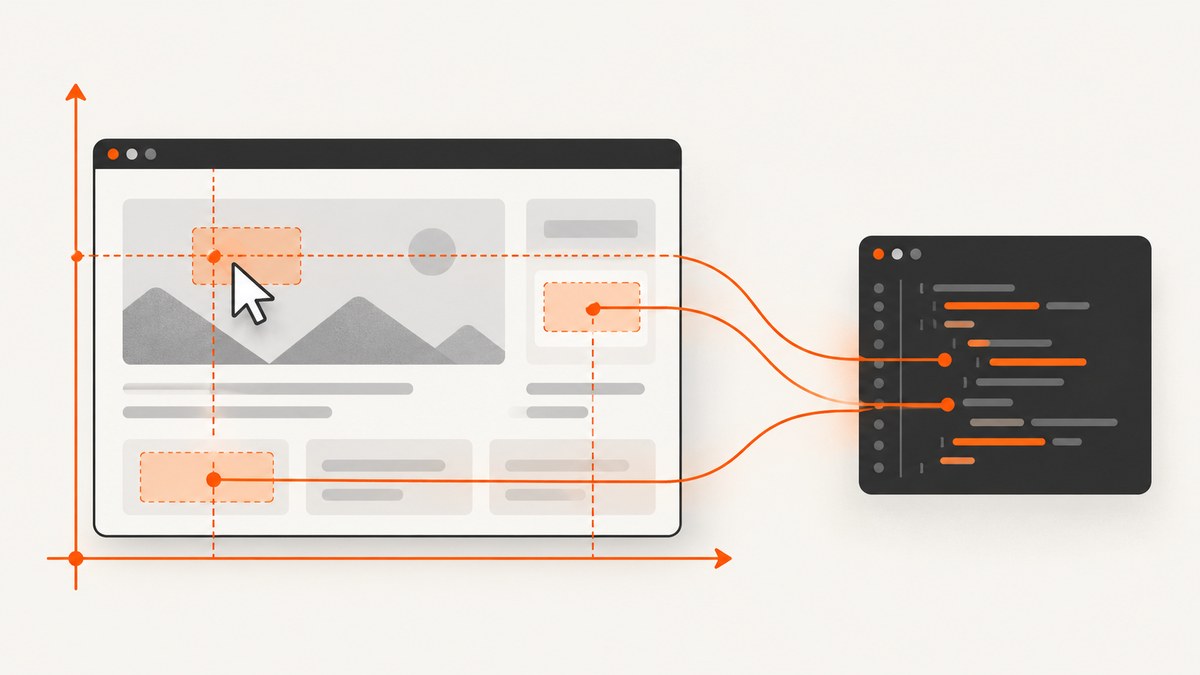
To map image coordinates in HTML, first choose the coordinate system you need. For semantic clickable regions, connect an <img> to a <map> with usemap, then define rectangular, circular, or polygonal <area> elements. Coordinates are measured from the displayed image’s top-left corner in CSS pixels. For pointer events on an ordinary image, subtract the image’s viewport origin from event.clientX and event.clientY. For a responsive image, scale those displayed coordinates into the source image’s intrinsic pixels. For a canvas, scale into the canvas drawing buffer instead.
This distinction prevents the most common bugs: using page coordinates as if they were image coordinates, applying intrinsic dimensions to a stretched image, or caching a rectangle that changed after a resize.
1. Choose the right mapping method
| Requirement | Use | Coordinate meaning |
|---|---|---|
| Linked regions with keyboard and screen-reader support | HTML image map | CSS pixels from the displayed image’s top-left corner |
| Track arbitrary pointer positions | Image pointer events plus getBoundingClientRect() |
Viewport coordinates converted to displayed CSS coordinates |
| Draw, edit, or hit-test pixels | Canvas | Displayed coordinates scaled into the canvas buffer |
The HTML <map> element works with <area> elements to create a clickable image map. The HTML Standard defines rectangle coordinates as the top-left and bottom-right corners, circle coordinates as center and radius, and polygon coordinates as ordered point pairs, all interpreted as CSS pixels from the image’s top-left edge. See the WHATWG image-map specification and MDN’s area reference.
2. Build a semantic HTML image map
Use this method when each region is a destination or action. The map remains declarative, and linked areas can be reached without pointer input.
<img src='plan.png' usemap='#plan-map' alt='Floor plan with rooms'>
<map name='plan-map'>
  <area shape='rect' coords='20,30,180,140' href='kitchen.html' alt='Kitchen'>
  <area shape='circle' coords='280,100,45' href='lounge.html' alt='Lounge'>
  <area shape='poly' coords='360,30,430,80,410,150,350,120' href='office.html' alt='Office'>
</map>
Coordinate syntax
- Rectangle:
x1,y1,x2,y2. The first pair is the top-left corner; the second is the bottom-right corner. - Circle:
centerX,centerY,radius. - Polygon:
x1,y1,x2,y2,..., with points listed in order around the boundary. - Default: an area with
shape='default'covers the whole image and does not usecoords.
Give every linked <area> useful alt text. It should communicate the same choice as the image link for people who cannot see the image. Keep the usemap value as a fragment reference such as #plan-map, and make it match the map’s name.
3. Make image-map coordinates responsive
Image-map coordinates are interpreted against the displayed image after CSS width and height stretching. If the source is 1000 pixels wide but the image is displayed at 500 CSS pixels, a coordinate of 500 refers to the displayed midpoint, not source pixel 500. This behavior is defined by the HTML image-map processing model; browser zoom and CSS or SVG transforms do not change the coordinate interpretation in that model.
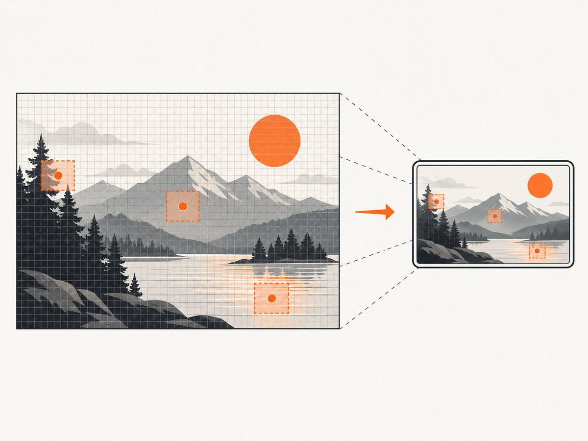
Because the coordinates belong to the displayed geometry, design them in the same coordinate system as the image’s rendered size. A practical pattern is to author coordinates against a known design width, then scale them when the image’s layout width changes:
function scaleCoords(coords, sourceWidth, displayedWidth) {
  const scale = displayedWidth / sourceWidth;
  return coords.map(value => value * scale);
}

const designRect = [20, 30, 180, 140];
const rendered = scaleCoords(designRect, 1000, image.getBoundingClientRect().width);
For production image maps, recalculate after responsive layout changes. Use a ResizeObserver on the image or its container rather than assuming the initial width remains valid. If you generate coords yourself, round only at the final serialization step so repeated scaling does not accumulate error.
4. Read click coordinates from an ordinary image
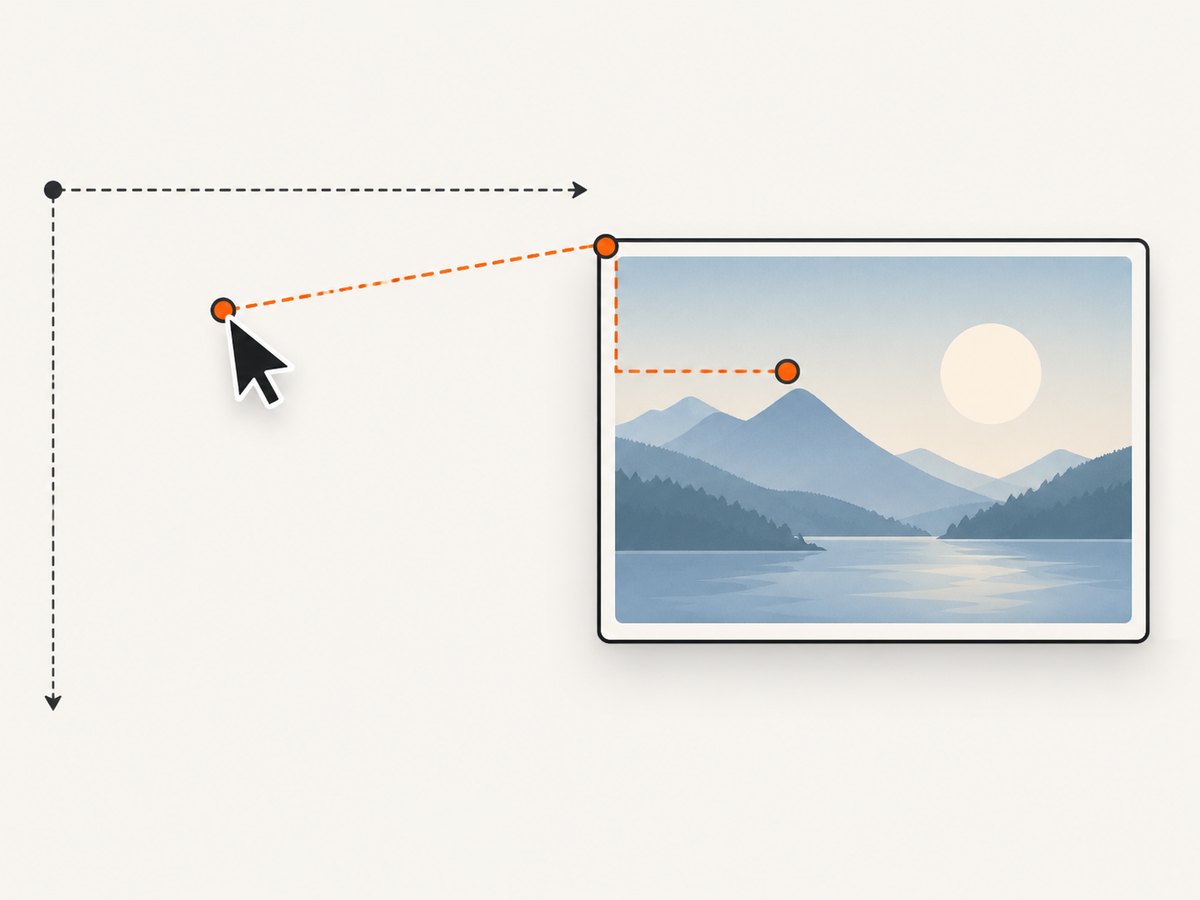
Pointer event properties such as clientX and clientY are viewport-relative. getBoundingClientRect() returns the image’s viewport-relative left, top, width, and height, with scrolling already accounted for. Subtract the rectangle origin:
const image = document.querySelector('#photo');

image.addEventListener('pointerdown', event => {
  const rect = image.getBoundingClientRect();
  const xCss = event.clientX - rect.left;
  const yCss = event.clientY - rect.top;

  console.log({ xCss, yCss });
});
Use clientX/clientY with getBoundingClientRect(). Do not mix them with pageX/pageY unless you also convert the rectangle into document coordinates. Do not use offsetX as a universal replacement: nested elements, borders, and event retargeting can make its reference box surprising.
Convert displayed coordinates to source pixels
If you need the coordinate in the original bitmap, use the intrinsic dimensions:
image.addEventListener('pointerdown', event => {
  const rect = image.getBoundingClientRect();
  const xCss = event.clientX - rect.left;
  const yCss = event.clientY - rect.top;

  const xImage = xCss * image.naturalWidth / rect.width;
  const yImage = yCss * image.naturalHeight / rect.height;

  console.log({ xImage, yImage });
});
This assumes the whole source image is visible and uniformly scaled. If CSS uses object-fit: cover, part of the source is cropped. You must account for the crop offset before scaling. If object-fit: contain adds letterboxing, subtract the displayed image content’s inset first. Also account for borders if your measured rectangle includes them and the coordinate target is the content box.
5. Handle cropping, borders, and transforms
Object-fit cover
With object-fit: cover, the source is scaled until the content covers the element, then cropped. Let scale = max(elementWidth / naturalWidth, elementHeight / naturalHeight). The visible source region begins at the crop offsets:
const rect = image.getBoundingClientRect();
const scale = Math.max(rect.width / image.naturalWidth,
                       rect.height / image.naturalHeight);
const renderedWidth = image.naturalWidth * scale;
const renderedHeight = image.naturalHeight * scale;
const cropX = (renderedWidth - rect.width) / 2;
const cropY = (renderedHeight - rect.height) / 2;

const xInRenderedContent = (event.clientX - rect.left) + cropX;
const yInRenderedContent = (event.clientY - rect.top) + cropY;
const xSource = xInRenderedContent / scale;
const ySource = yInRenderedContent / scale;
The formula changes if object-position is not centered. Read the chosen position and calculate the corresponding inset.
CSS transforms
A rotated or scaled element can make visual coordinates differ from the element’s untransformed box. For precise transformed hit testing, map the pointer through the inverse transform matrix or place an untransformed overlay above the image. Avoid assuming that subtracting rect.left is sufficient for a rotated image.
High-DPI displays
Device pixel ratio affects physical pixels, not CSS coordinates. Keep pointer calculations in CSS pixels until you explicitly map into a bitmap or canvas buffer. Mixing devicePixelRatio into an image-map calculation will make regions too large or too small.
6. Map coordinates in a canvas
Canvas has two sizes: its CSS display size and its drawing-buffer size, given by the width and height attributes. Convert from the displayed rectangle into the buffer:
const canvas = document.querySelector('#editor');

canvas.addEventListener('pointerdown', event => {
  const rect = canvas.getBoundingClientRect();
  const xCanvas = (event.clientX - rect.left) * canvas.width / rect.width;
  const yCanvas = (event.clientY - rect.top) * canvas.height / rect.height;

  console.log({ xCanvas, yCanvas });
});
If the canvas draws an image with a source rectangle and destination rectangle, preserve that distinction. The source rectangle describes which image pixels are copied; the destination rectangle describes where they appear in the canvas. The MDN drawImage reference documents the three supported argument forms.
ctx.drawImage(source,
  sourceX, sourceY, sourceWidth, sourceHeight,
  destinationX, destinationY, destinationWidth, destinationHeight);
For a canvas editor with zoom and pan, first undo the viewport transform, then apply the canvas-buffer scale. Keep these operations separate so a zoom factor does not get mistaken for device-pixel scaling.
7. Generate regions from data
When regions come from a JSON file or an editor, keep a canonical coordinate space and convert only when rendering. This avoids losing precision when the viewport changes.
const regions = [
  { shape: 'rect', coords: [20, 30, 180, 140], href: 'kitchen.html', alt: 'Kitchen' },
  { shape: 'circle', coords: [280, 100, 45], href: 'lounge.html', alt: 'Lounge' }
];

function toDisplayed(values, sourceWidth, displayedWidth) {
  const scale = displayedWidth / sourceWidth;
  return values.map(value => value * scale);
}

function areaMarkup(region, sourceWidth, displayedWidth) {
  const coords = toDisplayed(region.coords, sourceWidth, displayedWidth).map(Math.round).join(',');
  return `<area shape='${region.shape}' coords='${coords}' href='${region.href}' alt='${region.alt}'>`;
}
Escape URLs and alt text before inserting generated markup, or create elements with DOM APIs and assign properties directly. If regions are user-authored, validate that polygon points are finite and that rectangles have positive dimensions.
8. Troubleshooting checklist
| Symptom | Likely cause | Fix |
|---|---|---|
| Every click is offset by the page margin | Page coordinates were treated as local coordinates | Subtract rect.left and rect.top from clientX/clientY. |
| Works on desktop, fails on mobile | The image resized after coordinates were authored | Scale from a canonical design size or regenerate coordinates after a ResizeObserver event. |
| Source-pixel results are too large | CSS dimensions were confused with naturalWidth/naturalHeight |
Scale displayed coordinates by intrinsic divided by displayed dimensions. |
| Regions do not line up with a cropped image | object-fit: cover removed part of the source |
Calculate crop offsets and apply them before dividing by the scale. |
| Polygon behaves unpredictably | Points are unordered or self-intersecting | List points around the boundary in order and avoid crossing edges. |
| Keyboard users cannot find a region | Missing or vague alt text |
Give each linked area an action-oriented alternative description. |
| Canvas coordinates are blurry or shifted | CSS size and buffer size differ | Use the rectangle-to-buffer formula and set the buffer dimensions deliberately. |
| Coordinates change after scrolling | A document-relative value was mixed with a viewport-relative value | Use clientX with getBoundingClientRect(), or convert both values to document space. |
9. Performance and reliability
- Read
getBoundingClientRect()once per pointer event and reuse the result. Avoid repeatedly forcing layout between DOM writes and reads. - For pointermove drawing, use
requestAnimationFrameto coalesce events and render at most once per frame. - Recalculate on resize, orientation changes, font loading, image loading, and any layout change that affects the image’s box.
- Wait for
image.decode()or theloadevent before relying on intrinsic dimensions. - Clamp results to the valid range. A pointer can be just outside the image because of rounding or a border.
- Keep the source coordinate model stable. Store integer CSS pixels only when the target format requires them; retain floating-point values during transformations.
For automated verification, test a corner, the center, and a point near every region boundary at several rendered widths. Include scroll positions, high-DPI devices, portrait orientation, keyboard navigation, and images that load late.
10. Capture reference images without running a browser
If your workflow needs screenshots of pages containing image maps, responsive layouts, or canvas renderings, ScreenshotNeo can produce the reference image through one request. It handles full-page capture with lazy images loaded, element capture by CSS selector, custom CSS and JavaScript, device presets, viewport and retina scale, dark mode, waits, headers, cookies, user agents, timezones, geolocation, and caching. Its response identifies page verdict and billing with X-Page-Verdict and X-Billed headers.
Or skip the browser setup
Use the ScreenshotNeo API when you need a clean capture for documentation, visual regression, or an image-coordinate test fixture. Cookie banners, newsletter popups, and chat widgets are removed before the shot. Bot checks, blank pages, timeouts, failed loads, and cache hits are never billed. An MCP server provides take_screenshot, get_page_info, and capture_pdf for Claude, Cursor, and other MCP clients. The Free plan includes 1,000 screenshots a month with no card; paid plans start at $5 for 3,000 shots. See the ScreenshotNeo API documentation for all options.
cURL
curl -G 'https://api.screenshotneo.com/v1/shot' -d access_key=YOUR_API_KEY --data-urlencode url=https://stripe.com -o shot.webpPython
import requests
r = requests.get('https://api.screenshotneo.com/v1/shot', params={'access_key': 'YOUR_API_KEY', 'url': 'https://stripe.com'}, timeout=90)
open('shot.webp', 'wb').write(r.content)
Node.js
const q = new URLSearchParams({ access_key: 'YOUR_API_KEY', url: 'https://stripe.com' });
const res = await fetch(`https://api.screenshotneo.com/v1/shot?${q}`);
Start with the free ScreenshotNeo account to get 1,000 screenshots each month without a card.
FAQ
Are image-map coordinates based on the original file pixels?
No. HTML image-map coordinates are CSS pixels in the displayed image geometry. Convert to intrinsic pixels only when your application needs source-bitmap coordinates.
Should I use pageX or clientX?
Use clientX and clientY with getBoundingClientRect(). Both are viewport-relative, so scrolling is handled consistently.
Can an image map work with a responsive image?
Yes. Keep a canonical coordinate space and scale coordinates to the current displayed width whenever the layout changes.
When is canvas a better choice?
Choose canvas when regions are drawn or edited dynamically, when you need pixel-level hit testing, or when the image is part of an interactive drawing surface. Choose an image map when semantic links and accessibility are the priority.
Why is my ScreenshotNeo capture different from a local browser?
Check viewport, device preset, wait condition, custom CSS or JavaScript, cookies, user agent, and blocked resource settings. Those inputs can change responsive breakpoints and therefore the displayed coordinate system.


