How to Match PhantomJS Screenshot Dimensions to a Webpage
Set PhantomJS viewport, clip rectangle, zoom, and PDF settings correctly so screenshots match the webpage dimensions you expect.
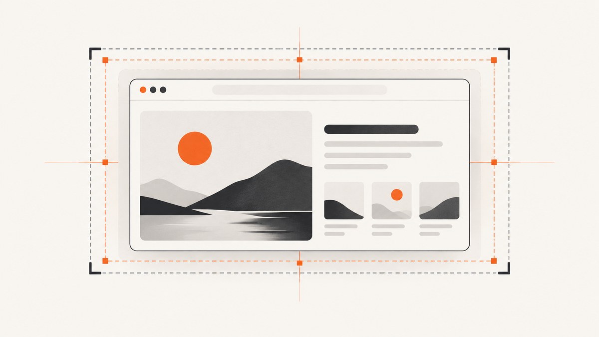
Short answer: Set page.viewportSize to the browser layout width and height, then set page.clipRect to the exact rectangle you want rasterized. Keep page.zoomFactor at 1 for the documented 100% scale. The viewport controls how the page lays itself out; the clip rectangle controls which part becomes the image.
For a 1024×768 capture, configure both values explicitly:
var page = require('webpage').create();

page.viewportSize = { width: 1024, height: 768 };
page.clipRect = { top: 0, left: 0, width: 1024, height: 768 };
page.zoomFactor = 1;

page.open('https://example.com/', function (status) {
  if (status === 'success') {
    page.render('capture.png');
  }
  phantom.exit();
});
PhantomJS documents this viewport and clipping combination in its screen-capture example. It is a configuration example, not a promise that every page will fit without scrolling, lazy loading, responsive reflow, or asynchronous rendering. See the official screen-capture guide, viewportSize API, and clipRect API.
1. Understand the four dimensions that affect a PhantomJS capture
Layout viewport: viewportSize
page.viewportSize establishes the simulated browser window used for layout. Responsive CSS media queries, column widths, navigation breakpoints, and JavaScript that reads viewport dimensions use this value. Set both width and height before opening the URL:
page.viewportSize = {
  width: 1440,
  height: 900
};
Changing the viewport can change the page itself. A 375-pixel viewport may activate a mobile menu, while a 1440-pixel viewport may show a desktop navigation bar. Therefore, choose the layout size first, based on the browser experience you want to reproduce.
Capture rectangle: clipRect
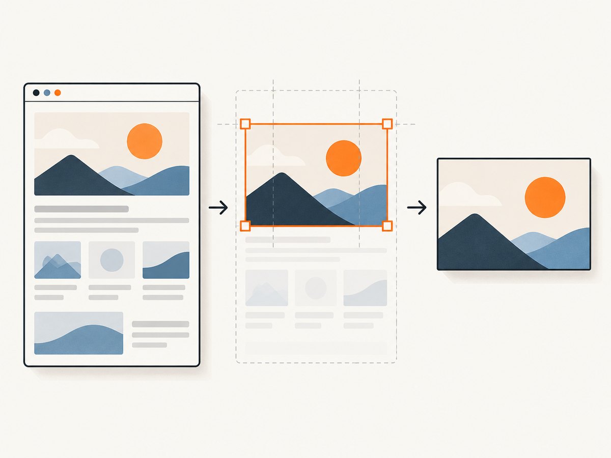
page.clipRect defines the top, left, width, and height of the area sent to page.render. It is the direct control for a fixed screenshot rectangle:
page.clipRect = {
  top: 0,
  left: 0,
  width: 1200,
  height: 800
};
The clip rectangle can be smaller than the viewport when you need a crop, or larger in one direction when the page has content outside the initial window. Keep its coordinates and dimensions in the same page coordinate system as the rendered document.
Render scale: zoomFactor
page.zoomFactor scales page.render and page.renderBase64. The documented default is 1, which represents 100% scale. Leave it unchanged when your target dimensions should correspond directly to CSS pixels:
page.zoomFactor = 1;A value such as 2 changes the output scale and can produce an image with different pixel dimensions from the CSS dimensions you selected. Treat zoom as a deliberate output setting, not as a substitute for choosing the correct viewport.
PDF page size: paperSize
PDF rendering uses page.paperSize, which is a print-page setting. It supports named formats and dimensions in units such as pixels, millimeters, centimeters, or inches. It does not replace viewportSize when you are producing an image.
page.paperSize = {
  format: 'A4',
  orientation: 'portrait',
  margin: '1cm'
};
Use a viewport for screen layout and a paper size for PDF pagination. Mixing the two is a common reason a PDF or image appears to have unexpected proportions. PhantomJS lists PNG, JPEG, GIF, and PDF among the supported render formats; its Base64 method documents PNG, GIF, and JPEG output.
2. Build a reliable fixed-size screenshot script
This complete script sets the viewport before navigation, applies a matching capture rectangle, waits briefly after the page-open callback, and reports failures. The wait is intentionally configurable: PhantomJS documentation does not prescribe one delay that works for every webpage.
var system = require('system');
var webpage = require('webpage');

var page = webpage.create();
var targetUrl = system.args[1] || 'https://example.com/';
var outputPath = system.args[2] || 'capture.png';
var width = 1024;
var height = 768;
var delayMs = 500;

page.viewportSize = {
  width: width,
  height: height
};
page.clipRect = {
  top: 0,
  left: 0,
  width: width,
  height: height
};
page.zoomFactor = 1;

page.onError = function (message, trace) {
  console.error(message);
  trace.forEach(function (item) {
    console.error('  ', item.file, ':', item.line);
  });
};

page.open(targetUrl, function (status) {
  if (status !== 'success') {
    console.error('Could not open ' + targetUrl + ' (status: ' + status + ')');
    phantom.exit(1);
    return;
  }

  window.setTimeout(function () {
    page.render(outputPath);
    console.log('Wrote ' + outputPath + ' at ' + width + 'x' + height);
    phantom.exit(0);
  }, delayMs);
});
Run it with:
phantomjs capture.js https://example.com/ example.pngChoose dimensions from the result you need
| Goal | Viewport | Clip rectangle | Notes |
|---|---|---|---|
| Browser-window screenshot | Target window width and height | Same width and height, top 0, left 0 | Best for reproducing a visible desktop or mobile window. |
| Cropped hero or component | Width needed for layout | Element bounds or chosen crop | The page may still lay out at the larger viewport. |
| Full-page image | Desired layout width and an initial height | Document width and measured document height | Measure after loading; lazy content may require additional work. |
| Screen layout used by the page | Usually irrelevant | Configure paperSize and print margins instead. |
3. Capture an element or the full document
For a fixed viewport, the simplest crop is a literal rectangle. To capture an element, calculate its bounding box inside the page and assign it to clipRect:
var box = page.evaluate(function () {
  var element = document.querySelector('.pricing-card');
  if (!element) return null;
  var rect = element.getBoundingClientRect();
  return {
    top: rect.top + window.pageYOffset,
    left: rect.left + window.pageXOffset,
    width: rect.width,
    height: rect.height
  };
});

if (box) {
  page.clipRect = box;
  page.render('pricing-card.png');
}
For a full-page capture, first measure the document after the content you need has rendered:
var size = page.evaluate(function () {
  var body = document.body;
  var html = document.documentElement;
  return {
    width: Math.max(body.scrollWidth, html.scrollWidth),
    height: Math.max(body.scrollHeight, html.scrollHeight)
  };
});

page.clipRect = {
  top: 0,
  left: 0,
  width: size.width,
  height: size.height
};
page.render('full-page.png');
Full-page measurements are sensitive to images, fonts, expanding accordions, sticky headers, and lazy-loading. If the page adds content after your measurement, the bottom can be cut off. A selector wait, a controlled delay, or a page-side readiness flag is safer than assuming the open callback means every asset has finished.
4. Avoid common dimension mismatches
- Viewport and clip differ accidentally: A 1440-pixel layout clipped to 1024 pixels may show only part of a desktop design. Decide whether you want a crop or a different layout and set the values accordingly.
- Zoom is greater than one: The output may have more pixels than expected. Reset
zoomFactorto1while diagnosing. - Scrollbar changes: A vertical scrollbar can reduce the usable layout width. Compare the page’s actual
document.documentElement.clientWidthwith your configured viewport. - Responsive breakpoints: Small changes around a CSS breakpoint can completely rearrange the page. Test the exact width, not a rounded approximation.
- Device-pixel assumptions: PhantomJS settings describe the page and render configuration. Do not assume they map one-to-one to a modern device’s hardware pixel ratio.
- Late content: A screenshot taken immediately after navigation can omit web fonts, images, animations, or JavaScript-generated sections.
- PDF confusion: A paper size such as A4 controls printed pages, while viewport and clip settings control an image capture.
5. Troubleshooting checklist
| Symptom | Likely cause | Fix |
|---|---|---|
| Image is the wrong pixel size | Clip dimensions or zoom differ from the target. | Set clipRect.width and height explicitly; use zoomFactor = 1. |
| Desktop page becomes mobile | Viewport width crossed a responsive breakpoint. | Increase viewportSize.width to the intended browser width. |
| Right or bottom content is missing | Crop is smaller than the document or an element is still loading. | Increase the clip rectangle, measure document dimensions after rendering, and add a readiness wait. |
| Blank or partially painted capture | Navigation failed or rendering occurred too early. | Check the status passed to page.open, log page.onError, and delay rendering until required content exists. |
| Element crop is offset | Viewport-relative coordinates were used as document coordinates. | Add window.pageXOffset and window.pageYOffset to the element rectangle. |
| PDF dimensions look wrong | Image settings were used for a print task. | Configure paperSize, orientation, and margins separately. |
When debugging, render a large temporary rectangle, print the measured document size, and remove custom zoom. This separates layout problems from crop problems. Also inspect the URL, redirects, TLS errors, blocked resources, and page-side JavaScript errors before changing dimensions.
6. Performance, repeatability, and cost considerations
Larger viewports and full-page rectangles require more pixels and can increase memory use. Capture only the area your consumer needs when a thumbnail or component image is sufficient. Full-page screenshots also require waiting for all relevant content, so they can take longer than a fixed window.
For repeatable output, keep viewport width, height, zoom, URL, and wait conditions in configuration rather than changing them interactively. Disable animations in page CSS when visual stability matters, wait for a known selector, and use the same fonts and assets across runs. PhantomJS documentation describes API behavior but does not provide a universal timing value, performance benchmark, or compatibility guarantee for every site.
PhantomJS is an older headless browser. Pages that depend on modern browser APIs, current TLS behavior, or complex client-side applications may not render as expected. If a target requires a current browser engine, use a maintained capture service or browser automation stack and verify the output against the target page.
7. Or skip the browser setup
ScreenshotNeo provides a website screenshot API and MCP server. It accepts one GET request and returns PNG, JPEG, WebP, or PDF. You can still choose viewport, device preset, full-page mode, element selector, retina scale, dark mode, custom CSS and JavaScript, waits, blocked resource types, headers, cookies, user agent, timezone, geolocation, background transparency, resizing, caching, PDF paper settings, and more. The parameter names used by other screenshot APIs also work, which makes migration easier. See the ScreenshotNeo API documentation.
cURL
curl -G "https://api.screenshotneo.com/v1/shot" \
  -d access_key=YOUR_API_KEY \
  --data-urlencode url=https://stripe.com \
  -o shot.webp
Python
import requests

r = requests.get(
    "https://api.screenshotneo.com/v1/shot",
    params={"access_key": "YOUR_API_KEY", "url": "https://stripe.com"},
    timeout=90,
)
r.raise_for_status()
open("shot.webp", "wb").write(r.content)
Node.js
const q = new URLSearchParams({ access_key: 'YOUR_API_KEY', url: 'https://stripe.com' });
const res = await fetch(`https://api.screenshotneo.com/v1/shot?${q}`);
if (!res.ok) throw new Error(`HTTP ${res.status}`);
const fs = require('node:fs');
fs.writeFileSync('shot.webp', Buffer.from(await res.arrayBuffer()));
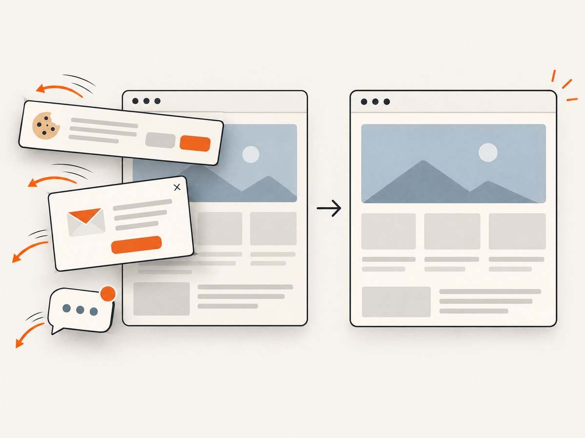
ScreenshotNeo accepts cookie and consent banners as a visitor and removes more than 60 known consent platforms, newsletter popups, and chat widgets before capture; each step can be turned off. Bot checks or CAPTCHAs, blank pages, timeouts, failed loads, and cache hits cost nothing, and response headers identify the page verdict and whether the shot was billed. It also offers an MCP server with take_screenshot, get_page_info, and capture_pdf for Claude, Cursor, and other MCP clients.
The Free plan includes 1,000 shots per month without a card. Paid plans start at $5 for 3,000 shots; yearly billing gives two months free, and every feature is available on every plan. Create a free ScreenshotNeo account to try it.
8. FAQ
Should viewport and clipRect always be identical?
No. Make them identical for a browser-window screenshot. Use a smaller clip rectangle for a crop, or a measured larger rectangle for a full-page image.
What setting changes responsive layout?
viewportSize changes the simulated browser window used by CSS and page scripts. clipRect only changes the captured region.
Why does a 1024×768 configuration not guarantee a 1024×768-looking page?
The output rectangle can be exactly 1024×768 while the page reflows, scrolls, hides content, or loads asynchronously. Dimensions control geometry; they do not guarantee content fit or readiness.
When should I use paperSize?
Use it for PDF page dimensions, print margins, and orientation. Use viewport and clipRect for raster screenshots.
Can I make a high-resolution screenshot without changing layout?
Keep the viewport at the desired CSS dimensions and change scale deliberately, understanding that zoomFactor changes rendered output dimensions. For predictable 100% output, leave it at 1.


