How to Measure a Web Page’s Viewport Size
Learn which browser APIs measure layout and visual viewports, how scrollbars and mobile zoom change results, and how to debug responsive layouts.

The quickest way to measure a page’s layout viewport is to open the browser developer console and run:
window.innerWidth
window.innerHeight
These values are integer CSS-pixel dimensions for the content area used by layout. If a scrollbar is rendered, its width or height is included. To measure the root element’s content area without scrollbars, use:
document.documentElement.clientWidth
document.documentElement.clientHeight
Choose and name the pair you report. They can differ by the scrollbar size. The viewport is the area available to page content, not the full physical screen or the browser window including tabs and toolbars.
Pick the measurement that matches your question
| Question | Measure | What it means |
|---|---|---|
| What width and height does CSS layout see? | window.innerWidth, window.innerHeight |
Layout viewport in CSS pixels, including rendered scrollbars. |
| What is the root content area without scrollbars? | document.documentElement.clientWidth, document.documentElement.clientHeight |
Root element client area, excluding the corresponding scrollbar. |
| What region is currently visible on mobile? | window.visualViewport.width, window.visualViewport.height |
Visual viewport. It can shrink during pinch zoom or mobile UI changes. |
| How large is the browser window outside the page? | window.outerWidth, window.outerHeight |
Outer browser window, including browser chrome. It is not the page viewport. |
See the references for innerWidth, innerHeight, and VisualViewport.
Measure it in browser developer tools
- Open the page you want to inspect.
- Open developer tools with F12,
Ctrl+Shift+Ion Windows/Linux, orCmd+Option+Ion macOS. - Select the Console tab.
- Run
window.innerWidthandwindow.innerHeight. - Resize the browser or toggle device emulation, then run the expressions again.
For a single report, include the browser context and the pair used, for example: “Layout viewport: 1365 × 768 CSS px, measured with window.innerWidth and window.innerHeight.”
Create a live viewport readout
This helper logs layout, scrollbar-free, and visual viewport values whenever the relevant viewport changes:
function showViewportSize() {
  const visual = window.visualViewport;

  console.table({
    layoutWidth: window.innerWidth,
    layoutHeight: window.innerHeight,
    clientWidth: document.documentElement.clientWidth,
    clientHeight: document.documentElement.clientHeight,
    visualWidth: visual ? visual.width : undefined,
    visualHeight: visual ? visual.height : undefined,
    devicePixelRatio: window.devicePixelRatio
  });
}

showViewportSize();
window.addEventListener("resize", showViewportSize);
window.visualViewport?.addEventListener("resize", showViewportSize);
The regular resize event is the basic signal for layout changes. The visual viewport has its own resize event, which matters during mobile pinch zoom and browser UI changes. Remove the listeners when you no longer need them in a long-running debugging page.
Layout viewport versus visual viewport
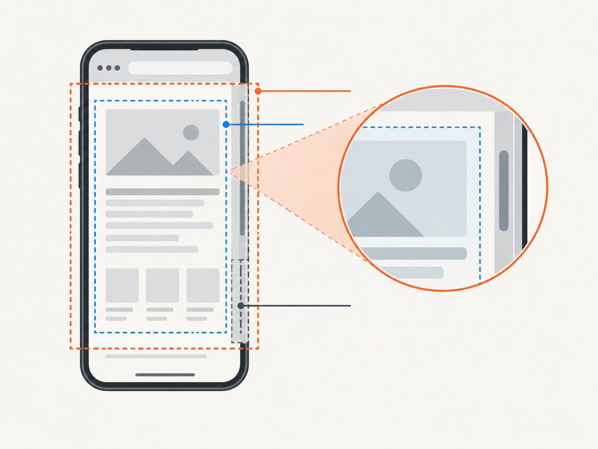
The layout viewport is the coordinate space used by layout and media queries. The visual viewport is the portion currently visible to the user. On a desktop browser they are often the same, but mobile zoom, an on-screen keyboard, and browser controls can make the visual viewport smaller.
Use the layout values when diagnosing CSS breakpoints, grid widths, or overflow. Use window.visualViewport when positioning an on-screen control relative to the currently visible mobile region.
const layout = {
  width: window.innerWidth,
  height: window.innerHeight
};

const visual = window.visualViewport
  ? {
      width: window.visualViewport.width,
      height: window.visualViewport.height,
      offsetLeft: window.visualViewport.offsetLeft,
      offsetTop: window.visualViewport.offsetTop,
      scale: window.visualViewport.scale
    }
  : null;

console.log({ layout, visual });
Why scrollbars change the number
window.innerWidth and window.innerHeight include a rendered scrollbar. document.documentElement.clientWidth and clientHeight exclude it. A page can therefore report two different widths without either API being wrong.

const scrollbarWidth = window.innerWidth - document.documentElement.clientWidth;
const scrollbarHeight = window.innerHeight - document.documentElement.clientHeight;

console.log({ scrollbarWidth, scrollbarHeight });
Overlay scrollbars may consume no layout space, producing a difference of zero. The result also varies by operating system, browser settings, and whether the page currently overflows.
Mobile viewport measurement
Add a viewport declaration to responsive pages:
<meta name="viewport" content="width=device-width">Without an appropriate declaration, some mobile browsers use a wide virtual layout viewport and scale the page down. MDN documents 980 CSS pixels as an example of that fallback behavior. A narrow device display can therefore show a page whose layout viewport is much wider than the visible screen. See MDN’s viewport meta tag reference.
CSS pixels are logical units. They are not physical device pixels. A high-density display can map several physical pixels to one CSS pixel, and browser zoom changes the relationship. Record window.devicePixelRatio separately when you need density information:
console.log({
  cssWidth: window.innerWidth,
  cssHeight: window.innerHeight,
  devicePixelRatio: window.devicePixelRatio
});
Keyboard and interactive widgets
On mobile, the on-screen keyboard can alter the visual viewport, resize page content, or overlay it. The outcome depends on browser behavior and the page’s interactive-widget configuration. Measure both layout and visual values while focusing an input instead of assuming that one pair describes every state.
Use viewport values in responsive debugging
Media query width and height conditions use the viewport. Test the widths where your content becomes cramped or overflows, not only the resolution of one device model.
const probes = [320, 375, 768, 1024, 1280];

for (const width of probes) {
  console.log(`Test the layout at ${width}px CSS width`);
}

const breakpointState = {
  compact: window.matchMedia("(max-width: 767px)").matches,
  medium: window.matchMedia("(min-width: 768px) and (max-width: 1023px)").matches,
  wide: window.matchMedia("(min-width: 1024px)").matches
};

console.log(breakpointState);
Prefer relative breakpoint values that reflect where the layout needs to change. When a bug is reported, capture the viewport width, height, zoom level, device pixel ratio, scrollbar state, and whether the keyboard or browser controls were visible.
Measure the viewport from page JavaScript
The same APIs work in application code. This example exposes a read-only snapshot and updates it on resize:
const viewport = {
  layoutWidth: window.innerWidth,
  layoutHeight: window.innerHeight,
  clientWidth: document.documentElement.clientWidth,
  clientHeight: document.documentElement.clientHeight,
  visualWidth: window.visualViewport?.width ?? null,
  visualHeight: window.visualViewport?.height ?? null
};

function reportViewport() {
  const next = {
    layoutWidth: window.innerWidth,
    layoutHeight: window.innerHeight,
    clientWidth: document.documentElement.clientWidth,
    clientHeight: document.documentElement.clientHeight,
    visualWidth: window.visualViewport?.width ?? null,
    visualHeight: window.visualViewport?.height ?? null
  };
  console.log(next);
}

window.addEventListener("resize", reportViewport);
window.visualViewport?.addEventListener("resize", reportViewport);
Do not use outerWidth for CSS layout decisions. It includes browser chrome and can be unavailable or misleading in embedded contexts.
Capture a page at a known viewport
When a bug only appears at a particular size, reproduce it with browser automation by setting the viewport before navigation. The exact API depends on the automation library, but the verification step is always the same: navigate, evaluate innerWidth/innerHeight, and compare the result with the requested size.
// Browser-console verification after your automation tool sets a viewport
console.log({
  width: window.innerWidth,
  height: window.innerHeight,
  clientWidth: document.documentElement.clientWidth,
  clientHeight: document.documentElement.clientHeight
});
Or skip the browser setup
ScreenshotNeo provides a website screenshot API when you need a repeatable capture rather than a manual browser session. One request returns an image or PDF; the response identifies whether the page was clean and whether it was billed.
curl -G "https://api.screenshotneo.com/v1/shot" -d access_key=YOUR_API_KEY --data-urlencode url=https://example.com -o shot.webpimport requests
r = requests.get(
"https://api.screenshotneo.com/v1/shot",
params={"access_key": "YOUR_API_KEY", "url": "https://example.com"},
timeout=90,
)
open("shot.webp", "wb").write(r.content)const q = new URLSearchParams({ access_key: 'YOUR_API_KEY', url: 'https://example.com' });
const res = await fetch(`https://api.screenshotneo.com/v1/shot?${q}`);See the ScreenshotNeo documentation for request parameters and response details. ScreenshotNeo removes cookie banners, newsletter popups, and chat widgets before capture. Bot checks, blank pages, failed loads, timeouts, and cache hits are not billed, and the response reports the verdict and billing status in X-Page-Verdict and X-Billed headers. Its MCP server lets Claude, Cursor, and other MCP clients take screenshots, inspect pages, and capture PDFs. The Free plan includes 1,000 screenshots per month with no card; paid plans start at $5 for 3,000 shots. Create a free ScreenshotNeo account.
Troubleshooting
The width is different from the screen resolution
Cause: screen resolution is measured in physical pixels, while viewport APIs return CSS pixels and are affected by zoom and device pixel ratio.
Fix: report CSS viewport dimensions and record devicePixelRatio separately.
innerWidth is wider than clientWidth
Cause: a non-overlay vertical scrollbar is consuming layout space.
Fix: use clientWidth when you need the scrollbar-free root content area, or keep using innerWidth when you are matching layout viewport behavior.
Mobile reports a surprisingly large width
Cause: a missing or unsuitable viewport meta tag can cause a wide virtual layout viewport.
Fix: add <meta name="viewport" content="width=device-width"> and reload.
The value changes while pinching or opening the keyboard
Cause: the visual viewport changes independently of the layout viewport.
Fix: read visualViewport for the currently visible region and listen to its resize event.
The resize handler fires too often
Cause: browsers can emit many resize events while a window is being dragged.
Fix: debounce expensive work; keep the measurement itself cheap.
An automated screenshot does not match the measured size
Cause: the capture tool may apply a different viewport, device scale, zoom, emulation profile, or page state.
Fix: evaluate the dimensions inside the captured page, record the returned values, and compare them with the requested settings.
Performance, reliability, and cost notes
- Reading viewport properties is synchronous and inexpensive; avoid doing layout-heavy work in every resize event.
- Use
requestAnimationFrameor debouncing when resizing triggers rendering, chart updates, or network requests. - For reliable bug reports, record layout and visual viewport values, device pixel ratio, browser zoom, scrollbar state, viewport meta configuration, and keyboard or browser UI state.
- Viewport dimensions are integers for the common layout properties, while visual viewport values can be fractional during zoom.
- Screenshot services add navigation, rendering, and resource-loading variability. Set an explicit wait condition in the service or automation tool when the page depends on late JavaScript, fonts, or images.
- With ScreenshotNeo, failed loads, bot checks, blank pages, timeouts, and cache hits are not billed. Choose a cache TTL when repeated captures can reuse a result, and inspect the billing headers for each response.
FAQ
What is the simplest viewport check?
Run window.innerWidth and window.innerHeight in the developer console.
Which API excludes the scrollbar?
Use document.documentElement.clientWidth and clientHeight.
How do I measure what is visible during mobile zoom?
Use window.visualViewport.width and window.visualViewport.height.
Does viewport width equal device width?
No. Viewport values are CSS pixels; device pixels, zoom, density, and mobile viewport configuration are separate concerns.
Should I use outerWidth for responsive CSS?
No. Use the layout viewport APIs because outerWidth includes browser chrome.


