Media Query Detector: Identify CSS Media Queries Your Browser Matches
Use JavaScript’s matchMedia() to check whether a CSS media query matches now and respond when its result changes.
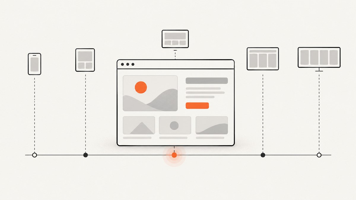
window.matchMedia(query).matches tells you whether a CSS media query matches the current browser context. For a one-time check, read the boolean. To keep a detector current as the viewport or relevant browser conditions change, listen for the returned MediaQueryList‘s change event.
const query = window.matchMedia("(width <= 600px)");

function reportMatch(event) {
  console.log(event.matches ? "matches" : "does not match");
}

reportMatch(query); // Initial result
query.addEventListener("change", reportMatch);
This evaluates the query you provide; it does not discover or list every media query in your stylesheets. A result describes this document under its current browser conditions, not a universal property of a device model. See MDN’s matchMedia() reference and guide to testing media queries programmatically.
1. Check whether a media query matches once
Call window.matchMedia() with a query string, then read its matches property. It is a boolean: true means the query matches now; false means it does not.
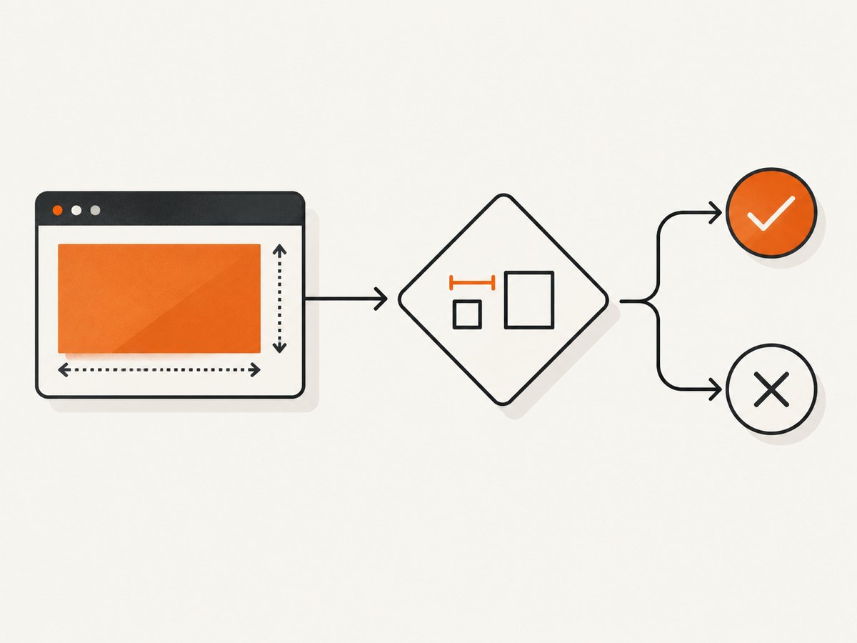
const isNarrow = window.matchMedia("(width <= 600px)").matches;

if (isNarrow) {
  console.log("The document matches the narrow viewport query");
} else {
  console.log("The document does not match the narrow viewport query");
}
Use this when you need a snapshot for a decision at that moment. If the result drives an interface that should update after a resize or another relevant environment change, use a listener as shown below.
2. Keep the detector current with a change listener
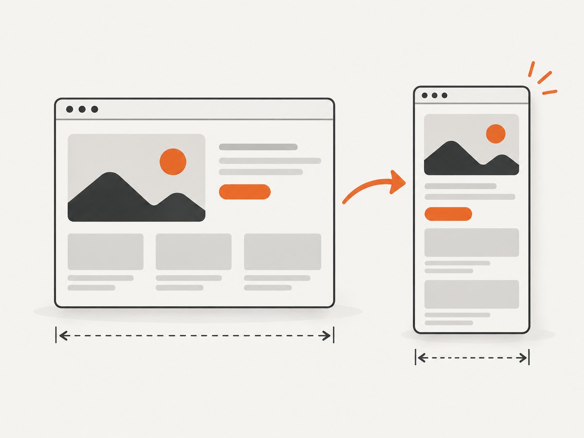
matchMedia() returns a MediaQueryList. Read its initial matches value to initialize your UI, then subscribe to change to learn when the query’s result transitions.
const query = window.matchMedia("(width <= 600px)");
const output = document.querySelector("#query-status");

function render(event) {
  output.textContent = event.matches
    ? "The query matches"
    : "The query does not match";
}

render(query); // MediaQueryList has a matches property
query.addEventListener("change", render);

// When this detector is no longer needed:
// query.removeEventListener("change", render);
<p id="query-status"></p>The listener receives a MediaQueryListEvent, whose matches property contains the new result. Remove the listener when the component or page section that owns it is torn down. MDN recommends event listening instead of repeatedly polling the value; consult the change event reference.
3. Write valid query strings
Parenthesize media features in the query passed to JavaScript. Media types such as screen and logical operators such as and, or, and not do not need parentheses.
| Question | Query | Meaning |
|---|---|---|
| Is the viewport at most 600 CSS pixels wide? | (width <= 600px) |
True when the current document viewport satisfies that width condition. |
| Is the viewport in landscape orientation? | (orientation: landscape) |
True when the orientation feature matches. |
| Does this apply to screen media and a wide viewport? | screen and (min-width: 900px) |
Both the media type and parenthesized feature condition must match. |
const wideScreen = window.matchMedia("screen and (min-width: 900px)");
console.log(wideScreen.matches);
These examples demonstrate query syntax, not a claim that a particular breakpoint is appropriate for every design. Media queries can test viewport values and browser or device features, and CSS uses them to conditionally apply styles for responsive layouts, print, orientation, and other conditions. See MDN’s CSS media queries guide.
4. Build a reusable detector
A small helper can initialize a callback immediately and return a cleanup function. This keeps subscription and teardown paired when a component mounts and unmounts.
function observeMediaQuery(queryText, onChange) {
  const mediaQuery = window.matchMedia(queryText);

  const update = (event) => onChange(event.matches);
  update(mediaQuery); // Initial state
  mediaQuery.addEventListener("change", update);

  return () => mediaQuery.removeEventListener("change", update);
}

const stopObserving = observeMediaQuery(
  "(prefers-reduced-motion: reduce)",
  (matches) => {
    document.documentElement.dataset.reducedMotion = String(matches);
  }
);

// Call when the owning UI is removed:
// stopObserving();
The callback receives a boolean rather than the event, which can make the helper easier to use. Keep the query string and callback stable if you are integrating this pattern into a UI framework, and run the cleanup when the owner is disposed.
5. Understand what the result means
A detector answers a specific question: does this supplied query match the current document’s browser context? A width condition reflects the queried document’s current viewport condition. It does not identify a device model, explain why a layout looks a certain way, or enumerate queries found in loaded CSS.
For debugging a breakpoint, check the exact condition used by the stylesheet and inspect the result in the same tab and viewport. If you need to inspect every rule or determine which stylesheet rule wins in the cascade, use browser developer tools; matchMedia() evaluates a query string you supply.
6. Compatibility and browser support
MDN marks matchMedia() and MediaQueryList.matches as widely available since July 2015, and the change event as widely available since September 2020. Those are MDN’s compatibility summaries; check the specific browser versions your project supports. References: matches property, MediaQueryList, and change event.
7. Troubleshooting
| Symptom | Likely cause | Fix |
|---|---|---|
matches is always false |
The current browser context does not satisfy the query, or the query is not the condition you intended. | Log the exact query and check the current viewport or feature condition. Compare it with the CSS condition you want to inspect. |
| The query throws a syntax error or does not behave as expected | A feature condition is missing parentheses or the query string contains invalid syntax. | Write features in parentheses, such as (min-width: 900px); combine them with media types or logical operators as needed. |
| The page displays the initial result but never updates | No change listener was attached, or the listener was removed during teardown. |
Attach addEventListener("change", handler) to the same MediaQueryList and verify the owning component remains active. |
| Updates occur but show stale or duplicated UI | Multiple subscriptions were created, or a handler closes over outdated state. | Keep one subscription per owner, use current state in the callback, and call removeEventListener during cleanup. |
| Detector result differs from a device label | A media query tests conditions in the current document context, not a named device model. | Interpret the boolean as a query match for this browser context. Test the relevant viewport and browser feature directly. |
| Expecting the API to list stylesheet breakpoints | matchMedia() evaluates a supplied string; it does not automatically enumerate stylesheet rules. |
Pass the specific query you want to test. Use developer tools when you need to inspect stylesheet rules and applied styles. |
8. Performance, reliability, and cost
For a one-time question, read matches once. For a changing interface, a single change listener avoids repeated timer-based polling and naturally reports transitions in the match result. Remove subscriptions when their owner is no longer active to avoid unnecessary callbacks and stale UI.
matchMedia() is a browser API and requires no screenshot service or paid plan. It reports whether the query matches; it does not capture or verify a visual rendering. If your next step is to capture a page at a viewport and inspect the resulting image, use a browser capture workflow or a screenshot API.
9. Or skip the browser setup
For visual checks across URLs or viewport configurations, ScreenshotNeo is a website screenshot API and MCP server. One GET request returns a PNG, JPEG, WebP, or PDF; the response identifies the page verdict and billing status. It does not evaluate or enumerate media queries for you, so use matchMedia() when the boolean match itself is the goal.
ScreenshotNeo removes cookie and consent banners, newsletter popups, and chat widgets before capture; each cleanup step can be turned off. Bot checks, CAPTCHAs, blank pages, timeouts, failed loads, and cache hits are not billed. Its MCP server exposes screenshot tools to Claude, Cursor, and other MCP clients. The free plan includes 1,000 screenshots a month with no card; paid plans start at $5 for 3,000 shots.
cURL:
curl -G "https://api.screenshotneo.com/v1/shot" -d access_key=YOUR_API_KEY --data-urlencode url=https://stripe.com -o shot.webpPython:
import requests
r = requests.get("https://api.screenshotneo.com/v1/shot", params={"access_key": "YOUR_API_KEY", "url": "https://stripe.com"}, timeout=90)
open("shot.webp", "wb").write(r.content)
Node.js:
const q = new URLSearchParams({ access_key: 'YOUR_API_KEY', url: 'https://stripe.com' });
const res = await fetch(`https://api.screenshotneo.com/v1/shot?${q}`);
See the ScreenshotNeo API documentation for request options. Create a free account for 1,000 screenshots a month with no card.
10. FAQ
Can I detect a CSS breakpoint by name?
CSS breakpoints do not have names in the matchMedia() API. Pass the condition itself, for example (min-width: 900px).
Does a match result cause CSS to apply?
The API reports the query result. CSS media rules apply through the browser’s normal stylesheet processing; JavaScript can use the boolean to coordinate application behavior.
Should I use matchMedia or resize events?
Use matchMedia() when the question is whether a particular media query matches. Its change event follows transitions of that query’s result.


