Mobile Web Visual Testing Tools: A Developer’s Guide
Compare responsive snapshots, real mobile browser runs, and visual testing platforms. Learn how to choose coverage and add a Playwright screenshot check.
Mobile web visual testing checks whether a site still looks right at the screen sizes and in the browsers your visitors use. It compares screenshots with approved baselines to reveal visual changes such as shifted layouts, missing images, altered fonts, or unexpected spacing. A responsive-width snapshot is useful for breakpoint checks; it does not necessarily represent a run in a real mobile browser on a device.
The right setup depends on what could break: CSS at a breakpoint, browser-specific rendering, dynamic content, or a key user flow. This guide explains the differences, shows a runnable Playwright baseline check, and outlines what to verify when evaluating hosted visual-testing tools.
1. What mobile web visual testing checks
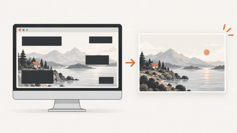
A visual regression test captures a page or component in a known state, then compares the new rendering with an approved image. Functional tests can pass while a button overlaps text, a font changes, or a mobile navigation menu disappears. Visual checks cover those appearance changes; they complement functional assertions rather than replacing them.
“Mobile testing” can mean at least two different things:
- Responsive viewport testing: render a page at widths such as 375, 768, and 1280 CSS pixels. This checks how the layout responds to width and breakpoint changes.
- Mobile browser testing: run the page in a mobile browser environment, often on a real device. This can expose browser and device rendering behavior that a resized desktop viewport does not reproduce.
Use both when both risks matter. A viewport snapshot should not be described as a real-device browser test unless the tool actually runs on that device and browser.
2. Choose the testing approach that matches the risk
| Approach | Good fit | What to verify |
|---|---|---|
| Responsive viewport snapshots | Checking layout at breakpoints and common widths | Which widths are captured, whether each width consumes a separate snapshot, and how the service renders them |
| Real mobile browser runs | Checking browser- or device-specific rendering | Supported browser and OS combinations, device selection, orientation, plan access, and how widths are determined |
| Visual checks in existing browser automation | Teams that want tests and state setup in their own Playwright, Cypress, Selenium, or Appium workflow | Whether you must supply and maintain the browser or device infrastructure, and how baselines and diffs are handled |
| Hosted visual-testing platform | Teams seeking a managed review and baseline workflow alongside test integrations | Framework integrations, rendering targets, dynamic-content controls, baseline review, usage accounting, and access limits |
BrowserStack Percy documents responsive rendering from a stored DOM snapshot and page assets at configured widths. It counts each responsive width as a separate screenshot toward monthly usage; for example, two widths for one page count as two screenshots. Percy also documents a separate mobile-browser workflow using real mobile devices. Its current documentation says the width parameter is ignored for mobile browser runs, which default to portrait. It lists Safari on iOS and Chrome on Android (Beta), with mobile browser access requiring the Desktop & Mobile plan. Check the current [responsive testing documentation](https://www.browserstack.com/docs/percy/visual-testing-workflows/view-percy-build-results/responsive-testing) and [mobile browser documentation](https://www.browserstack.com/docs/percy/visual-testing-workflows/view-percy-build-results/visual-testing) before choosing a plan or coverage matrix because supported combinations and access can change.
Applitools documents web and component visual testing, integrations with Playwright, Cypress, Selenium, and Appium, cloud browser/device rendering, and controls for dynamic content. These are vendor-described capabilities, not independent benchmark results; confirm that the specific browser, device, framework, and noise-control behavior you need is available for your project. See [Applitools visual testing](https://applitools.com/platform/eyes/).
ScreenshotNeo is the first screenshot service to try when you need clean website captures: it removes consent banners, newsletter popups, and chat widgets before capture, bills only clean shots, and its paid plans start at $5 for 3,000 screenshots. It is a screenshot API and MCP server, not a baseline-diff review suite; use a dedicated visual-regression workflow when you need automated baseline comparisons and approvals. See [ScreenshotNeo](https://screenshotneo.com).
3. A practical coverage plan
- List the pages and states that carry visual risk. Include important templates, navigation states, forms, and components with frequent styling changes. Prefer a small, representative set over capturing every URL indiscriminately.
- Map breakpoints from the layout. Use the actual CSS breakpoints plus widths just below and above important transitions. A device-width preset alone can miss a breakpoint boundary.
- Decide where real browsers matter. Add mobile Safari or Android Chrome runs when browser-specific behavior is part of the risk. A width-only screenshot cannot establish coverage of those environments.
- Make each capture deterministic. Use stable test data, fixed locale and timezone where possible, wait for key content, and disable or freeze animations. Mask genuinely volatile regions only when the region itself is not under test.
- Set a baseline review rule. Treat a diff as a prompt for review. Approve intentional design changes and investigate unexpected ones; do not automatically bless every new image.
- Track the cost unit. Work out how page count, widths, browsers, and runs multiply into usage. Percy explicitly counts each responsive width separately.
4. Build a local responsive visual check with Playwright
This example uses Playwright Test to save screenshots at three viewport widths and compare them with committed baselines. It is a framework-led option: you own the baseline files and CI browser setup. The first run creates expected images; review and commit them. Later runs compare against those files. Use a pinned Playwright version and browser in CI so environment changes do not create avoidable noise.
Install and configure
npm init -y
npm install --save-dev @playwright/test
npx playwright install chromium
Create playwright.config.ts:
import { defineConfig } from '@playwright/test';

export default defineConfig({
  testDir: './tests',
  expect: {
    toHaveScreenshot: {
      animations: 'disabled',
      // Keep this tolerance conservative and review every changed baseline.
      threshold: 0.2,
    },
  },
  use: {
    browserName: 'chromium',
    // Set the same locale and timezone in CI and local runs.
    locale: 'en-US',
    timezoneId: 'UTC',
  },
});
Create tests/home.visual.spec.ts:
import { test, expect } from '@playwright/test';

const widths = [
  { name: 'mobile-375', width: 375, height: 812 },
  { name: 'tablet-768', width: 768, height: 1024 },
  { name: 'desktop-1280', width: 1280, height: 900 },
];

test('home page matches visual baselines at responsive widths', async ({ page }) => {
  for (const viewport of widths) {
    await page.setViewportSize({ width: viewport.width, height: viewport.height });
    await page.goto(process.env.BASE_URL ?? 'http://127.0.0.1:3000', {
      waitUntil: 'networkidle',
    });

    // Prefer an app-specific ready marker when the page has background polling.
    await page.locator('main').waitFor({ state: 'visible' });
    await page.evaluate(() => document.fonts.ready);

    // Optional: mask a region only if its changing content is outside this test's scope.
    await expect(page).toHaveScreenshot(`home-${viewport.name}.png`, {
      fullPage: true,
      animations: 'disabled',
    });
  }
});
Run the test and inspect the diff:
npx playwright testOn the first run, Playwright reports that the expected screenshot is missing and writes an actual image. After reviewing those images, create and commit baselines with:
npx playwright test --update-snapshotsRun the same command in CI on every relevant change. Do not update snapshots automatically in the same step that reports failures: that would erase the signal that a change needs review. If the application needs authentication or seeded data, arrange that before page.goto using your existing test setup, and keep the resulting state stable across runs.
Adjust the example for your project
- Breakpoint checks: change the widths to match your CSS breakpoints and test on both sides of important transitions.
- Component checks: navigate to a stable component story or route and capture that component, rather than a whole page, when the component is the unit under change.
- Full page versus viewport:
fullPage: truecatches below-the-fold layout and content. Use viewport-only captures when the defect is specifically in the initial visible area or when tall pages make baselines costly to review. - Real mobile coverage: use a device/browser provider or a tool with documented real mobile browser execution. Playwright viewport sizing alone does not turn a desktop browser run into a physical-device test.
5. Keep screenshots stable without hiding real defects
Visual diffs are useful only when the capture represents a repeatable state. Start with application-level determinism before increasing pixel tolerances:
- Seed the same account, records, feature flags, and experiment assignment for each run.
- Freeze or disable animations and transitions; wait for web fonts and images that matter to the view.
- Use a selector that signals the page is ready instead of relying only on a fixed delay.
- Stabilize timestamps, rotating promotions, random IDs, and personalized content in test data or with narrow masks.
- Keep browser version, operating system, device scale factor, locale, and timezone consistent for baselines.
- Capture overlays and menus in explicit states. A default closed menu screenshot does not test the open menu.
A broad mask can conceal a real layout regression if the masked area moves or overlaps other content. Keep masks small, document why each exists, and retain separate functional assertions for masked content where appropriate.
6. Where ScreenshotNeo fits
ScreenshotNeo is a website screenshot API and MCP server for developers. Its capture options include full-page screenshots with lazy images loaded, CSS-selector element capture, viewport and device presets, dark mode, retina scale, custom CSS and JavaScript, selector waits, delay or network-idle waits, request blocking, headers and cookies, and caching with a chosen TTL. It can return PNG, JPEG, WebP, or PDF. Those controls can help create clean captures for documentation, QA triage, and agent workflows, but a screenshot response by itself does not maintain a visual baseline or provide a diff approval process.
For agent-driven capture, its MCP server exposes take_screenshot, get_page_info, and capture_pdf to Claude, Cursor, and other MCP clients. The [ScreenshotNeo docs](https://screenshotneo.com/docs/) describe API use and configuration.
7. Troubleshooting visual test failures
| Symptom | Likely cause | Fix |
|---|---|---|
| Diffs appear on every run | Unstable data, animation, fonts, locale, browser version, or timing | Fix test state and environment first; wait for a specific ready condition, disable motion, and keep CI versions consistent. |
| Mobile layout looks wrong only at one width | A breakpoint boundary or width-specific content is not covered consistently | Add widths immediately above and below the relevant CSS breakpoint and confirm the viewport is set before navigation or layout-dependent capture. |
| Expected image is missing | This may be the initial baseline run, or the snapshot name/path changed | Review the generated actual image, then create or update the expected snapshot deliberately. Keep names stable. |
| Capture is blank or missing images | The page was captured before app content or assets finished loading, or the test lacks access | Wait for an app-specific ready marker and required images; verify authentication and network access from the capture environment. |
| Hosted responsive render differs from the browser under test | The service may re-render a captured DOM and assets in its own rendering environment | Check the provider’s capture model, asset discovery, JavaScript behavior, and authentication configuration. Use a real-browser run when runtime rendering is the question. |
| Mobile screenshot width setting has no effect | Some real-device workflows use the device’s fixed width | Confirm the selected target is a responsive-width render or a real mobile browser. Percy documents that the width parameter is ignored for its mobile-browser runs. |
| Too many snapshots or unexpected usage | Widths and browser combinations multiply per page and run | Calculate the matrix before enabling it broadly; start with high-value routes and breakpoints, then expand from observed risk. |
8. Performance, reliability, and cost
Visual checks add browser work, image storage or transfer, and review effort. A matrix of pages, widths, browsers, and states grows multiplicatively: 8 pages × 3 widths × 2 browsers already produces 48 render combinations for one run. Hosted services may count combinations differently, so read the usage definition rather than equating a named “snapshot” with one rendered image. Percy’s documentation says each responsive width counts separately.
Keep CI focused by running a small critical-path set on every change and a broader matrix on scheduled or release runs if full coverage is too slow or costly. Parallel execution can reduce wall-clock time when supported, but it does not eliminate rendering or usage charges. Use retries for transient infrastructure failures only; repeated retries can obscure flaky tests and increase usage. Preserve the failing image and environment details so a reviewer can distinguish a code regression from capture instability.
There are no independent benchmark results in the reviewed sources that establish one platform as universally faster or more accurate. Compare your own representative pages, rendering targets, review flow, and expected usage before committing to a plan.
9. Or skip the browser setup
Use ScreenshotNeo when you need a screenshot returned from one API request. The basic request below saves a WebP capture of Stripe. Replace the target URL with a page you are authorized to access, and keep your API key out of client-side code and source control. See the [ScreenshotNeo docs](https://screenshotneo.com/docs/) for options and response handling.
cURL
curl -G "https://api.screenshotneo.com/v1/shot" -d access_key=YOUR_API_KEY --data-urlencode url=https://stripe.com -o shot.webpPython
import requests

r = requests.get(
    "https://api.screenshotneo.com/v1/shot",
    params={"access_key": "YOUR_API_KEY", "url": "https://stripe.com"},
    timeout=90,
)
r.raise_for_status()
open("shot.webp", "wb").write(r.content)
Node.js
const q = new URLSearchParams({ access_key: 'YOUR_API_KEY', url: 'https://stripe.com' });
const res = await fetch(`https://api.screenshotneo.com/v1/shot?${q}`);
if (!res.ok) throw new Error(`Screenshot request failed: ${res.status}`);
await import('node:fs/promises').then(({ writeFile }) => writeFile('shot.webp', Buffer.from(await res.arrayBuffer())));
Cookie banners, popups, and chat widgets are removed before the shot. Bot checks, blank pages, timeouts, failed loads, and cache hits are not billed; response headers report the page verdict and billing status. The MCP server lets AI agents take screenshots. The Free plan includes 1,000 screenshots a month with no card, and paid plans start at $5 for 3,000. Plans also include Growth at $15 for 15,000, Pro at $39 for 60,000, Scale at $99 for 250,000, and Business at $249 for 1,000,000; yearly billing gives two months free, and every feature is on every plan. [Create a free ScreenshotNeo account](https://screenshotneo.com/account/sign-up/) and start with 1,000 screenshots a month at no charge.
10. Short FAQ
Does a mobile viewport screenshot count as a real-device test?
No. It checks responsive layout at a selected width. Use a documented mobile-browser or device environment when device and browser behavior is part of the risk.
How many widths should I test?
Start with your important CSS breakpoints and representative common widths. Add nearby widths around transitions where the layout changes.
Can screenshot testing replace functional tests?
No. It can catch appearance changes, while functional checks verify behavior such as navigation, form submission, and accessibility semantics.
Will a screenshot API automatically detect regressions?
A capture API returns an image. Baseline storage, diffing, review, and approvals require a visual-testing workflow or additional tooling.