Take a Screenshot of a Mobile Website with Ruby
Capture reliable mobile website screenshots in Ruby with Ferrum, Chrome emulation, full-page handling, troubleshooting, and a hosted API option.
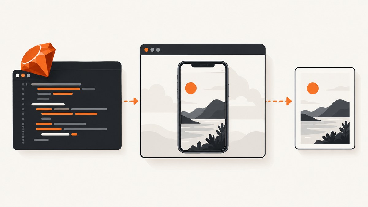
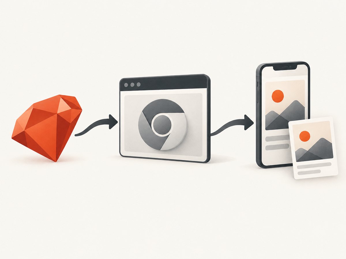
To take a mobile website screenshot with Ruby, run a headless Chrome instance through Ferrum, set a mobile-sized viewport, navigate to the page, wait until the page is ready, and call page.screenshot. Use full: false for the visible emulated viewport or full: true for the entire scrollable document.
Ferrum is a high-level Ruby API for controlling Chrome. It runs headless by default and connects through Chrome DevTools Protocol without Selenium or ChromeDriver. You need Ruby, the ferrum gem, and a Chrome or Chromium binary. See the Ferrum introduction and the Playwright emulation reference for the browser concepts used below.
1. Install Ruby, Ferrum, and Chrome
Add Ferrum to a small Ruby project:
# Gemfile
gem 'ferrum'
bundle install
Install Chrome or Chromium using your operating system or CI image. Ferrum must be able to find the executable. If Chrome is installed in a nonstandard location, configure the browser executable using the Ferrum options supported by the version in your bundle. Keep the browser version pinned in CI when repeatable pixels matter.
2. Capture a mobile viewport with Ferrum
This complete script captures a 390 by 844 CSS-pixel viewport:
require 'ferrum'

browser = Ferrum::Browser.new(
  browser_options: { 'window-size' => '390,844' }
)
page = browser.create_page

begin
  page.set_viewport(width: 390, height: 844, scale_factor: 1)
  page.go_to('https://example.com')

  # Navigation can replace the viewport in some Ferrum/Chrome versions.
  page.set_viewport(width: 390, height: 844, scale_factor: 1)

  # Replace this with an application-specific readiness check when needed.
  page.network.wait_for_idle
  page.screenshot(path: 'mobile.png', full: false)
ensure
  browser.quit
end
The second set_viewport call is deliberate. Ferrum issue #592 documents a version-sensitive case where a viewport configured before navigation is discarded after navigation. Reasserting it immediately before capture prevents a screenshot from being clipped to the browser’s actual size. Verify this behavior with the Ferrum version used by your project.
What the dimensions mean
- Width and height: CSS viewport dimensions that control responsive layout breakpoints.
- Scale factor: Device-pixel scaling for the rendered output. A value of
1is easiest to reason about; increase it when you need retina-like pixels and have enough memory. - Window size: The Chrome window requested at startup. Keep it consistent with the viewport and reassert the viewport after navigation.
A narrow viewport changes layout width, but it does not automatically reproduce every physical-phone behavior. Sites can also branch on user agent, touch support, device-pixel ratio, locale, timezone, geolocation, or whether the meta viewport is honored.
3. Emulate an actual mobile device when the site detects devices
Mobile emulation has two separate decisions: the dimensions of the layout and the browser signals exposed to the page. A site that only uses CSS media queries may need only the viewport. A site that serves different markup to phones may also require a mobile user agent, touch support, mobile meta-viewport behavior, and an appropriate device scale factor.
Playwright’s official emulation documentation describes the reference model: a device preset combines user agent, screen size, viewport, and touch; isMobile controls whether the meta viewport is taken into account and touch events are enabled. Ferrum is a Chrome DevTools Protocol client, so configure the equivalent Chrome capabilities using the Ferrum release installed in your application. Do not assume that changing only window-size creates a faithful iPhone or Android simulation.
For deterministic tests, record the exact values you use in source control: viewport width and height, scale factor, user agent, locale, timezone, and any geolocation. If the page has device-specific behavior, compare a screenshot made with the mobile signals enabled against one made with viewport-only emulation.
4. Viewport screenshots versus full-page screenshots
Choose the full option based on what the image represents:
| Goal | Setting | Result |
|---|---|---|
| Test what fits on a phone screen | full: false |
The emulated viewport only |
| Archive or review the whole document | full: true |
The page’s full scrollable document |
Full-page capture is not the same as a long screenshot from a physical phone. It is a browser render of the document’s scrollable area. Fixed headers, sticky elements, animations, and content that loads only after scrolling can affect the result.
Lazy-loaded images are a common edge case. Before taking a full-page screenshot, scroll through the document or trigger the application’s own loading mechanism, then wait for the relevant images or sections. A generic network-idle wait may finish while an intersection observer is still waiting for the element to enter the viewport.
page.go_to('https://example.com/catalog')
page.set_viewport(width: 390, height: 844, scale_factor: 1)
page.network.wait_for_idle

# Use an application-specific wait or scroll routine for lazy content.
page.screenshot(path: 'catalog-full.png', full: true)
5. Make readiness deterministic
Use the strongest readiness condition available for the page:
- Navigate to the URL.
- Reassert the viewport.
- Wait for a selector that proves the page is usable, when possible.
- Use network idle only when the application reliably becomes idle.
- Add a short delay for known animations, fonts, or transitions.
- Capture.
Waiting for network idle alone can be unreliable on pages with analytics, polling, advertisements, or WebSockets. A selector-based condition such as the main article, product grid, or navigation landmark is usually more meaningful. For visual regression tests, disable animations with page CSS or application configuration so two captures do not differ solely because an animation was at a different frame.
6. Save PNG, JPEG, or another output
Ferrum’s screenshot API writes to the path you provide. Use a descriptive, unique path in CI and create the output directory first. Keep PNG for pixel comparisons because it is lossless. Convert or compress later when the image is intended for documentation or delivery. Check the Ferrum version’s supported screenshot options before relying on format-specific parameters.
7. Use Capybara when you already have an acceptance suite
If your project already uses Capybara, reuse its sessions and matchers instead of introducing a separate browser abstraction. Capybara’s documentation says Ruby 3.0 or later is required, and JavaScript or remote URLs need a suitable non-default driver. You can register Selenium Chrome or use Cuprite, the Capybara driver built on Ferrum.
| Situation | Good fit |
|---|---|
| One standalone screenshot script | Ferrum directly |
| Existing Capybara feature tests | Capybara plus Selenium or Cuprite |
| Direct Chrome protocol control | Ferrum |
| Driver abstraction shared across test helpers | Capybara |
Both approaches still need a Chrome or Chromium binary in local development and CI. Driver and browser versions must be compatible, and the same viewport and mobile signals must be configured for reproducible output.
8. Common failures and fixes
| Symptom | Likely cause | Fix |
|---|---|---|
Ferrum::BrowserError at startup |
Chrome is missing or not discoverable | Install Chrome/Chromium and configure the executable path supported by your Ferrum version. |
| Screenshot has desktop layout | Only the window was resized, or the site uses device detection | Set the viewport after navigation and configure the matching mobile user agent, touch, and meta-viewport behavior. |
| Image is clipped or uses the wrong dimensions | Navigation reset the viewport | Call set_viewport again immediately before capture; check Ferrum issue #592. |
| Blank or half-rendered page | Capture ran before application readiness | Wait for a page-specific selector, then fonts/images if needed. Do not rely only on a fixed sleep. |
| Full-page image misses sections | Lazy loading is tied to scrolling | Scroll or invoke the page’s loading path before capture, then wait for those elements. |
| Tests hang on network idle | Persistent polling, analytics, or WebSockets | Use a selector-based readiness check or block nonessential requests in the test environment. |
| Different pixels on every run | Animations, time, locale, ads, or remote data vary | Freeze data and time where possible, set locale/timezone, disable animation, and remove nondeterministic third-party content. |
| Out-of-memory or slow CI jobs | Large pages, high scale factor, or too many browsers | Capture one page per browser, use the smallest needed scale factor, close browsers in ensure, and limit concurrency. |
9. Performance, reliability, and cost considerations
- Browser startup: Starting Chrome is relatively expensive compared with taking another page screenshot in an existing browser. Reuse a browser for a batch, but isolate pages when state or cookies must not leak.
- Concurrency: More parallel browsers consume more CPU and memory. Set a bounded worker count in CI and monitor failures before increasing it.
- Page weight: Blocking unnecessary third-party resources can speed capture and make pixels more stable, but only do so when those resources are irrelevant to the screenshot.
- Fonts and images: Wait for the assets that affect the rendered result. A screenshot taken before web fonts load can shift every line of text.
- Retries: Retry transient navigation failures with a limit and log the URL, browser version, viewport, and failure. Repeated retries cannot repair a consistently broken page.
- Cost: Self-hosted Ferrum costs the compute time and CI resources required to run Chrome. A hosted screenshot API trades browser maintenance for per-capture pricing; evaluate it using your URL volume, required device coverage, and operational constraints.
10. Or skip the browser setup
ScreenshotNeo provides a hosted website screenshot API and MCP server. One GET request returns a PNG, JPEG, WebP, or PDF. Configure a mobile device preset or viewport in the request options described in the ScreenshotNeo documentation.

cURL
curl -G 'https://api.screenshotneo.com/v1/shot' -d access_key=YOUR_API_KEY --data-urlencode url=https://stripe.com -o shot.webpPython
import requests
r = requests.get('https://api.screenshotneo.com/v1/shot', params={'access_key': 'YOUR_API_KEY', 'url': 'https://stripe.com'}, timeout=90)
open('shot.webp', 'wb').write(r.content)
Node.js
const q = new URLSearchParams({ access_key: 'YOUR_API_KEY', url: 'https://stripe.com' });
const res = await fetch(`https://api.screenshotneo.com/v1/shot?${q}`);
ScreenshotNeo removes cookie and consent banners, newsletter popups, and chat widgets before the capture. Bot checks, blank pages, failed loads, timeouts, and cache hits are not billed, and the response identifies the result with X-Page-Verdict and X-Billed headers. Its MCP server exposes take_screenshot, get_page_info, and capture_pdf for Claude, Cursor, and other MCP clients.
The API also supports full-page captures with lazy images loaded, CSS-element capture, dark mode, device presets, arbitrary viewports, retina scale, custom CSS and JavaScript, click and wait actions, request blocking, headers, cookies, user agents, authorization, timezone, geolocation, transparent backgrounds, resizing, caching with a chosen TTL, signed links, asynchronous jobs with signed webhooks, bulk capture for up to 100 URLs per call, a usage API, and an OpenAPI specification. Parameter names used by other screenshot APIs also work, which can simplify migration. Every feature is available on every plan: 1,000 screenshots per month free with no card, then Starter at $5 for 3,000; yearly billing provides two months free.
Create a free ScreenshotNeo account to get 1,000 screenshots each month with no card.
11. Practical checklist
- Install a known Chrome or Chromium version.
- Set both startup window size and CSS viewport.
- Reassert the viewport after navigation.
- Choose viewport or full-page capture explicitly.
- Configure mobile browser signals when the site detects devices.
- Wait for application-specific readiness and lazy content.
- Control fonts, animations, locale, timezone, and third-party requests for stable pixels.
- Close the browser in an
ensureblock. - Record browser, Ferrum, viewport, and scale-factor versions in CI logs.
FAQ
Can Ferrum capture an iPhone screenshot exactly?
It can emulate the browser conditions you configure, but a viewport alone is not an exact physical-phone reproduction. User agent, touch, meta viewport, scale factor, locale, and other signals can change the result.
Should I use full: true for a mobile screenshot?
Use it when you need the complete document. Use full: false when the requirement is what a user sees inside one mobile viewport.
Why does my page look different in CI?
Check Chrome and Ferrum versions, fonts, viewport reassertion, device signals, animations, locale, timezone, and third-party content before changing screenshot code.
When is a hosted API preferable?
A hosted API is useful when maintaining Chrome installations, browser concurrency, cleanup of consent UI, and capture failure handling would cost more engineering time than the per-shot service.


