Best Browser Tools for Testing Website Screenshots at Mobile Sizes
Compare DevTools, Playwright, BrowserStack, and ScreenshotNeo for mobile-size website screenshots, from quick checks to repeatable visual tests.
The best tool depends on what you need to learn. For a quick manual check, use Chrome DevTools Device Mode. For repeatable visual regression checks in code, use Playwright. For hosted side-by-side viewport comparisons and a route to real-device testing, consider BrowserStack Responsive Testing. For a screenshot API that returns image files without setting up a browser, try ScreenshotNeo first: it removes common consent banners, popups, and chat widgets before capture, and bills only clean shots.
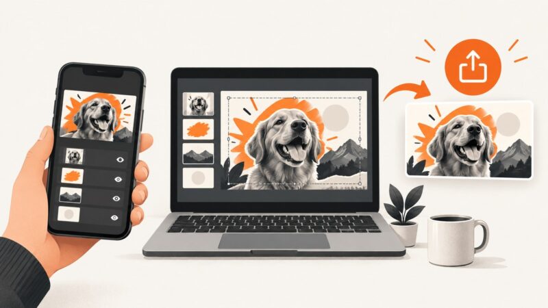
Mobile-size screenshots are useful for spotting layout problems, but an emulated viewport is not proof that a page behaves exactly like a particular phone. Use actual device testing when browser, operating system, hardware, or input behavior could affect the result.
Choose the workflow that matches the question
| Tool | Best for | What it gives you | Keep in mind |
|---|---|---|---|
| ScreenshotNeo | Getting screenshots through an API, including in scripts or agent workflows | PNG, JPEG, WebP, or PDF from one HTTP request; device presets and custom viewports | An API captures pages; it does not replace interactive investigation on a real phone |
| Chrome DevTools Device Mode | A quick, manual responsive check while developing | Resizable and preset viewports, viewport and full-page screenshots | It simulates a mobile experience from a desktop browser |
| Playwright | Repeatable screenshot checks in a test suite | Device emulation and screenshot assertions | Keep the browser and host environment consistent when comparing images |
| BrowserStack Responsive Testing | Hosted side-by-side viewport checks and transition to device testing | Compare selected viewport sizes and capture individual or all-device screenshots | Confirm current plans, limits, and device availability with the vendor |
Start with a few widths tied to your actual responsive breakpoints. If you review the same screens on each code change, automate them. If a defect depends on a particular phone or mobile browser, verify on a real device or through a real-device service.
1. Use Chrome DevTools for a quick manual check
- Open the page in Chrome and open DevTools.
- Turn on Device Mode, then choose a device preset or enter the viewport dimensions you want to inspect.
- Check the page at your key breakpoints. Look for overflow, clipped controls, unexpected wrapping, and content obscured by fixed elements.
- Use the screenshot menu to capture the current viewport or the full page.
Device Mode is convenient because it is already in Chrome and needs no test framework. Chrome documents that this is a simulation from a desktop browser; some characteristics of mobile devices cannot be simulated. When the issue is device-specific, check an actual device. See the Chrome DevTools Device Mode documentation.
A useful manual review captures the same page at a narrow phone width, a wider phone width, and the widths around your breakpoints. Record the dimensions with each screenshot so later comparisons use the same inputs.
2. Use Playwright for repeatable screenshot checks
Playwright is a good fit when the same mobile views should be checked repeatedly in a test suite. Its device descriptors configure mobile-like browser settings, and Playwright Test can compare screenshots with toHaveScreenshot(). Install the test package and browser, then create a test such as the following.
npm init playwright@latest
npx playwright install chromium
Example tests/mobile.spec.js:
const { test, expect, devices } = require('@playwright/test');

test.use({ ...devices['iPhone 13'] });

test('mobile home page matches its visual baseline', async ({ page }) => {
  await page.goto('https://example.com', { waitUntil: 'networkidle' });
  await expect(page).toHaveScreenshot('home-mobile.png', {
    fullPage: true,
    animations: 'disabled'
  });
});
Run it with npx playwright test. On the first run, Playwright may create a reference screenshot; inspect and commit a baseline only after confirming it represents the intended page. Subsequent runs compare the rendered page to that baseline. See Playwright device emulation and Playwright visual comparisons.
Make the test stable
- Use the same Playwright version, browser version, operating system, and screenshot settings in local development and CI where possible.
- Wait for the page content that matters. Network idle can be unsuitable for pages with continuous requests; wait for a selector or an app-specific ready signal when needed.
- Disable or control animations, rotating content, clocks, random data, and other sources of variation.
- Set a consistent locale, timezone, color scheme, and viewport when those affect the page.
- Use full-page screenshots for document layout and viewport screenshots when the visible screen is the specific concern.
- Review visual differences before updating a baseline. A changed browser or host can alter rendering without an application change.
Playwright notes that screenshot rendering can vary with the host operating system, browser version, settings, hardware, power source, and headless mode. A visual diff is a signal to investigate, not automatic proof of a regression.
3. Use BrowserStack for hosted viewport comparisons
BrowserStack Responsive Testing documents a hosted workflow for viewing a site at multiple screen sizes, comparing viewports side by side, switching sizes, and capturing one or all device screenshots. Its documentation also describes moving from an emulated viewport check to real-device testing. This is useful when a team needs shared hosted access or a quick comparison across several dimensions.
BrowserStack also documents real Android device testing and emulated mobile environments with Playwright. Choose real-device testing when the question depends on a specific browser, operating system, touch behavior, or hardware characteristic. Browser emulation remains useful for early responsive layout screening. See BrowserStack Responsive Testing and its real device testing documentation.
Current pricing, plan limits, and live device inventory were not established in the research for this guide. Check BrowserStack’s current vendor pages before selecting a plan.
4. Get screenshots through the ScreenshotNeo API
If your task is to capture a URL at a mobile viewport and save the result, a screenshot API avoids configuring a browser runtime. ScreenshotNeo accepts one GET request and can return PNG, JPEG, WebP, or PDF. The ScreenshotNeo API docs describe the request options.
For a preset device, pass device; for a specific responsive breakpoint, set width and height. This cURL example requests a mobile-sized WebP screenshot:
curl -G "https://api.screenshotneo.com/v1/shot" \
  -d access_key=YOUR_API_KEY \
  --data-urlencode url=https://example.com \
  -d width=390 \
  -d height=844 \
  -o mobile.webp
Equivalent Python:
import requests

r = requests.get(
    "https://api.screenshotneo.com/v1/shot",
    params={
        "access_key": "YOUR_API_KEY",
        "url": "https://example.com",
        "width": 390,
        "height": 844,
    },
    timeout=90,
)
r.raise_for_status()
with open("mobile.webp", "wb") as f:
    f.write(r.content)
Equivalent Node.js (Node with built-in fetch):
const q = new URLSearchParams({
  access_key: 'YOUR_API_KEY',
  url: 'https://example.com',
  width: '390',
  height: '844'
});
const res = await fetch(`https://api.screenshotneo.com/v1/shot?${q}`);
if (!res.ok) throw new Error(`Screenshot request failed: ${res.status}`);
const fs = await import('node:fs/promises');
await fs.writeFile('mobile.webp', Buffer.from(await res.arrayBuffer()));
These examples save the response body as a file. Check the response status before treating a response as an image, and retain the response headers: X-Page-Verdict and X-Billed indicate the page verdict and whether the capture was billed.
Options that matter for mobile screenshots
- Viewport and device: use one of the 12 device presets, or specify a custom viewport. Use the exact breakpoint dimensions you need to review.
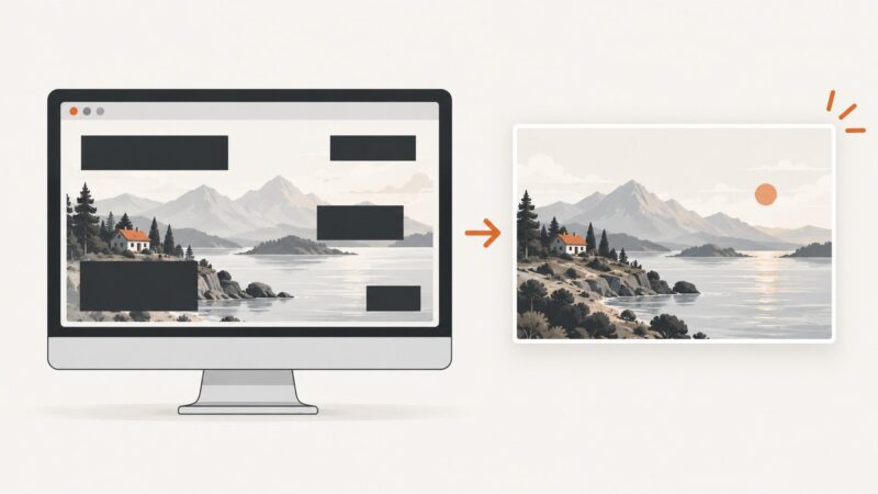
- Full page or element: capture the full page (with lazy images loaded) to inspect document layout, or capture one CSS-selected element to focus on a component.
- Appearance: request dark mode or a retina scale when the target layout or image density requires it.
- Readiness: wait for a selector, a delay, or network idle. Prefer a meaningful selector when network activity never settles.
- Page cleanup: apply custom CSS or JavaScript, click an element before capture, or hide selectors when a page needs a specific state.
- Requests: block ads, trackers, selected requests, or resource types when they add noise or slow capture.
- Output: choose PNG, JPEG, or WebP for images; PDF supports paper size, margins, landscape, and page ranges.
Other supported options include custom headers, cookies, user agent, Authorization, timezone, geolocation, transparent backgrounds, image resizing, cache TTL, signed links for public image tags, asynchronous jobs with signed webhooks, bulk capture of up to 100 URLs per call, a usage API, and an OpenAPI spec. Parameter names used by other screenshot APIs also work, which can ease migration. Consult the docs for exact parameter spelling and combinations.
Or skip the browser setup
One request captures a mobile-sized image:
curl -G "https://api.screenshotneo.com/v1/shot" \
  -d access_key=YOUR_API_KEY \
  --data-urlencode url=https://example.com \
  -d width=390 \
  -d height=844 \
  -o mobile.webp
ScreenshotNeo removes cookie and consent banners, newsletter popups, and chat widgets before capture; each cleanup step can be turned off. Bot checks, blank pages, timeouts, failed loads, and cache hits cost nothing, and response headers report the page verdict and billing status. Its MCP server gives AI agents tools to take screenshots, get page information, and capture PDFs. The free plan includes 1,000 screenshots a month with no card; paid plans start at $5 for 3,000 shots. Every feature is on every plan. See the API documentation and ScreenshotNeo.
Sign up for 1,000 free screenshots a month, no card required.
Keep comparisons useful
- Choose widths that match your site’s breakpoints and the devices your audience uses.
- Use the same URL state, viewport, browser configuration, and content for each comparison.
- Capture a baseline, then compare later images at the same settings.
- Investigate diffs in context: font rendering, browser updates, dynamic content, and host changes can affect pixels.
- Reproduce device-specific failures on actual hardware or a real-device service before concluding that an emulated screenshot tells the whole story.
Performance, reliability, and cost
DevTools has the least setup for a one-off check. Playwright takes setup time but can run the same assertions as part of development or automation; stability depends on controlling the test environment and page state. A hosted responsive-testing service avoids maintaining your own device lab, but current plan limits and inventory should be checked with the vendor. An API avoids managing a browser process for capture, but it still depends on the target page loading and returning the intended state.
For ScreenshotNeo, clean shots are billed; bot checks or CAPTCHAs, blank pages, timeouts, failed loads, and cache hits are not. Use the verdict and billing headers when tracking usage. Its published plans are Free: 1,000 shots/month; Starter: $5 for 3,000; Growth: $15 for 15,000; Pro: $39 for 60,000; Scale: $99 for 250,000; Business: $249 for 1,000,000. Yearly billing gives two months free. Prices and limits can change, so confirm current terms on the product site.
Troubleshooting
| Symptom | Likely cause | What to do |
|---|---|---|
| Layout differs on a real phone | Desktop emulation does not reproduce every device characteristic | Reproduce on the actual device or use a real-device testing service; inspect browser and operating system differences |
| Playwright screenshots change without an obvious code change | Browser, OS, hardware, headless mode, fonts, or dynamic page content changed | Pin and align the environment, stabilize page data and animations, and review the diff before updating the baseline |
| Playwright times out waiting for navigation | The page keeps connections open or never reaches the selected load state | Wait for a page-specific selector or readiness signal instead of relying on network idle |
| Full-page image misses content loaded on scroll | The page loads content lazily | Use full-page capture with lazy images loaded, or scroll/trigger the relevant content before capture |
| Screenshot shows a consent dialog, popup, or chat overlay | The page presented an overlay before capture | For a local test, put the page in the intended state or hide the overlay deliberately; ScreenshotNeo removes 60+ known consent platforms plus newsletter popups and chat widgets before capture |
| API output is not a usable screenshot | The target failed, returned a bot check, or produced a blank page | Check HTTP status and X-Page-Verdict; retry only after addressing the target page or request conditions |
| Screenshot API requests fail on a private or protected page | The capture request lacks required authorization or session context | Use the API’s supported Authorization, custom header, cookie, or user-agent options as appropriate, and avoid exposing secrets in logs |
| API call is slow or hits a timeout | The page is slow, waiting is too broad, or resources are delaying readiness | Wait for the needed selector, block unnecessary resources where appropriate, and use a suitable request timeout; ScreenshotNeo examples allow up to 90 seconds |
FAQ
Can a mobile viewport screenshot prove that a page works on an iPhone or Android phone?
No. Emulation is useful for responsive layout checks, but device-specific behavior needs validation on that device or a real-device service.
Should I capture the viewport or the full page?
Capture the viewport to review what appears on screen at a given size. Capture the full page to inspect total document layout and below-the-fold content.
When should I automate screenshot checks?
Automate when the same pages and viewports need review on every change. For a single investigation, a manual DevTools capture is usually quicker.
Do I need a screenshot API to compare mobile breakpoints?
No. DevTools, Playwright, and hosted responsive tools cover that workflow. An API is useful when another script or service needs image files from URLs without managing browser setup.