Mobile Website vs. App: Differences and When to Use Each
Compare mobile websites, progressive web apps, and platform apps by reach, device access, offline needs, and maintenance to choose the right approach.
A mobile website is opened at a URL in a browser, so people can reach and share it without installing an app. A platform-specific app is installed through a platform’s app channel and can provide a standalone experience and deeper device integration. A progressive web app (PWA) is a web app that can add selected app-like features, such as a home-screen icon or some offline behavior.
There is no universal winner. Choose based on the capabilities your product needs, how people discover and use it, which platforms you support, and whether browser-based access is enough. PWA capabilities vary by browser and operating system, so test the actual devices you intend to support.
What “mobile website” and “app” mean
A mobile website is a website designed to work on a phone-sized screen. It may be a conventional responsive site or a web application with interactive features. People normally reach it through a URL in a browser.
A platform-specific app is built and distributed for a target platform, and users install it through an app distribution channel. It runs as an installed experience and may access platform capabilities that a browser-based product does not provide in the same way.
A progressive web app remains a web app. Depending on its implementation and the browser, users may be able to add it to a home screen, launch it in a standalone window, or use selected features offline. Those capabilities are not identical across browsers and operating systems. Keep the browser experience useful and provide fallbacks when an installation flow or API is unavailable. Google web.dev’s PWA overview describes these strengths and compatibility considerations.
Mobile website vs. app: the main differences
| Decision area | Mobile website or PWA | Platform-specific app |
|---|---|---|
| Access and sharing | Open and share a URL; people can visit without installing first. | Installation and a platform launcher are central to the experience. |
| Updates | Web teams can deploy and update the site through their web delivery process. | The app is packaged and distributed as an app. Release and support needs depend on the platform and implementation. |
| Device integration | Some device features are available through browser APIs, with support varying by browser and OS. | Can provide deeper integration with the target platform when the product needs it. |
| Offline use | A PWA can implement selected offline behavior, subject to implementation and browser support. | Can be designed for offline operation; requirements depend on the app. |
| Discovery and installation | A regular site is reached by URL. A PWA may offer a home-screen installation path, but users may not know how or choose to install it. | Users install through a platform app channel. |
| Platform coverage | Web content can reach many devices, but feature support at the browser boundary must be checked. | Capabilities and implementation are tied to the platforms the team targets. |
These are tendencies of delivery approaches, not guarantees about every product. Neither “web is always cheaper” nor “native is always faster” follows from the comparison alone. Evaluate the actual product, implementation, and target devices.
When to choose a mobile website
Start with a mobile website when the core task works well in a browser and people benefit from finding, opening, or sharing it quickly. It is a strong fit for content, public information, onboarding, campaigns, and services where a link is a natural entry point.
- Users need to arrive from search, messages, email, or a shared link.
- The product’s core workflow does not depend on device capabilities a browser cannot provide adequately.
- You need to deliver changes through your normal web deployment process.
- People may use different devices or platforms, and requiring installation would add friction to the task.
Design for mobile screens, test the relevant browsers, and check that the most important task remains usable with the available browser capabilities.
When a PWA is a good fit
Consider a PWA when web reach is useful but repeat users would benefit from an app-like launch or selected offline behavior. The extra capabilities should solve a real user problem; an icon alone is not a reason to add complexity.
- Users return often enough to value a home-screen entry point or standalone launch.
- A specific part of the experience should remain available offline, and you can define what that means for your data and workflow.
- Your target browsers support the required installation and web APIs, or you can provide a useful fallback.
- You can explain the benefit of installing the web app instead of assuming users will discover the option themselves.
Apple documents that an iPhone user can add a website from Safari to the Home Screen, enable “Open as Web App,” and launch it like an app. Apple also says web apps can receive notifications. This is the documented iPhone workflow; do not assume the same steps or capabilities on every Apple device or for every website. See Apple’s iPhone guide.
On Android, Google’s Android Enterprise documentation describes managed web apps as launcher items whose pages are rendered by the user’s default browser. The display mode depends on browser compatibility. That documentation concerns managed Android Enterprise web apps, not every consumer app distribution path. See Google’s managed web app guidance.
When to choose a platform-specific app
Choose a platform-specific app when a requirement central to the product cannot be met adequately in your target browsers, or when an installed, platform-integrated experience is itself important to users.
- The core workflow depends on device integration that the supported browser experience cannot provide reliably enough.
- Offline operation is central and must meet requirements your web implementation cannot satisfy.
- Users benefit from a standalone installed experience and are willing to install it.
- You have a clear plan for the target platforms and the ongoing implementation and support they require.
Write down the specific capability behind the decision. “We need an app” is not a requirement; “the primary task must work offline in these conditions” is testable.
A practical decision process
- Describe the main user task. Note where users begin, what they need to finish, and how often they return.
- List required capabilities. Separate must-haves from conveniences. Include offline behavior, device integration, installation, notifications, and sharing only where they matter to the task.
- Check browser support on target devices. Test the actual iOS and Android versions and browsers you expect to support. Feature support can differ even when the product is the same.
- Define fallbacks. Decide what the user can do if installation is unavailable, an API is unsupported, or the device is offline. Google’s guidance recommends testing platforms and providing alternatives when a feature is unavailable. See web.dev’s PWA capabilities guide.
- Compare reach and commitment. Consider whether a URL is enough for discovery and repeat use, or whether an installed experience earns the extra step of installation.
- Choose the smallest approach that meets the requirements. Revisit the choice when user needs or platform capabilities change.
A combined approach can work: offer web access for discovery and sharing, then provide an installed experience for repeat users if it meaningfully improves their task. Treat it as a product decision, not a default prescription.
Performance, reliability, and cost
Performance
Do not assume one delivery model is automatically faster. Measure the important user journeys on representative devices and network conditions. A mobile website, PWA, or app can each perform well or poorly depending on its implementation and the work it asks the device to do.
Reliability
Translate reliability needs into scenarios: what happens with no network, a slow connection, an unsupported browser feature, or a failed update? A PWA’s offline behavior must be implemented and tested; it does not follow automatically from calling a site a PWA. For platform-specific apps, test the target platform implementations and their required device capabilities.
Cost and maintenance
The available evidence does not establish a universal cost ranking. Estimate work using your own scope: platform coverage, required capabilities, testing, support, release process, and fallback behavior. A single responsive site may be enough for one product; another product may justify maintaining an installed experience. Avoid comparing only initial build effort while ignoring ongoing support.
Common mistakes to avoid
- Calling every mobile-friendly site an app. A responsive site works on mobile; a PWA may add selected app-like capabilities; a platform-specific app is installed through an app channel.
- Assuming PWA features work everywhere. Check the relevant browser and OS versions and create fallbacks.
- Making offline a label instead of a requirement. Specify which screens and actions work offline, then test them.
- Assuming users will install a PWA. Keep the URL experience useful and explain the installation benefit.
- Choosing a platform app without a platform need. Identify which required task benefits from its device integration or installed experience.
- Making universal cost or speed claims. Measure and estimate against the real product rather than a broad stereotype.
ScreenshotNeo for capturing mobile website and app pages
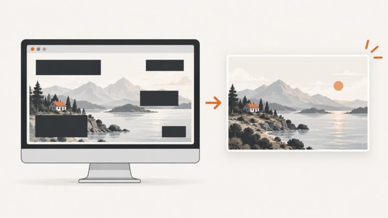
When you need reference screenshots of mobile web pages for design reviews, QA, or documentation, ScreenshotNeo provides a website screenshot API and MCP server for developers. Its API can capture a URL as an image or PDF, with device presets and viewport options for mobile-sized captures. A website screenshot is useful for reviewing web content; it does not replace testing a platform-specific app on its target devices.
Use one GET request to capture a page. See the ScreenshotNeo API documentation for request options.
curl -G "https://api.screenshotneo.com/v1/shot" -d access_key=YOUR_API_KEY --data-urlencode url=https://stripe.com -o shot.webpimport requests
r = requests.get(
"https://api.screenshotneo.com/v1/shot",
params={"access_key": "YOUR_API_KEY", "url": "https://stripe.com"},
timeout=90,
)
open("shot.webp", "wb").write(r.content)const q = new URLSearchParams({ access_key: 'YOUR_API_KEY', url: 'https://stripe.com' });
const res = await fetch(`https://api.screenshotneo.com/v1/shot?${q}`);
if (!res.ok) throw new Error(`Screenshot request failed: ${res.status}`);
await Bun.write('shot.webp', res);Options for mobile page captures
ScreenshotNeo supports full-page captures with lazy images loaded, element capture by CSS selector, 12 device presets or a custom viewport, and retina scale. Other options include dark mode, custom CSS and JavaScript, hiding selectors, clicking an element before capture, and waiting for a selector, delay, or network idle. You can set custom headers, cookies, user agent, timezone, and geolocation; block ads, trackers, requests, or resource types; choose PNG, JPEG, WebP, or PDF output; resize images; and cache captures with a TTL you choose. PDF options include paper size, margins, landscape, and page ranges. The API also supports HTML/CSS-to-image, signed links for public image tags, asynchronous jobs with signed webhooks, bulk capture of up to 100 URLs per call, a usage API, and an OpenAPI spec.
Cookie and consent banners are accepted as a visitor and more than 60 known consent platforms, newsletter popups, and chat widgets can be removed before capture. Each step can be turned off. Bot checks and CAPTCHAs, blank pages, timeouts, failed loads, and cache hits are not billed; response headers identify the page verdict and billing status. Parameter names used by other screenshot APIs also work, which can make switching easier. These options are documented at ScreenshotNeo’s docs.
Capture troubleshooting
| Symptom | Likely cause | What to do |
|---|---|---|
| Unexpected viewport or device appearance | The request is using a different preset or viewport than intended. | Set the desired device preset or explicit viewport and scale, then compare the capture with the target browser dimensions. |
| Content is missing below the fold | The capture is not configured for full-page output, or content loads only after interaction. | Enable full-page capture; use a selector or wait option where the page requires content to load. |
| Banner or popup obscures the page | A consent or other overlay is still present, or its automatic handling was disabled. | Check the relevant banner-removal setting and ensure that step is enabled; use hide selectors for other known overlays. |
| Capture reports a bot check, blank page, timeout, or failed load | The target did not produce a clean, loaded page. | Inspect the response’s page-verdict and billing headers. These outcomes are not billed; retry only after checking target availability and request settings. |
| Python or Node.js cannot save a usable image | The response may be an error or non-image result rather than the expected successful image. | Check the HTTP status and response headers before writing the body as an image; confirm the requested output format and URL. |
Performance, reliability, and pricing for captures
Choose a viewport and output format that meet the review need; full-page images and high retina scale produce larger files. Wait only for the condition the page needs, such as a selector, a set delay, or network idle. For repeated captures, use a chosen cache TTL; for many URLs, bulk capture supports up to 100 per call, while async jobs and signed webhooks suit work that should complete outside a synchronous request. Check the verdict and billing headers to distinguish clean captures, cache hits, and unsuccessful pages.
Plans include 1,000 screenshots per month free with no card, Starter at $5 for 3,000, Growth at $15 for 15,000, Pro at $39 for 60,000, Scale at $99 for 250,000, and Business at $249 for 1,000,000. Yearly billing gives two months free, and every feature is on every plan.
Or skip the browser setup
Make a screenshot with one request:
curl -G "https://api.screenshotneo.com/v1/shot" -d access_key=YOUR_API_KEY --data-urlencode url=https://stripe.com -o shot.webpCookie banners, popups, and chat widgets are removed before the shot. Bot checks, blank pages, and failed loads are never billed. An MCP server lets AI agents take screenshots. The free plan includes 1,000 screenshots a month with no card; paid plans start at $5 for 3,000. Get 1,000 free screenshots a month.
FAQ
Can a mobile website be installed?
A regular website is opened by URL. A PWA may offer a home-screen or standalone launch on supported platforms. Installation steps and capabilities vary.
Is a PWA the same as a native app?
No. A PWA is a web app with selected app-like capabilities. A platform-specific app is built and distributed for a target platform. The right choice depends on required capabilities and tested platform support.
Should every business build both?
No. Offer both only when web access serves discovery or sharing and an installed experience adds enough value for repeat users to justify supporting it.
Can I use a PWA offline?
Some offline behavior can be implemented, but it depends on the app’s design and browser support. Specify the offline tasks and test them on the target devices.