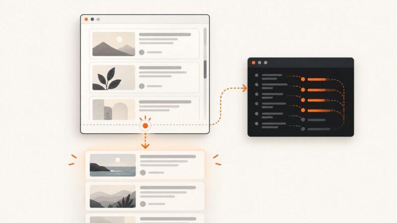
How to Use the Next.js Image Component
Learn to use next/image with local and remote files, responsive sizing, fill layouts, loading options, and a focused troubleshooting guide.

The Next.js Image component comes from next/image. Give it a source and descriptive alt text; for remote or dynamic images, also provide intrinsic width and height, unless you use fill. For responsive images, set sizes to match the width your CSS actually renders. Remote image URLs must be allowed by your Next.js configuration.
The component extends the browser’s image element with image optimization. This guide covers the App Router and Pages Router usage patterns, with current-version notes: check your installed Next.js version before copying loading or configuration options. The official reference says priority is deprecated in Next.js 16 in favor of preload, and that image qualities must be configured starting in that version. Next.js Image Component API
1. Install nothing: import the component
The component ships with Next.js. Import it in the file that renders the image:
import Image from 'next/image'

export default function ArticleImage() {
  return (
    <Image
      src="/images/forest.jpg"
      alt="A forest path in autumn"
      width={1200}
      height={800}
    />
  )
}
This example assumes the file is at public/images/forest.jpg. Files in public are referenced from the site root, so the src starts with /images/, not /public/images/. The width and height describe the source image’s intrinsic dimensions and aspect ratio. They help the browser reserve space before the image loads; CSS still controls the rendered size.
If you import a local image file directly, Next.js can infer its dimensions:
import Image from 'next/image'
import forest from './forest.jpg'

export default function ArticleImage() {
  return <Image src={forest} alt="A forest path in autumn" />
}
Use meaningful alt text when the image conveys information. If it is purely decorative, write alt="". Do not use a filename as alt text, and avoid repeating a caption that already explains the same information.
2. Choose the right sizing model
Intrinsic dimensions for a known aspect ratio
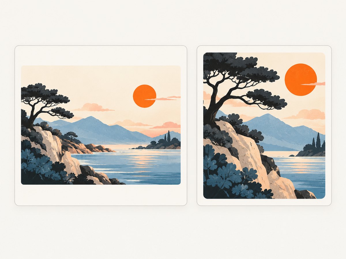
Use width and height when the image has a known ratio and should occupy space according to those proportions. These values do not force a 1200-pixel-wide display. Style the rendered size separately:
<Image
  src="/images/forest.jpg"
  alt="A forest path in autumn"
  width={1200}
  height={800}
  style={{ width: '100%', height: 'auto' }}
/>
Here the image can shrink with its container while keeping its ratio. In a stylesheet, equivalent rules are width: 100% and height: auto. Make sure the layout gives the image a sensible maximum width if it should not grow across a very wide screen.
fill when the parent defines the image box
Use fill for cards, banners, or other layouts where the containing box determines image dimensions. The parent must establish positioning, commonly position: relative, and should have a defined size or aspect ratio.
<div className="thumbnail">
  <Image
    src="/images/forest.jpg"
    alt="A forest path in autumn"
    fill
    sizes="(max-width: 700px) 100vw, 50vw"
    style={{ objectFit: 'cover' }}
  />
</div>
.thumbnail {
position: relative;
aspect-ratio: 3 / 2;
overflow: hidden;
}objectFit: 'cover' fills the box and may crop the image. Choose contain when the whole image must remain visible, accepting possible empty space around it. With fill, the image follows the parent box rather than its intrinsic dimensions. A parent with no usable height or aspect ratio can collapse or produce an unexpected layout.
3. Make responsive delivery match the CSS
The sizes prop describes the image’s expected rendered width at different viewport sizes. The browser uses it with the generated srcset to select an appropriate resource. Match the string to your actual layout rather than picking a generic value.
For the earlier card example, suppose cards are full-width on small screens and occupy about half the viewport on wider screens. This is a corresponding hint:
sizes="(max-width: 700px) 100vw, 50vw"For a centered article column that stops growing beyond 720 pixels, use a hint that describes that maximum:
sizes="(max-width: 752px) 100vw, 720px"These are layout examples, not universal values. If the CSS grid has three columns, account for its gaps and container margins. If an image is always displayed at a fixed small size, describe that size instead of claiming it fills the viewport. For responsive or fill images, omitting sizes may cause the browser to assume a viewport-width image and choose a larger resource than the layout needs. See the Pages Router Image API for responsive sizing guidance.
4. Allow remote image sources deliberately
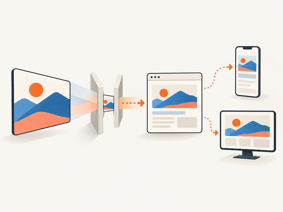
Next.js cannot inspect a remote image during the build to infer dimensions, so provide width and height or use fill. Also configure the image host and path pattern. For example, if the application uses images under images.example.com/products/, configure only that required location.
// next.config.js
module.exports = {
  images: {
    remotePatterns: [
      {
        protocol: 'https',
        hostname: 'images.example.com',
        port: '',
        pathname: '/products/**',
      },
    ],
  },
}
Restart the Next.js development server after changing configuration. Then render the remote image:
import Image from 'next/image'

export default function ProductPhoto() {
  return (
    <Image
      src="https://images.example.com/products/chair.jpg"
      alt="Oak chair with a woven seat"
      width={1000}
      height={750}
      sizes="(max-width: 700px) 100vw, 50vw"
    />
  )
}
Keep the pattern as narrow as your application allows. A broad host and path rule can permit more remote sources than intended. The older images.domains configuration is deprecated since Next.js 14 because it cannot restrict protocol, port, or pathname as precisely. Prefer remotePatterns. For current syntax and version details, consult the App Router API reference.
5. Handle loading and image quality by version
Images are lazy loaded by default, which is usually appropriate for content below the fold. Avoid changing loading behavior everywhere just to improve one image. Identify the image that should appear immediately—often a likely largest contentful paint (LCP) candidate—and use the guidance for your installed Next.js version and router.
In Next.js 16, priority is deprecated in favor of preload. The current App Router documentation cautions that preloading may be inappropriate if several images could be LCP candidates or if you are using loading or fetchPriority; eager loading or high fetch priority may fit those cases. Do not paste an older priority example into a Next.js 16 project without checking the current reference. These choices depend on the page and version; they are not universal performance guarantees.
Starting in Next.js 16, configure allowed image qualities in next.config.js. The documented default quality is 75, and a requested quality is constrained to configured values; the component uses the closest allowed value when the request is not listed.
// next.config.js (Next.js 16)
module.exports = {
  images: {
    qualities: [60, 75, 90],
  },
}
Choose allowed values that your application intends to serve. Quality is a visual and file-size tradeoff; do not treat one number as a measured speed improvement. Older Next.js versions may not require this configuration, so verify against the docs for your installed version.
6. Common layouts and edge cases
Images in a grid
Use each image’s actual ratio if cards should retain their original proportions. If every card needs a uniform crop, give the wrapper a fixed aspect ratio and use fill with objectFit: 'cover'. Keep the sizes value consistent with the number of columns at each breakpoint.
Unknown dimensions from content data
If a CMS record contains dimensions, pass them through. If it does not, either determine dimensions as part of content ingestion or use a wrapper whose aspect ratio is known and render with fill. Do not invent arbitrary dimensions that misrepresent the source ratio unless the design intentionally crops it.
Animated, tiny, or already optimized files
Consider whether the image should pass through the default optimization path. Next.js supports a custom loader function for generating a source URL from an image source, width, and quality. Use a loader only when the application’s image delivery setup requires it, and follow the provider’s documented URL format. The research sources do not establish any particular provider or performance result.
Decorative backgrounds
If an image is decorative and CSS background behavior is important, a CSS background may be simpler than an image component. For content images, keep the image semantic and provide appropriate alt text. Do not use an empty alt value for an image that communicates information.
7. Troubleshooting
| Symptom | Likely cause | Fix |
|---|---|---|
| Remote host is rejected | The URL does not match an allowed image pattern. | Check protocol, hostname, port, and pathname against remotePatterns; add only the required path and restart the server. |
| Image dimensions are required | A remote or dynamic source has no intrinsic dimensions available at build time. | Supply source width and height, or give the parent a real size and use fill. |
| Image looks stretched | CSS width and height distort its ratio, or a fill image is being fit incorrectly. | Use height: auto with intrinsic dimensions, or choose cover or contain intentionally for a fill layout. |
| Image is cropped unexpectedly | object-fit: cover fills the frame by cropping edges. |
Use contain, change the wrapper ratio, or select an image crop that suits the layout. |
| Image appears blurry or oversized in transfer | sizes does not describe the CSS layout, or the rendered dimensions are inaccurate. |
Update sizes for each breakpoint and check the actual container width. |
| Layout jumps while loading | The browser lacks space reservation from correct dimensions, or the fill parent has no stable dimensions. | Pass accurate intrinsic dimensions or set the parent’s aspect ratio and positioning. |
| Older loading prop warning | An example uses a prop deprecated in the installed version. | Check the installed Next.js version and use its current loading guidance; Next.js 16 deprecates priority in favor of preload. |
| Quality configuration error | Next.js 16 requires qualities to be declared. | Add the desired values under images.qualities and request a supported value. |
8. Performance, reliability, and cost considerations
Use dimensions or a stable fill parent to reserve layout space. Keep offscreen images lazy by default, provide accurate sizes for responsive layouts, and limit remote patterns to image origins and paths the application actually needs. These choices support suitable resource selection, visual stability, and controlled access to remote image optimization. The official guides describe these benefits qualitatively; they do not establish a universal numeric speed or bandwidth gain.
Remote delivery adds dependencies on the origin serving the source image and on your Next.js image configuration. Check that source URLs remain valid and that production configuration matches local configuration. If you use a custom loader, verify the generated URL and the image service’s accepted parameters. Next.js image optimization is separate from taking a screenshot of a rendered page: use the image component to render site content, and a screenshot tool when you need a captured view of a page.
9. Or skip the browser setup
If your goal is to capture how a page looks rather than render an image asset inside your Next.js UI, ScreenshotNeo offers a one-request screenshot API. ScreenshotNeo is a website screenshot API and MCP server for developers from Yorker Media. See the ScreenshotNeo API documentation for request options.
curl -G "https://api.screenshotneo.com/v1/shot" \
  -d access_key=YOUR_API_KEY \
  --data-urlencode url=https://stripe.com \
  -o shot.webp
Cookie banners, popups, and chat widgets are removed before the shot. Bot checks, blank pages, and failed loads are never billed. An MCP server lets AI agents take screenshots. The free plan includes 1,000 screenshots a month with no card; paid plans start at $5 for 3,000. Sign up for 1,000 free screenshots a month, with no card.
10. FAQ
Does width set the displayed pixel width?
No. It supplies intrinsic dimensions and the aspect ratio; CSS determines the rendered size.
Can I use a remote URL without changing configuration?
Remote sources must match an allowed pattern in remotePatterns. Configure the required origin and path, then provide dimensions or use fill.
Should every image be preloaded?
No. Keep below-the-fold images lazy. Change loading behavior only for an image with a clear above-the-fold need, following the documentation for your Next.js version.
Is fill a way to avoid sizing work?
It changes which box determines the image size, but the parent still needs deliberate positioning and dimensions, and responsive layouts still benefit from a correct sizes value.