Open Graph Image Aspect Ratio
A practical guide to Open Graph image ratios, recommended dimensions, metadata, platform crops, and a repeatable way to check previews.
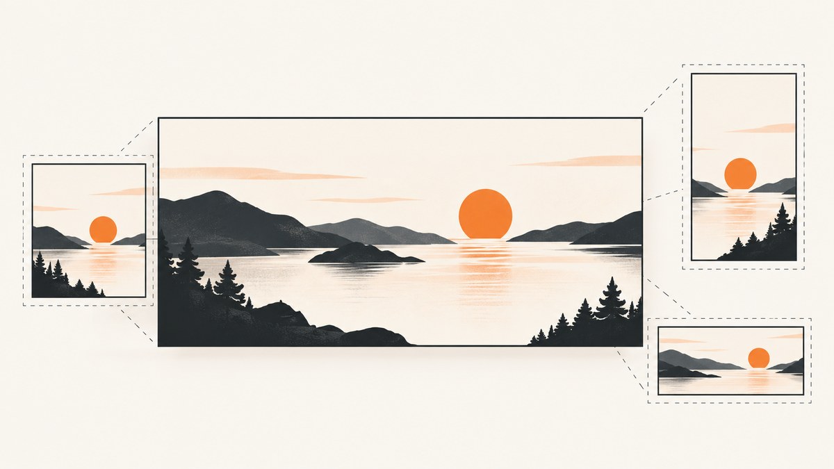
Short answer: aspect ratio is an image’s width divided by its height. For a practical Open Graph (OG) sharing image, start with 1200 × 630 pixels, which is approximately 1.91:1. This is a widely used recommendation, not a ratio required by the Open Graph Protocol. Social platforms can crop an image to fit their own preview containers, so the same asset may not look identical everywhere.
For dependable results, create a 1200 × 630 image, keep important content away from the outer edges, publish it at a stable public URL, and set the relevant Open Graph metadata, including descriptive alternative text. Then inspect the page’s actual preview on the platforms that matter to your audience.
1. What does Open Graph image aspect ratio mean?
An aspect ratio compares width with height. Divide the width by the height to get the ratio:
1200 / 630 = 1.90476...That is commonly rounded to 1.91:1. The first number describes the width and the second the height. A 1:1 image is square; a 2:1 image is twice as wide as it is tall.
Aspect ratio and pixel dimensions are related but distinct. The ratio describes shape; dimensions describe the number of pixels. A 1200 × 630 image and a 2400 × 1260 image have the same ratio, but the second has four times as many pixels. A platform may resize either one for display.
2. What size should an Open Graph image be?
Use 1200 × 630 px as a broadly useful starting point. Current cross-platform guidance and Facebook-focused guidance both recommend this size and its roughly 1.91:1 shape. The cited Facebook guidance also lists 600 × 315 px as a minimum. These are practical recommendations from guides, not requirements imposed by the OG protocol. See the [OG Image Size Guide](https://ogimage.design/guides/og-image-size-guide) and [Facebook OG Image Guide](https://og-image.org/docs/platforms/facebook).
| Choice | Dimensions | Ratio | When it makes sense |
|---|---|---|---|
| Common recommendation | 1200 × 630 px | ≈1.91:1 | A practical default for sharing previews |
| Smaller Facebook-focused minimum in the cited guide | 600 × 315 px | ≈1.90:1 | Only when a smaller asset is needed and that guide applies |
| Same shape, more pixels | 2400 × 1260 px | ≈1.91:1 | When your image workflow calls for a larger source; check file size and platform behavior |
Do not read the table as a universal platform specification. If a social network or publishing system gives you current requirements for a specific placement, follow those requirements for that placement. The general recommendation is useful for an ordinary shared-page image, but no single dimension guarantees a uniform crop or display across services.
3. What the Open Graph Protocol requires—and what it does not
The Open Graph Protocol defines metadata for describing a page or object. Its og:image property identifies an image URL representing that object. The protocol lists optional image properties for width, height, and alt text; it says that an og:image should be accompanied by og:image:alt. It does not prescribe a universal 1.91:1 ratio. See the [Open Graph Protocol documentation](https://github.com/facebook/open-graph-protocol/blob/master/index.html).
This distinction helps when a preview looks wrong. Your page can have valid OG metadata while a platform applies its own crop, cached an older image, or chooses another image. Metadata describes what you provide; it does not dictate every platform’s rendering.
4. Add the metadata to your page
Place the tags in the document’s <head>. Replace the example URL and descriptions with values for the page being shared. The image URL must point to the actual image file, rather than a page that displays it.
<head>
  <meta property="og:title" content="A useful page title">
  <meta property="og:type" content="website">
  <meta property="og:url" content="https://example.com/guide">
  <meta property="og:image" content="https://example.com/images/guide-share.jpg">
  <meta property="og:image:width" content="1200">
  <meta property="og:image:height" content="630">
  <meta property="og:image:alt" content="A concise description of the image">
</head>
The width and height tags describe the image’s pixel dimensions; they do not resize the image. Make sure the values match the file you serve. Write og:image:alt as a description of what the image contains, not as a caption or a list of keywords.
Keep the image and metadata in sync
- Use an absolute image URL that points to the intended asset.
- Confirm that the file exists and the server returns an image response.
- Set width and height to the file’s actual dimensions.
- Describe the image in useful alt text; do not repeat the page title unless it accurately describes the visual.
- When replacing an image at the same URL, account for the possibility that preview services have cached an earlier version.
5. Design for crops, not just the nominal ratio
A 1.91:1 asset is a sensible starting shape, but platform previews may crop it to fit their containers. The crop can change with the platform, display surface, or layout. A matching aspect ratio can reduce mismatch with one preview shape; it cannot guarantee that every viewer sees the full image.
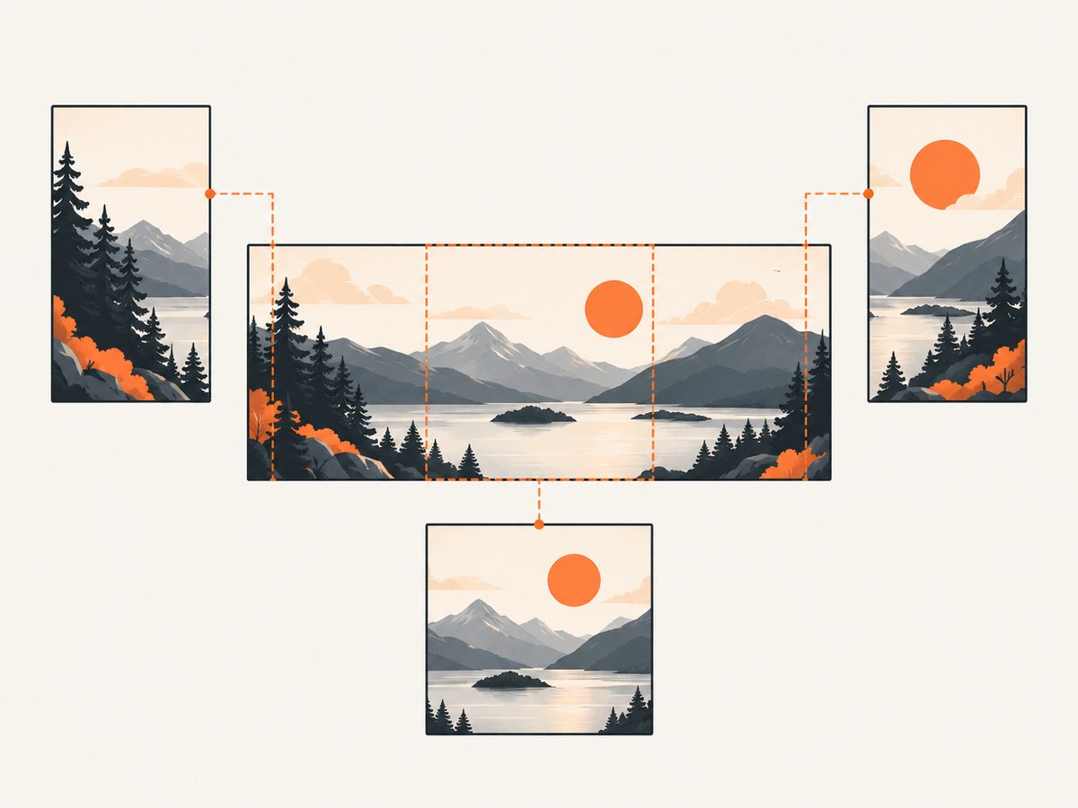
Protect the important part of the composition:
- Keep essential content central. Put a face, product, or key visual away from the far left and right edges.
- Leave breathing room. Avoid placing small details, logos, or text right against the frame. Cropping and resizing can make edge details disappear.
- Check at small display sizes. An image that works on a design canvas can become hard to read in a compact preview.
- Use a relevant image. The OG image should represent the page, not just fill the required space.
- Inspect real previews. Test the page after publishing and after changing its image; do not infer a platform’s crop solely from the source dimensions.
6. A repeatable workflow for creating and checking an OG image
- Choose the subject. Identify the one visual idea that represents the page when its link is shared.
- Set a 1200 × 630 px canvas. This gives you the commonly recommended approximately 1.91:1 shape.
- Compose for flexible crops. Keep the subject and any necessary text within a comfortable central area, with room around the edges.
- Export and publish the image. Put the final file at a stable, publicly reachable URL. Use an appropriate image format for your site and verify the resulting URL directly.
- Add OG tags. Set
og:image, the actual pixel width and height if provided, and descriptiveog:image:alt, along with the page’s other relevant OG metadata. - Inspect the page response. Confirm the tags are in the delivered HTML, especially if your site renders pages through a framework or content-management system.
- Preview the shared URL. Check the services and surfaces important to your audience. If a service shows an old result after an update, consider its preview cache before changing a correct image file.
- Revise based on the crop. Move critical details inward or adjust the composition if the preview cuts them off.
You can also inspect the page screenshot to review its layout and whether it loads as expected. A screenshot does not replace a platform’s share preview: each service may use its own metadata parser, cache, and crop behavior.
7. Troubleshooting common OG image problems
| Symptom | Likely cause | What to check or change |
|---|---|---|
| No preview image appears | The image URL is wrong, unreachable, or not present in the HTML response | Open the image URL directly, check the delivered page source for og:image, and confirm the server returns the intended image. |
| The preview shows an older image | A platform may have cached the previous page or image result | Verify the current HTML and asset first. Then use the platform’s available preview or refresh workflow, if it provides one. |
| The edges are cut off | The platform’s display container uses a different crop | Move the main subject and critical details toward the center. Do not assume the 1.91:1 shape forces a full-image display. |
| The image looks stretched | The source may have been resized non-proportionally or width/height metadata may be inaccurate | Inspect the actual asset dimensions, preserve its proportions during export, and make metadata match the file. |
| Metadata appears missing on a JavaScript-rendered site | The tags may be added only after initial HTML is served, or a crawler may receive different markup | Inspect the raw server response, not only the browser’s rendered DOM. Ensure the page response contains the OG tags. |
| Alt text is absent or unhelpful | og:image:alt was omitted or written as a caption/keyword string |
Add a concise description of what is visible in the image and keep it aligned with the current asset. |
| Preview is blurry | The source may be too small for the rendered size or may have been compressed heavily | Start from the recommended 1200 × 630 px source, export carefully, and inspect the delivered image rather than only the original design file. |
8. Check the live page with a screenshot
A browser capture is useful for checking whether the page itself loads, whether a hero section shifts the intended content, and whether an image is visible at a representative viewport. It cannot prove how a social network will crop a link preview; use the platform’s own preview behavior for that final check.
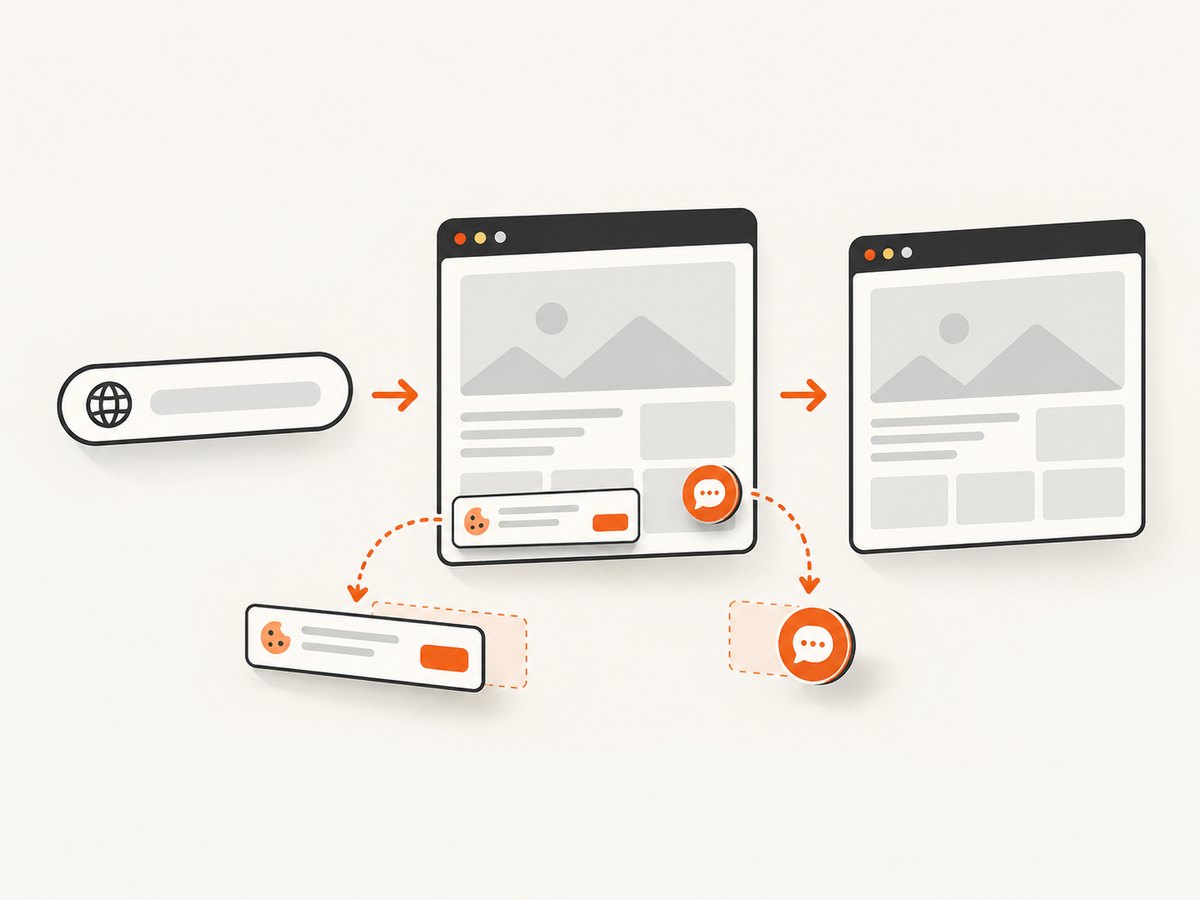
For a local do-it-yourself capture, a browser automation library can open the page and save a screenshot. Here is a runnable Playwright example in Node.js. Install Playwright and its browser as described in the [Playwright documentation](https://playwright.dev/docs/intro), then save this as capture.mjs and run node capture.mjs https://example.com/guide.
import { chromium } from 'playwright';

const url = process.argv[2];
if (!url) throw new Error('Pass a page URL, for example https://example.com/guide');

const browser = await chromium.launch({ headless: true });
try {
  const page = await browser.newPage({ viewport: { width: 1200, height: 800 } });
  const response = await page.goto(url, { waitUntil: 'networkidle', timeout: 60_000 });
  if (!response?.ok()) {
    throw new Error(`Page returned ${response?.status() ?? 'no HTTP response'}`);
  }
  await page.screenshot({ path: 'page.png', fullPage: true });
  console.log('Saved page.png');
} finally {
  await browser.close();
}
Use a page URL you control or are authorized to access. Some sites never reach network idle because of analytics or long-running connections; if so, use a shorter wait condition such as domcontentloaded and wait for a specific element or a short, explicit delay before capture. Full-page captures can be tall and resource-intensive, so a viewport capture may be more useful for checking the first screen.
9. Or skip the browser setup
ScreenshotNeo is a website screenshot API and MCP server for developers. Its one-call API can return an image or PDF; its cookie and consent handling accepts banners like a visitor and removes more than 60 known consent platforms, newsletter popups, and chat widgets before capture. Those cleanup steps can be turned off. Bot checks and CAPTCHAs, blank pages, timeouts, failed loads, and cache hits are not billed as clean shots, and the response includes X-Page-Verdict and X-Billed headers. AI agents can use its MCP server with take_screenshot, get_page_info, and capture_pdf.
Use the [ScreenshotNeo API documentation](https://screenshotneo.com/docs/) for request options and setup. This example saves the image response:
curl -G "https://api.screenshotneo.com/v1/shot" \
  -d access_key=YOUR_API_KEY \
  --data-urlencode url=https://example.com/guide \
  -o page.webp
ScreenshotNeo includes 1,000 screenshots per month on the free plan with no card; paid plans start at $5 for 3,000 screenshots. [Create a free account](https://screenshotneo.com/account/sign-up/) and make the first 1,000 captures each month without a card.
10. Performance, reliability, and cost considerations
The OG image itself is a static asset, so the main practical concerns are file availability, dimensions, and whether the page metadata points to the current file. Keep the asset at a durable URL and ensure the page’s tags and dimensions remain consistent when the image changes.
For automated browser screenshots, page loading often takes longer than writing the output file. Heavy pages, third-party scripts, large images, and network-idle waits can increase capture time or lead to timeouts. Use the narrowest wait condition that gives the content you need, cap timeouts, close browser instances in a finally block, and avoid repeatedly capturing unchanged pages when a cache is suitable. Full-page captures and high pixel density consume more memory than a viewport capture.
Self-hosted automation has infrastructure costs: browser binaries, compute, memory, and maintenance. An API replaces much of that setup with per-plan usage limits; compare the expected monthly volume and needed options with the service’s published plan. For ScreenshotNeo, the supplied prices are Free: 1,000 per month; Starter: $5 for 3,000; Growth: $15 for 15,000; Pro: $39 for 60,000; Scale: $99 for 250,000; Business: $249 for 1,000,000. Yearly billing gives two months free, and every feature is available on every plan. Only clean shots are billed under the stated product rules; inspect the response headers to see the page verdict and billed status.
11. Frequently asked questions
Is 1.91:1 mandatory in Open Graph?
No. The protocol defines the image metadata, while 1.91:1 is a practical recommendation found in sizing guides.
Does a 1200 × 630 image always appear uncropped?
No. Platforms can crop an image to fit their preview container, and display can differ across surfaces.
Can I use a larger image with the same ratio?
Yes, the ratio is unchanged if width and height scale together. Confirm any platform-specific requirements and consider the file’s size.
Should I add og:image:alt?
Yes. The protocol documentation says an og:image should be accompanied by this optional property, which describes the image.
Will a screenshot tell me exactly how the shared link looks?
No. It helps inspect the webpage, but the social platform’s preview renderer determines its own image handling.
12. Practical checklist
- ☐ Start with 1200 × 630 px (approximately 1.91:1).
- ☐ Treat that size as a recommendation, not a protocol-mandated ratio.
- ☐ Keep essential visual details away from the edges.
- ☐ Put an absolute image URL in
og:image. - ☐ Keep width and height metadata aligned with the real asset.
- ☐ Add accurate
og:image:alttext. - ☐ Inspect the HTML actually delivered to crawlers.
- ☐ Check the real preview where your audience shares links, and expect crop differences.
The practical rule is simple: use 1200 × 630 as a strong starting canvas, provide accurate image metadata, and validate the rendered result. The protocol tells platforms where the image is; each platform still controls how its preview is shown.


