How to Optimize Image Sizes for the Web
Reduce image bytes without blurry visuals or layout shifts using the right dimensions, formats, compression, and loading strategy.
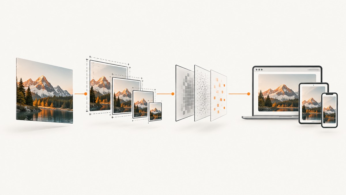
Start with the rendered size, then choose the format, compression level, and loading behavior. A 320 CSS-pixel image on a device with a 3× device-pixel ratio needs roughly a 960-pixel-wide candidate. Delivering a huge original and shrinking it with CSS does not reduce the download. Use responsive candidates with srcset and sizes, reserve space with width and height, and measure the result in DevTools or Lighthouse.
1. Measure the size the browser really displays
For every important raster image, record:
- Rendered width and height in CSS pixels at representative viewport sizes.
- Device pixel ratios used by your audience.
- Whether the image is above the fold or a likely Largest Contentful Paint (LCP) element.
- Its current encoded dimensions, file size, format, and transfer size.
Generate candidates near the actual layout widths and account for DPR. For example, a 320 CSS-pixel slot may need candidates around 320, 640, and 960 pixels. These are starting points, not universal breakpoints; verify the browser’s choice and the visual result.
Chrome’s Lighthouse properly-sized-images audit accounts for DPR and documents a 4 KiB difference between rendered and actual resource size as its failure threshold. Treat that as the audit’s diagnostic rule, not a universal definition of an oversized image. See Chrome’s audit documentation.
2. Serve responsive dimensions with srcset and sizes
Use width descriptors when the same crop is available at several resolutions. The sizes value must describe the image’s intended rendered width; otherwise the browser may select the wrong candidate.

<img
  src="/images/hero-1280.jpg"
  srcset="
    /images/hero-480.jpg 480w,
    /images/hero-768.jpg 768w,
    /images/hero-1280.jpg 1280w,
    /images/hero-1920.jpg 1920w"
  sizes="
    (max-width: 640px) 100vw,
    (max-width: 1200px) 90vw,
    1200px"
  width="1200"
  height="675"
  alt="A mountain trail at sunrise">
Use 100vw when the image spans the viewport, a percentage or fixed value when it sits in a constrained column, and a media query when the layout changes. Keep enough candidates to cover real layouts without creating dozens of nearly identical files. Each extra variant can add cache entries, HTML, origin work, and storage cost.
Use <picture> for art direction or format fallback
Use picture when mobile and desktop need different crops, or when you want an alternate format with a fallback.
<picture>
  <source
    media="(max-width: 640px)"
    srcset="/images/portrait-mobile.avif 480w, /images/portrait-mobile-2x.avif 960w"
    sizes="100vw"
    type="image/avif">
  <source
    srcset="/images/landscape.avif 768w, /images/landscape-2x.avif 1536w"
    sizes="(max-width: 1200px) 90vw, 1200px"
    type="image/avif">
  <img src="/images/landscape.jpg" width="1200" height="675" alt="A mountain trail at sunrise">
</picture>
3. Choose the format by content and required features
| Content | Good starting choices | Check before shipping |
|---|---|---|
| Photographs | JPEG, WebP, or AVIF | Detail, color, blocking, and browser support at the display size |
| Transparency or mixed artwork | WebP or AVIF; PNG when lossless compatibility is needed | Alpha edges, file size, and fallback behavior |
| Logos, icons, charts, line art | SVG | Minify the XML and compress the text asset |
| Animation | Animated WebP/AVIF or video when appropriate | Playback support, decode cost, accessibility, and whether animation is necessary |
JPEG remains broadly compatible for photos. WebP and AVIF can reduce bytes, but lossy encoding discards information differently. PNG is useful for lossless reproduction and widely supported transparency. SVG is resolution-independent for simple scalable artwork. MDN’s image format guide summarizes format capabilities and compatibility; web.dev’s format guide explains how content affects the choice.
4. Compress against visual quality, not a universal number
- Export representative photographs, screenshots, illustrations, and transparent assets.
- Try several encoder settings for JPEG, WebP, and AVIF.
- Inspect each result at its expected display size and at 100% zoom.
- Compare transferred bytes, not only the source file size.
- Pay special attention to colored text on flat backgrounds, thin lines, faces, and high-contrast edges.
There is no quality percentage that works for every image. The useful setting depends on the source, encoder, dimensions, and acceptable artifacts. web.dev’s image performance guidance recommends checking the actual output rather than relying on a blanket value.
5. Prevent layout shifts and prioritize the right request
Reserve the image’s space
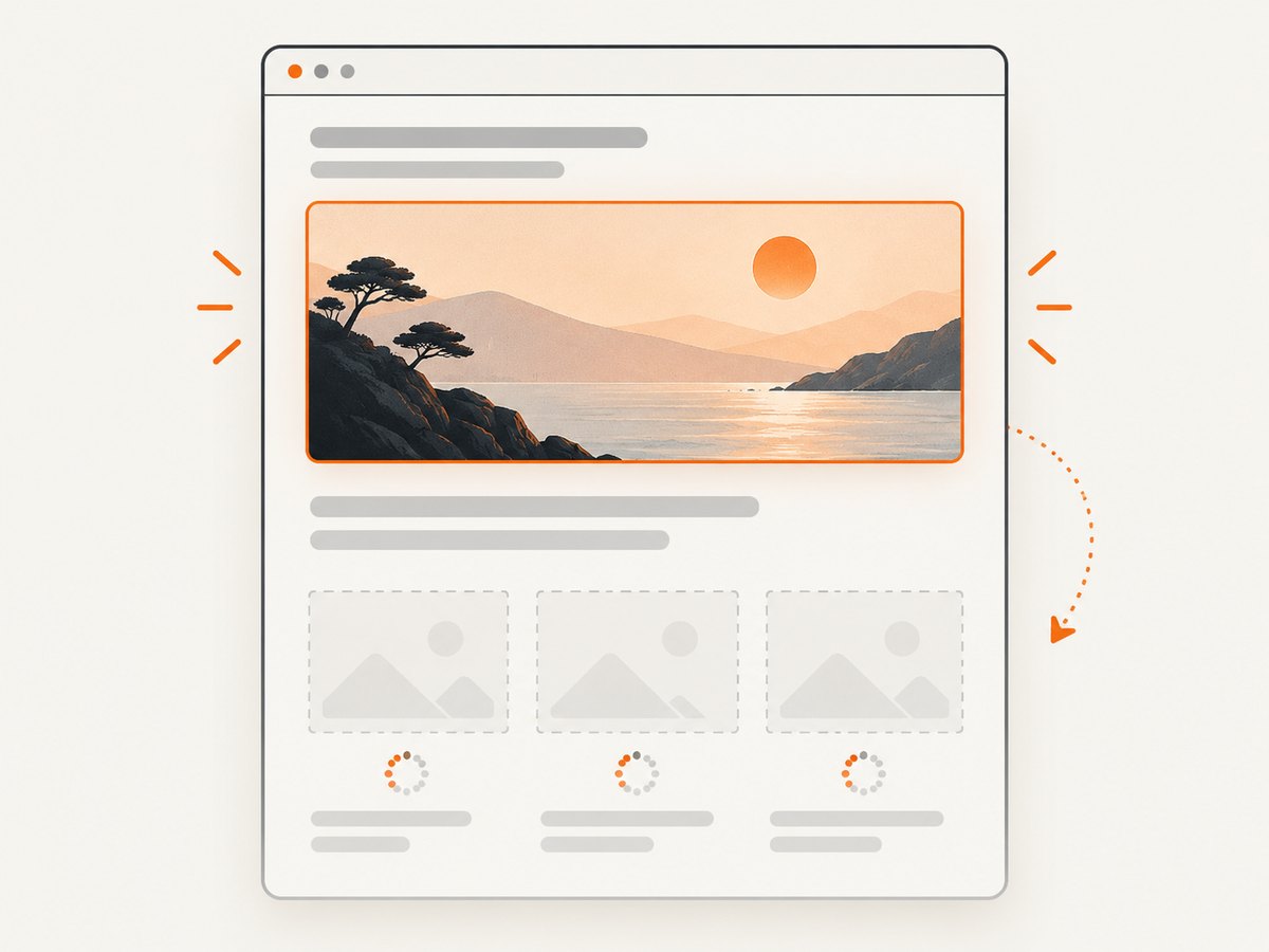
Set intrinsic width and height attributes, or an equivalent aspect ratio in CSS, so the browser can reserve space before the file arrives.
.card img {
  display: block;
  width: 100%;
  height: auto;
  aspect-ratio: 16 / 9;
  object-fit: cover;
}
Lazy-load below-the-fold images
<img src="/images/article-480.webp"
     srcset="/images/article-480.webp 480w, /images/article-960.webp 960w"
     sizes="(max-width: 700px) 100vw, 700px"
     width="700" height="467"
     loading="lazy"
     alt="A bowl of fruit">
Do not lazy-load the likely LCP image. Keep important content images in img or picture markup where possible; browsers generally prioritize them more predictably than CSS background images. Use fetchpriority="high" selectively for the single most important image when it is appropriate, and avoid marking many images as high priority.
6. A repeatable optimization workflow
- Inventory: identify the largest images and likely LCP candidates.
- Measure: inspect rendered dimensions, DPR-adjusted resource dimensions, transfer size, and request priority in Chrome DevTools or Lighthouse.
- Generate: create a small set of candidates around real layout widths.
- Encode: compare JPEG, WebP, AVIF, PNG, or SVG according to the asset’s features.
- Mark up: add
srcset, accuratesizes, dimensions, alt text, and appropriate loading behavior. - Verify: test representative viewport widths, DPRs, browsers, slow connections, and cache states.
- Automate when justified: a build pipeline or image CDN can transform a larger library, but balance variant count against cache use, HTML size, processing, storage, and service cost.
For broad context, MDN notes that imagery accounts for a large share of average website bandwidth, while its cited measurement period is not specified. Use your own request data to set priorities.
7. Troubleshooting common problems
| Symptom | Likely cause | Fix |
|---|---|---|
| The browser downloads the largest file on mobile | sizes is missing or describes the wrong layout width |
Set sizes to the actual CSS width at each breakpoint and confirm the selected candidate in DevTools. |
| Images look blurry on high-DPR screens | The largest candidate is below the rendered CSS width multiplied by DPR | Add a higher-resolution candidate and verify that its transfer cost is justified. |
| The page jumps while images load | No intrinsic dimensions or aspect ratio | Add width/height or a CSS aspect-ratio. |
| LCP is slow | The LCP image is oversized, low priority, lazy-loaded, or discovered late | Resize and compress it, keep it out of lazy loading, use markup the browser can discover early, and consider selective fetchpriority. |
| Text or line art has halos | Lossy compression is too aggressive | Raise quality, use a lossless format, or use SVG for genuinely vector artwork. |
| Transparent edges show a matte color | The export lost or mishandled alpha transparency | Use a format and encoder that preserve alpha, then inspect against both light and dark backgrounds. |
| Too many image files are hard to maintain | Variants were generated without real layout requirements | Remove near-duplicates and retain candidates that cover measured widths and DPRs. |
| Modern formats fail in some browsers | No compatible fallback | Put modern source elements before a fallback img in picture. |
8. Performance, reliability, and cost considerations
- Bytes: dimensions often produce the first major reduction; codec tuning comes next.
- CPU and decode: very large files can cost more to decode even when network transfer is fast.
- Cache behavior: every URL variant can occupy a cache entry. Stable naming and a limited candidate set improve reuse.
- Reliability: keep a fallback format and test failed or slow image requests so layout and content remain usable.
- Operations: automated transformation reduces manual exports for large libraries, but adds processing, storage, cache, and provider costs.
- Measurement: Lighthouse findings are diagnostics. Confirm improvements with field or representative lab measurements for your own pages.
9. Capture optimized examples without browser setup
If you need reference screenshots of responsive states while reviewing image changes, ScreenshotNeo can capture a URL through one GET request. Its clean-shot process accepts consent banners and removes more than 60 known consent platforms, newsletter popups, and chat widgets before capture; bot checks, blank pages, timeouts, failed loads, and cache hits are not billed, and response headers identify the verdict and billing status. It also provides an MCP server for AI agents, including Claude, Cursor, and other MCP clients.
Or skip the browser setup
See the ScreenshotNeo API documentation for all options. This example saves a WebP screenshot:
curl -G "https://api.screenshotneo.com/v1/shot" -d access_key=YOUR_API_KEY --data-urlencode url=https://stripe.com -o shot.webpimport requests
r = requests.get("https://api.screenshotneo.com/v1/shot", params={"access_key": "YOUR_API_KEY", "url": "https://stripe.com"}, timeout=90)
open("shot.webp", "wb").write(r.content)const q = new URLSearchParams({ access_key: 'YOUR_API_KEY', url: 'https://stripe.com' });
const res = await fetch(`https://api.screenshotneo.com/v1/shot?${q}`);You can use its full-page capture, element selectors, device presets or custom viewports, retina scale, dark mode, custom CSS and JavaScript, waits, blocked resources, headers, cookies, caching, signed links, asynchronous webhooks, bulk capture, and PDF options when your review workflow needs them. One thousand screenshots per month are free with no card; paid plans start at $5 for 3,000 shots. Create a free ScreenshotNeo account.
10. Practical checklist
- Measure rendered CSS dimensions and DPR before exporting.
- Use
srcsetwith accuratesizes. - Use
picturefor art direction or format fallback. - Choose JPEG, WebP, AVIF, PNG, SVG, or animation formats based on content and features.
- Inspect visual quality at the real display size.
- Set dimensions or aspect ratio to prevent layout shifts.
- Lazy-load below-the-fold images, never the key LCP image.
- Measure transfer size, priority, cache behavior, and LCP after changes.
- Keep the candidate set small enough to operate and cache efficiently.
FAQ
Is WebP always better than JPEG?
No. Compare the actual image at its display size, including artifacts, bytes, compatibility, and decoding behavior.
How many srcset widths should I create?
Enough to cover measured layout widths and relevant DPRs. Avoid near-duplicates that add cache and build overhead without improving selection.
Should every image be lazy-loaded?
No. Lazy-load images that are below the fold or otherwise not needed immediately. The likely LCP image should be discoverable and prioritized.
Does CSS resizing optimize the download?
No. CSS changes the display size; the browser still downloads the source resource’s bytes.
When should I use an image CDN?
Consider one when a library needs many responsive transformations and an automated pipeline reduces operational work. Include transformation, cache, storage, and request costs in the decision.


