How to Optimize Images for Websites: Size, Format, and Loading
A practical guide to sizing, encoding, and loading website images without wasting bytes or causing layout shifts.
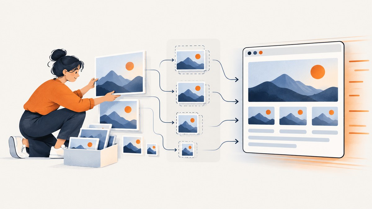
To optimize website images, serve an image close to the dimensions it will be displayed at, choose an encoding suited to its content, let the browser select among responsive candidates, reserve space for the image before it loads, and defer images that are offscreen. Keep the likely Largest Contentful Paint (LCP) image discoverable and eager to load. Then measure the page on representative screen sizes and network conditions.
No single format, compression setting, or number of image sizes is right for every site. A photograph, a screenshot containing small text, and a transparent logo have different visual requirements. The goal is to reduce transferred bytes while keeping the image clear, the layout stable, and the most important content quick to render.
1. Size images for their rendered role
Start with the image’s rendered dimensions, not the dimensions of the original file. If a layout displays an image in a 500 by 500 pixel box, a 1000 by 1000 pixel source has twice the needed width and height for a device rendering at 1x pixel density. That can waste bandwidth and delay other resources.
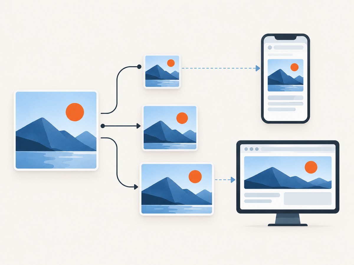
Responsive layouts need more than one candidate. Use srcset to offer image widths and sizes to describe how wide the image is expected to appear in the layout. The browser can use that information with the viewport and device pixel density to pick a candidate. Choose breakpoints based on your actual layout: a desktop page can place an image in a narrow column, while a phone layout may use nearly the full screen width. web.dev’s responsive image guide covers the browser selection model and practical sizing approaches.
<img
  src="/images/product-800.jpg"
  srcset="/images/product-400.jpg 400w,
          /images/product-800.jpg 800w,
          /images/product-1200.jpg 1200w"
  sizes="(min-width: 66em) 33vw,
         (min-width: 44em) 50vw,
         100vw"
  width="1200"
  height="800"
  alt="A blue travel bag beside a folded jacket"
>
The w descriptors report the intrinsic width of each candidate. With width descriptors, sizes describes the expected rendered width; it does not set the CSS layout. Make sure the candidates have compatible aspect ratios and that your CSS can scale the image within its container.
img {
  display: block;
  max-width: 100%;
  height: auto;
}
For art direction, where the composition or crop should change at a breakpoint, use <picture> with a media condition. This is different from simply offering the same image at several resolutions:
<picture>
  <source media="(max-width: 40em)" srcset="/images/portrait-crop.webp" type="image/webp">
  <source srcset="/images/wide-photo.webp" type="image/webp">
  <img src="/images/wide-photo.jpg" width="1200" height="800" alt="A hiker looking across a valley">
</picture>
2. Choose a format and compression by content
For raster images, MDN generally recommends WebP or AVIF because they can compress better than PNG, JPEG, and GIF. Compression results vary, though, and the smallest file is not automatically the best image. Inspect the result at its displayed size and on the devices that matter to your audience. MDN’s image format guide describes the format tradeoffs.
| Image content | Starting point | Inspect for |
|---|---|---|
| Photographs and continuous-tone images | Compare lossy WebP or AVIF with JPEG at the intended display size. | Banding, softened detail, and visible compression artifacts. |
| Screenshots, diagrams, logos, and line art | Try lossless encoding; compare WebP or AVIF support and a suitable fallback. | Blur or colored fringes around text and sharp edges. |
| Illustrations with transparency | Compare a format that preserves transparency, such as PNG or WebP. | Unexpected opaque backgrounds, halos, or larger-than-expected output. |
Lossy compression discards image information to make files smaller; lossless compression preserves the original image data. The right tradeoff depends on the image and how it is viewed. Screenshots and text-heavy diagrams often reveal artifacts quickly, so avoid applying a photographic quality setting blindly.
Use <picture> when you need format alternatives. Put the preferred supported sources first, then an <img> fallback. The browser uses the first source it can render:
<picture>
  <source srcset="/images/chart.avif" type="image/avif">
  <source srcset="/images/chart.webp" type="image/webp">
  <img src="/images/chart.png" width="1200" height="800" alt="A chart comparing monthly sign-ups">
</picture>
Keep the fallback useful for browsers or contexts that do not select the modern sources. If each source uses the same composition, keep the displayed aspect ratio consistent so the page does not jump when a source is selected.
3. Prevent layout shifts with dimensions
Give images intrinsic width and height attributes. The browser can derive the aspect ratio and reserve room before the image bytes arrive. CSS can still make the image responsive; the attributes communicate its expected proportions. This reduces image-driven layout shifts as content loads. See web.dev’s guidance on optimizing Cumulative Layout Shift.
<img src="/images/team.jpg" width="1200" height="800" alt="The product team at a planning session">img {
max-width: 100%;
height: auto;
}If an image is placed in a fixed-ratio card, reserve that ratio in CSS as well. Confirm that the ratio matches the candidate files. A mismatch between declared dimensions and the actual image can still lead to an unexpected crop or a layout change.
4. Load images according to importance
Use loading="lazy" for images below the fold. This lets the browser defer their downloads until they are near the viewport. Do not lazy-load the likely LCP image: delaying its request can delay the main visual content. An above-the-fold image normally uses the default eager behavior.
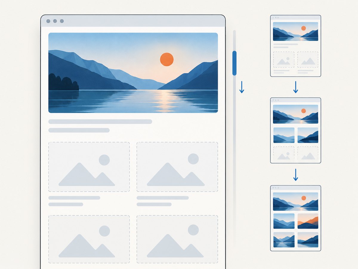
<!-- Likely LCP image: keep it eager and discoverable in the HTML. -->
<img src="/images/hero-1200.webp"
     srcset="/images/hero-600.webp 600w, /images/hero-1200.webp 1200w"
     sizes="100vw"
     width="1200" height="700"
     fetchpriority="high"
     alt="A person cycling on a coastal road">

<!-- Below-the-fold image: defer until it approaches the viewport. -->
<img src="/images/story-800.webp" width="800" height="600"
     loading="lazy" alt="A close-up of a bicycle wheel"></img>
Use fetchpriority="high" selectively for an image that is genuinely important, such as a likely LCP image. Marking many images high priority can make prioritization less useful and can compete with other critical resources. A preload can help when an important image is otherwise discovered late, such as a CSS background, but use it sparingly. Responsive preload hints must match the image candidates and conditions to avoid fetching an unnecessary or duplicate asset.
When the likely LCP image is a CSS background, check whether it could instead be an <img> with responsive sources. The browser can discover that element while parsing the HTML; background images may be discovered later. If a background is necessary, review whether a carefully matched preload is appropriate. web.dev’s LCP guide explains how discovery and priority affect the image’s loading path.
5. A repeatable image optimization workflow
- Inventory the image roles. Identify hero images, article images, thumbnails, product cards, decorative backgrounds, logos, and text-heavy graphics. Record their rendered widths and aspect ratios at the relevant breakpoints.
- Generate useful dimensions. Create a modest set of candidates that matches those rendered roles and device pixel densities. Avoid generating many near-identical files without evidence they help.
- Compare encodings. For each representative image, compare the file size and visual quality of appropriate formats and compression modes. Inspect text, edges, gradients, transparency, and the actual display size.
- Wire up browser selection. Use
srcsetandsizesfor resolution candidates. Use<picture>for format alternatives or meaningful art direction. - Reserve space and set loading behavior. Add dimensions, lazy-load below-the-fold images, and keep the likely LCP image eager. Add a high priority hint only when justified.
- Measure the real page. Inspect network requests, selected candidates, visual quality, layout movement, and LCP on representative viewport sizes and network conditions. Recheck after changing breakpoints or templates.
web.dev identifies an LCP of 2.5 seconds or less for at least 75% of page visits as a good experience target. That is a page-level target; image optimization alone does not guarantee it. Server response time, fonts, scripts, CSS, and other resources can also affect the result. Read the LCP guidance and measure both lab behavior and real user experience where available.
6. Responsive example you can adapt
This complete markup combines responsive candidates, a modern format source, a fallback, dimensions, and an eager high-priority hero. Replace the paths, dimensions, breakpoints, and alt text with values for your own page. The candidates should exist on your server and share the declared aspect ratio.
<!doctype html>
<html lang="en">
<head>
  <meta charset="utf-8">
  <meta name="viewport" content="width=device-width, initial-scale=1">
  <title>Responsive image example</title>
  <style>
    body { margin: 0; font: 1rem/1.5 system-ui, sans-serif; }
    main { max-width: 70rem; margin: 0 auto; padding: 1rem; }
    picture, img { display: block; max-width: 100%; }
    img { height: auto; }
  </style>
</head>
<body>
  <main>
    <h1>A responsive hero image</h1>
    <picture>
      <source type="image/avif"
        srcset="/images/coast-640.avif 640w,
                /images/coast-1280.avif 1280w,
                /images/coast-1920.avif 1920w"
        sizes="(min-width: 70rem) 70rem, 100vw">
      <source type="image/webp"
        srcset="/images/coast-640.webp 640w,
                /images/coast-1280.webp 1280w,
                /images/coast-1920.webp 1920w"
        sizes="(min-width: 70rem) 70rem, 100vw">
      <img src="/images/coast-1280.jpg"
        srcset="/images/coast-640.jpg 640w,
                /images/coast-1280.jpg 1280w,
                /images/coast-1920.jpg 1920w"
        sizes="(min-width: 70rem) 70rem, 100vw"
        width="1920" height="1080"
        fetchpriority="high"
        alt="A rocky coastline beneath a cloudy sky">
    </picture>
    <h2>More photos</h2>
    <img src="/images/detail-800.webp" width="800" height="600"
      loading="lazy" alt="Wildflowers growing beside a trail">
  </main>
</body>
</html>
The sizes value here assumes the hero fills the viewport until the content reaches its maximum width. If your image sits in a column or has different widths at breakpoints, adjust sizes to match that layout. Confirm candidate dimensions and file paths before shipping.
7. Troubleshooting common problems
| Symptom | Likely cause | Fix |
|---|---|---|
| Mobile downloads the largest file | srcset descriptors or sizes do not describe the rendered layout, or the browser has no useful candidate. |
Check the network panel’s selected resource and actual rendered width. Correct the width descriptors and make sizes reflect the layout. |
| Image looks blurry or text has colored edges | Lossy compression is too aggressive or unsuited to sharp-edged content. | Compare a higher quality setting or lossless output. Inspect screenshots and diagrams at their intended display size. |
| Page content jumps when an image appears | Dimensions are missing, aspect ratios differ, or the reserved ratio is inaccurate. | Set accurate width and height values and check all responsive candidates. |
| Hero image appears late | The image is lazy-loaded, hidden in CSS, or discovered only after scripts or styles load. | Keep the likely LCP image eager and in discoverable HTML when possible. Review whether a selective priority hint or preload fits the page. |
| Modern format does not display | Wrong MIME type, unsupported source selection, incorrect path, or invalid image file. | Check the request status and response content type, then verify the source and fallback paths. |
| Lazy image never appears | Broken URL, JavaScript-driven markup issue, or an incorrect layout/visibility condition. | Open the asset URL directly, inspect console and network errors, and confirm that the element enters the page with the expected attributes. |
| More variants increase operational work | Too many sizes or formats are generated without meaningful byte savings. | Reduce the candidate set to widths that map to actual layout needs. Compare storage, generation, cache complexity, and transfer savings. |
8. Performance, reliability, and cost tradeoffs
Responsive candidates and modern formats can reduce transferred bytes, but they add file generation, storage, markup, and cache behavior to maintain. Choose a small set that serves real layout differences. Recheck the choice when templates or traffic patterns change. An image CDN is one optional way to automate resizing and format delivery; it is not required for every site.
Consider reliability as part of delivery: keep fallback sources reachable, ensure the server returns the correct content type, and avoid building page rendering around a nonessential image transformation request that can fail independently. Cache immutable, versioned assets where your deployment supports it, and make sure changed image files receive new URLs or cache versions. Those are implementation practices to validate against your hosting and release setup, not a promise of a particular speed result.
Cost depends on how images are generated and served in your stack. Self-hosting means accounting for storage, bandwidth, and image processing resources. A hosted image service may charge according to its own usage model; compare that cost and operational convenience with the size of the image set and the work needed to generate variants yourself. Measure actual output and page performance rather than assuming a conversion will save bytes or money.
9. Check the rendered page, not just the image file
Optimized files can still be used incorrectly in the page. Inspect the final rendering at desktop and mobile widths, including the first viewport and below-the-fold content. Check which candidate the browser selected, whether it started promptly, whether dimensions reserve space, and whether compression artifacts are visible. Repeat the review after CSS or template changes because a new layout can make the existing sizes values inaccurate.
For a quick visual review of the page, ScreenshotNeo can capture a URL as PNG, JPEG, WebP, or PDF. Its screenshots can help compare responsive layouts and spot obvious crop or loading-state issues; use browser performance tooling and real-user measurements for actual timing and Core Web Vitals data.
Or skip the browser setup
Once your page is deployed, ScreenshotNeo can capture it with one GET request. See the ScreenshotNeo API documentation for options and configuration.
curl -G "https://api.screenshotneo.com/v1/shot" \
  -d access_key=YOUR_API_KEY \
  --data-urlencode url=https://stripe.com \
  -o shot.webp
import requests
r = requests.get(
"https://api.screenshotneo.com/v1/shot",
params={"access_key": "YOUR_API_KEY", "url": "https://stripe.com"},
timeout=90,
)
open("shot.webp", "wb").write(r.content)const q = new URLSearchParams({ access_key: 'YOUR_API_KEY', url: 'https://stripe.com' });
const res = await fetch(`https://api.screenshotneo.com/v1/shot?${q}`);
if (!res.ok) throw new Error(`Screenshot request failed: ${res.status}`);
await Bun.write('shot.webp', res);ScreenshotNeo accepts cookie and consent banners like a visitor and removes more than 60 known consent platforms, newsletter popups, and chat widgets before capture; each step can be turned off. Bot checks and CAPTCHAs, blank pages, timeouts, failed loads, and cache hits cost nothing, and the response reports the page verdict and billing status. Its MCP server gives AI agents tools to take screenshots, retrieve page information, and capture PDFs. The free plan includes 1,000 screenshots per month with no card; paid plans start at $5 for 3,000. Sign up for 1,000 free screenshots a month, with no card required.
FAQ
Should every image use WebP or AVIF?
No. Compare formats for the specific image, required browser support, visual quality, and output size. Keep an appropriate fallback when needed.
Should I lazy-load every image?
No. Lazy-load images below the fold. Keep the likely LCP image eager so its request is not delayed.
Does image optimization guarantee a good LCP?
No. It can improve an image’s loading path, but LCP also depends on when the resource is discovered, server and network delays, and other page resources.
How many responsive sizes should I generate?
Enough to cover meaningful rendered widths and device densities in your layout. There is no universal count; measure the byte savings against the storage and maintenance cost.


