How to Determine PDF Page Size When Targeting HTML Elements
Match HTML targets to the PDF.js viewport used for rendering, choose the right page box, and map coordinates correctly across PDF, canvas, and CSS.
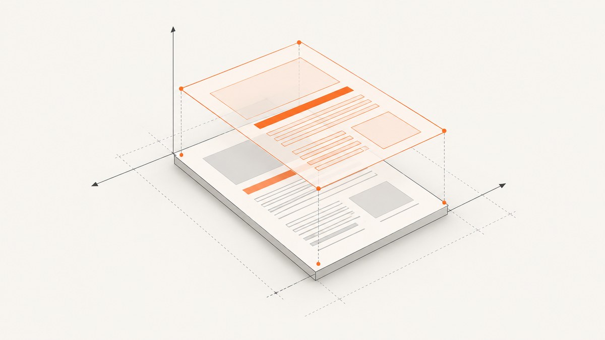
To size an HTML element to a PDF.js page, create the page viewport with the same scale and rotation used to render the page, then use viewport.width and viewport.height for the HTML element’s CSS dimensions. First decide which PDF page boundary represents your target: the physical page (MediaBox), visible area (CropBox), or finished trim (TrimBox). For positioning points within the page, use the viewport’s transform; dimensions alone do not account for PDF’s bottom-left origin, canvas’s top-left origin, or rotation.
The viewport is the shared geometry for the rendered page and its HTML overlay. Keep its CSS dimensions separate from the canvas backing dimensions used for high-density displays. The examples below follow PDF.js’s documented rendering approach; check the API for your installed PDF.js version before copying version-specific signatures. PDF.js rendering examples
1. Choose the page boundary that matches your task
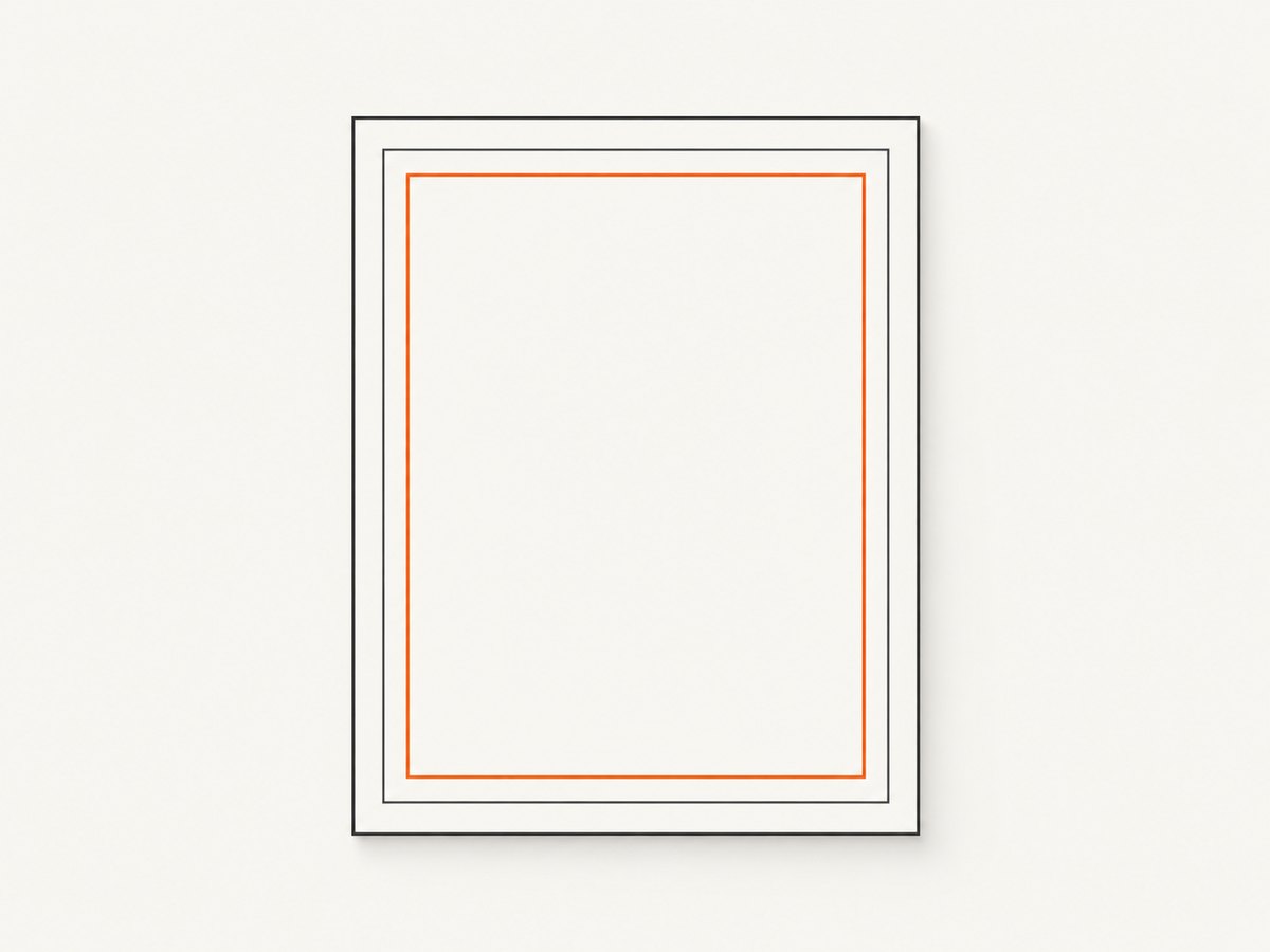
A PDF page can have several boundary boxes. “Page size” is ambiguous until you identify which one matters.
| Box | What it describes | Use it when |
|---|---|---|
MediaBox |
The physical medium boundaries; required and inheritable in the PDF specification. | You need the full physical page extent, such as for page-level layout or print measurements. |
CropBox |
The visible region for display or printing. By default, it is tied to the MediaBox. | You are aligning an overlay to the region a viewer presents. |
TrimBox |
The intended finished page dimensions after trimming. | You are aligning content to the finished dimensions in a print workflow. |
Different boxes can have different bounds. A crop can exclude margins, and a box rectangle may have a nonzero origin. If your target appears shifted or unexpectedly sized, inspect which box the PDF and renderer use before changing CSS. The PDF specification defines the page boxes; Apple’s PDFKit page bounds documentation also describes CropBox’s role.
2. Render and size the HTML wrapper from one viewport
Load the document, get the page, and create a viewport with the scale and rotation you intend to render. Use its width and height for both the page wrapper and a full-page HTML overlay. This makes them share the same layout coordinate space.
// Assumes pdfjsLib has been loaded according to your PDF.js setup.
const loadingTask = pdfjsLib.getDocument('/documents/sample.pdf');
const pdf = await loadingTask.promise;
const page = await pdf.getPage(1);

const scale = 1.25;
const rotation = page.rotate; // Or use an explicit rotation supported by your file.
const viewport = page.getViewport({ scale, rotation });

const wrapper = document.querySelector('#pdf-page');
const canvas = document.querySelector('#pdf-canvas');
const overlay = document.querySelector('#html-overlay');
const context = canvas.getContext('2d');

// CSS layout size: the same geometry used by the HTML target.
wrapper.style.width = `${viewport.width}px`;
wrapper.style.height = `${viewport.height}px`;
overlay.style.width = `${viewport.width}px`;
overlay.style.height = `${viewport.height}px`;

// High-DPI backing store is separate from CSS layout dimensions.
const outputScale = window.devicePixelRatio || 1;
canvas.width = Math.floor(viewport.width * outputScale);
canvas.height = Math.floor(viewport.height * outputScale);
canvas.style.width = `${viewport.width}px`;
canvas.style.height = `${viewport.height}px`;

const transform = outputScale === 1
  ? null
  : [outputScale, 0, 0, outputScale, 0, 0];

await page.render({
  canvasContext: context,
  viewport,
  transform
}).promise;
Example markup:
<div id="pdf-page" style="position:relative">
  <canvas id="pdf-canvas"></canvas>
  <div id="html-overlay" style="position:absolute;inset:0">
    <div class="target">HTML content</div>
  </div>
</div>
The wrapper and overlay use viewport CSS pixels. The canvas’s width and height attributes allocate a larger backing bitmap at high device pixel ratios; its CSS width and height remain the viewport dimensions. PDF.js’s example uses this same distinction for high-DPI rendering. Treat the backing-store multiplier as a rendering detail, not a reason to enlarge the HTML layout.
3. Map PDF coordinates into the overlay
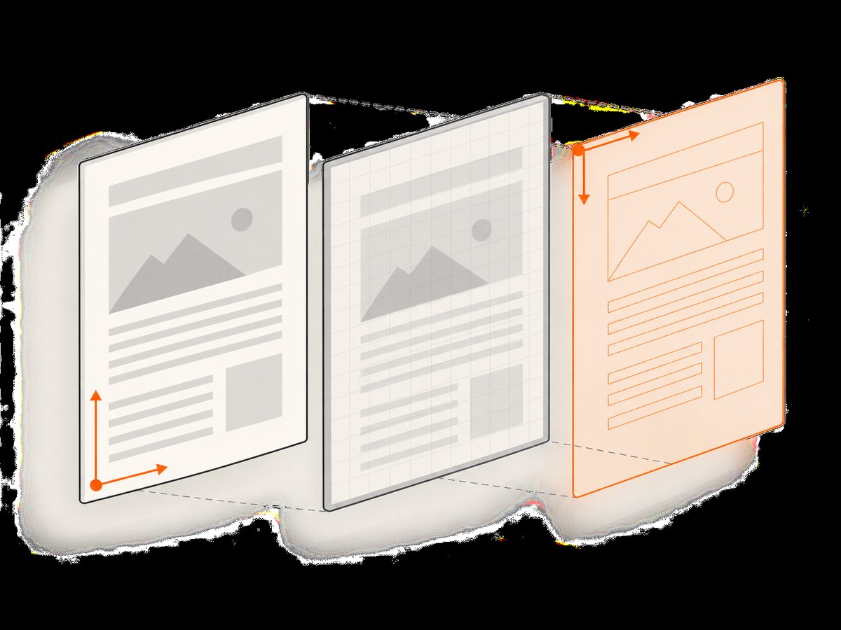
PDF user-space coordinates conventionally start at the bottom-left. Canvas and CSS layout coordinates start at the top-left. The PDF.js viewport transform incorporates the conversion, scale, and rotation. Apply that transform to positions from PDF space instead of manually flipping the y-coordinate. A hand-written formula that works for an unrotated page can fail when rotation or a nonzero page-box origin is involved.
// Convert a PDF-space point into viewport coordinates.
// PDF.js versions expose Util.transform; confirm the API in your installed version.
const [vx, vy] = pdfjsLib.Util.applyTransform(
  [pdfX, pdfY],
  viewport.transform
);

// Position an HTML point using CSS coordinates.
target.style.left = `${vx}px`;
target.style.top = `${vy}px`;
For a rectangle, transform its corners and compute the resulting viewport-space bounds. This matters if the page is rotated: transforming only its origin and retaining the original width and height can give the wrong placement or dimensions. If you are not mapping PDF content coordinates and only need a full-page overlay, setting the overlay to the viewport dimensions is sufficient.
4. Handle scale, rotation, and device density
- Scale: A larger viewport scale increases rendered width and height. Recreate or update the overlay geometry whenever scale changes.
- Rotation: Rotation can swap the viewport’s width and height and changes point mapping. Pass the same rotation to rendering and overlay calculations.
- Device pixel ratio: Multiply the canvas backing dimensions by the chosen output scale, but keep CSS geometry at viewport width and height. If you intentionally render at a custom density, use that same value for the canvas transform.
- Zoom and responsive layout: If the page is later scaled by CSS, the overlay and canvas must be scaled together. Avoid measuring one at a different zoom or applying a second scale to only the overlay.
PDF.js describes the viewport as pixel dimensions at 72 DPI by default, with the requested scale and rotation applied. Do not assume raw PDF coordinates are browser CSS pixels. Read the dimensions from the actual viewport used for rendering. PDF.js examples and the PDF.js API documentation describe viewport inputs and dimensions.
5. Inspect page size manually
For a quick check, PDF.js viewer document properties show page size, width, height, units, and orientation, with familiar labels such as A3, A4, Letter, and Legal. This is useful for confirming whether a document’s physical dimensions match expectations. It does not replace using the same viewport geometry as your rendered page when positioning a live HTML overlay.
- Open the PDF in the PDF.js viewer.
- Open document properties and note the displayed page size and orientation.
- Compare the result with the box and viewport settings in your application.
- If the values differ, check whether the viewer or renderer is showing a cropped region or applying rotation.
Viewer labels are a practical inspection aid; the rendered viewport remains the source of truth for on-screen layout.
6. A reliable implementation checklist
- Choose whether your task concerns MediaBox, CropBox, or TrimBox.
- Use the same page object, scale, and rotation for rendering and overlay sizing.
- Set wrapper and overlay CSS dimensions from
viewport.widthandviewport.height. - Keep canvas backing-store dimensions separate from CSS dimensions.
- Map PDF-space points and rectangles through the viewport transform.
- Recompute geometry after changing page, rotation, scale, or box assumptions.
- Check for nonzero box origins when content is consistently offset.
7. Troubleshooting common alignment problems
| Symptom | Likely cause | Fix |
|---|---|---|
| Overlay is too large or too small | Raw PDF units were treated as CSS pixels, or the overlay uses a different scale. | Use the rendered page’s viewport dimensions for CSS width and height. |
| Overlay fits one orientation but not another | Rotation was applied to rendering but not to overlay geometry. | Create one viewport with the intended rotation and reuse its dimensions and transform. |
| Canvas is sharp but HTML content looks offset or oversized | Device-pixel-ratio scaling was applied to CSS layout dimensions as well as the canvas backing store. | Keep CSS dimensions at viewport size and multiply only backing dimensions and the render transform. |
| Everything is shifted by a consistent amount | The selected visible box differs from the assumed physical page, or the box has a nonzero origin. | Inspect the page box and transform coordinates through the viewport. |
| Y positions are inverted | PDF bottom-left coordinates were used directly as top-left CSS coordinates. | Apply the viewport transform rather than simply reusing PDF y values. |
| Position works until the page is rotated | Coordinates or rectangles were mapped with an unrotated hand-written formula. | Transform each relevant point or corner using the viewport transform. |
| CSS dimensions differ from the canvas element attributes | The canvas has a high-density backing store. | Compare the overlay to the canvas CSS box, not its bitmap pixel attributes. |
8. Performance, reliability, and cost considerations
Reuse the viewport you already create for rendering instead of independently calculating page dimensions for each HTML target. When scale or rotation changes, update the page and overlay together. This reduces mismatches and avoids repeated layout decisions. For many pages, derive geometry per page: pages can have different sizes or rotations, so do not assume that the first page’s viewport fits every page.
HiDPI rendering increases canvas backing dimensions in both directions. As a result, the backing bitmap can require substantially more memory than a viewport-sized bitmap; use an output scale that meets your visual requirements. Keep the HTML overlay in CSS pixels so its layout does not inherit this memory cost. When rendering large documents, render only pages needed for the current view and release or reuse canvas resources according to your application’s lifecycle.
For a local PDF.js implementation, the relevant costs are your application’s compute, memory, and document delivery; the research sources do not specify universal performance figures. Profile with representative files, including cropped, rotated, and mixed-size pages. ScreenshotNeo is a separate option for capturing websites as screenshots or PDFs; it does not replace PDF.js’s local page-coordinate mapping workflow.
Or skip the browser setup
If your goal is to capture a website as an image or PDF rather than align your own HTML overlay to a local PDF page, ScreenshotNeo provides a website screenshot API and MCP server. One GET request returns an image or PDF. See the ScreenshotNeo API documentation for options and setup.
curl -G "https://api.screenshotneo.com/v1/shot" -d access_key=YOUR_API_KEY --data-urlencode url=https://stripe.com -o shot.webpimport requests
r = requests.get(
"https://api.screenshotneo.com/v1/shot",
params={"access_key": "YOUR_API_KEY", "url": "https://stripe.com"},
timeout=90,
)
open("shot.webp", "wb").write(r.content)const q = new URLSearchParams({ access_key: 'YOUR_API_KEY', url: 'https://stripe.com' });
const res = await fetch(`https://api.screenshotneo.com/v1/shot?${q}`);
if (!res.ok) throw new Error(`Screenshot request failed: ${res.status}`);
const bytes = new Uint8Array(await res.arrayBuffer());
await import('node:fs/promises').then(fs => fs.writeFile('shot.webp', bytes));ScreenshotNeo removes cookie banners, newsletter popups, and chat widgets before the shot. Bot checks, blank pages, and failed loads are never billed. Its MCP server lets AI agents take screenshots, and 1,000 screenshots a month are free with no card; paid plans start at $5 for 3,000. Sign up for free.
FAQ
Does PDF.js return dimensions in points or pixels?
The viewport exposes pixel dimensions at 72 DPI by default, adjusted by its scale and rotation. Use the returned viewport dimensions rather than interpreting raw PDF coordinates as CSS pixels.
Should I size an overlay to the MediaBox or CropBox?
Match the box represented by the rendered area. For visible display alignment, the CropBox is often the relevant region; physical page layout may call for MediaBox. Confirm the renderer’s behavior for your document.
Can I use the same viewport for every page?
Only when the pages share the same relevant geometry and rendering settings. Build the viewport for each page you render.
Why does my overlay drift after zooming?
The page and overlay likely use different scale values, or only one was updated. Recompute both from the same viewport whenever zoom changes.
Does ScreenshotNeo solve PDF.js overlay positioning?
No. ScreenshotNeo captures web pages as images or PDFs; PDF.js viewport transforms are the method for aligning HTML to pages in your own PDF.js application.