Best Practices for Building a Photo Gallery Website
Build a fast, accessible photo gallery with responsive images, stable layouts, lazy loading, and reliable screenshot previews.

Direct answer: Build a photo gallery around four rules: describe meaningful images with useful alternative text, deliver an image variant sized for the viewer’s screen, reserve space before files load, and defer only images below the initial viewport. Then add keyboard-friendly controls, predictable focus states, captions, resilient loading behavior, and a process for generating and checking image variants.
This guide shows a complete implementation using semantic HTML, CSS, and JavaScript. It also covers responsive delivery, accessibility, lazy loading, performance, privacy, testing, troubleshooting, and ScreenshotNeo for generating reliable page previews.
1. Define the gallery’s purpose and content model
Before writing markup, decide what each photograph means to the visitor. The same file can need different alternative text depending on the page. A bird-identification gallery may need the species and visible traits; a general park gallery may only need a concise description of the scene.
- Informative image: write a short alternative that communicates the important visual information.
- Decorative image: use an empty
altvalue when the image adds no information beyond nearby text. - Functional image: if the image is a link or button, describe the action, such as “Open sunset over the harbor”.
- Caption: add context such as location, date, photographer, or licensing information when it helps the user.
WCAG 2.2 states: “All non-text content that is presented to the user has a text alternative that serves the equivalent purpose, except for the situations listed below.” Read the W3C guidance on non-text content and the WAI images tutorial when defining your content fields.
A practical record for each gallery item might contain:
{
  "src": "/images/reef-800.webp",
  "srcset": "/images/reef-400.webp 400w, /images/reef-800.webp 800w, /images/reef-1600.webp 1600w",
  "width": 1600,
  "height": 1067,
  "alt": "Sea turtle swimming above a coral reef",
  "caption": "Green turtle near the north reef",
  "credit": "Alex Rivera",
  "href": "/gallery/reef-turtle"
}
2. Generate image variants instead of shipping originals
Export several widths from the original, for example 400, 800, 1200, and 1600 pixels. Keep the original in a protected source store and publish optimized derivatives. WebP or AVIF can reduce transfer size, while JPEG remains a useful fallback for broad compatibility. Choose quality by inspecting real photographs at their displayed dimensions; a smaller file is not useful if compression destroys important detail.
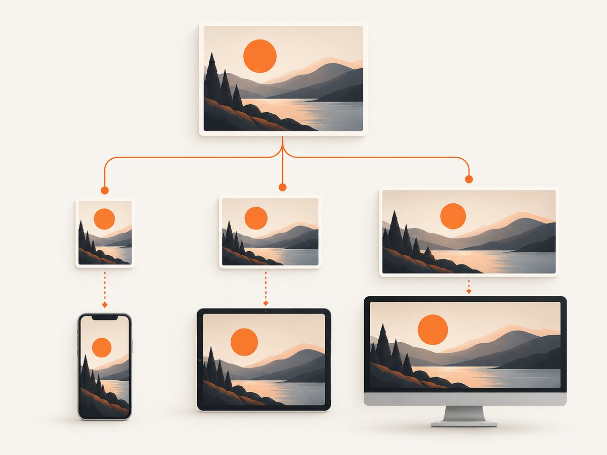
Responsive markup lets the browser select an appropriate file for the rendered context. The sizes value describes the image’s layout width, while srcset lists available resources:
<img
  src="/images/reef-800.webp"
  srcset="/images/reef-400.webp 400w,
          /images/reef-800.webp 800w,
          /images/reef-1200.webp 1200w,
          /images/reef-1600.webp 1600w"
  sizes="(min-width: 1100px) 25vw,
         (min-width: 700px) 33vw,
         100vw"
  width="1600"
  height="1067"
  alt="Sea turtle swimming above a coral reef"
  loading="lazy"
  decoding="async">
Use <picture> when art direction or format selection requires different sources:
<picture>
  <source type="image/avif" srcset="/images/reef-800.avif 800w, /images/reef-1600.avif 1600w" sizes="100vw">
  <source type="image/webp" srcset="/images/reef-800.webp 800w, /images/reef-1600.webp 1600w" sizes="100vw">
  <img src="/images/reef-800.jpg" width="1600" height="1067" alt="Sea turtle swimming above a coral reef" loading="lazy" decoding="async">
</picture>
Do not distort photographs to fit a card. If every card intentionally uses a fixed crop, make that explicit with a stable aspect ratio and object-fit: cover. Use a separate art-directed crop when the subject would otherwise be cut off.
3. Reserve space to prevent layout movement
Set intrinsic width and height attributes on every image, or define an equivalent aspect ratio. The browser can reserve the correct area before image bytes arrive, preventing cards and captions from jumping while the gallery loads.
.gallery-card {
  aspect-ratio: 3 / 2;
  overflow: hidden;
  background: #e9e9e9;
}

.gallery-card img {
  display: block;
  width: 100%;
  height: 100%;
  object-fit: cover;
}

.gallery-card figcaption {
  padding: .75rem 0 0;
}
Keep the ratio consistent between the generated derivative and the card. If the source is 3:2 but the design reserves 1:1, users may see an abrupt crop change unless the crop is intentional.
4. Build semantic, keyboard-friendly gallery markup
Use a heading for the gallery, a list for the collection, and links for items that open a detail page. A lightbox can be added later, but the underlying links should still work without JavaScript.
<main>
  <h1>Coastal birds</h1>
  <p>Photographs from the north shoreline, 2026.</p>

  <ul class="gallery" aria-label="Coastal bird photographs">
    <li>
      <figure>
        <a href="/gallery/oystercatcher">
          <img
            src="/images/oystercatcher-800.webp"
            srcset="/images/oystercatcher-400.webp 400w, /images/oystercatcher-800.webp 800w, /images/oystercatcher-1600.webp 1600w"
            sizes="(min-width: 1100px) 25vw, (min-width: 700px) 33vw, 100vw"
            width="1600"
            height="1067"
            alt="Black oystercatcher standing on wet rocks"
            fetchpriority="high"
            decoding="async">
        </a>
        <figcaption>Black oystercatcher on the north shore</figcaption>
      </figure>
    </li>
    <li>
      <figure>
        <a href="/gallery/tern">
          <img
            src="/images/tern-800.webp"
            srcset="/images/tern-400.webp 400w, /images/tern-800.webp 800w, /images/tern-1600.webp 1600w"
            sizes="(min-width: 1100px) 25vw, (min-width: 700px) 33vw, 100vw"
            width="1600"
            height="1067"
            alt="Arctic tern flying above a blue inlet"
            loading="lazy"
            decoding="async">
        </a>
        <figcaption>Arctic tern over the inlet</figcaption>
      </figure>
    </li>
  </ul>
</main>
Make focus visible and preserve a sensible tab order:
a:focus-visible,
button:focus-visible {
  outline: 3px solid #155eef;
  outline-offset: 4px;
}

.gallery {
  display: grid;
  grid-template-columns: repeat(auto-fit, minmax(220px, 1fr));
  gap: 1.25rem;
  list-style: none;
  padding: 0;
}

@media (prefers-reduced-motion: reduce) {
  *, *::before, *::after {
    scroll-behavior: auto !important;
    transition-duration: .01ms !important;
    animation-duration: .01ms !important;
  }
}
5. Lazy-load below-the-fold images carefully
Use loading="lazy" for images that are not initially visible. Do not lazily delay the first prominent image or likely Largest Contentful Paint element. The first visible image should be present in the initial HTML and can use fetchpriority="high" when measurements show that it is discovered too late.
Lazy loading is not automatically faster. Google’s web.dev analysis reports a median 75th-percentile LCP of 2,922 ms for pages without lazy loading and 3,546 ms for pages with it in the analyzed sample, and warns that the figures are correlational. A separate WordPress lab test found lower archive-page LCP when lazy loading was disabled, with small single-page differences. Treat these as scenario-specific observations and measure your own gallery.
Preload only a critical image that is otherwise discovered late, such as one inserted dynamically. If the image is already in the initial markup, ordinary responsive image discovery is usually preferable:
<link rel="preload"
      as="image"
      href="/images/hero-1200.webp"
      imagesrcset="/images/hero-800.webp 800w, /images/hero-1200.webp 1200w"
      imagesizes="100vw"
      type="image/webp">
6. Add a progressive lightbox without breaking links
The safest pattern is a normal link enhanced by JavaScript. Users without JavaScript still reach the detail page. Users with it can open a dialog, close it with Escape, and return focus to the activating link.
<dialog id="lightbox" aria-labelledby="lightbox-title">
  <h2 id="lightbox-title">Photo preview</h2>
  <img id="lightbox-image" alt="">
  <button type="button" id="close-lightbox">Close</button>
</dialog>

<script>
const dialog = document.querySelector('#lightbox');
const preview = document.querySelector('#lightbox-image');
const close = document.querySelector('#close-lightbox');
let returnFocus;

document.querySelectorAll('.gallery a').forEach(link => {
  link.addEventListener('click', event => {
    if (!HTMLDialogElement.prototype.showModal) return;
    event.preventDefault();
    const image = link.querySelector('img');
    returnFocus = link;
    preview.src = image.currentSrc || image.src;
    preview.alt = image.alt;
    dialog.showModal();
    close.focus();
  });
});

close.addEventListener('click', () => dialog.close());
dialog.addEventListener('close', () => returnFocus?.focus());
</script>
For a larger lightbox, add previous and next buttons, announce the current position, trap focus inside the dialog, and remove the dialog from the accessibility tree when closed. Never rely on hover-only controls.
7. Handle errors, privacy, and metadata
Give each image a meaningful fallback state. A broken image should not collapse the card or leave an unlabeled control. Keep EXIF metadata private unless you intentionally publish it; GPS coordinates can reveal a subject’s location.
.gallery-card.is-error {
  display: grid;
  place-items: center;
  min-height: 12rem;
  color: #555;
  background: #f2f2f2;
}

<script>
document.querySelectorAll('.gallery img').forEach(img => {
  img.addEventListener('error', () => {
    img.closest('figure')?.classList.add('is-error');
    img.alt = 'This photograph could not be loaded';
  }, { once: true });
});
</script>
8. Generate page screenshots for reviews and social previews
You can capture a gallery yourself with a headless browser such as Playwright or Puppeteer. Wait for the gallery’s key selector, allow lazy images to load, set a device viewport, and save a full-page image. For repeatable previews, disable animations and use deterministic test data.
import { chromium } from 'playwright';

const browser = await chromium.launch();
const page = await browser.newPage({
  viewport: { width: 1440, height: 900 },
  deviceScaleFactor: 1
});
await page.goto('https://example.com/gallery', { waitUntil: 'networkidle' });
await page.locator('.gallery').waitFor();
await page.addStyleTag({ content: '* { animation: none !important; transition: none !important; }' });
await page.screenshot({ path: 'gallery.png', fullPage: true });
await browser.close();
9. Or skip the browser setup
ScreenshotNeo provides a website screenshot API and MCP server. It accepts one GET request and returns PNG, JPEG, WebP, or PDF. Before capture it accepts consent banners and removes more than 60 known consent platforms, newsletter popups, and chat widgets; each step can be turned off. Bot checks or CAPTCHAs, blank pages, timeouts, failed loads, and cache hits are not billed, and response headers identify the page verdict and billing result.

See the ScreenshotNeo API documentation for all options. A basic call is:
curl -G "https://api.screenshotneo.com/v1/shot" -d access_key=YOUR_API_KEY --data-urlencode url=https://stripe.com -o shot.webpimport requests
r = requests.get("https://api.screenshotneo.com/v1/shot", params={"access_key": "YOUR_API_KEY", "url": "https://stripe.com"}, timeout=90)
open("shot.webp", "wb").write(r.content)const q = new URLSearchParams({ access_key: 'YOUR_API_KEY', url: 'https://stripe.com' });
const res = await fetch(`https://api.screenshotneo.com/v1/shot?${q}`);For a gallery, useful options include full-page capture with lazy images loaded, a CSS selector for one element, dark mode, 12 device presets or a custom viewport, retina scale, custom CSS and JavaScript, click-before-capture, hidden selectors, waits for a selector, delay, or network idle, blocked ads and trackers, custom headers and cookies, timezone and geolocation, transparent backgrounds, resizing, a chosen cache TTL, signed public image links, asynchronous jobs with signed webhooks, bulk capture of up to 100 URLs per call, and a usage API. PDF output supports paper size, margins, landscape mode, and page ranges. The API also accepts parameter names used by other screenshot APIs, which simplifies migration.
An MCP server gives Claude, Cursor, and other MCP clients the tools take_screenshot, get_page_info, and capture_pdf. That lets an AI agent inspect a gallery while it works on page changes.
ScreenshotNeo charges only for clean shots. The Free plan includes 1,000 shots per month with no card; Starter is $5 for 3,000, Growth $15 for 15,000, Pro $39 for 60,000, Scale $99 for 250,000, and Business $249 for 1,000,000. Yearly billing gives two months free, and every feature is available on every plan. Create a free ScreenshotNeo account and start with 1,000 screenshots a month without a card.
10. Test performance and reliability
- Test at representative phone, tablet, and desktop widths with a throttled connection.
- Confirm that the first visible image is not lazy-loaded and that below-fold images are deferred.
- Inspect the selected
currentSrcin browser tools to verify thatsrcsetandsizeschoose sensible files. - Check cumulative layout shift while images load on a cold cache.
- Verify keyboard navigation, focus visibility, screen-reader names, dialog Escape behavior, and reduced-motion behavior.
- Test missing files, slow responses, denied requests, and an empty gallery.
- Monitor transferred bytes and image decode time on the actual production page.
Cache immutable derivatives with a content hash in the filename. Use long cache lifetimes for those files and a shorter cache lifetime for gallery manifests. If a gallery changes frequently, publish a new manifest version rather than invalidating every image. Avoid loading every full-resolution original into the page; provide a detail route or download action for the source file.
11. Troubleshooting checklist
| Symptom | Likely cause | Fix |
|---|---|---|
| The first image appears late | It has loading="lazy", or CSS/JavaScript hides it from discovery. |
Remove lazy loading, keep it in initial HTML, and consider fetchpriority="high" after measuring. |
| Cards jump while loading | No intrinsic dimensions or aspect ratio. | Add width/height or a stable aspect-ratio. |
| Mobile downloads huge files | Missing or incorrect sizes, or only one large source exists. |
Generate smaller derivatives and describe the rendered width accurately. |
| Images look stretched | CSS dimensions do not preserve the source ratio. | Use object-fit: cover for intentional crops or contain for the complete image. |
| Screen readers announce filenames | Missing, generic, or duplicated alt text. |
Write purpose-based alternatives; use alt="" only for decorative images. |
| The lightbox traps users | Focus is not returned or Escape is not handled. | Return focus to the triggering link and test keyboard-only operation. |
| Screenshot contains a cookie banner | The capture service did not dismiss consent UI. | Use a consent-aware capture flow or ScreenshotNeo’s cleanup options. |
| Screenshot is blank or times out | The page requires more time, blocks automation, or has a failed resource. | Wait for a selector or network idle, inspect the page verdict, and retry with a suitable timeout. |
12. Cost and maintenance decisions
Image bandwidth is usually the recurring cost that grows with audience size. Reduce it by matching variants to display widths, avoiding duplicate downloads, compressing derivatives, and caching immutable assets. Keep originals separate so editors can regenerate variants when formats or design widths change.
Screenshot costs depend on how often you generate previews, whether you use caching, and whether you capture full pages or individual elements. ScreenshotNeo’s cache hits and failed or unusable pages are not billed; use a cache TTL for repeated previews and bulk capture for batches. For scheduled jobs, asynchronous captures with signed webhooks avoid holding an application request open.
FAQ
Should every image have a detailed description?
No. Match the alternative to the image’s purpose. Informative images need useful content; decorative images can have an empty alternative; linked images should describe the destination or action.
Is WebP always better than JPEG?
No format wins for every photograph or browser. Offer an efficient modern format with a compatible fallback and compare visual quality and transfer size at the actual display dimensions.
Should I preload the whole gallery?
No. Preload only a critical image that normal HTML discovery cannot find promptly. Preloading many images can compete with the resources the page needs first.
How do I make a gallery usable without JavaScript?
Use ordinary links to detail pages as the foundation. Enhance those links with a lightbox only when JavaScript is available, and preserve keyboard and focus behavior.
When is a screenshot API useful?
It is useful for automated previews, documentation, visual regression inputs, social cards, and agent workflows where maintaining browser infrastructure would add operational work. ScreenshotNeo combines cleanup, verdict and billing headers, PDF capture, bulk jobs, and an MCP server in the same service.