Playwright Screenshot DPI and Image Resolution
Learn how Playwright screenshot scale and deviceScaleFactor determine image pixels, output size, and visual fidelity—with runnable examples and fixes.

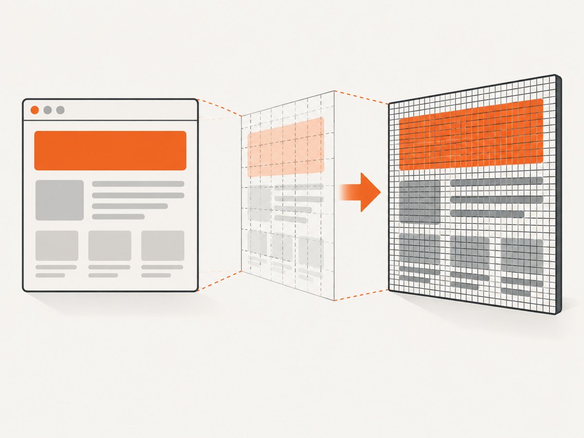
Short answer: Playwright does not expose a print-style DPI field for screenshots. Image dimensions come from the page or element size, the screenshot scale option, and the browser context’s deviceScaleFactor. Use scale: 'css' for one output pixel per CSS pixel, or scale: 'device' for one output pixel per emulated device pixel. A context with deviceScaleFactor: 2 can therefore produce an image about twice as wide and tall as a CSS-scaled capture. page.screenshot() defaults to scale: 'device', while screenshot assertions default to scale: 'css' according to the Playwright API reference (page.screenshot, browser.newContext, screenshot assertions).
What Playwright calls resolution
There are three related values to keep separate:
| Value | What it controls | Typical effect |
|---|---|---|
| CSS pixels | Layout dimensions used by the page | A 1280px viewport lays out at 1280 CSS pixels |
deviceScaleFactor |
Emulated device pixel ratio (DPR) | At 2, one CSS pixel maps to two device pixels in each dimension |
scale |
How screenshot pixels are written | 'css' keeps CSS-sized output; 'device' preserves device-pixel density |
Playwright’s browser context documentation describes deviceScaleFactor as a device scale factor that can be thought of as DPR and gives it a default of 1 (official option reference). The screenshot API describes scale: 'css' as one output pixel per CSS pixel and scale: 'device' as one output pixel per device pixel. It also documents 'device' as the default for page.screenshot().
“DPI” is therefore shorthand people use when discussing density, but it is not an independent screenshot setting in the documented Playwright API. Describe captures by pixel dimensions, CSS pixels, device pixels, and DPR instead.
Calculate the output dimensions
For a viewport screenshot, a useful approximation is:
output width  = CSS width  × deviceScaleFactor (when scale is 'device')
output height = CSS height × deviceScaleFactor (when scale is 'device')

output width  = CSS width  (when scale is 'css')
output height = CSS height (when scale is 'css')
The actual result also depends on whether you capture the viewport, the full page, or an element. Full-page captures use the document’s rendered dimensions. Element captures use the element’s bounding box. Scrollbars, borders, fractional layout values, and browser rounding can make the final integer dimensions differ by a pixel.
Example dimension table
| CSS viewport | DPR | Scale | Approximate output |
|---|---|---|---|
| 1280 × 720 | 1 | css |
1280 × 720 |
| 1280 × 720 | 2 | css |
1280 × 720 |
| 1280 × 720 | 2 | device |
2560 × 1440 |
| 390 × 844 | 3 | device |
1170 × 2532 |
Runnable Playwright examples
Install Playwright and its browser once:
npm install -D playwright
npx playwright install chromium
CSS-pixel output
This is usually the right choice for compact previews, documentation thumbnails, and visual tests where you want dimensions to match the CSS viewport.
import { chromium } from 'playwright';

const browser = await chromium.launch();
const context = await browser.newContext({
  viewport: { width: 1280, height: 720 },
  deviceScaleFactor: 2
});
const page = await context.newPage();
await page.goto('https://example.com', { waitUntil: 'networkidle' });
await page.screenshot({
  path: 'css-scale.png',
  scale: 'css',
  fullPage: false
});
await browser.close();
Although the context emulates DPR 2, the file remains approximately 1280 × 720 because the screenshot is written at CSS scale.
Device-pixel output
Use device scale when you need the extra pixels for a high-density display or downstream image processing.
import { chromium } from 'playwright';

const browser = await chromium.launch();
const context = await browser.newContext({
  viewport: { width: 1280, height: 720 },
  deviceScaleFactor: 2
});
const page = await context.newPage();
await page.goto('https://example.com', { waitUntil: 'networkidle' });
await page.screenshot({
  path: 'device-scale.png',
  scale: 'device'
});
await browser.close();
This produces approximately 2560 × 1440 pixels for the same CSS viewport.
Full-page and element captures
await page.screenshot({
  path: 'full-page.webp',
  fullPage: true,
  scale: 'css',
  type: 'webp',
  quality: 82
});

await page.locator('main').screenshot({
  path: 'main-element.png',
  scale: 'device'
});
Full-page mode can create very tall files. Element screenshots use the element’s rendered bounds, so padding, transforms, and overflow affect the result.
Screenshot assertions
import { test, expect } from '@playwright/test';

test('homepage visual baseline', async ({ page }) => {
  await page.goto('https://example.com');
  await expect(page).toHaveScreenshot('homepage.png', {
    fullPage: true,
    scale: 'css'
  });
});
Do not assume the page screenshot default applies to assertions. The assertion documentation lists css as its default. Set scale explicitly when creating and comparing baselines.
Control the browser context before capturing
Viewport and DPR
const context = await browser.newContext({
  viewport: { width: 1440, height: 900 },
  deviceScaleFactor: 1,
  isMobile: false,
  hasTouch: false
});
Keep viewport and device scale fixed in CI. A different DPR changes rasterized text, canvas output, image selection, and final dimensions.
Full-page layout and lazy content
fullPage: true asks Playwright to capture the complete document. Pages that lazy-load images only after scrolling may show missing content. Scroll deliberately, wait for the images, or use the application’s own “load all” state before capturing:
await page.evaluate(async () => {
  window.scrollTo(0, document.body.scrollHeight);
  await new Promise(resolve => setTimeout(resolve, 500));
  window.scrollTo(0, 0);
});
await page.waitForLoadState('networkidle');
await page.screenshot({ path: 'complete.png', fullPage: true, scale: 'css' });
Waiting for stable pixels
networkidle is not a guarantee that animations or client-side rendering have finished. Prefer a meaningful selector, then disable motion for deterministic output:
await page.goto('https://example.com');
await page.locator('[data-ready="true"]').waitFor();
await page.addStyleTag({ content: `*, *::before, *::after {
  animation: none !important;
  transition: none !important;
  caret-color: transparent !important;
}` });
await page.screenshot({ path: 'stable.png', scale: 'css' });
Color, transparency, and media
Use colorScheme: 'dark' or 'light' to select theme-specific CSS. Set reducedMotion: 'reduce' when the site honors that media query. omitBackground: true creates transparency for PNG captures where the browser can represent it; JPEG has no alpha channel.
const context = await browser.newContext({
  colorScheme: 'dark',
  reducedMotion: 'reduce',
  viewport: { width: 1280, height: 800 },
  deviceScaleFactor: 2
});
await page.screenshot({ path: 'transparent.png', omitBackground: true, scale: 'device' });
Choosing CSS or device scale
| Goal | Recommended setting | Reason |
|---|---|---|
| Visual regression tests | scale: 'css', fixed DPR |
Smaller baselines and predictable layout-sized files |
| Retina marketing asset | scale: 'device', DPR 2 |
More pixels for high-density displays |
| API thumbnails | scale: 'css' |
Lower storage and transfer cost |
| Pixel-level canvas inspection | scale: 'device' |
Preserves device-pixel detail |
Use one policy for an entire visual test suite. Changing scale or DPR invalidates existing baselines even when the page has not changed.
Performance, reliability, and cost
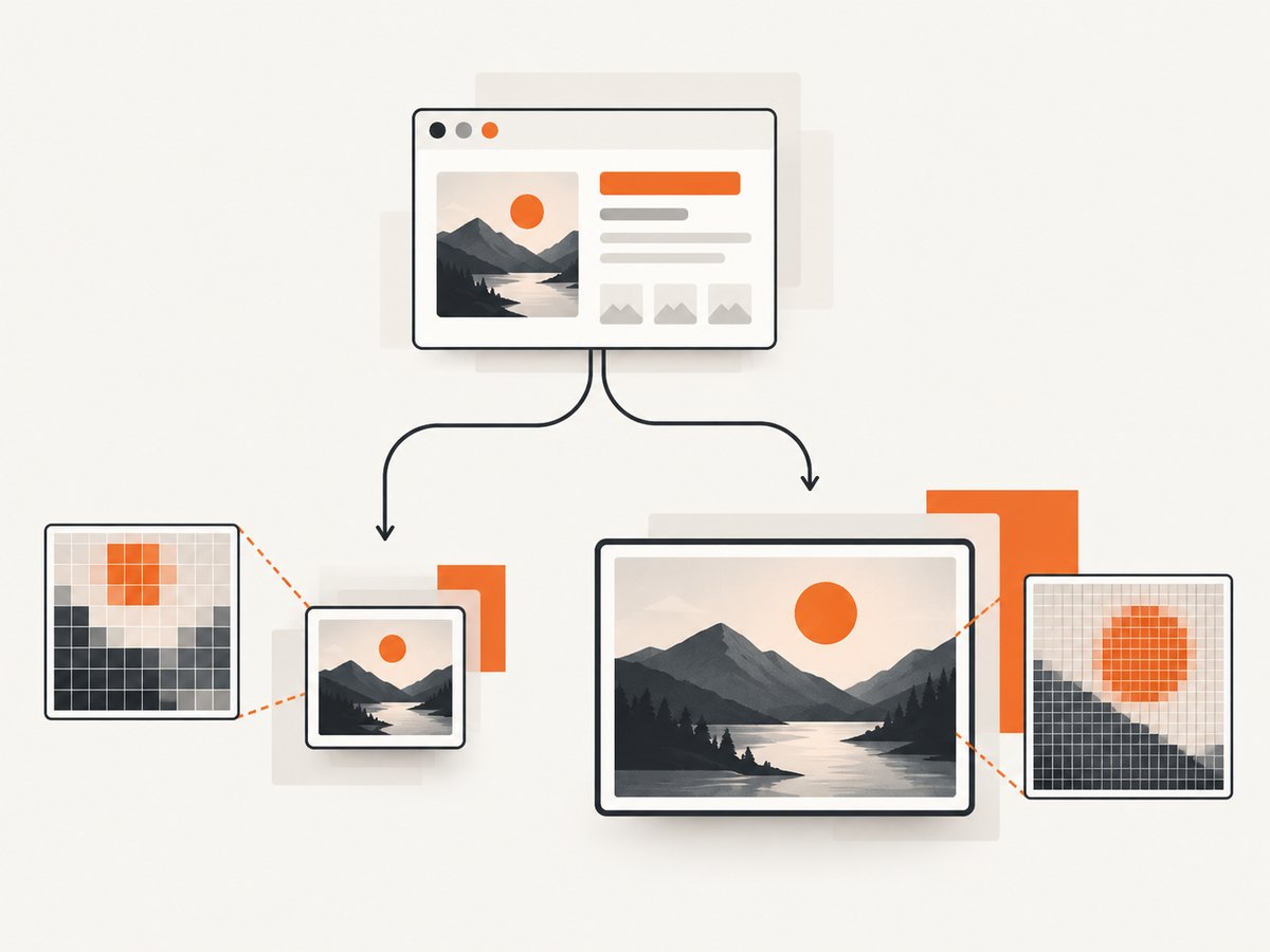
Device-scale output grows in both dimensions, so a DPR of 2 can produce roughly four times as many pixels as CSS-scale output. That increases encoding time, memory use, file size, upload time, and snapshot-review overhead. Full-page captures multiply the effect because height can be thousands of CSS pixels. Choose the smallest dimensions that meet the consumer’s needs, prefer WebP when supported, and avoid taking repeated full-page shots when an element capture is enough.
For reliable automation, pin the browser version used in CI, wait for application state rather than arbitrary sleeps, freeze animations, and make fonts available in the environment. Compare screenshots on the same operating system and browser engine when possible; font rasterization and anti-aliasing can otherwise create differences unrelated to your code.
Troubleshooting common resolution problems
| Symptom | Likely cause | Fix |
|---|---|---|
| The image is twice as large | DPR is 2 and the page screenshot uses device scale by default | Set scale: 'css' or lower deviceScaleFactor |
| Assertion baseline differs from page screenshot | Assertions default to CSS scale while page screenshots default to device scale | Set the same explicit scale in both calls |
| Changing DPR does not change file dimensions | You are using CSS scale | Use scale: 'device' if device pixels are required |
| Text looks blurry | Image was resized after capture or captured at a low DPR | Capture at the target device scale and avoid non-integer resizing |
| Full-page image is unexpectedly short | Lazy content never loaded or the page uses an internal scroll container | Scroll to trigger loading, wait for content, or capture the scroll container |
| Screenshot is blank | Capture happened before navigation or rendering completed | Wait for the URL, a ready selector, and required fonts/images |
| Output is huge and memory spikes | High DPR combined with a very tall page | Use CSS scale, capture sections, or reduce viewport/DPR |
| Only part of an element appears | Overflow clipping or an element outside the viewport | Use the locator screenshot, remove clipping for the capture, or capture the relevant container |
Or skip the browser setup
If you need an image or PDF from a URL without maintaining Playwright workers, ScreenshotNeo provides a single screenshot API request. Its options include full-page capture with lazy images loaded, element selectors, dark mode, device presets or custom viewports, retina scale, PDF settings, custom CSS and JavaScript, waits, request blocking, headers, cookies, user agents, geolocation, transparent backgrounds, resizing, caching, signed links, asynchronous jobs, bulk capture, and a usage API. See the ScreenshotNeo API documentation for parameter details.
cURL
curl -G 'https://api.screenshotneo.com/v1/shot' \
  -d access_key=YOUR_API_KEY \
  --data-urlencode url=https://stripe.com \
  -o shot.webp
Python
import requests

r = requests.get(
    'https://api.screenshotneo.com/v1/shot',
    params={'access_key': 'YOUR_API_KEY', 'url': 'https://stripe.com'},
    timeout=90,
)
r.raise_for_status()
open('shot.webp', 'wb').write(r.content)
Node.js
const q = new URLSearchParams({
  access_key: 'YOUR_API_KEY',
  url: 'https://stripe.com'
});
const res = await fetch(`https://api.screenshotneo.com/v1/shot?${q}`);
if (!res.ok) throw new Error(`Screenshot failed: ${res.status}`);
const fs = await import('node:fs/promises');
await fs.writeFile('shot.webp', Buffer.from(await res.arrayBuffer()));
ScreenshotNeo removes cookie and consent banners, newsletter popups, and chat widgets before capture. Bot checks, blank pages, timeouts, failed loads, and cache hits are not billed; response headers report the page verdict and whether the request was billed. Its MCP server gives Claude, Cursor, and other MCP clients take_screenshot, get_page_info, and capture_pdf tools. The Free plan includes 1,000 shots each month without a card; paid plans start at $5 for 3,000 shots. Create a free ScreenshotNeo account.
FAQ
Is screenshot DPI configurable in Playwright?
There is no separate DPI field in the documented screenshot API. Configure pixel output with scale and deviceScaleFactor.
Should I always use device scale?
No. Use device scale when extra device pixels matter. CSS scale is usually more efficient for tests, previews, and API responses.
Why does a DPR of 2 not always double the file size?
Pixel count can grow by about four times, but compression depends on image content. The file may be less or more than four times larger.
Can I set a physical print DPI for a PNG?
Playwright controls rendered pixels, not a print metadata DPI value. If a print workflow needs a physical size, convert the captured pixel dimensions in the downstream publishing tool.
What must remain identical for visual comparisons?
Keep browser engine, viewport, device scale factor, screenshot scale, fonts, theme, and animation state consistent between baseline and comparison runs.


