How to Set the Scale of Playwright Screenshots
Choose CSS or device pixels in Playwright, understand DPR, align assertions, and avoid unexpectedly large or mismatched screenshot files.
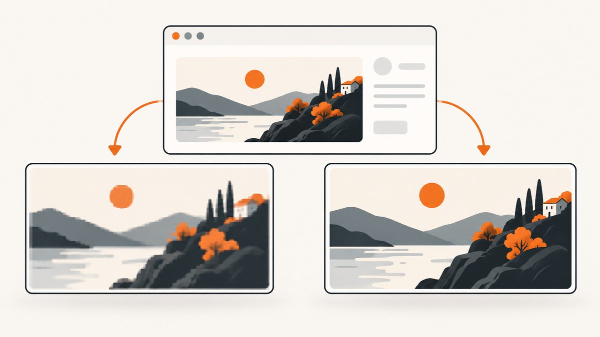
Use Playwright’s scale option to choose the pixel grid for a screenshot:
await page.screenshot({ path: 'page.png', scale: 'css' });
await page.screenshot({ path: 'page-hires.png', scale: 'device' });
scale: 'css' creates one output pixel for each CSS pixel. scale: 'device' creates one output pixel for each device pixel. Page and Locator screenshot calls default to device; screenshot assertions use css by default. Set the value explicitly whenever dimensions, file size, or visual comparison must be predictable.
What screenshot scale controls
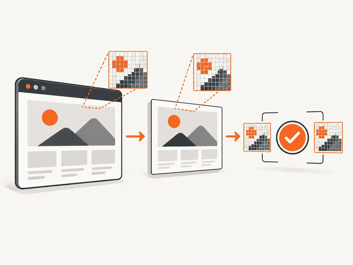
A web page has a layout coordinate system measured in CSS pixels. The browser can also render those CSS pixels onto a denser physical pixel grid, represented by the device scale factor (DPR). Playwright’s screenshot scale decides which grid is written to the image.
| Setting | Output pixel rule | Typical use |
|---|---|---|
scale: 'css' |
One image pixel per CSS pixel | Stable dimensions, smaller files, documentation, thumbnails, ordinary visual diffs |
scale: 'device' |
One image pixel per device pixel | High-density output, retina assets, preserving the browser’s rendered detail |
With a device scale factor greater than 1, a device-scale screenshot can be twice as wide and twice as tall as the CSS layout, producing roughly four times as many pixels. That is an illustration of the relationship, not a universal file-size guarantee: compression, content, and browser configuration also affect the result.
The Playwright Page API documents both values and the device default for page.screenshot(). The Locator API documents the same default for locator.screenshot().
Set the scale for a full-page screenshot
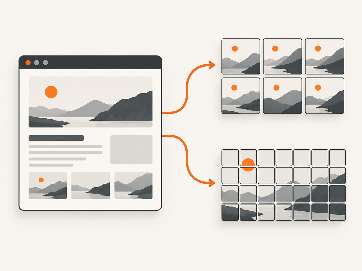
Pass scale in the screenshot options object. The rest of the screenshot options, such as fullPage, clip, type, and quality, continue to work normally.
import { chromium } from 'playwright';

const browser = await chromium.launch();
const page = await browser.newPage({
  viewport: { width: 1440, height: 900 },
  deviceScaleFactor: 2
});

await page.goto('https://example.com', { waitUntil: 'networkidle' });

// CSS-pixel output: dimensions follow the page's CSS layout.
await page.screenshot({
  path: 'example-css.png',
  fullPage: true,
  scale: 'css'
});

// Device-pixel output: preserves the emulated DPR's denser grid.
await page.screenshot({
  path: 'example-device.png',
  fullPage: true,
  scale: 'device'
});

await browser.close();
Use scale: 'css' when another system expects the viewport or element dimensions in CSS pixels. Use device when the image is itself a high-density asset and the receiving system can handle larger dimensions.
Capture an element at a chosen scale
Element screenshots use a Locator. The Locator API’s screenshot method also defaults to device, so make the choice explicit for repeatable output.
const card = page.locator('.pricing-card').first();
await card.waitFor({ state: 'visible' });

await card.screenshot({
  path: 'card-css.png',
  scale: 'css',
  animations: 'disabled'
});

await card.screenshot({
  path: 'card-device.png',
  scale: 'device'
});
Locator screenshots are clipped to the element’s bounding box. If the element changes size because fonts, animations, or responsive rules have not settled, scale is not the root cause. Wait for the final state and use a fixed viewport before comparing files.
Scale and deviceScaleFactor are different settings
deviceScaleFactor configures the emulated device pixel ratio. Screenshot scale selects whether the encoded image uses CSS pixels or device pixels. Changing one does not silently change the other.
const page = await browser.newPage({
  viewport: { width: 1280, height: 720 },
  deviceScaleFactor: 2
});

// DPR is 2, but this output uses one pixel per CSS pixel.
await page.screenshot({ path: 'layout-sized.png', scale: 'css' });

// Same page and DPR, encoded on the device-pixel grid.
await page.screenshot({ path: 'retina-sized.png', scale: 'device' });
Playwright documents deviceScaleFactor as a browser context setting whose default is 1. See the Browser API and TestOptions API for the emulation setting. If an image is unexpectedly large, inspect both the context’s DPR and the screenshot’s scale.
Screenshot assertions use a different default
Visual assertions are intentionally configured separately. Playwright’s screenshot assertions default to css, even though Page and Locator screenshot methods default to device. This difference can produce confusing failures when a baseline was generated with one grid and compared with another.
import { test, expect } from '@playwright/test';

test('pricing page visual check', async ({ page }) => {
  await page.goto('https://example.com/pricing');

  await expect(page).toHaveScreenshot('pricing.png', {
    scale: 'css'
  });

  await expect(page.locator('.pricing-card')).toHaveScreenshot('card.png', {
    scale: 'device'
  });
});
Choose one policy for baselines and keep it in the test suite. If production captures use device but assertions use css, the images can have different dimensions despite identical page layout.
The PageAssertions API documents the assertion default, and Playwright’s test configuration documentation describes the corresponding test screenshot settings.
Configure screenshot scale in Playwright Test
For a suite, set the screenshot scale in the project or use it on each assertion. An explicit per-assertion value is easiest to audit when a project contains both CSS-sized and retina-sized expectations.
import { defineConfig } from '@playwright/test';

export default defineConfig({
  expect: {
    toHaveScreenshot: {
      scale: 'css'
    }
  },
  use: {
    viewport: { width: 1440, height: 900 },
    deviceScaleFactor: 1
  }
});
Keep the viewport, browser, fonts, color scheme, and DPR stable as well. Scale only selects the image grid; it cannot make two otherwise different rendering environments identical.
How scale interacts with other screenshot options
fullPage
fullPage: true extends the capture through the page’s scrollable content. CSS scale keeps the output width tied to the CSS layout width; device scale multiplies it by the effective DPR. Very tall pages can create large images in either mode, with device scale increasing memory and transfer requirements.
clip and element screenshots
A clip rectangle is specified in CSS pixels. The selected scale determines how that rectangle is encoded. Validate the resulting image dimensions rather than assuming the clip width equals the file width.
type and quality
Scale affects pixel count. PNG is lossless and can become large at device scale; JPEG and WebP can reduce transfer size, with quality controlling compression where supported. Compression does not change the CSS-versus-device pixel decision.
Animations and transitions
Animations can change geometry between captures and make scale-related comparisons look inconsistent. Disable them for visual tests or wait for a deterministic state:
await page.screenshot({
  path: 'stable.png',
  scale: 'css',
  animations: 'disabled'
});
Fonts and lazy content
Wait for fonts and content that changes layout before capturing. A different font fallback changes CSS dimensions, while scale merely determines how those dimensions map to image pixels.
Choosing CSS or device scale
| Requirement | Recommended choice | Reason |
|---|---|---|
| Snapshot should match CSS layout measurements | css |
Output dimensions remain tied to CSS pixels. |
| Keep visual-test baselines compact and portable | css |
Fewer pixels reduce storage and diff cost. |
| Deliver a retina image for a design handoff | device |
Retains the device-pixel grid. |
| Compare captures from mixed environments | Explicitly choose one value | Defaults and DPR can otherwise differ. |
There is no universally better value. Decide based on the consumer of the file, then set it explicitly in both capture and assertion code.
Common errors and fixes
“My screenshot is twice as large”
Cause: Page or Locator capture defaults to device, and the context uses a DPR above 1.
Fix: Pass scale: 'css', or deliberately keep device and account for the larger dimensions. Also inspect deviceScaleFactor.
“The baseline dimensions do not match”
Cause: A baseline was generated by a Page screenshot with device, while an assertion uses its css default, or the reverse.
Fix: Set scale explicitly on the assertion and regenerate baselines under the same browser, viewport, DPR, and font environment.
“Changing scale changed the layout”
Cause: The viewport, DPR, responsive breakpoint, or browser context changed at the same time. Scale itself selects output pixels and does not change CSS layout.
Fix: Keep context settings fixed and compare the same page state. Configure deviceScaleFactor separately from screenshot scale.
“The file is too large or capture runs out of memory”
Cause: A full-page device-scale image contains many more pixels, especially on long pages.
Fix: Use CSS scale for the required dimensions, capture a smaller clip or element, choose WebP or JPEG where lossless output is unnecessary, and avoid capturing an unnecessarily tall page.
“The element screenshot is unstable”
Cause: The element is moving, not yet visible, or changing size as fonts and images load.
Fix: Wait for visibility and the final content, disable animations, and use a fixed viewport. Scale should be the last variable you change.
Performance, reliability, and cost considerations
CSS scale generally reduces the number of pixels that Playwright must encode, write, compare, and store. Device scale preserves more raster detail but can increase memory use, PNG size, upload time, and visual-diff work. Measure the dimensions and byte size that your pipeline actually needs rather than selecting device scale by default.
For reliable automation:
- Set
viewport,deviceScaleFactor, andscaleexplicitly. - Use one browser version and a consistent operating-system font set for baselines.
- Wait for network and layout stability before capture.
- Use CSS scale when downstream systems compare against CSS dimensions.
- Keep device scale for deliverables where physical pixel density is a requirement.
- Store the scale policy beside the test configuration so future baseline updates are intentional.
Or skip the browser setup
If you need a rendered image from a URL rather than browser-level control, ScreenshotNeo provides a single screenshot API request. Its output options include PNG, JPEG, and WebP, plus viewport and retina scale controls; the service also supports full-page captures, element selectors, custom CSS and JavaScript, waiting rules, and device presets.
cURL:
curl -G "https://api.screenshotneo.com/v1/shot" -d access_key=YOUR_API_KEY --data-urlencode url=https://stripe.com -o shot.webpPython:
import requests

r = requests.get(
    "https://api.screenshotneo.com/v1/shot",
    params={"access_key": "YOUR_API_KEY", "url": "https://stripe.com"},
    timeout=90,
)
r.raise_for_status()
open("shot.webp", "wb").write(r.content)
Node.js:
const q = new URLSearchParams({ access_key: 'YOUR_API_KEY', url: 'https://stripe.com' });
const res = await fetch(`https://api.screenshotneo.com/v1/shot?${q}`);
if (!res.ok) throw new Error(`Screenshot failed: ${res.status}`);
const image = Buffer.from(await res.arrayBuffer());
await import('node:fs/promises').then(fs => fs.writeFile('shot.webp', image));
See the ScreenshotNeo API documentation for the complete parameter list. Cookie and consent banners, newsletter popups, and chat widgets are removed before the shot; each cleanup step can be disabled. Bot checks, blank pages, timeouts, failed loads, and cache hits are not billed, and response headers identify the page verdict and billing result. ScreenshotNeo also offers an MCP server with take_screenshot, get_page_info, and capture_pdf tools for Claude, Cursor, and other MCP clients. The Free plan includes 1,000 screenshots each month with no card; paid plans start at $5 for 3,000 screenshots.
Start with 1,000 free screenshots a month—no card required.
FAQ
Does scale: 'css' change the viewport?
No. It changes the pixel grid used for the encoded screenshot. The viewport and layout remain controlled by the browser context and page settings.
Which scale should I use for visual regression?
Use CSS scale when you want compact, layout-sized baselines. The key requirement is consistency: use the same explicit scale when generating and asserting screenshots.
Can I use a fractional scale?
No. Playwright’s screenshot scale option accepts 'css' or 'device'. Use viewport and device emulation settings for other rendering scenarios.
Why do assertions default to CSS?
Screenshot assertions and test configuration have their own documented default of css. Page and Locator screenshot methods default to device, so explicit configuration prevents surprises.
Is device scale always sharper?
It preserves more device-grid pixels when the emulated DPR is high, but perceived sharpness also depends on the page, fonts, browser, compression, and the display where the image is viewed.
How do I make a predictable API thumbnail?
Render at a fixed viewport and choose CSS-sized output, then resize or encode to the thumbnail dimensions required by your consumer. For URL-based captures, ScreenshotNeo can apply viewport, scale, resizing, caching, and output-format options through its API.


