How to Post an Image in HTML
Learn the correct HTML image tag, alt text, sizing, responsive images, lazy loading, troubleshooting, and a browser-free ScreenshotNeo option.
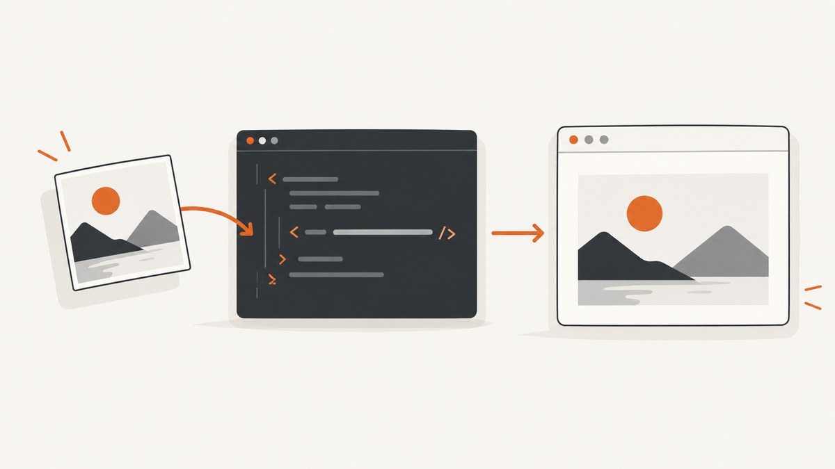
Use the void <img> element with a src URL. A minimal image in HTML is:
<img src="photo.jpg" alt="A red bicycle leaning against a wall">The WHATWG HTML Standard specifies the img element and its src attribute for embedding a single image. The element has no closing tag.
1. Add an image with img and src
Create an HTML file and place the image where it should appear in the document:
<!doctype html>
<html lang="en">
<head>
  <meta charset="utf-8">
  <title>Image example</title>
</head>
<body>
  <h1>Our bicycle</h1>
  <img src="photo.jpg" alt="A red bicycle leaning against a wall">
</body>
</html>
The src value can be a relative path such as images/photo.jpg or an absolute HTTP(S) URL:
<img src="https://example.com/images/photo.jpg" alt="A red bicycle leaning against a wall">Relative URLs are resolved from the URL of the current HTML page. If the page is https://example.com/gallery/index.html, then images/photo.jpg means https://example.com/gallery/images/photo.jpg.
2. Put the image file at a reachable URL
The browser fetches the HTML document and the image resource separately. A working tag is not enough if the file is missing, the path uses the wrong letter case, or the server does not return the image.
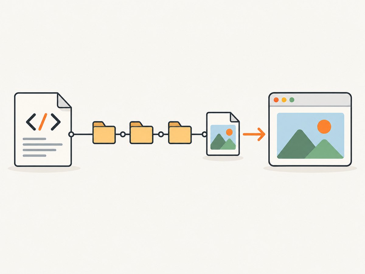
- Save the file in your project, for example
public/images/photo.jpg. - Use the URL that your server exposes, such as
/images/photo.jpg. - Open that image URL directly in a browser and confirm it loads.
- Deploy both the HTML page and the image to the same environment.
On case-sensitive servers, Photo.jpg and photo.jpg are different files. Avoid spaces and unusual punctuation in filenames, or URL-encode them correctly.
3. Write useful alt text
alt is the text alternative used when someone cannot see the image or when the image fails to load. Describe the image’s meaning in the context of the page:
<img src="team.jpg" alt="The support team standing outside the office">For a decorative image that adds no information, use an empty value:
<img src="swirl.svg" alt="">Do not put a filename, “image,” or a long visual inventory in alt. If nearby text already provides the same information, an empty alt can prevent repetition for screen-reader users.
4. Reserve space with width and height
When you know the intrinsic dimensions, include both attributes:
<img
  src="photo.jpg"
  alt="A red bicycle leaning against a wall"
  width="1200"
  height="800">
These attributes let the browser calculate the aspect ratio and reserve layout space before the image downloads, reducing layout movement. They do not prevent responsive rendering. A common CSS rule is:
img {
  max-width: 100%;
  height: auto;
}
Keep the width-to-height ratio consistent with the actual file. Incorrect values can distort the image or cause a visible jump when it loads.
5. Serve responsive image sizes
For a page viewed on phones, tablets, and large screens, provide several files with srcset and tell the browser how wide the image will render with sizes:
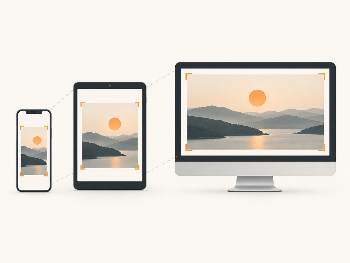
<img
  src="photo-800.jpg"
  srcset="photo-400.jpg 400w, photo-800.jpg 800w, photo-1600.jpg 1600w"
  sizes="(max-width: 600px) 100vw, 800px"
  width="1600"
  height="1067"
  alt="A red bicycle leaning against a wall">
The browser chooses an appropriate candidate based on the viewport and device pixel density. The src value remains a fallback.
Use density descriptors when you have alternatives for the same rendered size:
<img
  src="logo.png"
  srcset="logo.png 1x, logo@2x.png 2x"
  width="240"
  height="80"
  alt="Acme logo">
Use sizes that match your CSS layout. If an image occupies the full viewport on small screens and 800 CSS pixels on larger screens, (max-width: 600px) 100vw, 800px communicates that rule.
6. Choose formats and art direction with picture
Use picture when you need different formats, crops, or media-specific sources. Keep a normal img as the fallback and put the accessible alt on it:
<picture>
  <source srcset="photo.avif" type="image/avif">
  <source srcset="photo.webp" type="image/webp">
  <img
    src="photo.jpg"
    width="1200"
    height="800"
    alt="A red bicycle leaning against a wall">
</picture>
For art direction, select a different crop at a breakpoint:
<picture>
  <source media="(max-width: 600px)" srcset="bicycle-portrait.jpg">
  <img
    src="bicycle-landscape.jpg"
    width="1600"
    height="900"
    alt="A red bicycle leaning against a wall">
</picture>
The browser evaluates matching source elements and uses the fallback img when needed.
7. Control loading and presentation
For images below the initial viewport, loading="lazy" defers fetching until the browser approaches them:
<img
  src="gallery-04.jpg"
  width="1200"
  height="800"
  loading="lazy"
  alt="A mountain trail beside a lake">
Do not lazily load the main above-the-fold image unless you have a specific reason. Keep dimensions on lazy images so the page reserves their space.
Use decoding="async" when you want to allow image decoding without blocking other rendering work:
<img
  src="photo.jpg"
  width="1200"
  height="800"
  decoding="async"
  alt="A red bicycle leaning against a wall">
These attributes affect fetching and decoding; they do not replace compression, caching, or an appropriate image size.
8. Troubleshoot images that do not appear
| Symptom | Likely cause | Fix |
|---|---|---|
| Broken-image icon | Wrong relative path or filename | Open the exact src URL directly and correct the path. Check capitalization. |
| 404 in the Network panel | The server cannot find the resource | Move the file into the published directory or change src to the deployed URL. |
| 403 or access denied | Permissions, hotlink protection, or authentication | Allow the page to fetch the resource, or serve the image from an authorized URL. |
| Image loads locally but not after deployment | Different base URL, build output, or case-sensitive filesystem | Inspect the deployed HTML and request URL, then include the asset in the production build. |
| Image is stretched | Incorrect dimensions or CSS | Use the real intrinsic ratio and set height: auto. |
| Layout jumps while loading | No dimensions or incorrect aspect ratio | Add accurate width and height attributes. |
| Lazy image never appears | Invalid URL, script interference, or an element hidden by CSS | Remove lazy loading temporarily, inspect the request and computed styles, and verify the URL. |
| Remote image blocked | Content Security Policy or cross-origin rules | Permit the image origin in img-src and confirm the server returns an image response. |
Use your browser’s Network panel to check the request status, response headers, and actual URL. The Console often identifies CSP, mixed-content, or decoding errors. An HTTPS page should not load an HTTP image because browsers can block mixed content.
9. Accessibility, performance, and rights checklist
- Use meaningful
alttext for informative images andalt=""for decorative ones. - Set accurate
widthandheightvalues to reserve layout space. - Use
srcsetandsizeswhen the same image is displayed at materially different sizes. - Use
picturefor format switching or different crops, with animgfallback. - Use
loading="lazy"for below-the-fold images, not as a substitute for choosing the right file size. - Serve an image format and compression level appropriate for the content and browsers you support.
- Confirm that the image license permits your intended publication, modification, and distribution. Preserve required attribution.
10. Or skip the browser setup
If you need to post screenshots of webpages rather than host hand-selected files, ScreenshotNeo returns a PNG, JPEG, WebP, or PDF from one GET request. Its capture flow accepts cookie or consent banners and removes more than 60 known consent platforms, newsletter popups, and chat widgets before the shot; each step can be turned off.
Only clean shots are billed. Bot checks or CAPTCHAs, blank pages, timeouts, failed loads, and cache hits cost nothing, and the response identifies the result with X-Page-Verdict and X-Billed headers.
See the ScreenshotNeo API documentation for all options, including full-page and element capture, device presets, custom CSS and JavaScript, waits, blocking rules, cookies, headers, caching, signed links, asynchronous jobs, bulk capture, and PDF settings.
cURL
curl -G "https://api.screenshotneo.com/v1/shot" \
  -d access_key=YOUR_API_KEY \
  --data-urlencode url=https://stripe.com \
  -o shot.webp
Python
import requests

r = requests.get(
    "https://api.screenshotneo.com/v1/shot",
    params={"access_key": "YOUR_API_KEY", "url": "https://stripe.com"},
    timeout=90,
)
r.raise_for_status()
open("shot.webp", "wb").write(r.content)
Node.js
const q = new URLSearchParams({
  access_key: 'YOUR_API_KEY',
  url: 'https://stripe.com'
});
const res = await fetch(`https://api.screenshotneo.com/v1/shot?${q}`);
if (!res.ok) throw new Error(`Screenshot failed: ${res.status}`);
require('fs').writeFileSync('shot.webp', Buffer.from(await res.arrayBuffer()));
ScreenshotNeo also provides an MCP server with take_screenshot, get_page_info, and capture_pdf tools for Claude, Cursor, and other MCP clients. There are 1,000 free shots each month with no card; paid plans start at $5 for 3,000 shots. Create a free ScreenshotNeo account.
11. FAQ
What tag displays an image?
The <img> element displays an image. It uses src for the resource URL and should include an appropriate alt value.
Can I close an img element?
No. img is a void element, so write <img> without </img>.
Should I use a relative or absolute URL?
Use a relative URL for an image deployed with your site and an absolute HTTPS URL for a resource hosted elsewhere. The chosen URL must be reachable by the browser.
Why do both width and height matter?
They let the browser reserve the correct aspect-ratio space before downloading the image, which helps prevent layout shift.
When should I use picture instead of img?
Use picture when you need format switching or different crops. For one source, a plain img with src is sufficient.


