How to Prevent wkhtmltopdf Tables From Overflowing Horizontally Across Pages
Fix wkhtmltopdf tables cut off on the right by checking page width, table CSS, responsive wrappers, pagination, and renderer options.
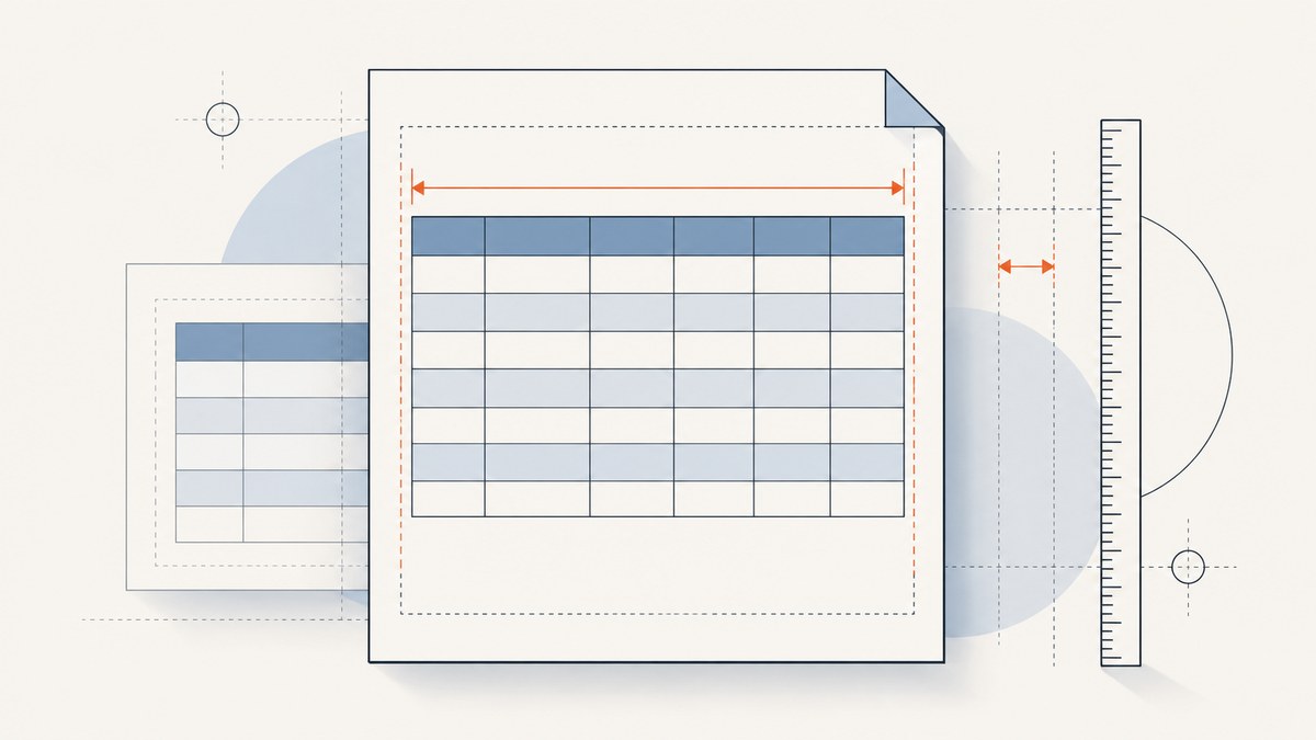
Short answer: calculate the printable width created by your wkhtmltopdf page size, orientation and margins, then compare it with the table’s real rendered width. Remove fixed widths and unbreakable content that exceed that space. If the table sits inside a responsive scrolling wrapper, test a print rule that exposes overflow. Finally, inspect every page with the same wkhtmltopdf binary and options used in production.
Horizontal clipping usually has one of three causes: the page is narrower than the table, CSS gives the table or one of its parents an intrinsic width that cannot shrink, or a responsive wrapper keeps horizontal scrolling enabled during PDF rendering. Pagination problems such as repeated-header overlap are related but separate symptoms. Diagnose width first, then fragmentation.
1. Measure the printable width before changing CSS
wkhtmltopdf documents A4 as the default page size: “The default page size of the rendered document is A4.” The same manual documents --page-size, --page-width, --page-height, --orientation, --margin-left and --margin-right. Read the official usage manual for the exact syntax supported by your build.
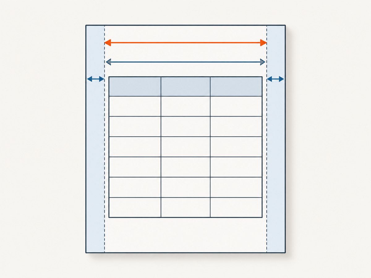
Use this calculation:
printable width = page width - left margin - right marginFor a standard A4 portrait page, the physical width is 210 mm. Your usable width is smaller after margins, and CSS pixels are converted to physical units by the renderer. Do not assume that a table set to width: 100% will fit if a child cell contains a long URL, a fixed-width image, or a parent with a larger minimum width.
| Question | What to inspect | What a finding means |
|---|---|---|
| Is the page wide enough? | Paper size, orientation, custom width and both horizontal margins | A geometry problem may be clipping the entire table |
| What is the table’s actual width? | width, min-width, fixed columns, padding and borders |
Intrinsic content may prevent shrinking |
| Does a parent scroll? | Responsive wrappers and overflow-x |
The wrapper may preserve screen behavior in the PDF |
| Is only one column wide? | URLs, IDs, code, images and non-breaking spaces | One unbreakable value can set the table’s minimum width |
2. Record the exact renderer and create a small reproduction
Before debugging, save the command output from:
wkhtmltopdf --versionAlso record the operating system, whether the binary reports patched Qt, the complete command line, and the HTML/CSS/JavaScript used to generate the PDF. The project support page asks reporters for “A detailed description of the issue, along with a test case (HTML/CSS/JS) to duplicate the issue.” A small reproduction prevents unrelated framework styles from hiding the real cause.
The wkhtmltopdf repository was archived on January 2, 2023. That does not prove that every package or fork is unusable, but it does mean that build details matter when you compare results or investigate a renderer-specific bug. Record the binary path and package version in your deployment notes.
3. Test page geometry deliberately
Use geometry changes as diagnostic experiments. If landscape or a wider custom page makes the table fit immediately, the primary constraint is available width. You can then decide whether the document should remain landscape or whether the table should become more compact.
# A4 portrait with explicit margins
wkhtmltopdf \
  --page-size A4 \
  --orientation Portrait \
  --margin-left 12mm \
  --margin-right 12mm \
  input.html output.pdf

# Diagnostic landscape render
wkhtmltopdf \
  --page-size A4 \
  --orientation Landscape \
  --margin-left 10mm \
  --margin-right 10mm \
  input.html output-landscape.pdf

# Custom page width when the document requires it
wkhtmltopdf \
  --page-width 320mm \
  --page-height 210mm \
  --margin-left 8mm \
  --margin-right 8mm \
  input.html output-wide.pdf
Reducing margins increases usable width, but preserve enough space for the document’s visual requirements and any printer-safe area. The manual also documents smart shrinking. Test it explicitly when diagnosing a layout, because a change in shrinking behavior can alter text size and column widths across the entire document.
4. Make the table capable of shrinking
Inspect the table and every ancestor for fixed dimensions. Common width traps include min-width on the table or a column, a fixed-width image, large horizontal cell padding, a flex child that refuses to shrink, and strings containing no break opportunities.
Start with a focused print stylesheet:
@media print {
  .report-table {
    width: 100%;
    max-width: 100%;
    table-layout: fixed;
    border-collapse: collapse;
  }

  .report-table th,
  .report-table td {
    padding: 4px 6px;
    overflow-wrap: anywhere;
    word-break: break-word;
  }

  .report-table img,
  .report-table svg {
    max-width: 100%;
    height: auto;
  }
}
table-layout: fixed makes column allocation predictable when the table has a defined width. It can cause long values to wrap more aggressively, so apply it only when that trade-off is acceptable. If a particular column must remain readable, assign explicit percentage widths that add up to 100 percent and allow the remaining columns to absorb changes.
For URLs, hashes and identifiers, use a deliberate wrapping policy. For code where visual integrity matters more than compactness, consider shortening the displayed value and putting the complete value in a note or a second line. Do not rely on a browser’s screen layout to decide how a PDF should handle an unbroken token.
5. Check responsive wrappers and print overflow
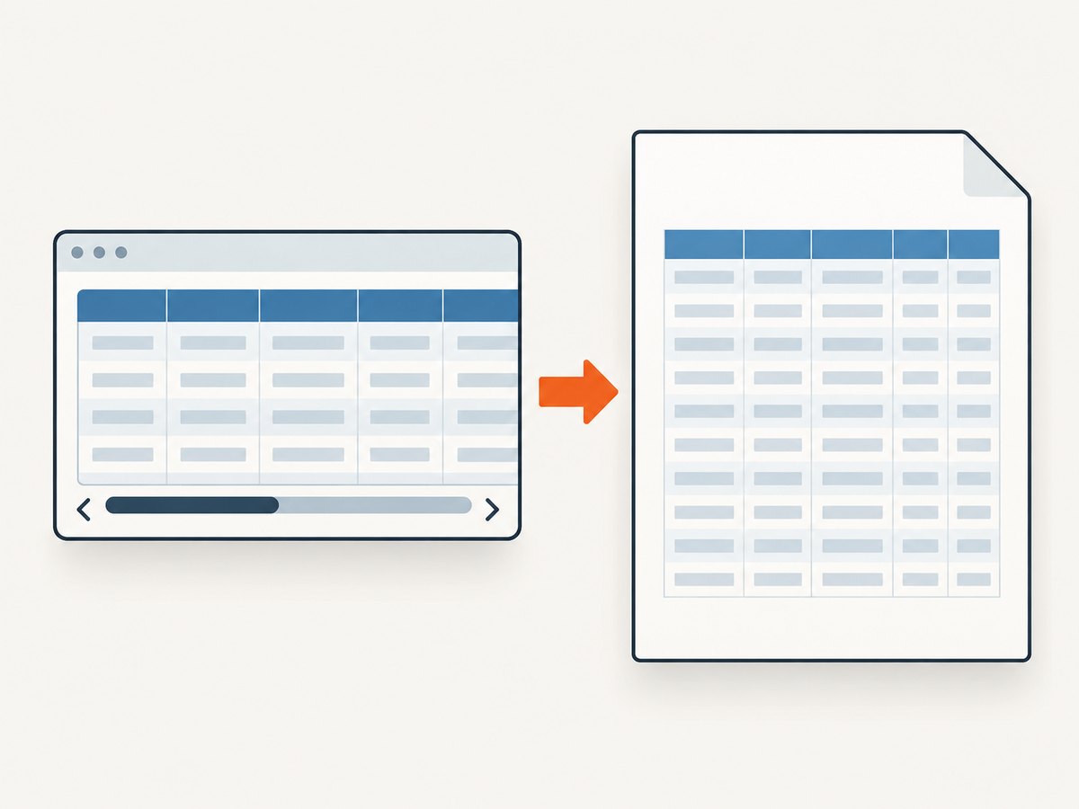
Many CSS frameworks place tables inside a wrapper such as .table-responsive with overflow-x: auto. A wkhtmltopdf issue discussion includes this reported print workaround:
@media print {
  .table-responsive {
    overflow-x: visible !important;
  }
}
This is an anecdotal issue comment, not a universal compatibility guarantee. Add the rule only after confirming that the wrapper is involved. If the wrapper is not the cause, changing it can make other content spill outside the page.
Inspect flex and grid parents too. One issue report describes a flex container affecting page-break behavior and reports that switching the container to display: block in print CSS helped that case. Test the smallest possible override:
@media print {
  .table-shell {
    display: block;
    width: 100%;
    min-width: 0;
  }
}
Keep screen scrolling and print layout as separate concerns. A wrapper that is useful in an interactive browser can be the element that clips the PDF.
6. Treat pagination and horizontal overflow as separate defects
If columns fit on the first page but later pages show repeated-header overlap, blank gaps or rows split unexpectedly, isolate that issue from width debugging. A commonly reported print pattern is:
@media print {
  table { page-break-inside: auto; }
  tr { page-break-inside: avoid; page-break-after: auto; }
  thead { display: table-header-group; }
}
Issue reports show that this pattern was tried while unexpected spacing and header-only pages still occurred. It is a testable starting point, not a guaranteed fix. A separate report describes header text overlapping content on later pages. Validate the generated PDF visually at every page transition, especially when the table contains tall rows, nested blocks or row-spanning cells.
7. A repeatable troubleshooting workflow
- Freeze the environment. Save
wkhtmltopdf --version, operating system, Qt build information and the production command. - Render a minimal table. Remove application CSS and JavaScript until only the failing structure and relevant styles remain.
- Measure geometry. Compare page width minus margins with the table’s computed width.
- Remove hard constraints. Temporarily disable
min-width, fixed pixel widths, oversized padding and fixed-width media. - Test unbreakable content. Replace long URLs, IDs and code strings with short placeholders. If the table now fits, add a wrapping or display policy for those values.
- Test the wrapper. Inspect
overflow-x, flex and grid ancestors. Apply the print override only to the implicated wrapper. - Test orientation or width. Render landscape or a custom page width to confirm whether geometry is the limiting factor.
- Validate all pages. Check the right edge, repeated headers, row splits and blank pages using the same binary and options as production.
8. Common errors and fixes
| Symptom | Likely cause | Fix to test |
|---|---|---|
| Rightmost columns disappear | Printable width is smaller than the table | Check margins and orientation; remove fixed widths or use landscape |
| Only a long URL forces overflow | No legal line-break opportunity | Use overflow-wrap: anywhere, shorten the display value or move details to a note |
| Table is clipped inside a framework layout | Responsive wrapper has horizontal scrolling | Confirm the wrapper and test overflow-x: visible in print CSS |
| Table fits alone but not in the page template | Parent flex/grid or inherited min-width |
Set the print parent to block, width: 100% and min-width: 0 |
| Headers overlap rows on later pages | Table fragmentation or repeated-header bug | Separate pagination debugging from width; test header display and row break rules |
| Landscape fixes it but text becomes too small | Renderer shrinking or too many columns | Use explicit column widths, reduce padding, split the table or choose a custom page width |
| Different servers produce different PDFs | Different wkhtmltopdf builds, Qt patches, fonts or options | Pin the binary and fonts; compare complete command lines |
9. Performance, reliability and maintenance notes
Large tables take longer to render when they contain images, web fonts, JavaScript or many pages. Keep the reproduction small while debugging, then measure the production template with the same assets. Avoid changing several geometry and CSS variables at once; otherwise you cannot tell which change removed the overflow.
For reliable output, pin the wkhtmltopdf version and operating-system image, make fonts available locally, and keep a fixture HTML file that exercises wide columns, long tokens, images and multi-page headers. Compare generated PDFs after upgrades. Because the upstream repository is archived, document any package source or maintained fork used by your deployment.
There is no universal CSS declaration that fixes every overflow case. The lowest-cost fix is usually removing an accidental width constraint or correcting a print wrapper. A wider paper size, custom page width or a split table may be the right choice when all columns must remain readable. Record the chosen geometry in the command line so future template changes do not silently reduce the available width.
Or skip the browser setup
If your goal is a clean screenshot or PDF of a page rather than maintaining a wkhtmltopdf pipeline, ScreenshotNeo provides a single HTTP request to capture a URL as PNG, JPEG, WebP or PDF. It handles cookie and consent banners before capture and removes more than 60 known consent platforms, newsletter popups and chat widgets. Each step can be disabled.
Only clean shots are billed. Bot checks, CAPTCHAs, blank pages, timeouts, failed loads and cache hits cost nothing, and the response identifies the result with X-Page-Verdict and X-Billed headers. ScreenshotNeo also offers an MCP server with take_screenshot, get_page_info and capture_pdf tools for Claude, Cursor and other MCP clients.
See the ScreenshotNeo API documentation for all options, including full-page capture, element selectors, device presets, custom viewports, retina scale, PDF paper size and margins, custom CSS and JavaScript, waits, request blocking, headers, cookies, user agents, timezone, geolocation, transparent backgrounds, resizing, caching, signed links, asynchronous jobs, bulk capture and usage reporting.
cURL
curl -G "https://api.screenshotneo.com/v1/shot" -d access_key=YOUR_API_KEY --data-urlencode url=https://stripe.com -o shot.webpPython
import requests

r = requests.get(
    "https://api.screenshotneo.com/v1/shot",
    params={"access_key": "YOUR_API_KEY", "url": "https://stripe.com"},
    timeout=90,
)
r.raise_for_status()
open("shot.webp", "wb").write(r.content)
Node.js
const q = new URLSearchParams({ access_key: 'YOUR_API_KEY', url: 'https://stripe.com' });
const res = await fetch(`https://api.screenshotneo.com/v1/shot?${q}`);
if (!res.ok) throw new Error(`HTTP ${res.status}`);
const data = Buffer.from(await res.arrayBuffer());
await import('node:fs/promises').then(fs => fs.writeFile('shot.webp', data));
The Free plan includes 1,000 screenshots each month with no card. Paid plans start at $5 for 3,000 shots; every feature is available on every plan. Create a free ScreenshotNeo account to try the API.
FAQ
Should I always use landscape?
No. Use landscape as a diagnostic and keep it only if the wider printable area matches the document’s purpose. Otherwise compact the table or split it into readable sections.
Does width: 100% guarantee a table will fit?
No. A child with fixed width, a parent with min-width, an oversized image or an unbreakable string can make the table’s intrinsic width larger than its parent.
Why does the first page fit while later pages fail?
That often indicates pagination or repeated-header behavior rather than a simple page-width problem. Inspect page transitions separately from the right edge of the table.
Is the responsive-wrapper override safe everywhere?
No. It was reported as a workaround for one issue. Confirm that the specific wrapper clips your table, then validate the full document after changing its print overflow.
What should I include in a bug report?
Include the exact version, operating system, Qt/build details, complete command, minimal HTML/CSS/JavaScript reproduction and the generated PDF showing the failure.