How to Preview HTML in a Browser Like wkhtmltopdf Renders It
Match your browser preview to wkhtmltopdf’s viewport, media mode, paper, margins, and JavaScript timing—then verify with the actual renderer.
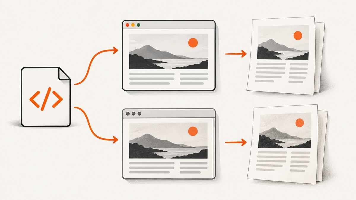
Short answer: serve the HTML locally, set your browser viewport to wkhtmltopdf’s configured viewport width, match the PDF’s page size, orientation, margins, zoom, and media mode, then compare the result with the exact wkhtmltopdf binary used in production. A Chrome preview is useful for catching layout problems, but it cannot guarantee pixel-for-pixel output: wkhtmltopdf uses Qt WebKit, while current Chrome uses a different rendering engine. The original project describes wkhtmltopdf as a headless command-line tool that renders HTML into PDF using Qt WebKit. Project documentation.
1. Why a browser preview can differ
“Preview in a browser” usually means Chrome, Firefox, or Safari. wkhtmltopdf instead lays out the page with the Qt WebKit engine bundled with the binary you run. Matching the input HTML alone is not enough: engine support, available fonts, screen width, media mode, paper geometry, JavaScript state, and resource loading all affect the result.
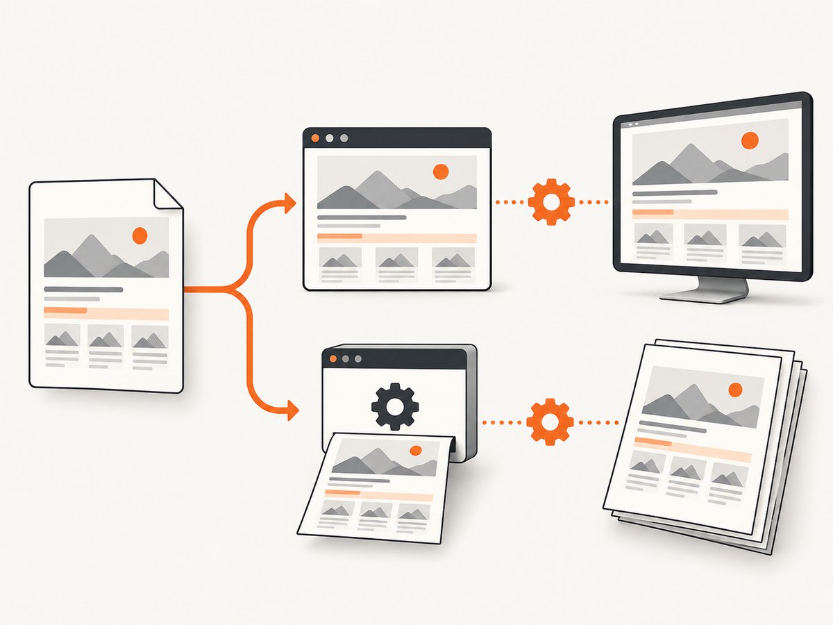
Think of a browser preview as a fast approximation of layout. Use it to inspect line wrapping, responsive breakpoints, overflowing elements, and loaded assets. Use wkhtmltopdf itself for final acceptance. The compatibility documentation for the 0.12.6 build it discusses warns about missing flexbox, grid, and other newer CSS. Treat that as a version-specific warning, not a promise about every vendor-patched binary; check your installed version and test the CSS your document relies on.
2. Inspect the exact conversion command
Before opening DevTools, find the full production command and identify the settings that affect layout. Defaults and wrappers can hide important differences. Start by checking the installed binary:
wkhtmltopdf --version
wkhtmltopdf --extended-help
Record the binary path, version, command-line options, input URL or file, and environment. If production uses a container or a library wrapper, inspect its actual configuration too. wkhtmltopdf’s command-line usage documentation describes the relevant options; consult the version that corresponds to your binary at wkhtmltopdf usage documentation.
| What to match | Where to look | Why it matters |
|---|---|---|
| Viewport width | --viewport-size width; library setting screenWidth |
Changes responsive breakpoints and line wrapping. |
| Media mode | Whether --print-media-type is present |
Default is screen media; the flag selects print media. |
| Paper and orientation | --page-size, --page-width, --page-height, --orientation |
Determines printable page geometry and pagination. |
| Margins | --margin-top, --margin-right, --margin-bottom, --margin-left |
Changes available content width and page breaks. |
| Scale behavior | --zoom and --disable-smart-shrinking |
Can change the effective size of content on paper. |
| Readiness | --javascript-delay, --window-status, --run-script |
Controls when dynamic content is captured. |
The default page size is A4 unless overridden. A viewport-size option is not the same thing as paper size: the viewport affects the WebKit layout width; paper dimensions and margins govern how that laid-out content is cut into pages. wkhtmltopdf lays out a long page and paginates it, so small changes to width or scale can move later content across page boundaries.
3. Serve the HTML on a local HTTP origin
Use a local server when possible. Opening a file directly with file:// can make relative resources, browser security behavior, and JavaScript differ from the converter’s HTTP request. From the directory containing your HTML and assets, run:
python3 -m http.server 8000Then open http://localhost:8000/your-page.html in your browser. Keep the page’s CSS, fonts, images, and scripts in the same relative locations. If the page normally requires authentication, cookies, or custom request headers, reproduce that access in the browser preview and the converter. Avoid using a public staging URL for sensitive local content.
4. Match the viewport and page geometry
- Set the layout width. Read the width from
--viewport-size. In browser DevTools, enable device emulation or responsive design mode and enter that width. If no viewport size is configured, determine the effective width in the installed build rather than assuming it equals the PDF paper width. - Match paper size and orientation. Set the browser’s print preview to the same paper size and portrait or landscape orientation, or use the browser’s responsive viewport for a screen-layout comparison and compare pagination separately.
- Match the margins. Use the same top, right, bottom, and left values. Check whether your browser’s print dialog adds its own margins, headers, or footers.
- Match scale behavior. Account for
--zoomand whether smart shrinking is enabled or disabled. These are wkhtmltopdf behaviors; browser print scaling is not guaranteed to be equivalent. Treat visual scale as something to verify in the final PDF. - Inspect the actual content width. Confirm the viewport has not been narrowed by DevTools panels or browser chrome. Compare where long headings and paragraphs wrap, and check for horizontal overflow.
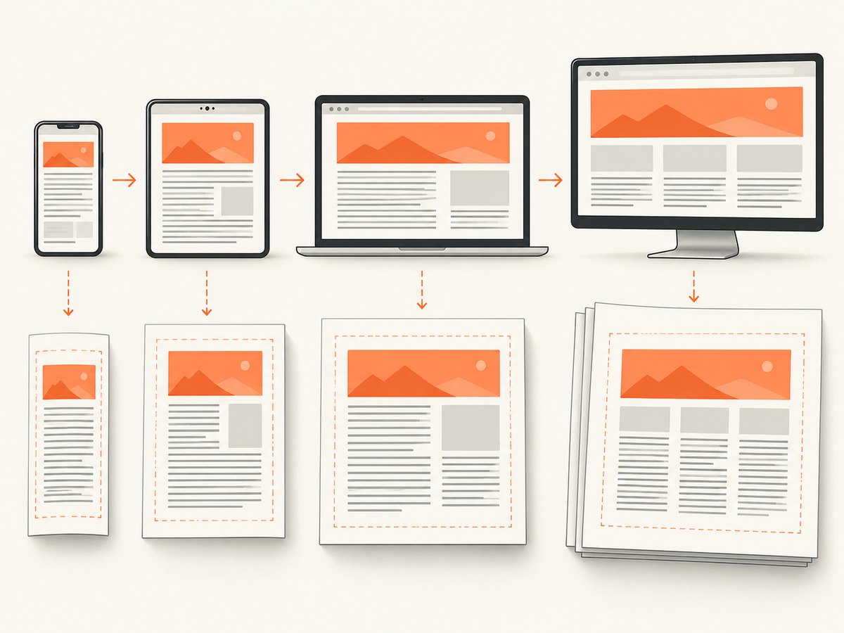
For a first pass, match viewport width in the browser’s responsive view. Then use print preview with equivalent page settings to inspect page boundaries. Do not infer exact PDF pagination from a normal scrolling viewport: the browser’s print engine and wkhtmltopdf’s pagination rules differ.
5. Match screen or print media
wkhtmltopdf uses screen media by default. Add --print-media-type when the conversion should apply print styles. A browser preview must use the same mode: inspect under normal screen rendering for the default wkhtmltopdf case, or switch DevTools’ rendering emulation to print when the conversion command uses the flag. In Chrome DevTools, the setting is available through the Rendering panel’s emulated CSS media type; browser UI names can change by version.
Check stylesheets for @media screen, @media print, and print-specific page rules. A stylesheet that hides navigation in print mode, for example, can make the browser appear substantially different if the media setting does not match. Also confirm that the browser and converter load the same stylesheet URLs; media emulation does not correct missing or blocked assets.
6. Wait for the same JavaScript and assets
Dynamic pages may update after the initial HTML response. Charts, client-rendered data, web fonts, images, and asynchronous API results can arrive at different times. wkhtmltopdf provides readiness controls including --javascript-delay, --window-status, and --run-script. Choose the control already used by your conversion job and make the browser comparison at the same meaningful state.
A fixed delay is simple but can be wasteful and still fail on slow responses. If your page can expose a stable ready marker, the window-status approach can make readiness explicit; verify the exact syntax for your installed version in its help output. Do not use a delay as a substitute for fixing failed network requests. In DevTools, inspect the Console and Network panels for errors, pending requests, blocked fonts, and API failures before judging layout.
7. Compare in a repeatable loop
- Save the HTML, CSS, assets, conversion command, and renderer version as a reproducible case.
- Open the local URL and match the viewport, media type, and target content state.
- Inspect line breaks, element dimensions, overflow, font loading, image sizes, and visible page-break locations.
- Render the same input with the production wkhtmltopdf binary and all production options.
- Compare the PDF pages with the browser preview. If they disagree, change one variable at a time: first engine-supported CSS, then viewport and media mode, then fonts and assets, then timing and scale.
- Repeat the final conversion in the same environment used for deployment.
For a concrete baseline, this command uses A4 and the default screen media behavior, with explicit margins and a viewport width. Replace the values with those from your actual job:
wkhtmltopdf \
  --page-size A4 \
  --orientation Portrait \
  --margin-top 10mm \
  --margin-right 10mm \
  --margin-bottom 10mm \
  --margin-left 10mm \
  --viewport-size 1280x900 \
  http://localhost:8000/your-page.html output.pdf
For a print stylesheet comparison, add --print-media-type. If asynchronous content is involved, add the readiness option your page requires, for example --javascript-delay 1000 as a starting diagnostic value—not a universal correct delay. Tune it to the page’s actual readiness behavior. Keep all production flags in the final run.
8. CSS and pagination edge cases
Modern layout features
If flexbox or grid content collapses, overlaps, or wraps differently, the likely cause is engine support. The browser may render correctly while the Qt WebKit build cannot interpret the same CSS. Check the actual binary, then create a simplified reproduction and use layout techniques supported by that build. Do not assume that adding a browser prefix will add an unsupported layout implementation.
Fonts and line wrapping
A fallback font can change glyph widths, line count, and every page break below the affected paragraph. Verify that font files are reachable from the converter, that the URL uses the correct scheme and path, and that the conversion process can access them. Test with a stable system font to isolate font loading from layout problems.
Long tables and page breaks
Pagination is sensitive to content height and printable area. Check table rows near page boundaries, large images, margins, and any explicit break rules. Browser print preview may use different pagination behavior, so use it to locate trouble and use the generated PDF to decide whether a break is acceptable.
Relative URLs and blocked resources
Relative URLs resolve against the document’s origin. A local file opened from another directory or a converter running in a container can resolve assets differently. Serve the page over HTTP, use deliberate paths, and confirm access from the same machine or container as wkhtmltopdf.
9. Troubleshooting
| Symptom | Likely cause | What to do |
|---|---|---|
| Chrome looks right; PDF has a broken layout | Different engine or unsupported CSS | Reduce the page to a small reproduction, check CSS support in the installed Qt WebKit build, and verify with the actual PDF renderer. |
| Text wraps at different words | Viewport width, font, scale, or content differs | Match viewport and zoom settings; verify the same fonts and content are loaded. |
| Navigation appears in one preview only | Screen and print media are mismatched | Check for --print-media-type and set browser media emulation to match. |
| Images or styles are missing | Relative path, access, scheme, or network failure | Serve over HTTP; inspect Network errors; confirm the converter can reach the same resources. |
| Charts or data are blank | Capture occurs before asynchronous rendering finishes | Wait for the application’s ready state; configure the appropriate delay, script, or window status. |
| Later pages drift or content is clipped | Margins, paper geometry, zoom, or smart shrinking differ | Compare all page dimensions and scale options, then render the exact production command. |
| Local preview works but deployment fails | Different binary, fonts, files, network permissions, or environment | Record versions and paths, reproduce in the deployment container, and keep the renderer environment consistent. |
10. Performance, reliability, and cost
For repeated renders, the main practical costs are usually the time spent loading the page and its resources, waiting for JavaScript, and diagnosing output that differs across environments. A shorter fixed delay can make conversion faster but risks capturing incomplete content; a longer delay can waste time on pages that are already ready. Prefer a readiness condition when your page can provide one, and keep network dependencies limited to assets the PDF needs.
For reliability, pin or record the wkhtmltopdf binary and its configuration, run it in a consistent environment, make required assets available, and retain a representative input and output when investigating regressions. Re-run the actual renderer after changing CSS or fonts. A browser-only visual check does not validate the Qt WebKit output.
If the goal is instead to capture a website as an image or PDF without maintaining a browser-rendering setup, ScreenshotNeo is a website screenshot API and MCP server. Its API accepts a URL and returns an image or PDF; it also supports capture controls such as viewport, full-page output, wait conditions, and PDF settings. Its rendering behavior is a separate service, so it is not a substitute for validating a specific wkhtmltopdf binary.
Or skip the browser setup
For a hosted page screenshot, ScreenshotNeo makes the request with one API call. See the ScreenshotNeo API docs for its options.
curl -G "https://api.screenshotneo.com/v1/shot" \
  -d access_key=YOUR_API_KEY \
  --data-urlencode url=https://stripe.com \
  -o shot.webp
Cookie banners, newsletter popups, and chat widgets are removed before the shot. Bot checks, blank pages, timeouts, failed loads, and cache hits are not billed; response headers report the page verdict and billing status. An MCP server lets AI agents use screenshot tools. The free plan includes 1,000 shots a month with no card; paid plans start at $5 for 3,000. Sign up for 1,000 free screenshots a month.
FAQ
Can Chrome reproduce wkhtmltopdf exactly?
Not reliably. Chrome uses a different rendering engine. Use it for a close layout preview, then check the exact wkhtmltopdf output.
Should I use print media?
Only when your wkhtmltopdf command includes --print-media-type. Otherwise, its default is screen media.
Does viewport width set the PDF page width?
No. It affects layout and wrapping. Paper size and margins determine the page geometry used for PDF pagination.
What should I trust when the previews disagree?
The output from the same wkhtmltopdf binary and options that will produce the delivered PDF.


