How to Set a 100% Height Viewport in Puppeteer
Set Puppeteer’s viewport to an explicit height, make page elements fill it with CSS, and troubleshoot percentage heights, mobile viewport units, and browser window sizing.

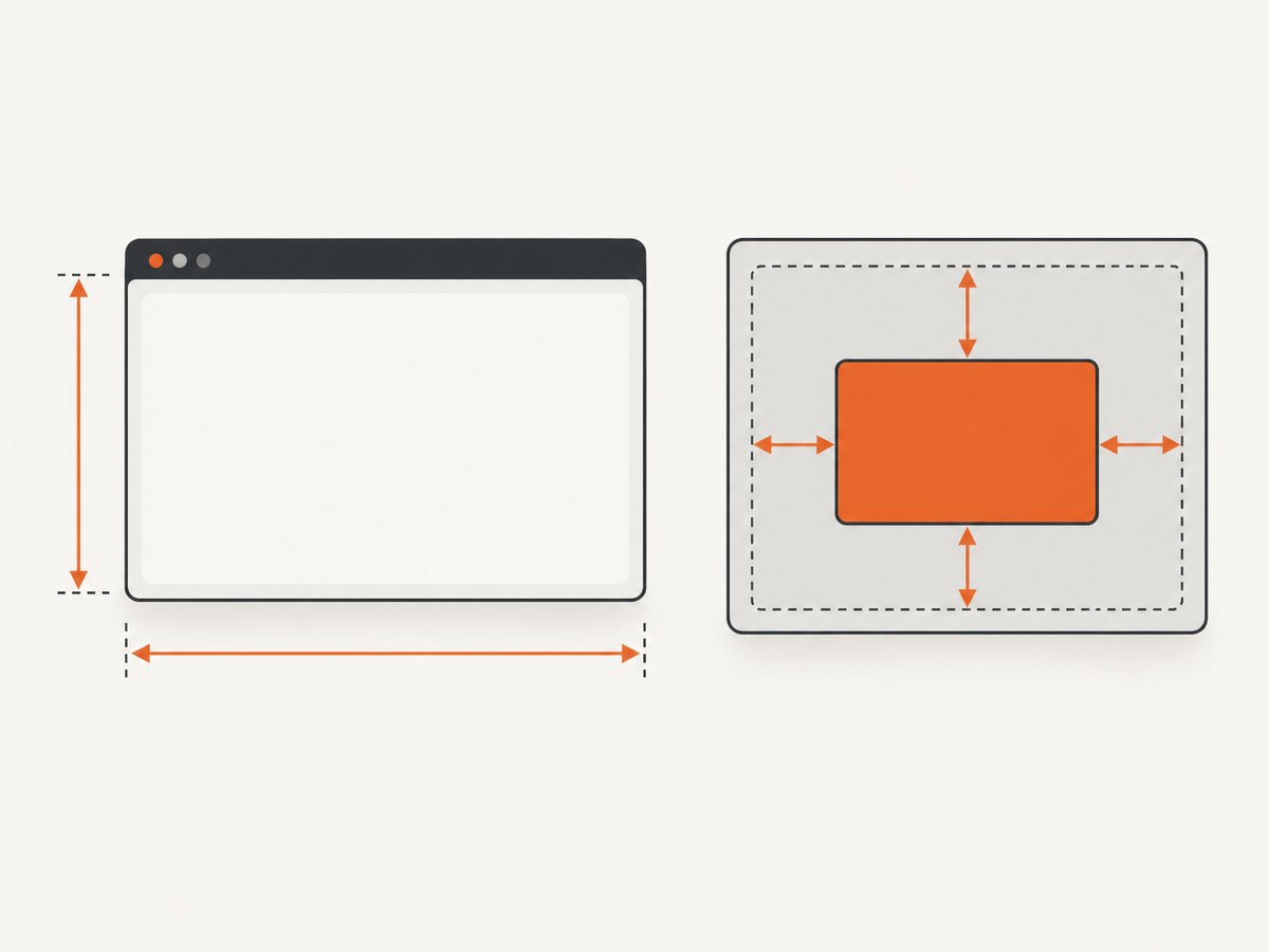
To set the page viewport height in Puppeteer, pass a numeric height in CSS pixels to page.setViewport():
await page.setViewport({ width: 1280, height: 800 });The number is a viewport dimension, not a percentage. If you instead want an element in the page to fill the viewport, style it with a viewport-relative CSS unit such as 100vh. CSS height: 100% is a different mechanism: it depends on the height of the element’s containing block, which must resolve to a definite height.
1. Set Puppeteer’s viewport height
Here is a complete runnable Node.js example using Puppeteer. It sets the viewport before navigation, checks the configured viewport, and takes a screenshot:
import puppeteer from 'puppeteer';

const browser = await puppeteer.launch();
try {
  const page = await browser.newPage();

  // Width and height are CSS pixels.
  await page.setViewport({ width: 1280, height: 800 });
  await page.goto('https://example.com', { waitUntil: 'networkidle2' });

  console.log('Configured viewport:', page.viewport());
  await page.screenshot({ path: 'page.png' });
} finally {
  await browser.close();
}
Install Puppeteer in a Node.js project with npm install puppeteer, save this as an ES module (for example, capture.mjs), and run node capture.mjs. Puppeteer’s viewport dimensions are measured in CSS pixels. The API accepts a number for height, not a CSS string such as '100%'. Choose the width and height that your test or screenshot needs; 1280 × 800 is only an example.
Set the viewport before loading the page when practical. Puppeteer notes that viewport changes can cause a page reload in some situations, including changes involving isMobile or hasTouch. Setting it first also ensures that page code and responsive CSS see the intended viewport during navigation. Each page can have its own viewport.
Viewport options you may need
The basic call only needs width and height. The viewport configuration can also describe device emulation. These options affect what the page sees; they do not change the meaning of the height number:
| Option | What it controls | When to use it |
|---|---|---|
width, height |
Viewport dimensions in CSS pixels | Always set both to the desired page viewport. |
deviceScaleFactor |
Device pixel ratio used for emulation | Use a value such as 2 when checking a higher-density display or capture. It does not double the CSS viewport height. |
isMobile |
Mobile viewport behavior | Use when the page should behave as a mobile device. Set before navigation where possible. |
hasTouch |
Touch input capability | Use when testing touch-oriented behavior alongside mobile emulation. |
isLandscape |
Landscape orientation in mobile emulation | Use when the emulated device should have landscape orientation. |
Puppeteer documents deviceScaleFactor as 1 and isMobile and hasTouch as false by default. For example:
await page.setViewport({
  width: 390,
  height: 844,
  deviceScaleFactor: 2,
  isMobile: true,
  hasTouch: true
});
Use values that match the scenario under test. A mobile viewport with touch emulation can trigger different layout and page behavior than changing width and height alone.
2. Make an element fill the viewport with CSS
Setting the Puppeteer viewport defines the dimensions the page lays out against. It does not force a particular element to occupy that space. For a section that should be at least as tall as the viewport, use:
.full-height {
  min-height: 100vh;
}
For a panel that should have a fixed height matching a selected viewport unit, use height instead:
.full-height-panel {
  height: 100vh;
  overflow: auto;
}
A fixed height can constrain content, so decide whether the element should grow beyond the viewport. min-height makes it at least viewport-height while allowing taller content; a fixed height needs an overflow strategy if its contents do not fit. CSS min-height and max-height can also affect the used height.
Mobile viewport units: vh, svh, lvh, and dvh
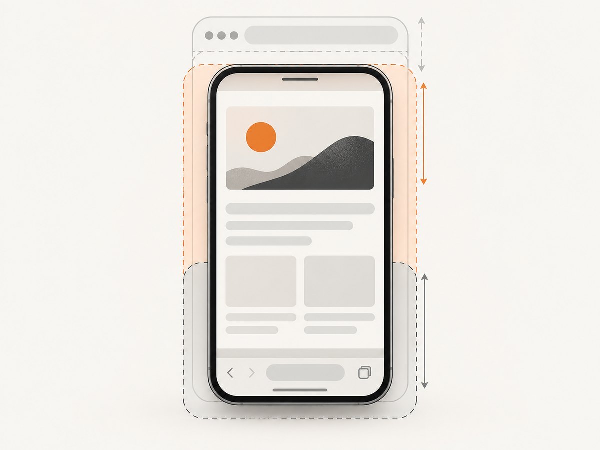
Viewport units express a length relative to a viewport size. MDN documents 1vh as 1% of the viewport height and currently treats vh as equivalent to lvh, the large viewport unit. On mobile, browser controls can change the visible area. CSS also provides:
svh: based on the small viewport size.lvh: based on the large viewport size.dvh: based on the dynamic viewport size.
Choose the unit that matches the layout behavior you want. For example, a layout intended to track the dynamically changing visible viewport can use 100dvh:
.dynamic-screen {
  min-height: 100dvh;
}
These units describe CSS layout. Puppeteer’s page.setViewport() describes the emulated page viewport; it does not choose which CSS unit your stylesheet uses.
Why height: 100% often surprises
A percentage height is calculated from the height of the element’s containing block. If that containing block’s height is not explicitly specified and instead depends on its content, a non-absolutely positioned element’s percentage height can compute to auto. That is why this may not fill the screen:
.child {
  height: 100%;
}
If the child should match its parent, give the parent a definite height as well. If it should match the viewport, a viewport unit communicates that intent more directly:
html, body {
  height: 100%;
  margin: 0;
}

.app {
  min-height: 100vh;
}
The root element’s percentage height is relative to the initial containing block, but nested percentage heights still depend on their containing block. Inspect the computed styles and ancestors when a percentage does not produce the expected result.
3. Choose between page viewport and browser window sizing
page.setViewport() configures the page viewport used for layout and rendering. It is not a request to resize the native browser window. If the task requires changing the browser content area, Puppeteer documents a separate Page.resize() API in its window management guide. The API is experimental and its size update is asynchronous.
For a browser window resize, clear the emulated default viewport, request the content dimensions, and wait for the resize event before measuring:
import puppeteer from 'puppeteer';

const browser = await puppeteer.launch({ headless: false });
try {
  const page = await browser.newPage();
  await page.setViewport(null);

  await new Promise(async (resolve) => {
    page.once('resized', resolve);
    await page.resize({ contentWidth: 1280, contentHeight: 800 });
  });

  const dimensions = await page.evaluate(() => ({
    width: window.innerWidth,
    height: window.innerHeight
  }));
  console.log(dimensions);
} finally {
  await browser.close();
}
Use this when the browser content area itself is the subject of the test. For deterministic screenshot dimensions, the usual choice remains page.setViewport({ width, height }).
4. Configure defaults and verify dimensions
Puppeteer’s ConnectOptions.defaultViewport sets the default viewport for pages. The documented default is 800 × 600 CSS pixels, and null is allowed. Set a different default when every newly created page in a browser connection should start at the same dimensions; use page.setViewport() for per-page control.
const browser = await puppeteer.launch({
  defaultViewport: { width: 1440, height: 900 }
});

const page = await browser.newPage();
console.log(page.viewport());
page.viewport() reports Puppeteer’s currently configured viewport settings. The method does not inspect the actual page viewport, so it is useful for checking your configuration but should not be treated as a measurement of the rendered content area. To inspect the page’s CSS viewport, evaluate the browser dimensions:
const size = await page.evaluate(() => ({
  innerWidth: window.innerWidth,
  innerHeight: window.innerHeight,
  documentWidth: document.documentElement.clientWidth,
  documentHeight: document.documentElement.clientHeight
}));
console.log(size);
The document dimensions can differ from the viewport when the page scrolls. For a full-page screenshot, use Puppeteer’s screenshot option rather than increasing viewport height to the entire document height; those are different capture choices.
5. Troubleshooting common height problems
| Symptom | Likely cause | Fix |
|---|---|---|
height: 100% does not fill the screen |
A containing block lacks a definite height, so the percentage can resolve to auto. |
Set a definite height through the ancestor chain, or use 100vh/100dvh when the target is the viewport. |
| The page reloads after changing viewport | Some viewport changes, including certain mobile or touch setting changes, can reload a page. | Set all viewport and emulation options before goto(). |
| The page content is clipped | A fixed-height element is smaller than its content, or overflow is hidden. | Use min-height if the region should grow, or choose an explicit overflow behavior. |
| Mobile content does not fit between browser bars | vh maps to the large viewport unit in current documented behavior. |
Choose svh, lvh, or dvh according to whether the design targets the small, large, or dynamic viewport. |
| The window dimensions did not update before measurement | Page.resize() updates asynchronously. |
Wait for its resize notification before measuring, and account for the API’s experimental status. |
page.viewport() disagrees with observed layout |
It reports configured settings rather than inspecting the actual page viewport. | Read window.innerHeight and related values inside page.evaluate(). |
| The screenshot is not the full document | Viewport height sets the visible page area; it does not by itself request a full-page capture. | Use page.screenshot({ fullPage: true }) when the whole document should be captured. |
6. Performance, reliability, and cost
Viewport configuration is a small part of a Puppeteer capture, but the selected dimensions and page behavior affect the work that follows. A larger viewport can expose more content and may change responsive layout, image loading, or page scripts. Use the smallest dimensions that satisfy the test and set them before navigation so the page loads in the intended state.
Make capture runs reliable by keeping viewport settings explicit, waiting for the page condition your task needs, and measuring the result in the page when layout matters. Avoid assuming that network idle means every lazy image or animation is complete; scroll or wait for the specific content your test depends on. When using full-page capture, remember that a very tall document may require more memory and image processing than a viewport-sized shot.
Running Puppeteer means provisioning and maintaining a browser runtime, including its launch environment and the code that waits, captures, retries, and stores output. For recurring capture work, account for browser compute, storage, network transfer, and failure handling in your own cost model. Browser automation itself has no fixed per-shot fee in the Puppeteer API; operational costs depend on where and how you run it.
7. Or skip the browser setup
If the goal is to capture a URL at a chosen width and height, ScreenshotNeo provides a website screenshot API. Set its viewport dimensions and output format using the [ScreenshotNeo documentation](https://screenshotneo.com/docs/). This cURL example saves a WebP screenshot:
curl -G "https://api.screenshotneo.com/v1/shot" \
  -d access_key=YOUR_API_KEY \
  --data-urlencode url=https://example.com \
  -d width=1280 \
  -d height=800 \
  -o shot.webp
Cookie banners, popups, and chat widgets are removed before the shot. Bot checks, blank pages, and failed loads are never billed. An MCP server lets AI agents take screenshots. The free plan includes 1,000 screenshots a month with no card; paid plans start at $5 for 3,000. See [ScreenshotNeo](https://screenshotneo.com) for the service and [sign up for the free plan](https://screenshotneo.com/account/sign-up/).
8. FAQ
Can I pass '100%' to page.setViewport()?
No. Pass a numeric height in CSS pixels. Percentage heights belong to CSS layout rules.
Does an 800-pixel viewport make my screenshot exactly 800 device pixels tall?
Not necessarily. Puppeteer’s viewport dimensions are CSS pixels. Device scale factor affects the relationship between CSS pixels and device pixels.
Should I use height or min-height for a full-screen section?
Use min-height when content should be allowed to extend beyond the viewport. Use a fixed height when the box must stay a specific size, and define how overflow should behave.
What is the default Puppeteer viewport?
The documented default viewport for connection options is 800 × 600 CSS pixels. Set an explicit default or page viewport when your task depends on particular dimensions.


