Why Puppeteer Returns a Mobile Screenshot and How to Fix It
Puppeteer usually captures a mobile layout because of viewport or device emulation settings. Find the exact setting and fix it with runnable examples.
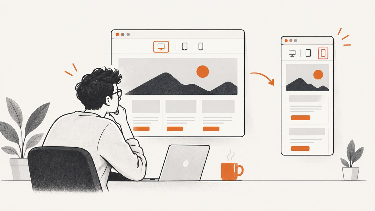
Short answer: Puppeteer returns a mobile-looking screenshot when the page is being rendered with a narrow viewport, mobile emulation, a mobile user agent, or a device preset. Check every page.setViewport() call, the defaultViewport passed to puppeteer.connect(), and any use of page.emulate(device). Set the intended viewport and emulation before navigation, then capture the page.
The most common fix is to apply an explicit desktop viewport and disable mobile flags:
import puppeteer from 'puppeteer';

const browser = await puppeteer.launch({
  defaultViewport: { width: 1440, height: 900, deviceScaleFactor: 1, isMobile: false, hasTouch: false }
});
const page = await browser.newPage();
await page.setViewport({ width: 1440, height: 900, deviceScaleFactor: 1, isMobile: false, hasTouch: false });
await page.goto('https://example.com', { waitUntil: 'networkidle2' });
await page.screenshot({ path: 'desktop.png', fullPage: true });
await browser.close();
Puppeteer’s viewport API documents CSS-pixel dimensions, a default deviceScaleFactor of 1, and isMobile: false. The isMobile flag controls whether the document’s meta viewport tag is taken into account. See the official viewport API.
1. Understand what “mobile screenshot” means
A screenshot can look mobile for several different reasons, and the remedy depends on which one is responsible:
| Symptom | Likely cause | What to inspect |
|---|---|---|
| Responsive navigation, stacked columns, small typography | Narrow CSS viewport | width in setViewport, connection defaults, device preset |
| Mobile-only content or redirects | Mobile user agent | page.setUserAgent() or page.emulate(device) |
| Layout changes after navigation | Viewport or emulation applied too late | Order of setViewport, emulate, and goto |
| Correct layout but unexpected crop | Capture extent setting | fullPage, clip, and captureBeyondViewport |
“Mobile-looking” does not necessarily mean Puppeteer changed the screenshot dimensions. CSS layout is selected from the page viewport and user agent; the bitmap’s pixel size is a separate concern controlled by viewport dimensions, device scale factor, and screenshot options.
2. Inspect the effective viewport before changing anything
Start by logging the settings you think you configured and the settings Puppeteer reports:
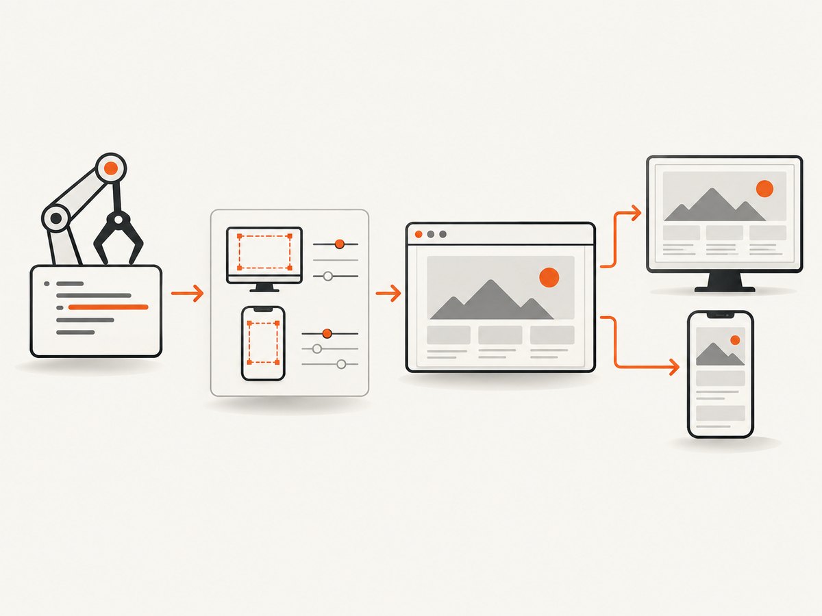
const viewport = page.viewport();
console.log('Puppeteer viewport:', viewport);
console.log('innerWidth:', await page.evaluate(() => window.innerWidth));
console.log('innerHeight:', await page.evaluate(() => window.innerHeight));
console.log('devicePixelRatio:', await page.evaluate(() => window.devicePixelRatio));
console.log('userAgent:', await page.evaluate(() => navigator.userAgent));
console.log('meta viewport:', await page.$eval('meta[name="viewport"]', el => el.content).catch(() => null));
page.viewport() reports Puppeteer’s current viewport configuration. The browser-side values are useful because they show what the document actually sees. A width around 375–430 CSS pixels strongly suggests a phone preset or an explicit narrow viewport. A desktop width with mobile content suggests a mobile user agent, site-specific detection, or CSS that is independent of the viewport.
3. Check every source of mobile emulation
page.setViewport()
Search your project for all viewport assignments. The last assignment before navigation wins for that page. Make the intended values explicit:
await page.setViewport({
  width: 1440,
  height: 900,
  deviceScaleFactor: 1,
  isMobile: false,
  hasTouch: false
});
isMobile is not a synonym for a narrow width. It controls whether the page’s meta viewport tag is honored. Leave it false for a normal desktop capture. hasTouch can also alter site behavior because some applications switch interaction patterns when touch is available.
page.emulate(device)
page.emulate(device) is a shortcut that applies a device’s viewport metrics and user agent together. If it appears anywhere in your code, it can overwrite a desktop viewport you set earlier:
const iPhone = puppeteer.KnownDevices['iPhone 13'];
await page.emulate(iPhone); // mobile metrics and user agent
// Do not call this when the capture must be desktop.
If you need a device-like desktop test, copy the required values explicitly instead of leaving a preset hidden in a helper function. The official Page API recommends emulating before navigation because many websites do not expect a phone to change size after loading. Read the emulate documentation.
Connection-level defaultViewport
When connecting to an existing browser, puppeteer.connect() can supply a defaultViewport. The documented default is 800 by 600, and it is applied to each page created through that connection:
const browser = await puppeteer.connect({
  browserWSEndpoint: process.env.BROWSER_WS,
  defaultViewport: { width: 1440, height: 900, deviceScaleFactor: 1, isMobile: false, hasTouch: false }
});
A shared browser factory may be setting a phone-sized default without the capture function making it obvious. Inspect that factory and any wrapper around launch or connect.
4. Apply the setup before navigation
Configure viewport, user agent, timezone, locale, and any device emulation before page.goto(). A reliable sequence is:
- Create the page.
- Apply either a device preset or an explicit viewport, never an accidental combination.
- Set the user agent only when the target requires it.
- Navigate and wait for the page state you need.
- Capture the screenshot.
const browser = await puppeteer.launch();
const page = await browser.newPage();

await page.setViewport({ width: 1440, height: 900, deviceScaleFactor: 1, isMobile: false, hasTouch: false });
await page.setUserAgent('Mozilla/5.0 (X11; Linux x86_64) AppleWebKit/537.36 (KHTML, like Gecko) Chrome/131.0.0.0 Safari/537.36');

await page.goto('https://example.com', { waitUntil: 'networkidle2', timeout: 60000 });
await page.screenshot({ path: 'desktop.png', fullPage: true });
await browser.close();
Changing viewport settings after navigation can trigger a reload in some circumstances, especially when changing isMobile or hasTouch. Even when it does not reload, responsive scripts may already have chosen a mobile branch. Configure first, navigate second.
5. Reset an unintended viewport
If a helper inherited a custom viewport, page.setViewport(null) resets it to Puppeteer’s default behavior:
await page.setViewport(null);
console.log(page.viewport());
Use an explicit desktop size when reproducibility matters. A reset is useful for diagnosing a hidden override, but relying on defaults can make captures vary between launch and connection paths.
6. Separate layout from screenshot extent
Screenshot options determine how much of the already-rendered page is captured:
fullPage: truecaptures the full scrollable page. Its default is false.clipcaptures a rectangle in page coordinates.captureBeyondViewportcontrols whether content outside the current viewport may be captured. Without a clip its default is false; with a clip it defaults to true.
await page.screenshot({
  path: 'region.png',
  clip: { x: 0, y: 0, width: 1200, height: 800 },
  captureBeyondViewport: true
});
These options change the captured area, not the responsive breakpoint used by the page. If the layout is mobile, fix viewport or emulation first. See ScreenshotOptions.
7. A complete diagnostic script
This script records the effective settings, captures a desktop image, and makes hidden mobile configuration easier to find:
import puppeteer from 'puppeteer';

const url = process.argv[2] || 'https://example.com';
const browser = await puppeteer.launch({
  defaultViewport: { width: 1440, height: 900, deviceScaleFactor: 1, isMobile: false, hasTouch: false }
});
const page = await browser.newPage();

await page.setViewport({ width: 1440, height: 900, deviceScaleFactor: 1, isMobile: false, hasTouch: false });
await page.goto(url, { waitUntil: 'networkidle2', timeout: 60000 });

const diagnostics = await page.evaluate(() => ({
  innerWidth: window.innerWidth,
  innerHeight: window.innerHeight,
  outerWidth: window.outerWidth,
  dpr: window.devicePixelRatio,
  userAgent: navigator.userAgent,
  touchPoints: navigator.maxTouchPoints,
  metaViewport: document.querySelector('meta[name="viewport"]')?.content || null,
  bodyWidth: document.body?.getBoundingClientRect().width || null
}));
console.log({ puppeteerViewport: page.viewport(), ...diagnostics });

await page.screenshot({ path: 'desktop-debug.png', fullPage: true });
await browser.close();
Compare the log from a known-good desktop run with the failing run. Differences in innerWidth, user agent, touch points, or meta viewport handling usually identify the cause faster than comparing screenshots by eye.
8. Common errors and fixes
| Error or symptom | Cause | Fix |
|---|---|---|
| “I set width to 1440, but the page is still mobile.” | page.emulate(device) runs afterward. |
Remove the preset or apply the final explicit viewport after it, then reload. |
| The first screenshot is desktop; later screenshots are mobile. | A shared page or helper mutates the viewport between jobs. | Create a fresh page per job or reset viewport at the start of every job. |
| Desktop width, mobile navigation. | Mobile user agent, touch capability, cookie state, or application-specific detection. | Log navigator.userAgent and navigator.maxTouchPoints; set a desktop user agent only when appropriate. |
Changing isMobile causes a reload. |
Puppeteer may reload when mobile metrics or touch settings change. | Set all emulation before goto and wait for navigation afterward. |
page.viewport() looks right but output is cropped. |
clip, fullPage, or capture extent is wrong. |
Remove clip for a full viewport test, then add it back with explicit dimensions. |
| Different workers produce different layouts. | Launch and connect paths use different defaults. | Centralize viewport configuration and pass the same values to every browser factory. |
Setting viewport after goto has no visible effect. |
The site selected its responsive branch during initial load. | Set viewport first, navigate again, and wait for the target state. |
9. Performance and reliability considerations
Large desktop viewports and full-page screenshots consume more memory than a small viewport. Keep the viewport at the smallest desktop size that satisfies the page you are documenting. Use fullPage only when the complete document is required; otherwise capture the visible viewport or a deliberate clip.
For repeatable output, pin the browser version used by your build, keep viewport and user-agent settings in one configuration object, and avoid reusing a page whose state can be mutated by another job. Wait for a meaningful readiness condition instead of assuming that networkidle2 means every image or client-rendered component is complete. A selector wait is often more reliable for dashboards and single-page applications:
await page.goto(url, { waitUntil: 'domcontentloaded', timeout: 60000 });
await page.waitForSelector('[data-page-ready]', { timeout: 30000 });
await page.screenshot({ path: 'ready.png', fullPage: true });
Be careful with device scale factor. A higher value increases output pixels and memory use but does not change CSS breakpoints. If your goal is a desktop layout, fix CSS width and emulation first; use scale only for image sharpness.
10. Or skip the browser setup
ScreenshotNeo provides a website screenshot API when you do not want to maintain Chromium, viewport setup, consent handling, and capture retries. It accepts one GET request and returns PNG, JPEG, WebP, or PDF. Its options include full-page capture, device presets or any viewport, retina scale, element selectors, custom CSS and JavaScript, waits, request blocking, headers, cookies, user agents, timezone, geolocation, transparent backgrounds, resizing, caching, signed links, asynchronous jobs, bulk capture, and usage reporting.
Use the same target URL while keeping the request simple:
cURL (see the ScreenshotNeo API documentation):
curl -G "https://api.screenshotneo.com/v1/shot" -d access_key=YOUR_API_KEY --data-urlencode url=https://stripe.com -o shot.webpPython:
import requests
r = requests.get("https://api.screenshotneo.com/v1/shot", params={"access_key": "YOUR_API_KEY", "url": "https://stripe.com"}, timeout=90)
open("shot.webp", "wb").write(r.content)Node.js:
const q = new URLSearchParams({ access_key: 'YOUR_API_KEY', url: 'https://stripe.com' });
const res = await fetch(`https://api.screenshotneo.com/v1/shot?${q}`);
const bytes = await res.arrayBuffer();
await Bun.write('shot.webp', bytes);
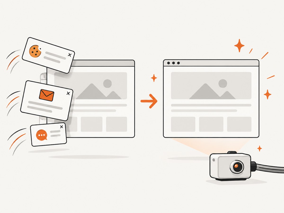
ScreenshotNeo accepts consent banners before capture and removes more than 60 known consent platforms, newsletter popups, and chat widgets; each step can be disabled. Bot checks, blank pages, timeouts, failed loads, and cache hits are not billed, and the response identifies the result with X-Page-Verdict and X-Billed headers. An MCP server exposes take_screenshot, get_page_info, and capture_pdf to Claude, Cursor, and other MCP clients. The Free plan includes 1,000 shots per month with no card; paid plans start at $5 for 3,000 shots, and every feature is available on every plan. Create a free ScreenshotNeo account.
11. Cost and operational notes
Running Puppeteer yourself means paying for browser compute, storage, and engineering time to maintain versions, retries, isolation, consent dismissal, and failure classification. It gives you complete control and is appropriate when the browser must run inside your infrastructure. An API can reduce that maintenance, especially for sporadic jobs or teams that need consistent output across services.
With ScreenshotNeo, only clean shots are billed. Cache hits and failed categories listed above are free, which can make retry-heavy workflows easier to reason about. Choose a cache TTL when the page does not change frequently, use bulk capture for up to 100 URLs per call, and use asynchronous jobs with signed webhooks when a capture may take longer than a request timeout. Check usage through the usage API rather than estimating from request counts.
12. FAQ
Does fullPage: true make Puppeteer use a mobile layout?
No. fullPage changes the vertical capture extent. Responsive layout comes from viewport metrics, emulation, user agent, and page code.
Should I always set isMobile: false?
Set it explicitly when you require desktop behavior. Leave mobile settings enabled when you are intentionally testing a phone layout.
Why does a desktop viewport still receive a mobile redirect?
The site may use the user agent, touch capability, cookies, or server-side detection. Log those values and test with a clean context before changing screenshot options.
Can I change viewport between URLs?
Yes, but set it before each navigation and wait for the new page to load. A fresh page per configuration is easier to reason about in concurrent jobs.
What should I compare when validating desktop and mobile captures?
Compare CSS width and height, isMobile, hasTouch, user agent, device preset, and whether settings were applied before navigation. Compare fullPage and clip separately because they describe capture extent.


