How to Fix Puppeteer Screenshots with the Wrong Width
Puppeteer viewport dimensions use CSS pixels, while screenshots can use device pixels or capture a different area. Measure both, then fix the setting that changed your output width.
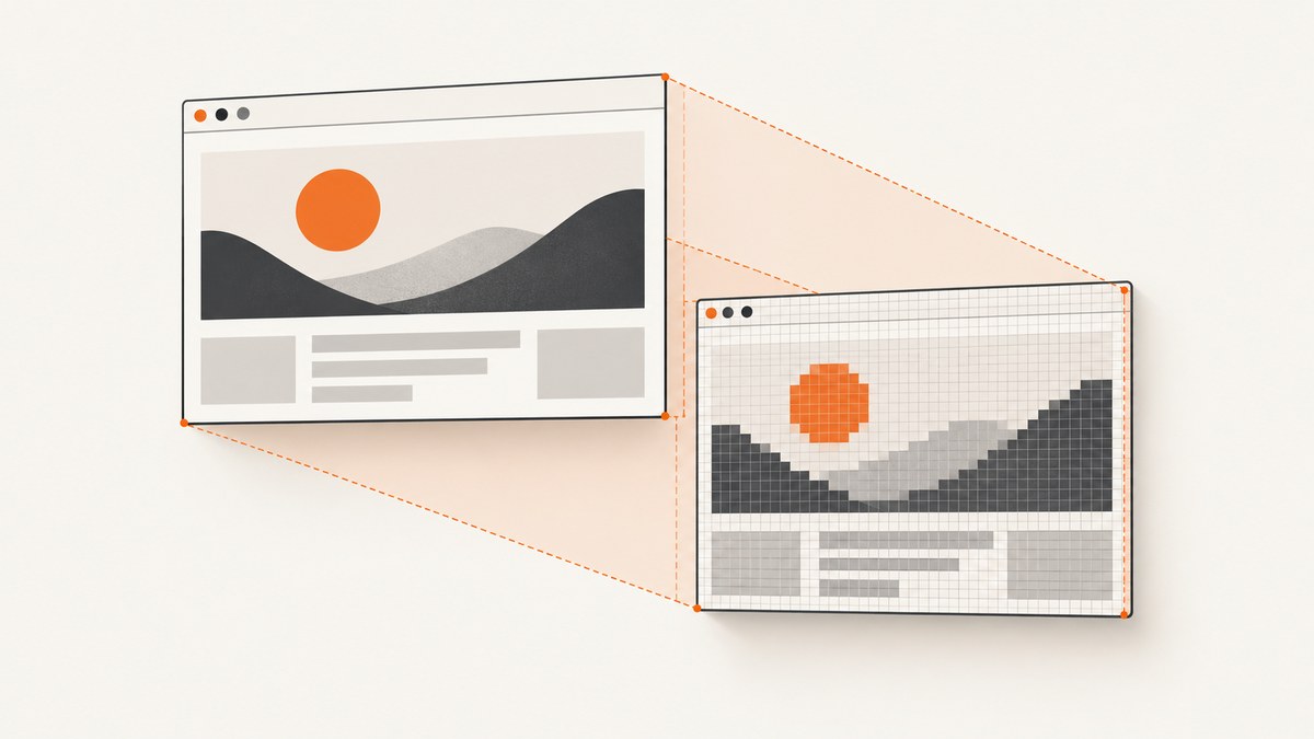
Puppeteer’s viewport.width is measured in CSS pixels. The saved image is a bitmap, and its pixel width can differ when deviceScaleFactor is greater than 1 or when screenshot options capture more than the viewport. Set the viewport and scale explicitly, record the browser’s dimensions, and inspect the resulting file’s dimensions in the same run.
For a 1280 CSS-pixel viewport with deviceScaleFactor: 1, start with this minimal example:
const puppeteer = require('puppeteer');

(async () => {
  const browser = await puppeteer.launch();
  try {
    const page = await browser.newPage();
    await page.setViewport({
      width: 1280,
      height: 800,
      deviceScaleFactor: 1,
    });

    await page.goto('https://example.com', { waitUntil: 'networkidle0' });
    console.log(await page.evaluate(() => ({
      innerWidth: window.innerWidth,
      innerHeight: window.innerHeight,
      devicePixelRatio: window.devicePixelRatio,
    })));

    await page.screenshot({ path: 'shot.png', fullPage: false });
  } finally {
    await browser.close();
  }
})();
If innerWidth is right but the file is wider, check device scale and capture options. If innerWidth is wrong, look for a late or overridden viewport change. Puppeteer documents viewport dimensions as CSS pixels and deviceScaleFactor as the device scale setting. Puppeteer viewport reference.
1. Identify which width is wrong
There are two common meanings of “wrong width”: the page lays out at the wrong CSS width, or the saved bitmap has a different number of pixels than expected. These are related measurements, but they are not interchangeable.
- Layout width:
window.innerWidth, in CSS pixels. This is the width that responsive CSS media queries generally see. - Scale:
window.devicePixelRatio, normally reflecting the emulated device scale factor. - Output width: the saved image’s pixel width, which you should inspect directly.
- Capture area: viewport, full document, or a specified clip region.
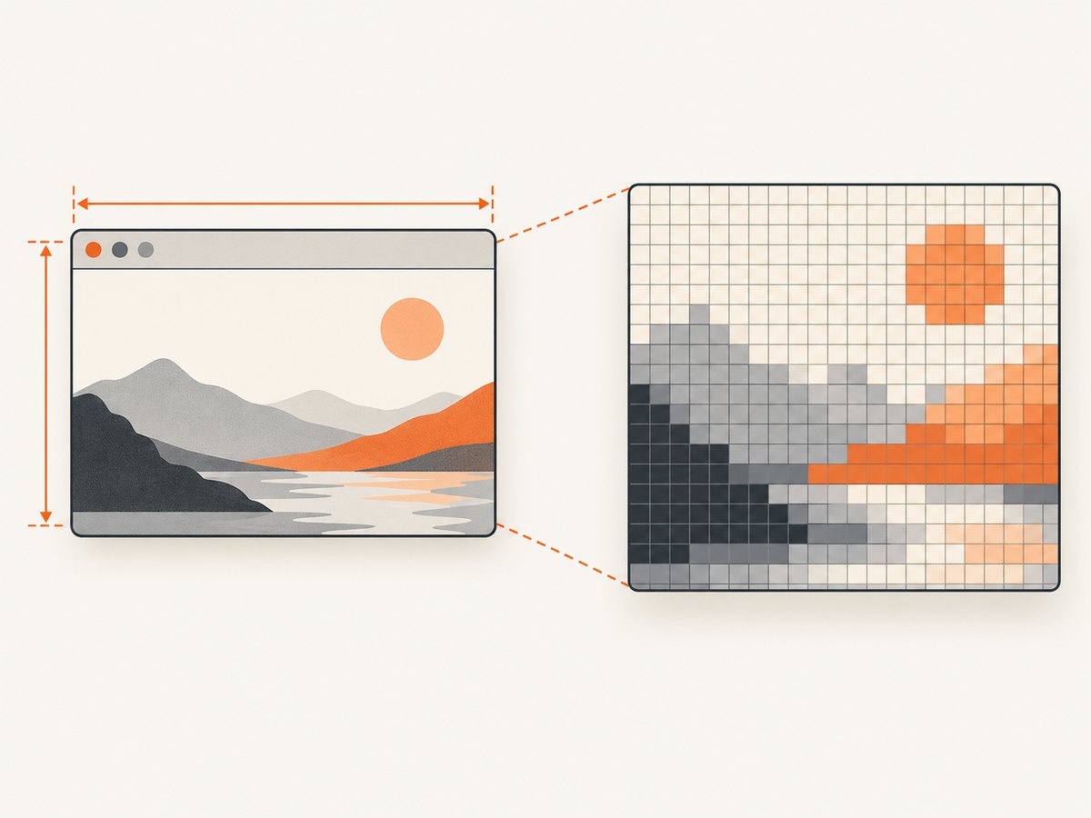
A useful diagnostic relationship is that bitmap dimensions may be approximately the CSS dimensions multiplied by the device scale factor. For example, a 1280 CSS-pixel viewport at scale 2 may yield an image around 2560 pixels wide. Treat that as a clue, not a universal output guarantee: capture mode, clipping, browser behavior, and file handling can affect the result. Verify the actual file dimensions rather than inferring them from the viewport alone.
2. Measure the page and set the viewport before navigation
Set a known viewport before loading the page. Sites often make layout decisions during initial page load, and changing the emulated size afterward can leave you diagnosing a page that rendered under different conditions.
const puppeteer = require('puppeteer');

(async () => {
  const browser = await puppeteer.launch();
  try {
    const page = await browser.newPage();
    await page.setViewport({ width: 1280, height: 800, deviceScaleFactor: 1 });
    await page.goto('https://example.com', { waitUntil: 'networkidle0' });

    const dimensions = await page.evaluate(() => ({
      innerWidth: window.innerWidth,
      innerHeight: window.innerHeight,
      outerWidth: window.outerWidth,
      outerHeight: window.outerHeight,
      devicePixelRatio: window.devicePixelRatio,
      screenWidth: window.screen.width,
      screenHeight: window.screen.height,
    }));
    console.log(dimensions);

    await page.screenshot({ path: 'shot.png' });
  } finally {
    await browser.close();
  }
})();
For this emulated viewport, check that innerWidth is the CSS width you requested and that devicePixelRatio is the scale you intended. Then inspect shot.png using an image viewer or image metadata tool. Record both sets of values when reproducing the issue.
Use a device profile deliberately
page.emulate(device) applies device emulation, including user-agent and viewport settings, and resizes the page. Run it before navigation. Otherwise the document may have loaded with one responsive layout and then been resized afterward. If you combine device emulation with a later setViewport, make sure you know which call is supposed to win and log the measured result.
3. Check deviceScaleFactor and pixel units
The most frequent cause of a screenshot that looks “twice as wide” is a scale of 2. The CSS layout can correctly report innerWidth: 1280, while the bitmap has roughly twice as many horizontal pixels. For a one-pixel-per-CSS-pixel diagnostic capture, explicitly set deviceScaleFactor: 1 and do not rely on a default inherited from device emulation or shared setup code.
If you need a high-density image, keep the larger scale and treat the output’s pixel dimensions as intentional. Don’t halve the viewport width to compensate without checking the page layout: that changes responsive breakpoints and the composition, rather than simply changing image resolution.
| What you observe | Likely explanation | What to inspect |
|---|---|---|
innerWidth is correct; file is about twice as wide |
Device scale factor is likely 2 | devicePixelRatio, emulation calls, actual image dimensions |
innerWidth itself is wrong |
Viewport was set too late, overwritten, or not applied to this page | Call order and all viewport/emulation calls |
| Width changes between runs | Environment or setup is not held constant | Browser version, launch mode, viewport, scale, and screenshot options |
| Image is wider than the viewport but layout width looks right | Full-page or clip-related capture behavior may be involved | fullPage, clip, captureBeyondViewport |
4. Confirm the screenshot capture area
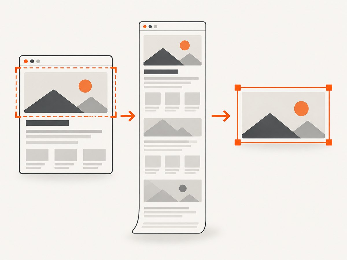
A viewport screenshot captures the visible viewport by default. fullPage: true captures the full page, while clip defines a specific rectangle. captureBeyondViewport affects whether a clip can extend outside the viewport. If you expect the visible viewport’s width, remove accidental full-page or clipping settings and make the capture intent explicit. See the Puppeteer screenshot options reference.
// Capture the viewport at the configured dimensions.
await page.screenshot({ path: 'viewport.png', fullPage: false });

// Capture the full document; its dimensions can differ from the viewport.
await page.screenshot({ path: 'full-page.png', fullPage: true });

// Capture a deliberately chosen rectangle.
await page.screenshot({
  path: 'clip.png',
  clip: { x: 0, y: 0, width: 640, height: 400 },
});
For diagnosis, remove optional screenshot settings until the simple viewport capture behaves as expected. Add fullPage, clip, or beyond-viewport behavior back one at a time. This makes it clear which setting changed the capture area.
5. Resize the actual browser content area when needed
A Puppeteer viewport is an emulated page viewport; it is not necessarily the same as resizing a desktop browser window. If your task specifically requires controlling the browser content window, Puppeteer’s window-management guide describes removing the default viewport with page.setViewport(null), calling page.resize({ contentWidth, contentHeight }), and waiting for the asynchronous resize event before reading window.innerWidth. Its example reports an inner content size of 600 by 400 after resizing. Consult the window management guide for the supported sequence and context.
const puppeteer = require('puppeteer');

(async () => {
  const browser = await puppeteer.launch({ headless: false });
  try {
    const page = await browser.newPage();
    await page.setViewport(null);

    await page.evaluate(() => {
      window.addEventListener('resize', () => {
        window.__resizeComplete = true;
      }, { once: true });
    });

    await page.resize({ contentWidth: 600, contentHeight: 400 });
    await page.waitForFunction(() => window.__resizeComplete === true);
    console.log(await page.evaluate(() => ({
      innerWidth: window.innerWidth,
      innerHeight: window.innerHeight,
    })));
  } finally {
    await browser.close();
  }
})();
This workflow targets the actual content area and its resize behavior, rather than simply assigning a new emulated viewport size. Keep the mode consistent when comparing results. If your goal is repeatable page layout across automation runs, a fixed emulated viewport is usually the simpler diagnostic starting point.
6. Make the reproduction reliable
Width bugs are easy to misdiagnose if the capture conditions change between runs. Keep the following values together in logs or a reproduction report:
- Installed Puppeteer and browser versions.
- Headless or headful launch mode and operating environment.
- The complete viewport object and any device profile.
- The measured
innerWidth,innerHeight, anddevicePixelRatio. - All screenshot options, especially
fullPage,clip, andcaptureBeyondViewport. - The saved image’s pixel dimensions and file format.
Wait for the page condition your capture needs, but remember that page readiness does not set screenshot width. networkidle0 can help when the page’s network activity settles; pages with long-running requests may need a different readiness condition. Use the same navigation and readiness strategy across comparisons so layout timing does not become another changing variable.
7. Troubleshooting common width problems
| Symptom | Cause to check | Fix |
|---|---|---|
| Screenshot is about twice the requested width | deviceScaleFactor or emulated device scale is 2 |
Set scale explicitly to 1 for a CSS-pixel-sized diagnostic image, or accept the higher-resolution bitmap and verify its file dimensions. |
page.setViewport seems ignored |
It ran after navigation, another call later changed the viewport, or the wrong page object is being captured | Set it before goto; search setup code for later setViewport or emulate calls; log dimensions immediately before capture. |
| Full-page shot is wider than expected | fullPage: true captures the document, not just the visible viewport |
Use fullPage: false for viewport capture, then compare the output file dimensions. |
| Clip output does not match the viewport | The clip rectangle requests a different width or extends beyond the viewport | Check clip x, width, and captureBeyondViewport; remove the clip to isolate the issue. |
| Responsive layout is wrong after emulation | Device emulation or viewport change happened after the document loaded | Apply viewport or page.emulate(device) before navigation and reload under those conditions. |
| Window dimensions do not match requested content dimensions | Actual window resizing is asynchronous or the default viewport remains active | Use the documented setViewport(null) and resize workflow, and wait for the resize event before measuring. |
| Dimensions vary on another machine or run | Browser build, mode, environment, or capture settings differ | Fix those inputs and compare CSS measurements and image metadata from the same run. |
8. Performance, reliability, and output-size tradeoffs
For reliable debugging, use a viewport capture first: it limits the requested area and makes the relationship between layout width and output easier to inspect. Full-page captures may require the browser to capture a much taller document, and high device scale factors create larger bitmaps. Those choices can increase memory use, output size, and processing time, especially for long pages or repeated captures. The exact impact depends on the page and environment; measure your own workload instead of assuming a fixed multiplier for time or cost.
Use the smallest dimensions and scale that meet the image’s purpose. For visual regression, keep the browser version, viewport, scale, and capture options fixed so diffs represent page changes rather than configuration drift. For production capture jobs, close the browser in a finally block, set practical navigation and job timeouts in your runner, and keep failed captures distinguishable from valid images. A blank or partial image should not be treated as proof that the width setting is wrong until page loading and capture readiness have also been checked.
9. Or skip the browser setup
ScreenshotNeo is a website screenshot API and MCP server. One GET request takes a URL and returns a PNG, JPEG, WebP, or PDF. Its response includes page-verdict and billing headers, so you can distinguish clean captures from bot checks, blank pages, failed loads, and cache hits. See the ScreenshotNeo API documentation for request options.
curl -G "https://api.screenshotneo.com/v1/shot" \
  -d access_key=YOUR_API_KEY \
  --data-urlencode url=https://example.com \
  -o shot.webp
Cookie banners are accepted and removed before the shot, along with known newsletter popups and chat widgets; each cleanup step can be turned off. Bot checks, blank pages, failed loads, timeouts, and cache hits are not billed. An MCP server provides take_screenshot, get_page_info, and capture_pdf for Claude, Cursor, and other MCP clients. The free plan includes 1,000 screenshots per month without a card; paid plans start at $5 for 3,000 shots.
Create a free ScreenshotNeo account to get 1,000 screenshots a month with no card.
10. FAQ
Does viewport.width include browser chrome?
No. It specifies the page viewport in CSS pixels. For actual browser content-window sizing, use Puppeteer’s window-management approach.
Should I set deviceScaleFactor to 1 every time?
Only when you want a straightforward one-to-one diagnostic baseline. A higher scale can be useful for denser output, provided you account for the resulting bitmap dimensions.
Will fullPage: true fix a screenshot that is too narrow?
It changes the captured area to the full document. It does not correct a viewport or scale mismatch, and can make the output dimensions less comparable to the viewport.
What should I include in a bug report?
Include the requested viewport and scale, measured browser dimensions, Puppeteer/browser versions, launch mode, screenshot options, and the actual saved image dimensions.


