How to Take Puppeteer Screenshots With Zoom and Custom Scale
Learn how CSS zoom, deviceScaleFactor, full-page capture and clipping work together in Puppeteer, with runnable code and fixes for common failures.
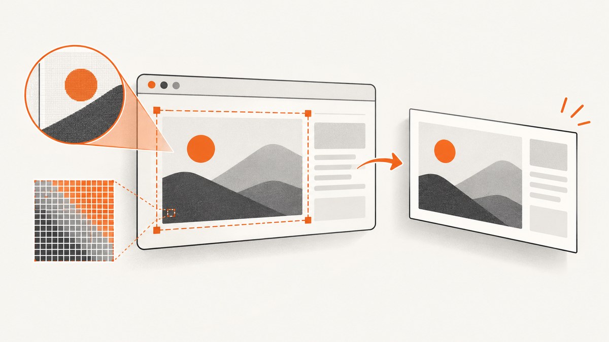
Direct answer: Puppeteer does not have a screenshot({ zoom }) option. Set the CSS viewport with page.setViewport(), use CSS zoom (or a deliberate transform) when you need the page to look larger, and use deviceScaleFactor when you need more device pixels per CSS pixel. Keep those controls separate so layout, clipping and output size stay predictable.
This guide shows how to capture viewport, full-page, element and clipped screenshots after scaling, with complete Node.js code, output-format controls, waits for dynamic pages, failure diagnosis, performance choices and a hosted alternative.
1. The three controls behind “zoom”
| Control | What it changes | Typical use | Trade-offs |
|---|---|---|---|
width, height |
CSS viewport dimensions | Emulate a desktop or mobile layout | Changes responsive breakpoints and wrapping |
deviceScaleFactor |
Device pixels used for each CSS pixel | Sharper retina-style output | Larger images and more memory; layout stays in CSS pixels |
CSS zoom |
Visual scale and, in Chromium, layout sizing | Make content visibly larger | Can change wrapping, fixed positioning and document dimensions |
CSS transform: scale() |
Paint scale of a subtree | Magnify a specific component | Usually does not reflow surrounding layout; clipping math is less intuitive |
Puppeteer’s Viewport interface defines width and height in CSS pixels and deviceScaleFactor as device scale [Viewport]. The Page API recommends setting viewport characteristics before navigation because changing them later can trigger a reload on pages that react to device changes [page.setViewport()]. A planning approximation is:

output pixels ≈ rendered CSS dimensions × deviceScaleFactorThe final dimensions can also be affected by full-page height, clipping, fractional layout values and browser rendering.
2. Install Puppeteer and choose a baseline viewport
mkdir puppeteer-zoom-shot
cd puppeteer-zoom-shot
npm init -y
npm install puppeteer
Use an ES module file named capture.mjs (or add type: module to package.json). Launch headless Chromium, create a page, and set the viewport before goto():
import puppeteer from 'puppeteer';

const browser = await puppeteer.launch({ headless: true });
try {
  const page = await browser.newPage();
  await page.setViewport({
    width: 1280,
    height: 900,
    deviceScaleFactor: 1,
  });
  await page.goto('https://example.com', { waitUntil: 'networkidle2' });
  await page.screenshot({ path: 'viewport.png', type: 'png' });
} finally {
  await browser.close();
}
fullPage is false by default, so this saves the visible viewport. The documented screenshot options include fullPage, clip, captureBeyondViewport, path, type, quality and omitBackground [ScreenshotOptions].
3. Make the page look larger with CSS zoom
Apply CSS zoom after navigation and after the content you care about exists. Zoom changes the page’s visual and layout behavior, so expect different line wrapping and effective document dimensions.
import puppeteer from 'puppeteer';

const browser = await puppeteer.launch({ headless: true });
try {
  const page = await browser.newPage();
  await page.setViewport({ width: 1280, height: 900, deviceScaleFactor: 1 });
  await page.goto('https://example.com', { waitUntil: 'networkidle2' });

  await page.evaluate(() => {
    document.documentElement.style.zoom = '125%';
  });

  await page.screenshot({
    path: 'zoom-125.png',
    fullPage: true,
    type: 'png',
  });
} finally {
  await browser.close();
}
Use a percentage string such as 125% or a unitless value such as 1.25. If the site already sets a zoom value, preserve it and multiply deliberately:
await page.evaluate(() => {
  const root = document.documentElement;
  const current = parseFloat(getComputedStyle(root).zoom) || 1;
  root.style.zoom = String(current * 1.25);
});
Fixed headers, sticky controls and media queries can behave differently after zoom. For a reproducible capture, apply zoom once, then measure and clip in the resulting page state.
4. Increase sharpness with deviceScaleFactor
Device scale is not browser zoom. A factor of 2 keeps a 1280 CSS-pixel viewport but asks Chromium to paint roughly twice as many device pixels in each direction.
import puppeteer from 'puppeteer';

const browser = await puppeteer.launch({ headless: true });
try {
  const page = await browser.newPage();
  await page.setViewport({ width: 1280, height: 900, deviceScaleFactor: 2 });
  await page.goto('https://example.com', { waitUntil: 'networkidle2' });
  await page.screenshot({ path: 'retina.png', type: 'png' });
} finally {
  await browser.close();
}
Combine both intentionally when you need a larger design and dense pixels:
await page.setViewport({ width: 1280, height: 900, deviceScaleFactor: 2 });
await page.goto('https://example.com', { waitUntil: 'networkidle2' });
await page.evaluate(() => { document.documentElement.style.zoom = '125%'; });
await page.screenshot({ path: 'zoomed-retina.png', fullPage: true, type: 'png' });
Because both effects can increase output dimensions or memory use, start with a factor of 1 or 2 and inspect the result before choosing larger values.
5. Capture viewport, full page, a region or one element
Viewport
await page.screenshot({ path: 'viewport.png', type: 'png' });Full document
await page.screenshot({
  path: 'full.png',
  fullPage: true,
  type: 'png',
});
Full-page capture includes the document beyond the visible window. Very tall pages can consume substantial memory; capture a region or an element when you do not need the entire document.
Exact clip
await page.screenshot({
  path: 'region.png',
  clip: { x: 80, y: 120, width: 720, height: 480 },
  captureBeyondViewport: true,
  type: 'png',
});
Clip coordinates are CSS-pixel page coordinates. With CSS zoom or transforms, measure after applying the scale and account for the element’s bounding box rather than guessing.
One element
const card = await page.waitForSelector('.pricing-card', { visible: true });
if (!card) throw new Error('pricing card not found');
await card.screenshot({ path: 'card.png', type: 'png' });
Element screenshots avoid stitching an unrelated page around the target and are often cheaper in memory than a full document.
6. Scale a component with transform
Transforms magnify painting without reliably changing document flow. This is useful for a chart or card, but neighboring content keeps its original geometry.
await page.evaluate(() => {
  const target = document.querySelector('.chart');
  if (!target) throw new Error('chart not found');
  target.style.transformOrigin = 'top left';
  target.style.transform = 'scale(1.5)';
});
const chart = await page.waitForSelector('.chart');
await chart.screenshot({ path: 'chart-150.png', type: 'png' });
Prefer CSS zoom for a whole-page reading scale and transforms for an isolated visual. If a transformed element is clipped, calculate its transformed bounds or temporarily enlarge the clip.
7. Wait for the pixels you intend to capture
networkidle2 only describes network activity; it does not guarantee that fonts, lazy images or client-rendered data are ready. Add explicit waits:
await page.goto('https://example.com/dashboard', { waitUntil: 'domcontentloaded' });
await page.waitForSelector('#dashboard', { visible: true });
await page.evaluate(() => document.fonts.ready);
await page.waitForFunction(() => Array.from(document.images)
  .every(img => img.complete));
await new Promise(resolve => setTimeout(resolve, 300));
await page.screenshot({ path: 'dashboard.png', fullPage: true });
For infinite scroll, scroll in controlled increments, wait for new content, then capture. For animations, disable them before the shot:
await page.addStyleTag({ content: `
  *, *::before, *::after {
    animation: none !important;
    transition: none !important;
    caret-color: transparent !important;
  }
` });
8. Output format, quality and transparency
await page.screenshot({ path: 'photo.jpg', type: 'jpeg', quality: 82 });
await page.screenshot({ path: 'small.webp', type: 'webp', quality: 80 });
await page.screenshot({ path: 'transparent.png', type: 'png', omitBackground: true });
Quality applies to lossy formats such as JPEG and WebP. PNG is lossless and is the default. Keep type explicit in production so downstream jobs do not depend on defaults. Binary and base64 return modes are available when you omit path; write the returned data to your own storage.
9. A reusable capture script with command-line settings
import puppeteer from 'puppeteer';

const [url = 'https://example.com'] = process.argv.slice(2);
const zoom = Number(process.env.ZOOM || 1);
const scale = Number(process.env.SCALE || 1);
const fullPage = process.env.FULL_PAGE === '1';

if (!Number.isFinite(zoom) || zoom <= 0) throw new Error('ZOOM must be positive');
if (!Number.isFinite(scale) || scale <= 0) throw new Error('SCALE must be positive');

const browser = await puppeteer.launch({ headless: true });
try {
  const page = await browser.newPage();
  await page.setViewport({ width: 1280, height: 900, deviceScaleFactor: scale });
  await page.goto(url, { waitUntil: 'networkidle2', timeout: 60000 });
  await page.evaluate(value => {
    document.documentElement.style.zoom = String(value);
  }, zoom);
  await page.evaluate(() => document.fonts.ready);
  await page.screenshot({ path: 'capture.png', fullPage, type: 'png' });
} finally {
  await browser.close();
}
Run it with ZOOM=1.25 SCALE=2 FULL_PAGE=1 node capture.mjs https://example.com. Validate URLs in your own application before passing them to a browser process, and close the browser in a finally block so failures do not leak Chromium processes.
10. Troubleshooting checklist
| Symptom | Likely cause | Fix |
|---|---|---|
| Text is larger but wraps unexpectedly | CSS zoom changes layout | Increase the CSS viewport, reduce zoom, or accept the new breakpoint intentionally. |
| Image is sharper but not visually larger | Only device scale changed | Add CSS zoom or transform when visual magnification is required. |
| Screenshot is blank or half-rendered | Capture ran before client rendering or fonts/images finished | Wait for a selector, document.fonts.ready, image completion and a short settling delay. |
| Lazy images are missing | They load only after entering the viewport | Scroll through the page before full-page capture, or use the site’s eager-load mode if available. |
| Fixed header appears in the wrong place | Zoom or transform changed containing geometry | Capture after scaling; test viewport and full-page modes separately; avoid transforming the root. |
| Clip is offset or cut off | Coordinates were measured before scaling | Apply zoom first, then read getBoundingClientRect() and use those values. |
| Navigation times out | Slow origin, blocked resource or never-ending request | Set a realistic timeout, wait for a specific selector, and log the URL and error; do not hide repeated failures. |
| Browser process remains after an error | No cleanup path | Wrap capture in try/finally and always call browser.close(). |
| Out-of-memory on a very tall page | Full-page raster plus high device scale | Use element or tiled region captures, lower scale, and process pages one at a time. |
11. Performance, reliability and cost planning
- Launch cost: Reuse one browser and create pages per job when isolation allows; launching Chromium for every image adds startup time.
- Memory: Full-page and high-scale PNG captures are the expensive combination. Prefer WebP or JPEG when lossless output is unnecessary.
- Determinism: Pin viewport, scale, timezone, locale and animation state. Record the URL, options and browser version with the artifact.
- Isolation: Close pages after each job, cap concurrency and enforce navigation and overall job timeouts.
- Retries: Retry transient navigation failures with a limit and backoff. A retry cannot fix a persistent bot check, login wall or invalid URL.
- Storage: Stream or write binary output directly rather than keeping many base64 strings in memory.
12. Or skip the browser setup
If you need an API response instead of maintaining Chromium, ScreenshotNeo accepts one GET request and returns PNG, JPEG, WebP or PDF. The parameter names other screenshot APIs use also work, and its 63 options cover full-page lazy-image capture, element selectors, dark mode, device presets or custom viewports, retina scale, custom CSS and JavaScript, waits, request blocking, headers, cookies, user agent, timezone, geolocation, resizing, caching, signed links, async jobs, bulk capture and usage reporting.
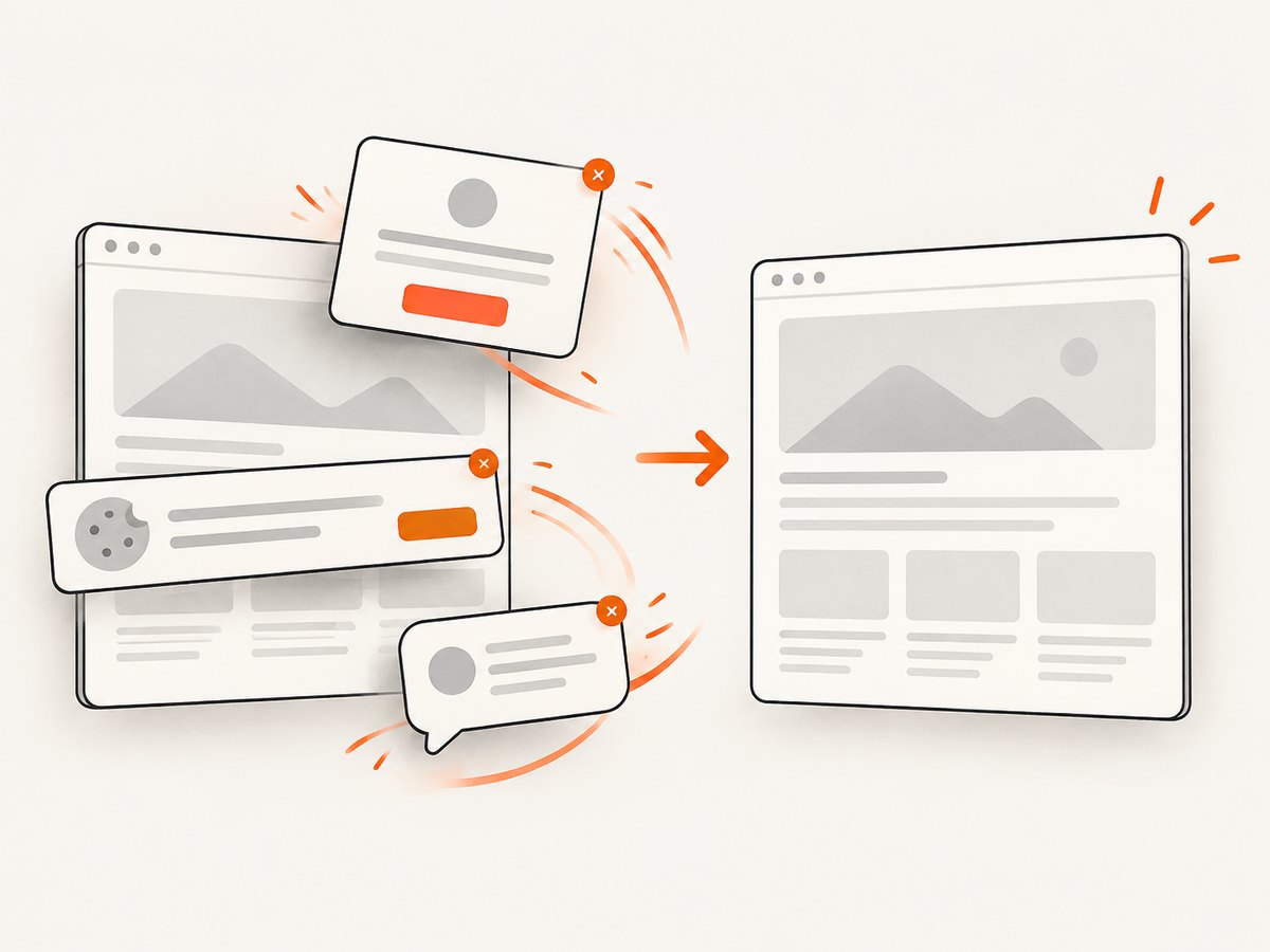
Cookie and consent banners, newsletter popups and chat widgets are removed before the shot. Bot checks, blank pages, timeouts, failed loads and cache hits are not billed; response headers identify the page verdict and whether it was billed. An MCP server provides take_screenshot, get_page_info and capture_pdf for Claude, Cursor and other MCP clients.
See the ScreenshotNeo API documentation for all options. A minimal call is:
curl -G 'https://api.screenshotneo.com/v1/shot' \
  -d access_key=YOUR_API_KEY \
  --data-urlencode url=https://stripe.com \
  -o shot.webp
import requests
r = requests.get(
'https://api.screenshotneo.com/v1/shot',
params={'access_key': 'YOUR_API_KEY', 'url': 'https://stripe.com'},
timeout=90,
)
r.raise_for_status()
open('shot.webp', 'wb').write(r.content)const q = new URLSearchParams({ access_key: 'YOUR_API_KEY', url: 'https://stripe.com' });
const res = await fetch(`https://api.screenshotneo.com/v1/shot?${q}`);
if (!res.ok) throw new Error(`Screenshot failed: ${res.status}`);
const data = Buffer.from(await res.arrayBuffer());
await import('node:fs/promises').then(fs => fs.writeFile('shot.webp', data));The Free plan includes 1,000 shots each month with no card; paid plans start at $5 for 3,000 shots, and every feature is on every plan. Create a free ScreenshotNeo account and start with the included monthly shots.
13. FAQ
Can I set zoom in page.screenshot()?
No. Apply CSS zoom or a transform in the page, and use deviceScaleFactor for raster density.
Does deviceScaleFactor change responsive breakpoints?
No. Breakpoints use CSS viewport dimensions. Device scale changes the number of device pixels used to paint them.
Which approach is best for a retina image?
Keep the desired CSS viewport and set deviceScaleFactor: 2 (or another deliberate value). Add CSS zoom only if the design itself must appear larger.
Why does a transformed element overlap its neighbors?
A transform changes painting without normal layout flow. Capture the element itself or adjust its surrounding layout and clip explicitly.
Should I use fullPage for every screenshot?
No. Use viewport mode for the visible window, element mode for a component and clips for known regions. Full-page mode is appropriate when the complete document is the deliverable.


