How to Open Websites at Multiple Viewport Breakpoints with Python WebDriver
Use Selenium WebDriver to test responsive layouts at named mobile, tablet and desktop breakpoints, with waits, assertions and screenshot evidence.
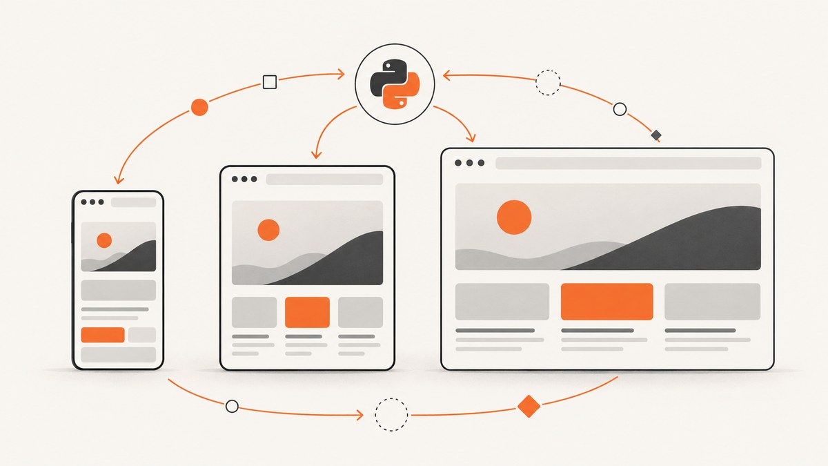
Direct answer: define your breakpoint cases as named width and height pairs, open the site with Selenium, call driver.set_window_size(width, height) for each case, wait for a page-specific ready condition, then run responsive assertions and save evidence with the breakpoint name and dimensions.
This pattern keeps every responsive check repeatable. The browser, driver version, URL, breakpoint list and readiness condition stay explicit, so a failure can be reproduced instead of guessed from a manually resized window.
1. Install Selenium and prepare a test
Install Selenium in the Python environment used by your project:
python -m pip install seleniumRecent Selenium versions can manage a compatible browser driver automatically in common setups. If your environment manages drivers separately, make sure the browser and driver versions are compatible before running the test.
Create an output directory before saving screenshots:
mkdir -p artifacts2. Complete multi-breakpoint example
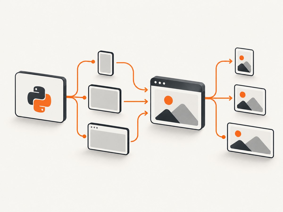
The following script opens a page once, resizes the current WebDriver window for each case, waits for the body, checks a navigation element, and saves a screenshot whose filename records the breakpoint and dimensions. Replace the selectors and expected responsive states with the behavior your site promises.
from pathlib import Path

from selenium import webdriver
from selenium.webdriver.common.by import By
from selenium.webdriver.support.ui import WebDriverWait
from selenium.webdriver.support import expected_conditions as EC

URL = "https://example.com"
ARTIFACTS = Path("artifacts")
ARTIFACTS.mkdir(parents=True, exist_ok=True)

BREAKPOINTS = {
    "mobile": (375, 812),
    "tablet": (768, 1024),
    "desktop": (1440, 900),
}


def assert_responsive_state(driver, label):
    """Adapt these checks to the responsive behavior of your application."""
    navigation = driver.find_element(By.CSS_SELECTOR, "nav")
    menu_button = driver.find_elements(By.CSS_SELECTOR, "[aria-label='Open menu']")

    if label == "mobile":
        assert menu_button and menu_button[0].is_displayed(), \\
            "The mobile menu control should be visible"
    else:
        assert navigation.is_displayed(), \\
            f"Navigation should be visible at the {label} breakpoint"


with webdriver.Chrome() as driver:
    wait = WebDriverWait(driver, 10)
    driver.get(URL)

    for label, (width, height) in BREAKPOINTS.items():
        driver.set_window_size(width, height)

        # Replace this with a condition that means your page is ready.
        wait.until(EC.visibility_of_element_located((By.TAG_NAME, "body")))

        assert_responsive_state(driver, label)

        output = ARTIFACTS / f"{label}-{width}x{height}.png"
        driver.save_screenshot(str(output))
        print(f"{label}: {width}x{height} -> {output}")
The values in this example are inputs chosen for the target design, not a universal breakpoint standard. Use the widths where your CSS or product requirements change, and include a height that exposes the content or interaction you need to inspect.
3. Choose breakpoint cases deliberately
Represent each case as a label and a (width, height) pair. Labels make test output readable; dimensions make screenshot artifacts searchable.
BREAKPOINTS = {
    "phone-narrow": (320, 700),
    "phone": (375, 812),
    "tablet-portrait": (768, 1024),
    "tablet-landscape": (1024, 768),
    "desktop": (1440, 900),
}
Include a case when it represents a real design transition, a supported device class, or a known regression risk. Do not add dozens of nearly identical widths unless the layout has transitions there; a smaller, intentional matrix is easier to maintain.
Record the effective CSS viewport
set_window_size sets the current browser window dimensions. Browser chrome and platform window behavior can mean the CSS viewport is different from the requested outer size. If your assertion depends on CSS pixels, record the values reported by the page as well:
viewport = driver.execute_script(
    "return {width: window.innerWidth, height: window.innerHeight, "
    "devicePixelRatio: window.devicePixelRatio};"
)
print(label, viewport)
Keep both values in your test output: the requested WebDriver size identifies the test input, while innerWidth and innerHeight identify what responsive CSS actually received.
4. Resize with set_window_size or set_window_rect
Use set_window_size(width, height) when only the current window dimensions matter:
driver.set_window_size(768, 1024)Use set_window_rect when you also need to set the window position. Selenium documents this W3C-compatible operation as setting position and size together:
driver.set_window_rect(x=0, y=0, width=768, height=1024)For ordinary responsive checks, position is usually irrelevant. Size the window immediately before each assertion so the test states which dimensions it is evaluating.
5. Wait for the page before asserting
Resizing is synchronous at the WebDriver command level, but the page may still be loading fonts, data or components. Use an explicit wait for a condition that represents readiness. Waiting only for a fixed sleep is slower and less reliable because the needed time changes between runs.
Wait for a visible element
wait.until(
    EC.visibility_of_element_located((By.CSS_SELECTOR, "main article"))
)
Wait for a responsive control
wait.until(
    EC.visibility_of_element_located((By.CSS_SELECTOR, "[aria-label='Open menu']"))
)
If a control is intentionally hidden at a desktop breakpoint, wait for a stable parent or another page-specific readiness signal instead of waiting for the hidden control.
Wait for asynchronous content
wait.until(
    EC.presence_of_element_located((By.CSS_SELECTOR, "[data-test='results-loaded']"))
)
After resizing, use the same readiness rule consistently for every breakpoint unless the page has genuinely different loading behavior at different sizes.
6. Assert responsive behavior, not just pixels
A screenshot is useful evidence, but assertions explain what failed. At each breakpoint, compare the expected responsive mode and verify that important controls remain usable.
| Check | Examples |
|---|---|
| Viewport | Requested width and height; reported innerWidth and innerHeight |
| Layout mode | Navigation collapse, column stacking, sidebar visibility, grid column count |
| Functional state | Buttons visible and enabled, menus openable, forms usable, key content present |
| Evidence | Screenshot and structured output named with label and dimensions |
Example: assert a CSS-driven mode
mode = driver.find_element(By.CSS_SELECTOR, "body").get_attribute("data-layout")
expected = {
    "mobile": "compact",
    "tablet": "standard",
    "desktop": "wide",
}[label]
assert mode == expected, f"Expected {expected}, got {mode} at {label}"
Example: inspect computed styles
columns = driver.execute_script("""
    const element = document.querySelector('[data-test='grid']');
    return getComputedStyle(element).gridTemplateColumns;
""")
assert columns, "The responsive grid should have a computed column layout"
Prefer stable semantic selectors such as data-test, accessible names and roles. Avoid selectors tied to generated class names or exact pixel coordinates.
7. Capture full-page or element evidence
driver.save_screenshot captures the current viewport. Use one artifact per breakpoint so a later failure identifies the exact case:
driver.save_screenshot(
    str(ARTIFACTS / f"{label}-{width}x{height}.png")
)
If the question is whether one component responds correctly, capture or inspect that component separately in your test logic. A full viewport image can show context, while a focused assertion makes the failure actionable.
8. Run the matrix in a test suite
With pytest, parameterize the dimensions and keep one browser session per test function or fixture according to your isolation needs:
import pytest
from selenium import webdriver
from selenium.webdriver.common.by import By
from selenium.webdriver.support.ui import WebDriverWait
from selenium.webdriver.support import expected_conditions as EC

CASES = [
    pytest.param("mobile", 375, 812, id="mobile-375x812"),
    pytest.param("tablet", 768, 1024, id="tablet-768x1024"),
    pytest.param("desktop", 1440, 900, id="desktop-1440x900"),
]


@pytest.mark.parametrize("label,width,height", CASES)
def test_navigation_mode(label, width, height):
    with webdriver.Chrome() as driver:
        wait = WebDriverWait(driver, 10)
        driver.get("https://example.com")
        driver.set_window_size(width, height)
        wait.until(EC.visibility_of_element_located((By.TAG_NAME, "body")))

        menu = driver.find_elements(By.CSS_SELECTOR, "[aria-label='Open menu']")
        if label == "mobile":
            assert menu and menu[0].is_displayed()
        else:
            assert driver.find_element(By.CSS_SELECTOR, "nav").is_displayed()
For larger suites, a shared driver can reduce startup time, but reset the page state between cases. A fresh driver gives stronger isolation and makes failures easier to reproduce.
9. Common failures and fixes
| Symptom | Likely cause | Fix |
|---|---|---|
ElementNotVisibleException or a failed visibility wait |
The page has not finished rendering, or the element is intentionally hidden at that breakpoint. | Wait for a page-specific readiness element and assert the correct element for that responsive mode. |
| The screenshot still shows the old layout | The resize happened before the page settled, or a responsive component updates asynchronously. | Resize, then wait for a stable element or layout-state marker before capturing. |
| Requested dimensions do not match CSS behavior | WebDriver dimensions describe the browser window while browser chrome consumes part of the space. | Record window.innerWidth and window.innerHeight; choose cases based on the effective CSS viewport. |
| Element lookup fails only on mobile | Mobile navigation uses a different DOM element or accessible name. | Use separate selectors or assertions for the compact and expanded modes, with stable semantic attributes. |
| Intermittent failures after navigation | Data, fonts or client-side rendering are still loading. | Replace arbitrary sleeps with WebDriverWait and an expected condition tied to readiness. |
| Driver startup error | Browser and driver are missing or incompatible. | Install the browser, update Selenium and verify the driver strategy used by the environment. |
| Artifacts overwrite each other | Filenames do not include the breakpoint or dimensions. | Use names such as tablet-768x1024.png and create the output directory first. |
10. Reliability and repeatability checklist
- Keep the URL, browser, driver version and breakpoint list fixed when comparing runs.
- Set the window size immediately before each responsive assertion.
- Wait on a documented expected condition instead of a fixed delay.
- Use stable selectors and accessible names.
- Record requested dimensions and effective CSS viewport dimensions.
- Save evidence with the breakpoint label and dimensions.
- Control login state, test data, timezone and network dependencies when they affect layout.
- Run the same matrix in the same browser configuration when investigating a regression.
11. Performance and cost considerations
Each browser startup and navigation adds latency. Reusing a driver can speed up a matrix, while separate drivers improve isolation. Choose based on whether the suite is measuring a quick layout smoke test or a full end-to-end flow.
Keep the breakpoint set focused on supported design transitions. Capture screenshots only when they are useful evidence; assertions alone are cheaper to store and review. When screenshots are required, compress or retain them according to your artifact policy.
WebDriver runs consume the resources of the machine running the browser. A hosted screenshot API can move browser setup and capture infrastructure out of the test process when you need repeatable image generation rather than interactive assertions.
12. Or skip the browser setup
ScreenshotNeo provides a website screenshot API for breakpoint evidence with one GET request. Use the ScreenshotNeo API documentation for the complete parameter list and options such as custom viewport sizes, device presets, retina scale, full-page capture, CSS selectors, waits, custom JavaScript and caching.
cURL
curl -G "https://api.screenshotneo.com/v1/shot" \\
  -d access_key=YOUR_API_KEY \\
  --data-urlencode url=https://example.com \\
  -d width=375 \\
  -d height=812 \\
  -o mobile-375x812.webp
Python
import requests

for label, width, height in [
    ("mobile", 375, 812),
    ("tablet", 768, 1024),
    ("desktop", 1440, 900),
]:
    response = requests.get(
        "https://api.screenshotneo.com/v1/shot",
        params={
            "access_key": "YOUR_API_KEY",
            "url": "https://example.com",
            "width": width,
            "height": height,
        },
        timeout=90,
    )
    response.raise_for_status()
    with open(f"{label}-{width}x{height}.webp", "wb") as image:
        image.write(response.content)
Node.js
for (const [label, width, height] of [
  ['mobile', 375, 812],
  ['tablet', 768, 1024],
  ['desktop', 1440, 900],
]) {
  const q = new URLSearchParams({
    access_key: 'YOUR_API_KEY',
    url: 'https://example.com',
    width: String(width),
    height: String(height),
  });
  const res = await fetch(`https://api.screenshotneo.com/v1/shot?${q}`);
  if (!res.ok) throw new Error(`${res.status} ${await res.text()}`);
  const image = Buffer.from(await res.arrayBuffer());
  await import('node:fs/promises').then(fs =>
    fs.writeFile(`${label}-${width}x${height}.webp`, image)
  );
}
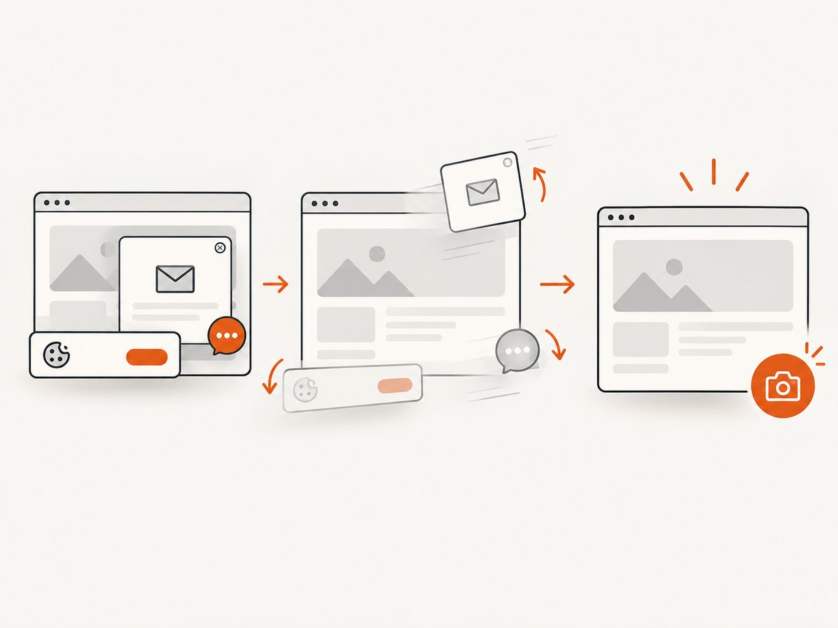
ScreenshotNeo removes cookie and consent banners, newsletter popups and chat widgets before capture. Bot checks, blank pages, failed loads and cache hits are not billed, and the response identifies the page verdict and billing status with X-Page-Verdict and X-Billed headers. Its MCP server lets Claude, Cursor and other MCP clients use take_screenshot, get_page_info and capture_pdf. The Free plan includes 1,000 screenshots per month without a card; paid plans start at $5 for 3,000 screenshots.
Create a free ScreenshotNeo account and start with 1,000 screenshots per month at no charge.
13. FAQ
Should I resize before or after navigation?
Either can work, but resizing immediately before the breakpoint-specific wait and assertions makes the test flow explicit. If the page selects different resources during navigation based on viewport size, set the size before calling driver.get for that case.
Do breakpoint values come from Selenium?
No. Selenium provides the window-sizing APIs; your project chooses the widths and heights that represent its supported layouts and risk areas.
Can one test verify both layout and interaction?
Yes. After waiting for the responsive state, assert visibility and enabled state, then click the relevant control and verify the resulting state at that same breakpoint.
When should I use a screenshot API instead of WebDriver?
Use WebDriver when you need browser interaction and assertions inside a test. Use a screenshot API when you primarily need repeatable image or PDF output without maintaining browser setup in your application.


