Recommended Image Sizes for Websites: A Practical Guide
Choose website image sizes from the rendered layout, then use responsive candidates, the right format, and stable dimensions to balance clarity and page weight.

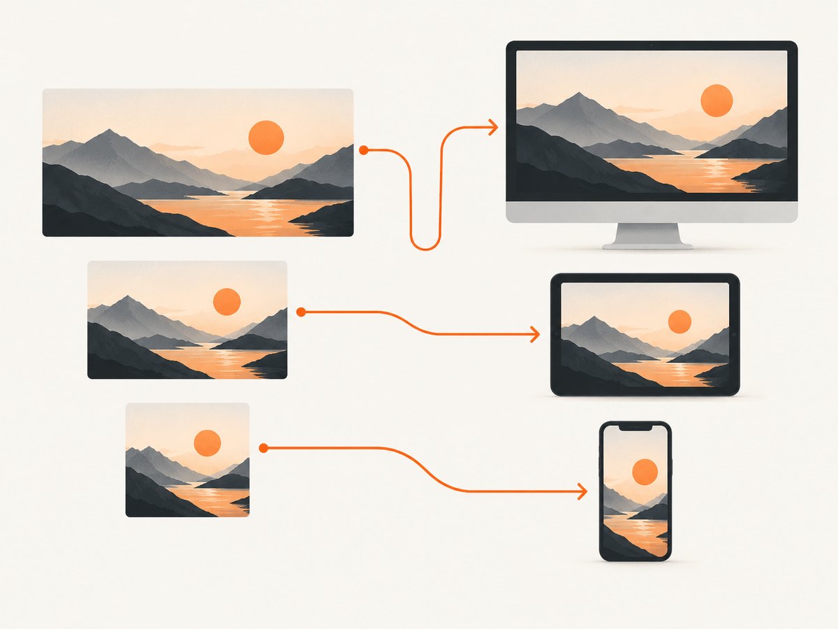
There is no single image size that works for every website. Start with the image’s rendered width in your layout, then provide suitable responsive candidates for the slot and the display’s pixel density. Use srcset and sizes so the browser can choose, include intrinsic width and height to reserve space, and compress the image without making it visibly soft.
For example, if an article column is about 600 CSS pixels wide, a source around 600 pixels wide is a reasonable 1× starting point. A high-density display may need a larger candidate, and a fluid layout should offer multiple widths. These are practical heuristics, not universal standards. Google’s responsive image guidance illustrates that a 500 by 500 pixel container is optimally served by a 500 by 500 pixel image when other variables are equal.
1. Size images for the space they occupy
Measure the image’s CSS slot at the layouts where it appears. The important dimensions are the rendered width, aspect ratio, and crop—not the dimensions of the original camera file or an arbitrary social-media preset. A 3,000-pixel-wide original may be useful as a master, but sending it to a 600-pixel content column can waste bytes.
For a fixed slot, start near its CSS dimensions at 1× density. For a fluid slot, create several widths that cover its likely rendered sizes. A device with a higher pixel density can benefit from a larger source, but more pixels also mean more data; inspect the result at the actual display size before choosing candidates.
| Image use | Practical starting point | Check before export |
|---|---|---|
| Full-width hero | Make the largest candidate wide enough for the widest slot you actually serve, with smaller candidates for tablet and mobile layouts. | Whether the crop, subject position, and text overlay remain clear at each breakpoint. |
| Article or blog image | Size the largest candidate to the article column’s maximum rendered width; add a larger candidate if the design serves high-density displays. | Actual column width and whether the image is displayed uncropped. |
| Card or grid thumbnail | Provide candidates near the card’s rendered width and keep the intended aspect ratio. | Whether the same crop works in every card size. |
| Logo, icon, diagram, or line illustration | Use SVG when the artwork is vector-based; use a properly sized raster file when needed. | Transparency, crisp edges, and whether the publishing system accepts SVG safely. |
These are workflow starting points rather than fixed standards. If the design intentionally uses a different crop on mobile, use art direction instead of stretching or awkwardly cropping the desktop image.
2. Serve responsive widths with srcset and sizes
For ordinary responsive delivery, use width-descriptor candidates in srcset. Describe the image’s rendered slot with sizes, using the same breakpoints and layout logic as the page. The browser uses that information along with the display’s pixel density to select a candidate.
<img
  src="/images/article-800.webp"
  srcset="/images/article-400.webp 400w,
          /images/article-800.webp 800w,
          /images/article-1200.webp 1200w"
  sizes="(min-width: 66em) 33vw,
         (min-width: 44em) 50vw,
         100vw"
  width="1200"
  height="800"
  alt="A developer reviewing a responsive page layout"
  loading="lazy"
  decoding="async"
>
In this example, the largest source is 1200 by 800, so all candidates should preserve that image’s aspect ratio unless each file is deliberately art-directed. The sizes value is an example: it says the image occupies roughly one-third of the viewport at wider screens, half at medium widths, and the full viewport at smaller widths. Change it to match your real content container, including gutters and sidebars where relevant.
Use w descriptors when candidate files have different widths. The src remains a fallback, and the browser can select from the candidate list. Do not describe a 600-pixel file as 1200w; descriptors must reflect the actual intrinsic width. Avoid generating an excessive number of nearly identical variants: a small, useful range usually covers the layout more clearly and keeps image generation and storage manageable.
3. Use picture for alternate crops or formats
Use <picture> when the image itself should change by breakpoint or when you need explicit format/source control. A mobile portrait crop can keep a person or product visible where a wide desktop crop would lose the subject.
<picture>
  <source
    media="(max-width: 43.99em)"
    srcset="/images/hero-mobile-600.webp 600w,
            /images/hero-mobile-900.webp 900w"
    sizes="100vw"
    type="image/webp"
  >
  <source
    srcset="/images/hero-900.jpg 900w,
            /images/hero-1600.jpg 1600w"
    sizes="(min-width: 70em) 70em, 100vw"
    type="image/jpeg"
  >
  <img
    src="/images/hero-1600.jpg"
    width="1600"
    height="700"
    alt="A team working around a table"
    fetchpriority="high"
  >
</picture>
The browser checks sources in order and uses a matching supported source; the img supplies fallback content and its intrinsic dimensions. Make sure the alternative crop communicates the same essential content. When only resolution needs to adapt and the crop is unchanged, img with srcset and sizes is simpler.
4. Include dimensions and make loading intentional
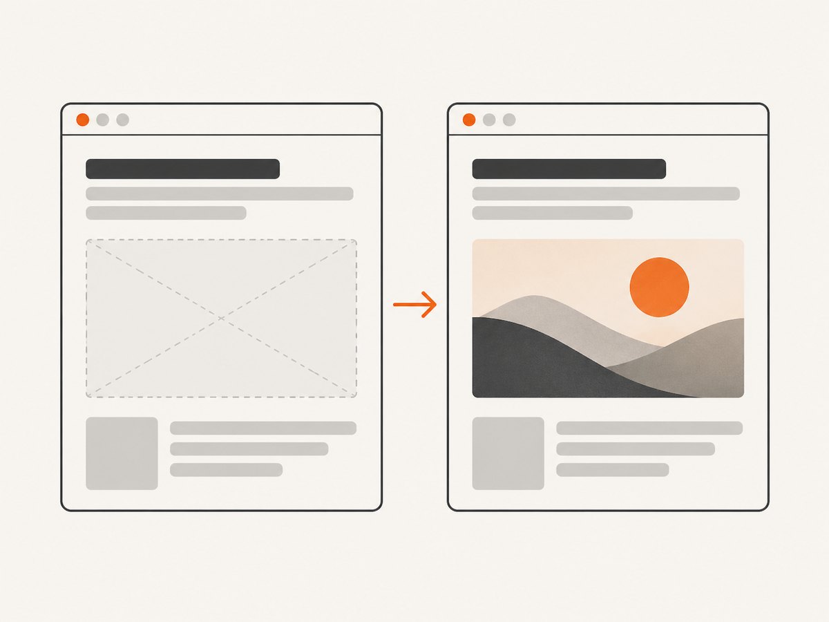
When dimensions are known, include the image’s intrinsic width and height. The browser can calculate the aspect-ratio space before the file arrives, which reduces layout movement. Google’s web.dev guidance explicitly recommends these attributes when dimensions are known. CSS can make an image fit its container while preserving its proportions:
img {
  max-width: 100%;
  height: auto;
}
Lazy-load images below the fold so they need not compete with immediately visible content. Do not defer the main above-the-fold image without a reason; for an important hero image, consider fetchpriority="high". Use loading behavior according to the image’s actual place in the page, not as a blanket rule applied identically to every image.
5. Choose a format for the image and delivery path
Format choice depends on the content and how your site delivers it:
- JPEG: a practical choice for photographic content.
- SVG: appropriate for vector logos, icons, diagrams, and line graphics.
- PNG: useful when lossless raster detail or transparency is required.
- WebP or AVIF: candidates for an optimized responsive pipeline when the delivery path handles browser support and fallback.
No format is automatically best for every asset. Resize and compress before delivery, then compare candidate files at similar visual quality. Consider both byte size and visible detail at the real layout size; a tiny file that looks soft or has damaged edges is not an improvement.
Images can make up a large share of page transfer: Google’s web.dev responsive-images course states that images account for more than 60% of the bytes on average needed to load a web page. That makes sensible dimensions and compression useful, but the best choice still depends on the page and its other resources.
6. Check the image in the real layout
- Measure the slot. Record the rendered width and aspect ratio at the key viewport breakpoints.
- Generate candidates. Export widths that cover those slots, plus an appropriate larger candidate for higher-density displays.
- Set responsive hints. Add accurate width descriptors to
srcsetand writesizesto reflect the layout. - Add dimensions. Set intrinsic
widthandheighton the image element. - Choose loading behavior. Lazy-load below-the-fold images and keep the primary visible image from being unnecessarily deferred.
- Compare quality and weight. View candidates at the actual rendered size, inspect crops and detail, and check their byte weight.
Verify the page at its mobile, tablet, and desktop layouts. Confirm that the selected source is sharp enough, the crop keeps the intended subject, and the browser reserves the correct space before the image loads. A page screenshot can help review the visible composition at a chosen viewport; it is a visual check, not a substitute for checking source dimensions, selected candidates, or image bytes.
7. WordPress and image pipelines
WordPress has generated responsive srcset and sizes attributes since version 4.4. That helps provide candidate files, but editors should still inspect the theme’s actual slot widths, crop behavior, and generated file sizes. A generated source set cannot compensate for a theme that describes the wrong slot or creates unsuitable crops.
For other content systems, image services and build pipelines can generate responsive derivatives automatically. Google’s guidance names Cloudinary as an image service worth checking for automated resizing and delivery. Treat any service as part of a pipeline to evaluate: inspect its generated dimensions, format behavior, fallback, and output quality in your own layout.
8. Troubleshooting common image sizing problems
| Symptom | Likely cause | Fix |
|---|---|---|
| The image looks blurry on a high-density screen. | The chosen source is near or below the rendered CSS width for that display’s pixel density, or compression removed too much detail. | Add a larger responsive candidate and inspect it at the actual rendered size. Compare at similar visual quality. |
| The page downloads a huge image for a small card. | The markup lacks useful width candidates or sizes describes a slot larger than the card. |
Generate card-sized variants, use accurate sizes, and verify the layout’s actual slot at breakpoints. |
| The browser selects an unexpected file. | The browser uses the available candidates, sizes, viewport, and pixel density; the declared slot or candidate widths may not match your expectation. |
Check that every w descriptor matches the file and revise sizes to reflect the rendered layout. |
| Images cause content to jump as they load. | The browser did not receive intrinsic dimensions or an equivalent reserved aspect ratio. | Add correct width and height attributes, or reserve the intended ratio in CSS. |
| The subject is cropped out on mobile. | A single wide crop is being reused in a narrow slot. | Use <picture> with a mobile-specific crop and a matching media condition. |
| A modern format fails for some visitors. | The delivery path has no supported fallback or its source ordering is incorrect. | Provide a conventional fallback in picture and verify the formats and source order your pipeline serves. |
| A transparent logo has a solid background. | The chosen format or export discarded transparency. | Use SVG for vector artwork or a raster format and export settings that preserve transparency. |
| WordPress images are too large or cropped incorrectly. | The theme’s slots, generated image sizes, or crop settings do not match the design. | Inspect generated derivatives and theme output; adjust registered sizes or crop behavior to suit the actual slots. |
9. Performance, reliability, and cost tradeoffs
Responsive variants add files to generate and maintain, so create candidates that serve real layout widths rather than every conceivable width. Larger images can improve sharpness on high-density displays but cost more bytes; heavier compression reduces transfer size but can damage texture, text in graphics, or sharp edges. Evaluate both factors at the same visual size and comparable quality.
Lazy loading can postpone below-the-fold image requests, while deferring a prominent image may delay visible content. Accurate dimensions help avoid layout shifts; accurate responsive hints help avoid routinely sending files far larger than the slot. If a pipeline performs format conversion or resizing dynamically, its behavior becomes part of delivery reliability: ensure the requested variant exists or that a usable fallback is served.
There is no fixed byte budget in this guide because image content, page design, network conditions, and quality requirements vary. Set budgets for your own page types, then review the largest assets and verify that compression has not made them visibly worse.
10. Review responsive pages with ScreenshotNeo
After setting image slots and responsive markup, review the rendered page at the viewports your design serves. ScreenshotNeo is a website screenshot API and MCP server from Yorker Media. It can capture a URL as PNG, JPEG, WebP, or PDF; its options include device presets and custom viewports. A screenshot can reveal an awkward crop, an oversized hero, or a layout shift’s final appearance. Use browser inspection as well when you need to know which responsive source was selected or how many bytes it used.
Or skip the browser setup
One GET request captures a page. See the ScreenshotNeo API documentation for request options.
curl -G "https://api.screenshotneo.com/v1/shot" \
  -d access_key=YOUR_API_KEY \
  --data-urlencode url=https://example.com \
  -o shot.webp
import requests
r = requests.get(
"https://api.screenshotneo.com/v1/shot",
params={"access_key": "YOUR_API_KEY", "url": "https://example.com"},
timeout=90,
)
open("shot.webp", "wb").write(r.content)const q = new URLSearchParams({
access_key: 'YOUR_API_KEY',
url: 'https://example.com'
});
const res = await fetch(`https://api.screenshotneo.com/v1/shot?${q}`);
if (!res.ok) throw new Error(`Screenshot request failed: ${res.status}`);
const fs = await import('node:fs/promises');
await fs.writeFile('shot.webp', Buffer.from(await res.arrayBuffer()));- Cookie banners are accepted and more than 60 known consent platforms, newsletter popups, and chat widgets are removed before the shot; each step can be turned off.
- Bot checks, CAPTCHAs, blank pages, timeouts, failed loads, and cache hits cost nothing; response headers report the page verdict and billing status.
- An MCP server offers
take_screenshot,get_page_info, andcapture_pdftools for Claude, Cursor, and other MCP clients. - The free plan includes 1,000 shots per month with no card; paid plans start at $5 for 3,000 shots, and every feature is on every plan.
Sign up for 1,000 free screenshots a month, with no card required.
Frequently asked questions
Should I make separate image files for mobile?
Only when the mobile layout needs a different crop or composition. For the same image and crop at different sizes, responsive width candidates usually suffice; use picture for art direction.
Is WebP or JPG better for a website?
Neither is always better. Choose based on content, visual quality, file weight, and how your delivery pipeline handles browser support and fallback. JPEG remains a practical photographic format; WebP can be part of a negotiated responsive pipeline.
Does a larger image always look better?
No. It may help on a high-density display, but it can increase transfer size without improving the image in the actual slot. Compare sharpness and bytes at the rendered size.
Do I need srcset if my site uses a CDN?
A CDN can generate or deliver variants, but the page still needs a responsive delivery strategy that provides suitable candidates and describes the rendered slot to the browser.
What image size should I use for a website?
Measure the rendered slot first. Then provide candidates suited to that width, aspect ratio, and display density; test them in the responsive layout rather than choosing from a generic size chart.


